Client
LEEUM 리움
Workscope
Website design
Manual Graphics
Director – Seongkyun Lee
Design – Seongkyun Lee, Yeji Jeong
Photography – Hanyeon Lee
Motion – Minseon Gwak
Project Overview
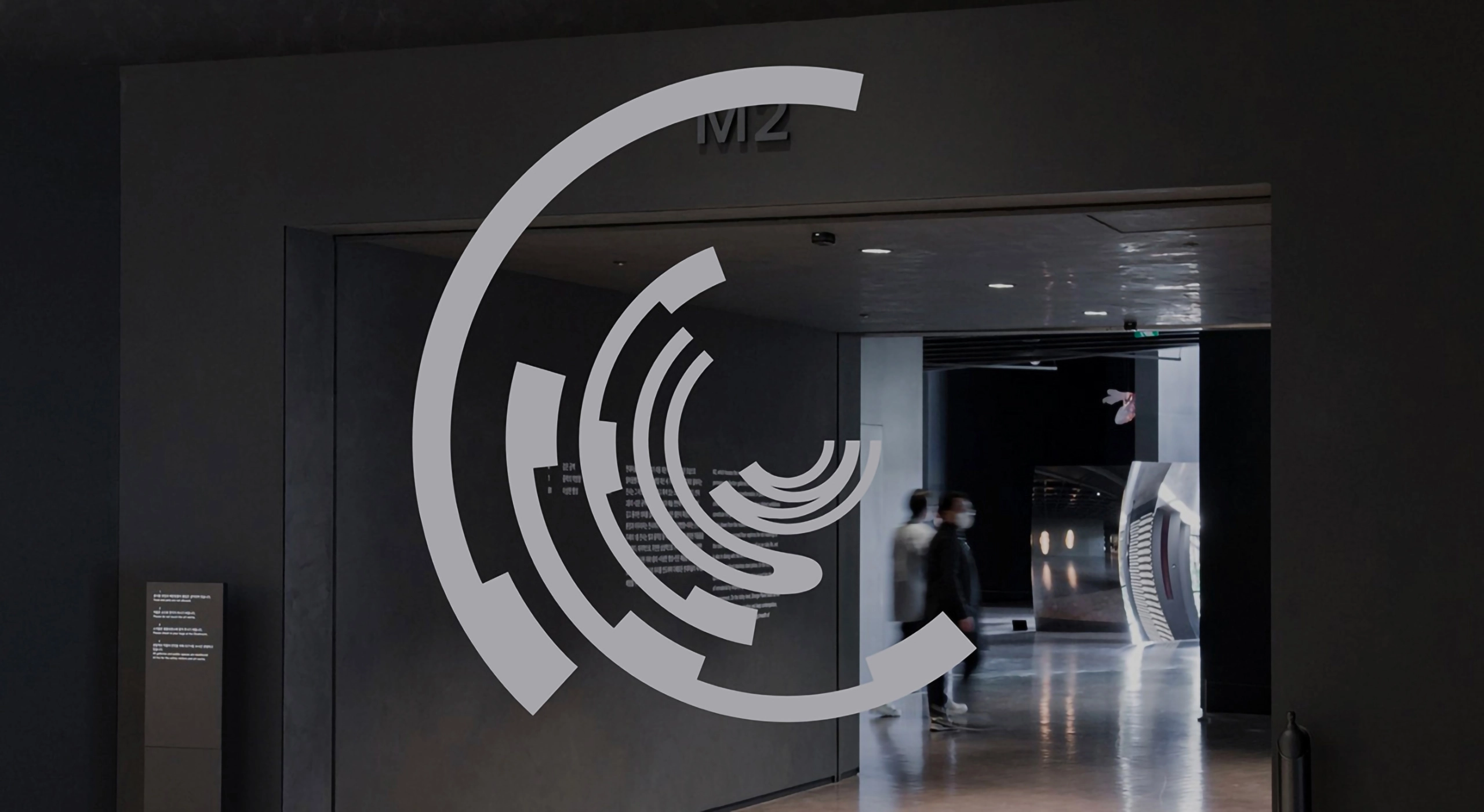
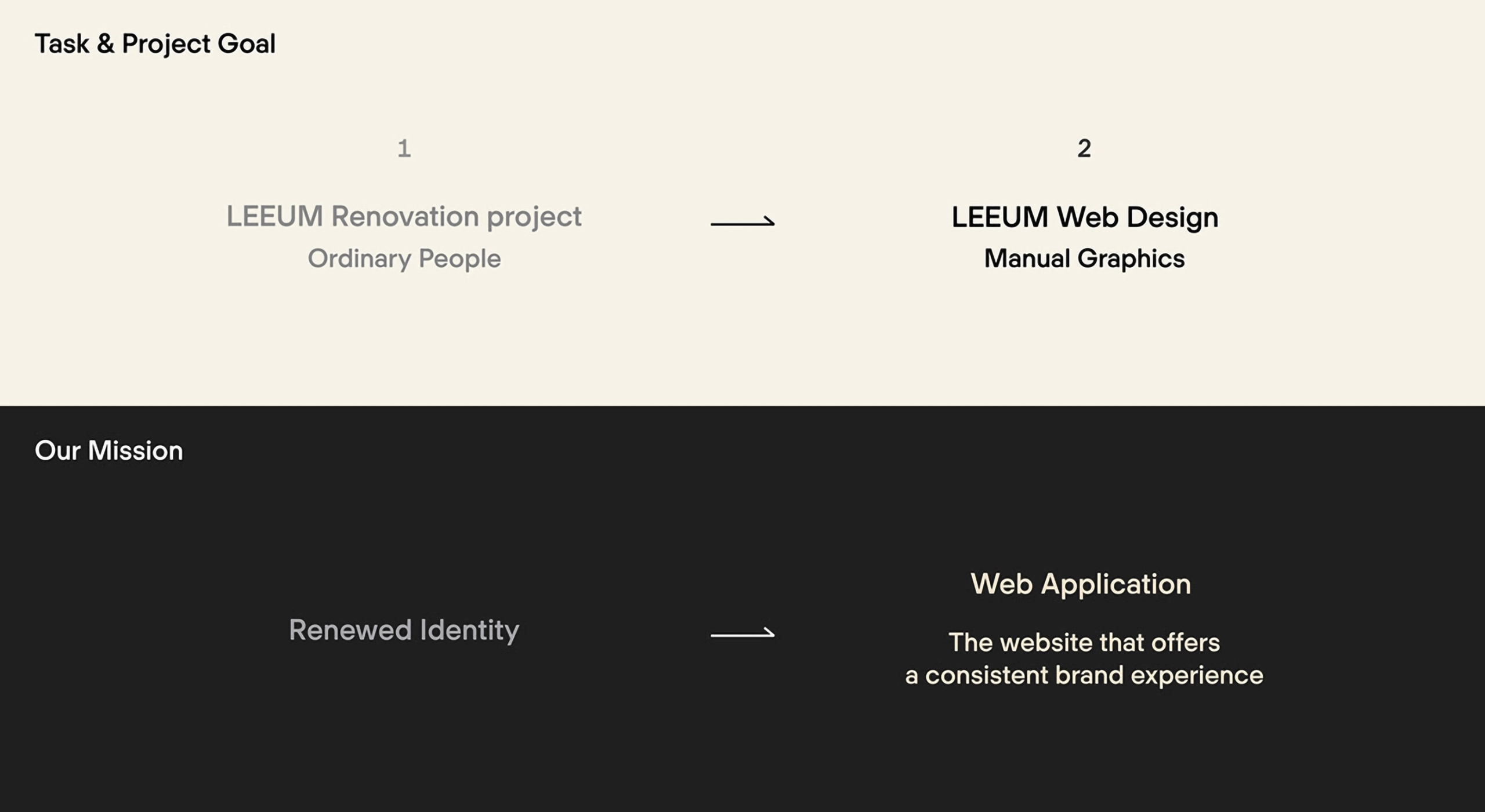
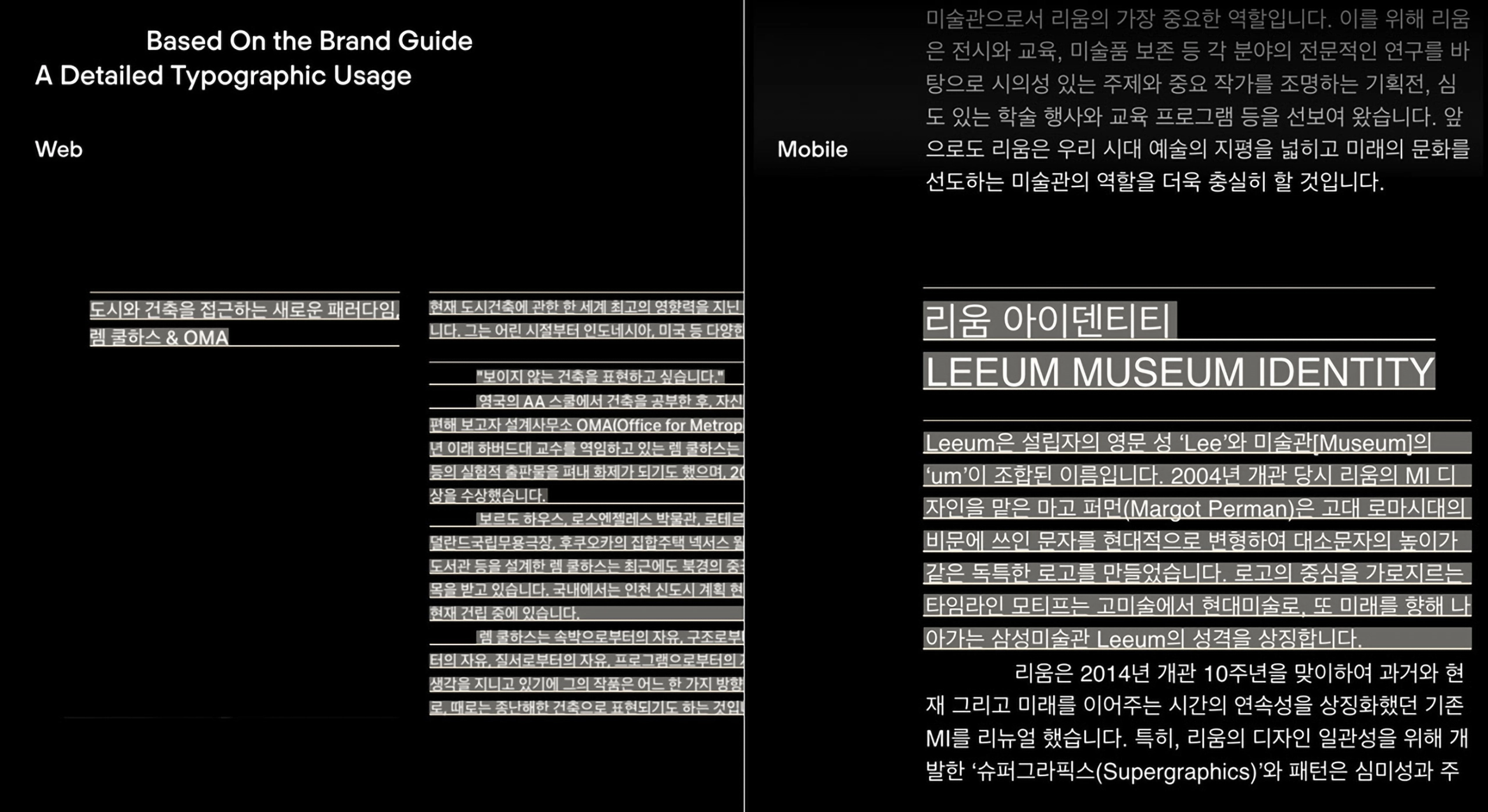
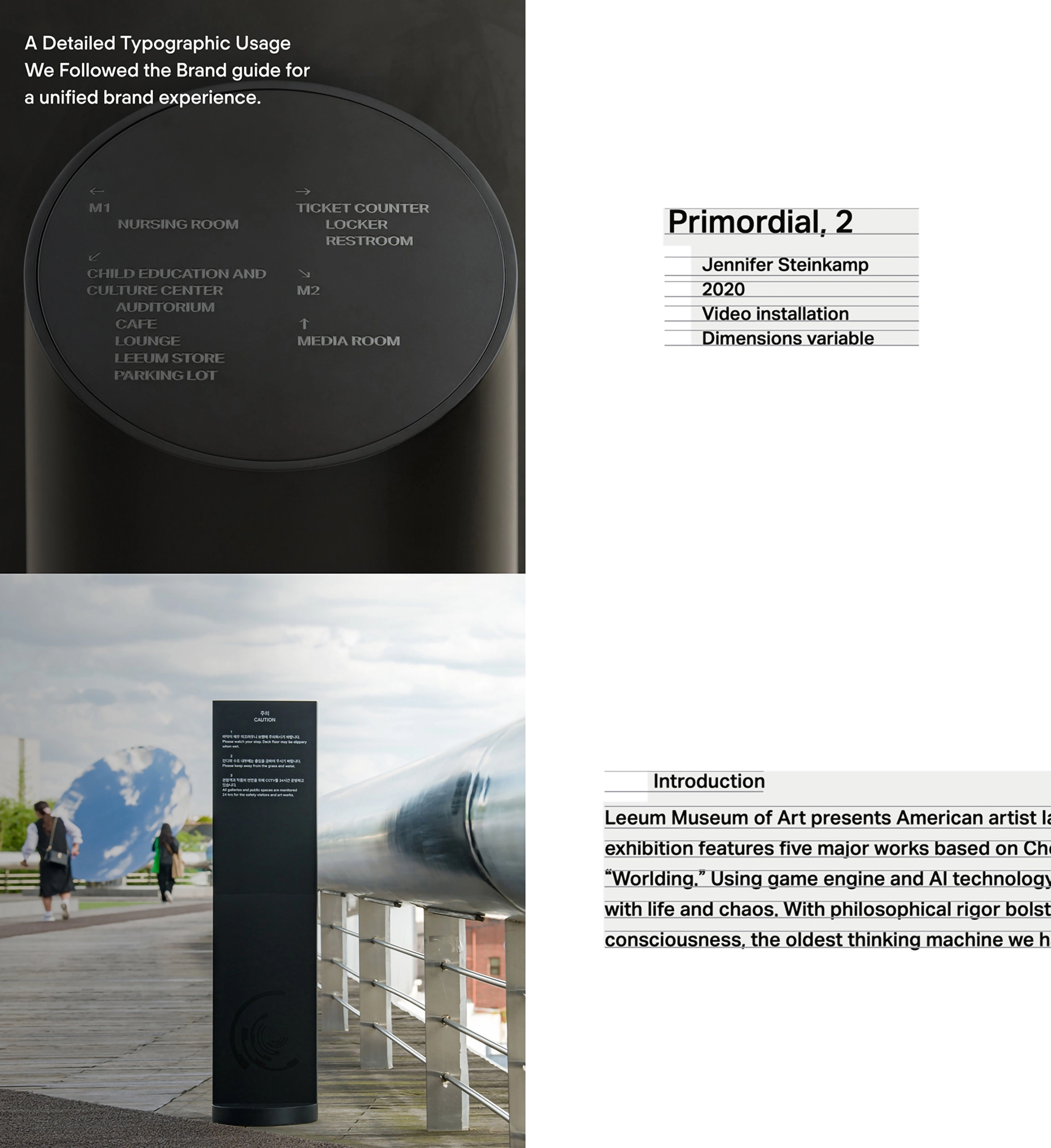
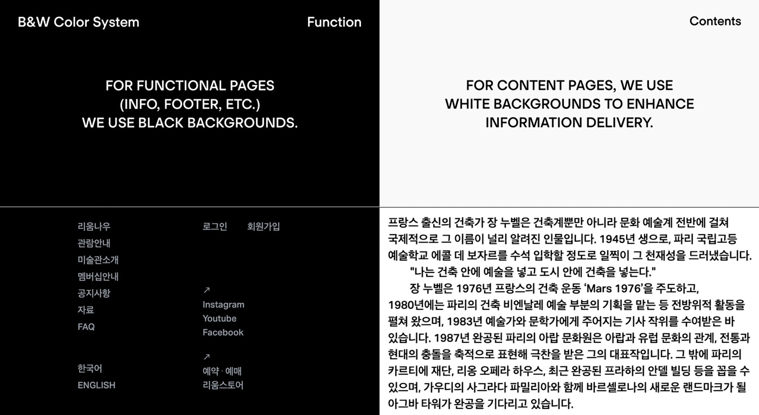
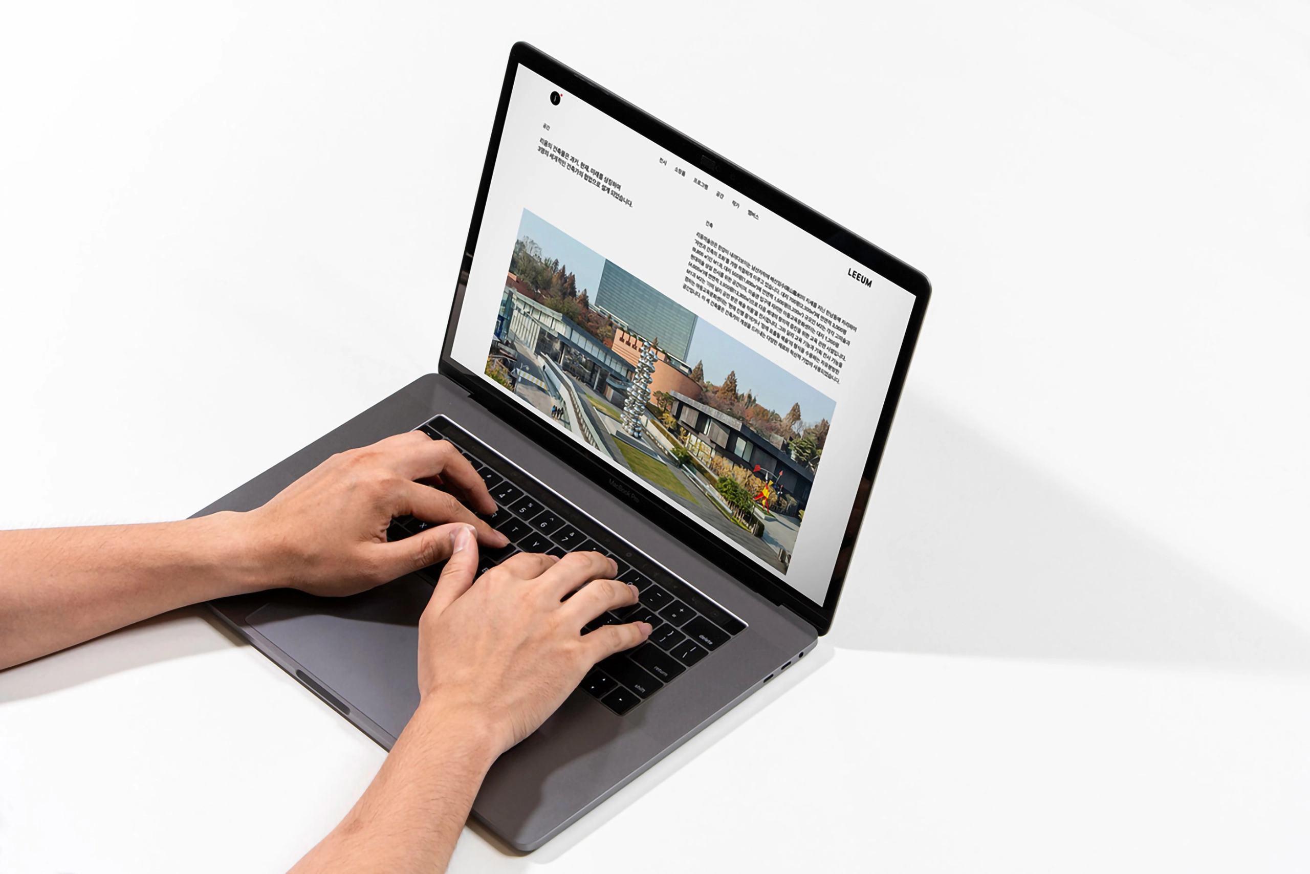
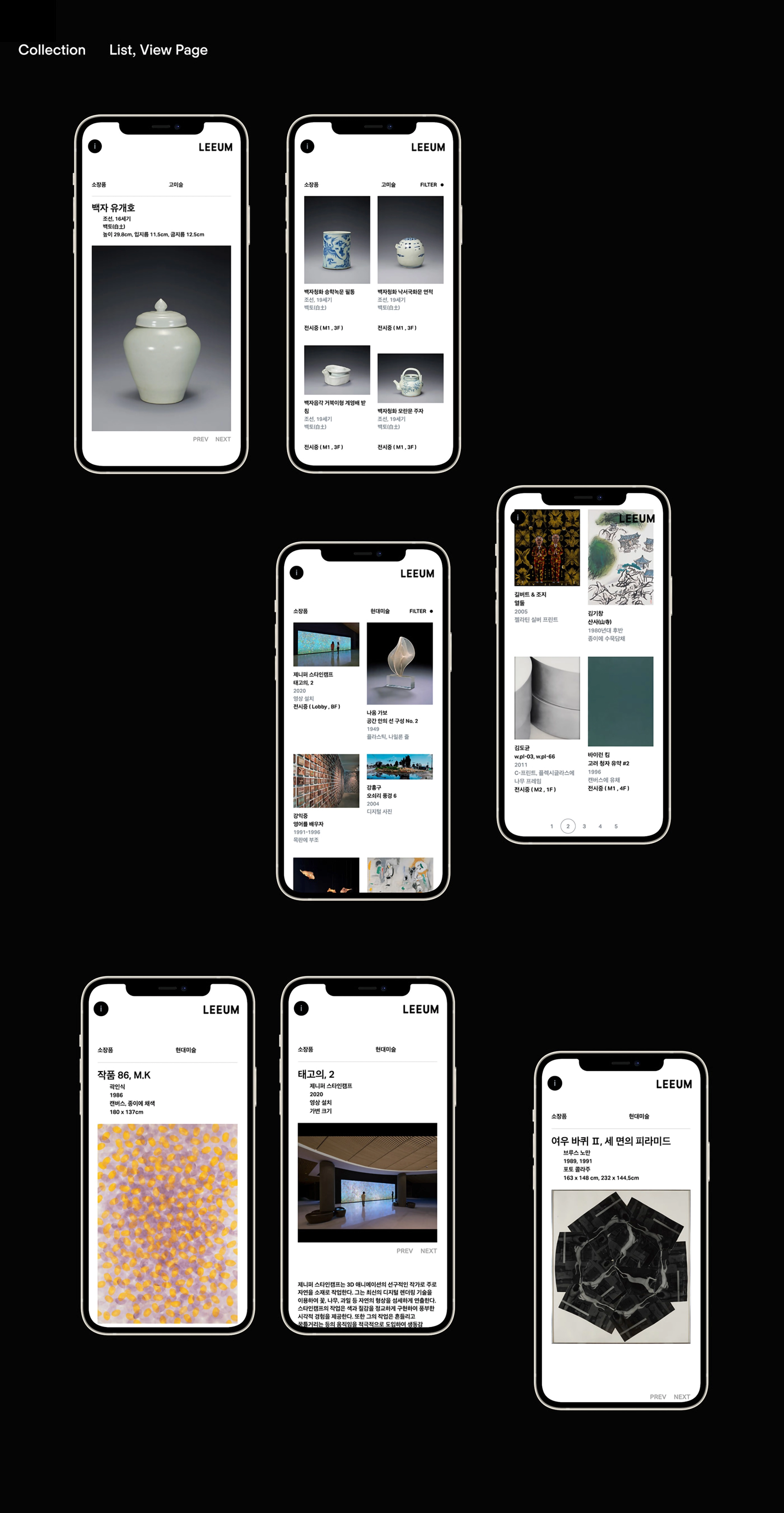
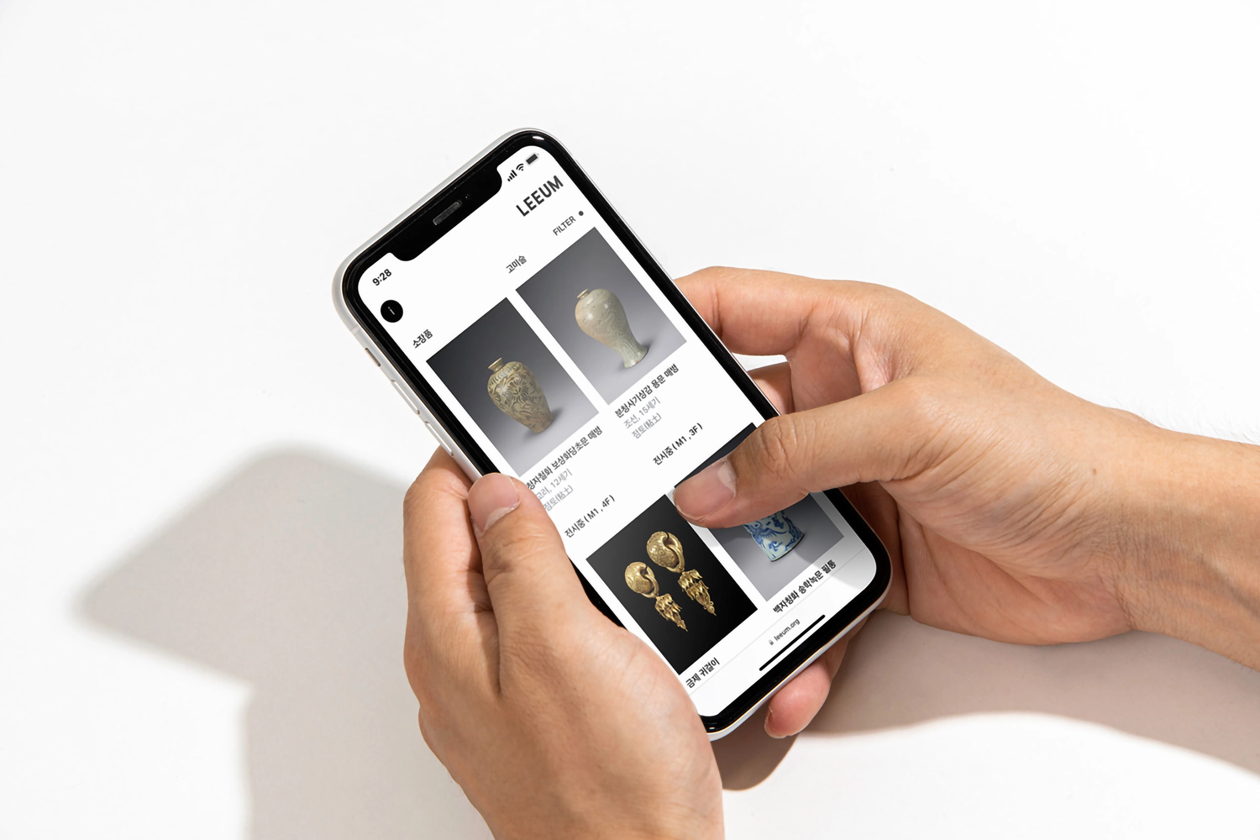
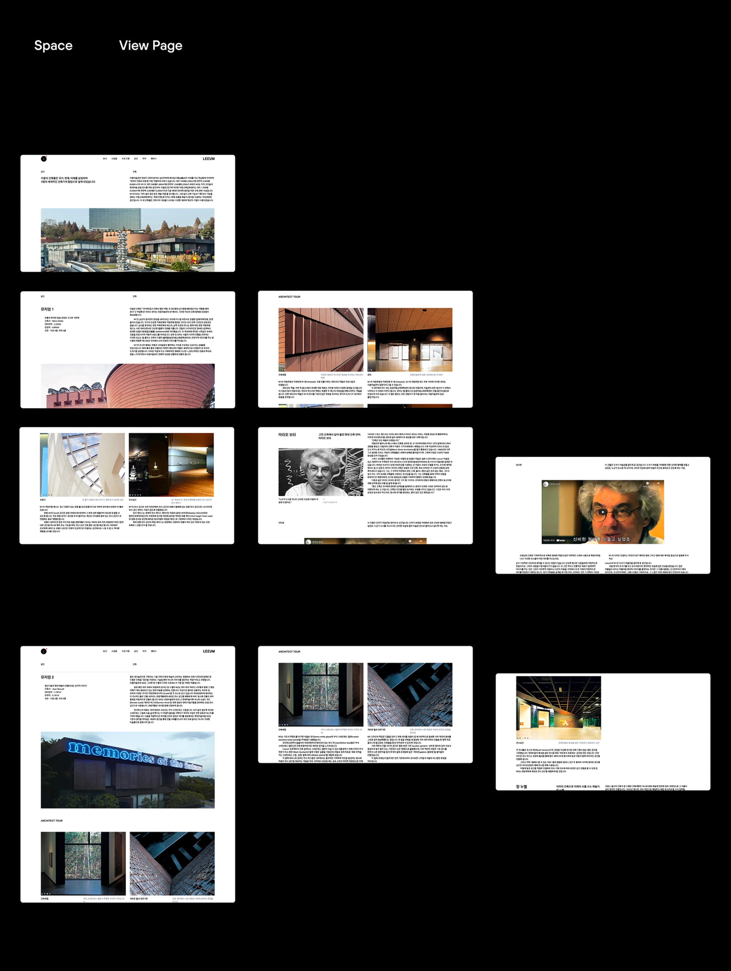
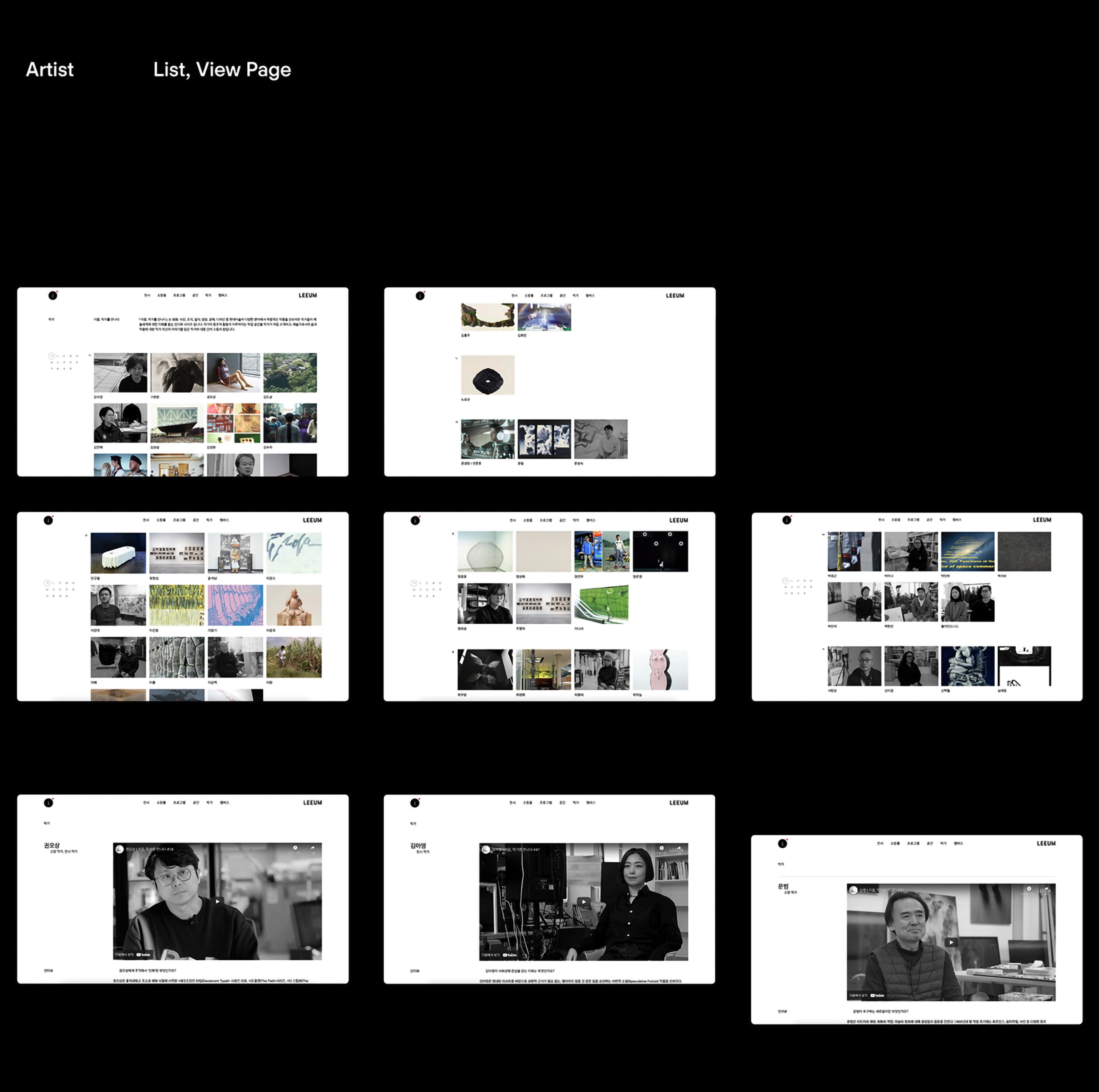
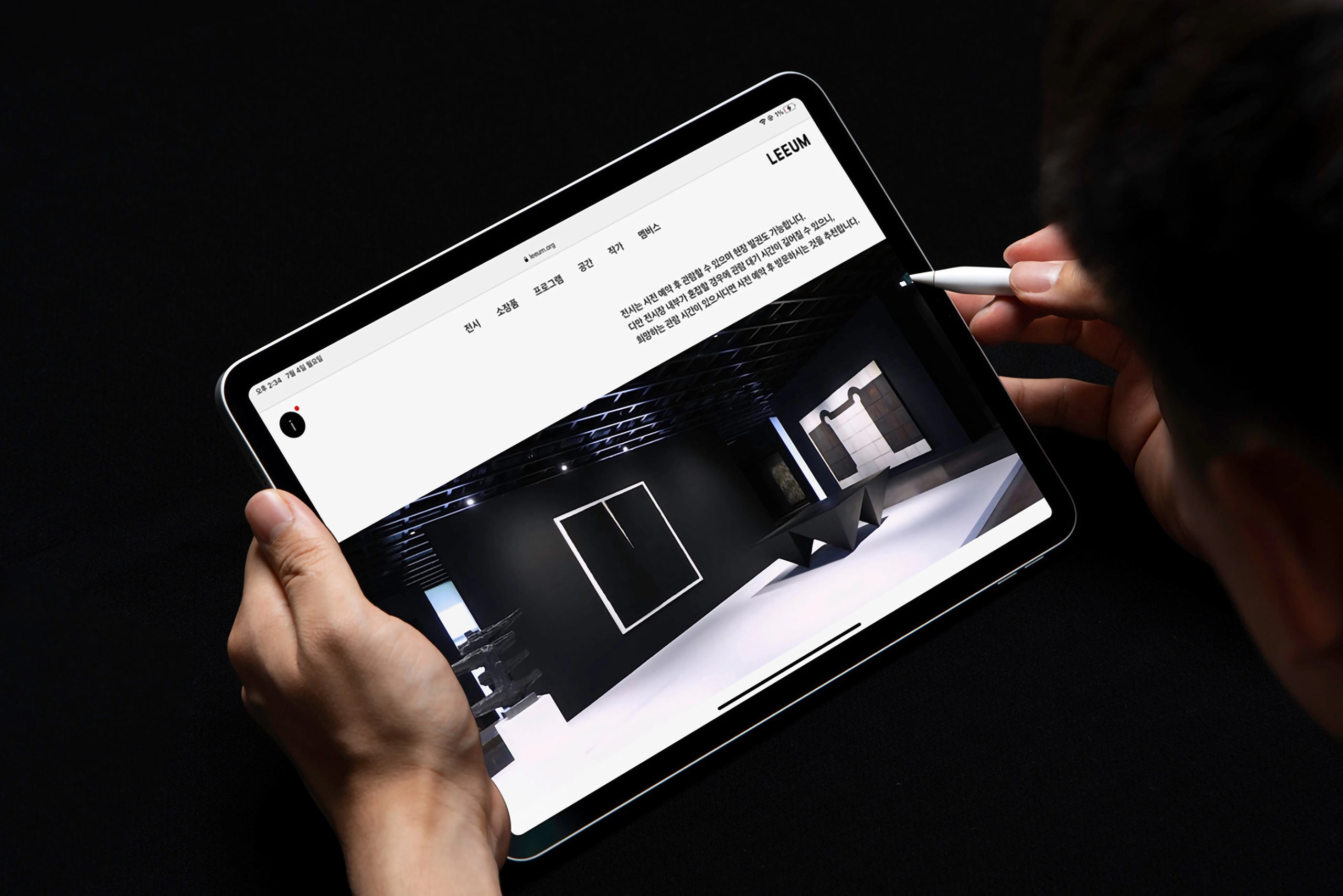
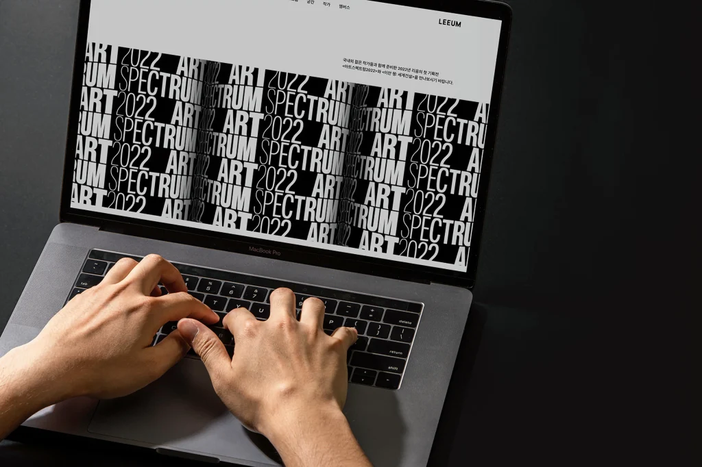
Manual Graphics designed the website for the Samsung Leeum Museum of Art. The website design closely followed the brand guidelines of the revamped museum. With the reopening of the museum, delivering a consistent brand experience to customers was a top priority, so we designed the website in consultation with Ordinary People, who worked on the renovation project. The entire brand experience was aligned with a sophisticated typographic design and rhythmic arrangement. We created a black and white color system to visually separate functional and content pages, with a black and white background for the functional footer and information, respectively, and a white background for the content for information and readability. To convey the impression that the changed MI and form are linked, we placed an ‘i’ in the top left corner, using the circular shape of the Rijksmuseum logo as a metaphor.
(Museum photo courtesy of Ordinary People | Photography by Kim Jin-sol)
매뉴얼 그래픽스는 삼성리움미술관 웹사이트를 디자인했습니다. 웹사이트 디자인은 리뉴얼 된 리움 미술관의 브랜드 가이드를 충실히 따랐습니다. 리움 미술관이 재개관 되며, 고객에게 일관된 브랜드 경험을 전달하는 것을 가장 우선순위로 두어 리움 리노베이션 프로젝트를 진행한 오디너리피플과 협의하며 웹사이트 디자인을 진행 했습니다. 정교한 타이포그래피 디자인과 리듬감 있는 배열로 전체 브랜드 경험을 일치시켰습니다. Black&White color system을 마련해, 기능적 페이지와 콘텐츠 페이지를 각 블랙, 화이트로 시각적으로 구분 했습니다. 기능적 Footer, Info를 블랙 백그라운드, 콘텐츠는 정보전달과 가독성을 위해 화이트 백그라운드를 사용합니다. 변경된 MI와 형태가 연동된 인상을 전달하고자, 원형 형태의 리움 미술관 로고를 메타포로 활용한 ‘i’를 왼쪽 상단에 배치했습니다.
(미술관 사진 제공: 오디너리피플 | 촬영: 김진솔)