Client
으라차차
Workscope
Brand Identity, Application Design, Signage Design
Space
Glad 글래드
Output
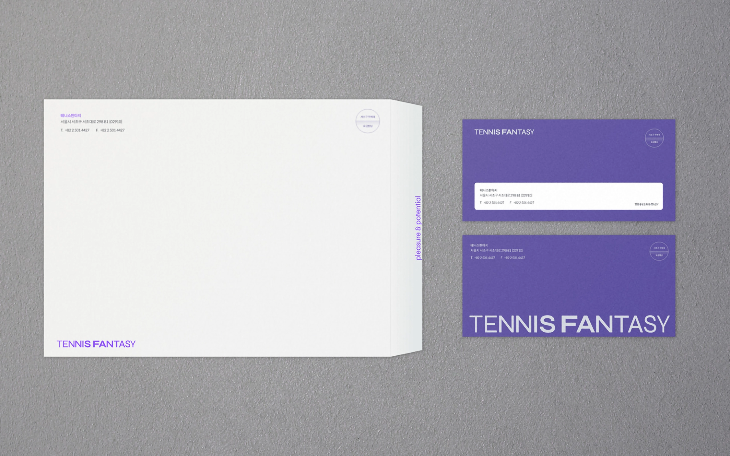
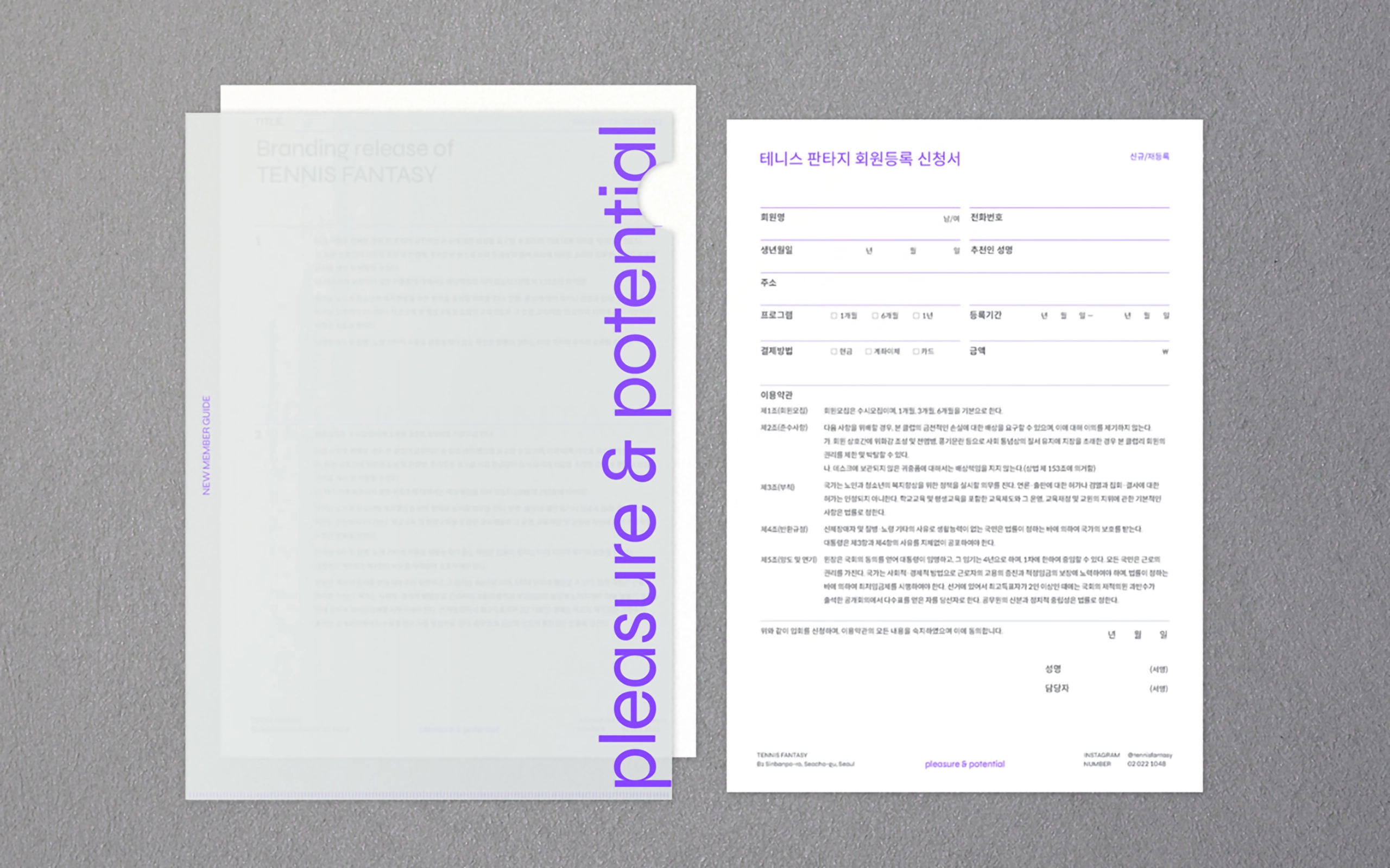
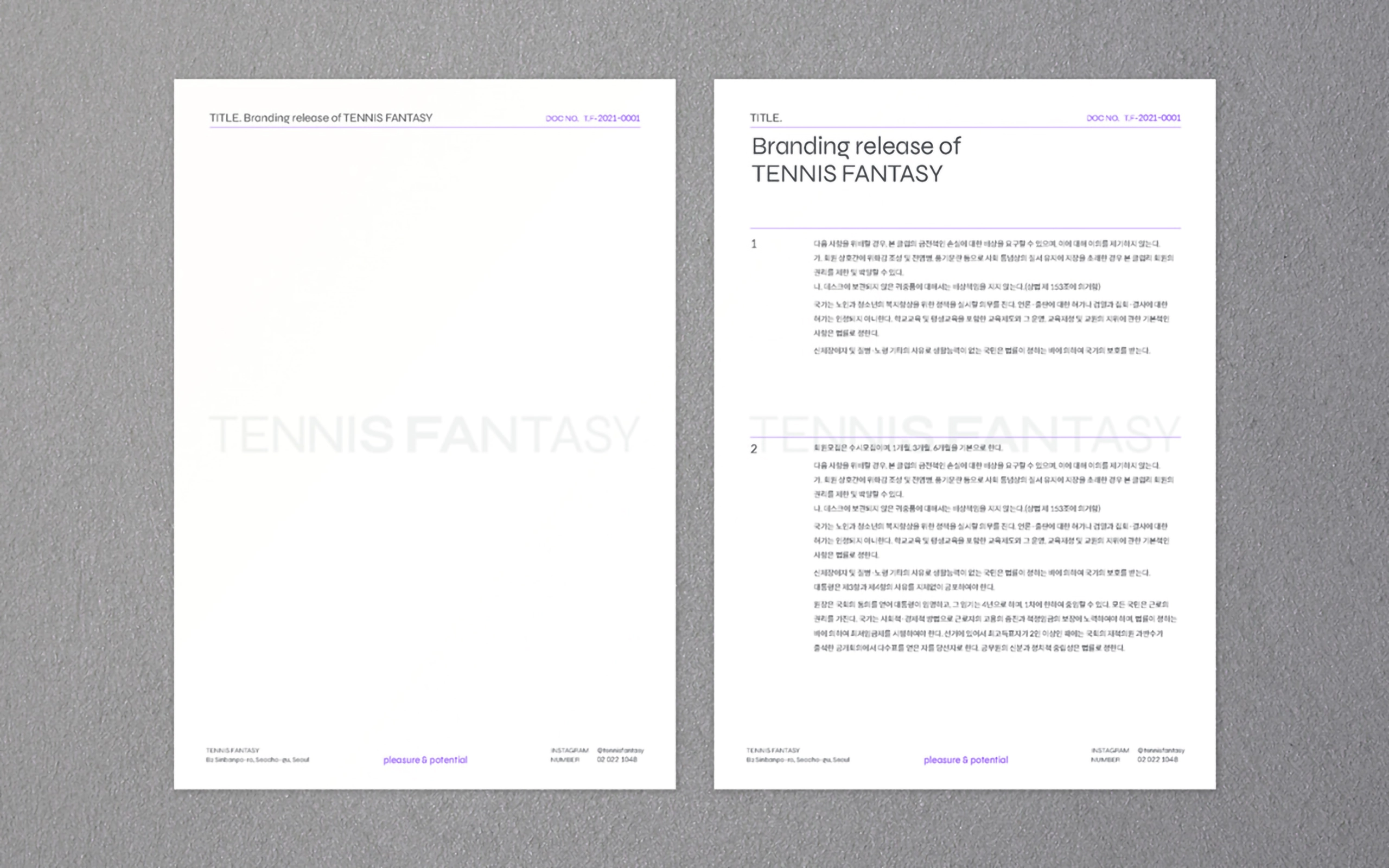
Logotype, Slogan, Brand keyword, Color System, Graphic Tool, Business Card, Signage, Documents
Project Overview
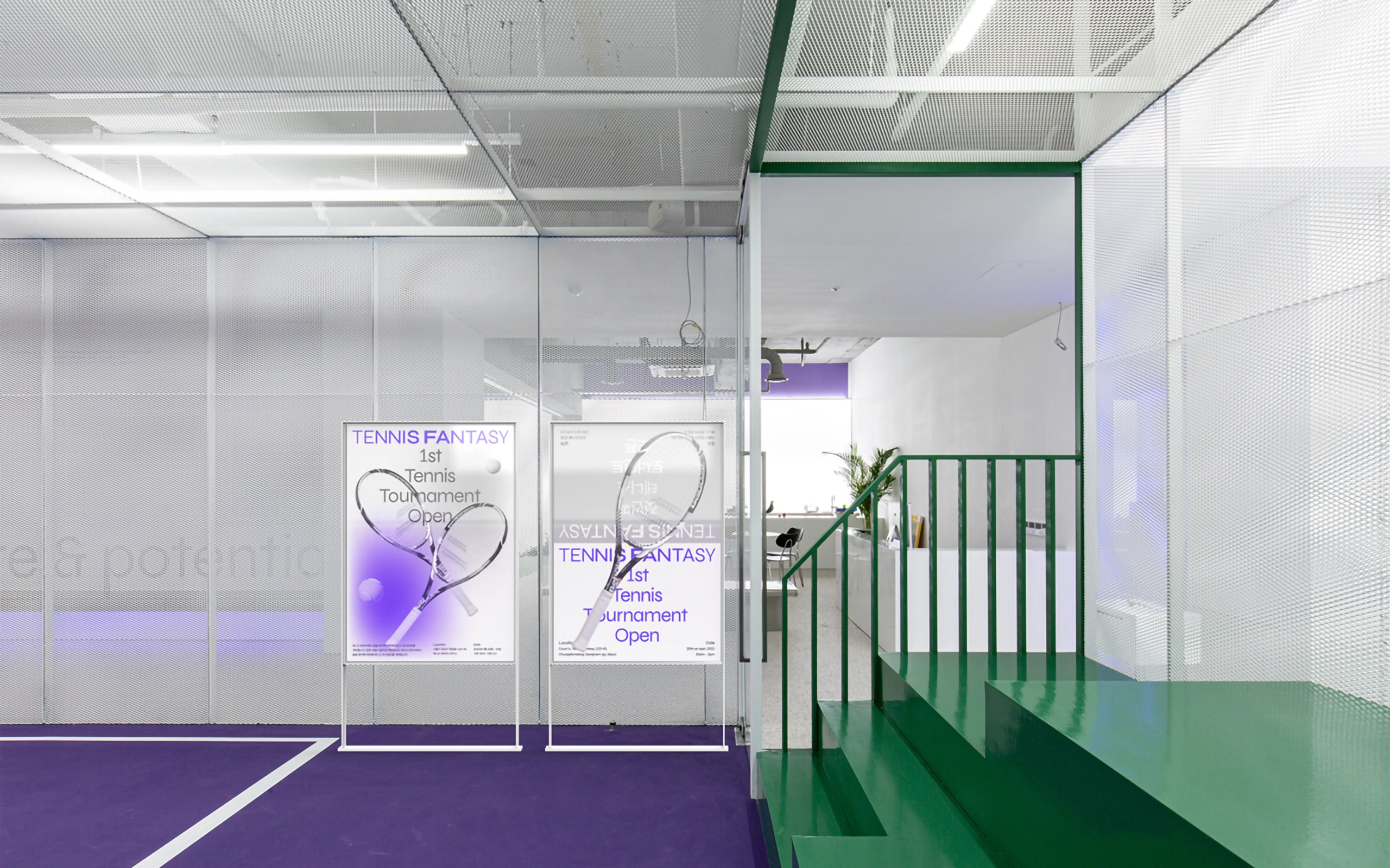
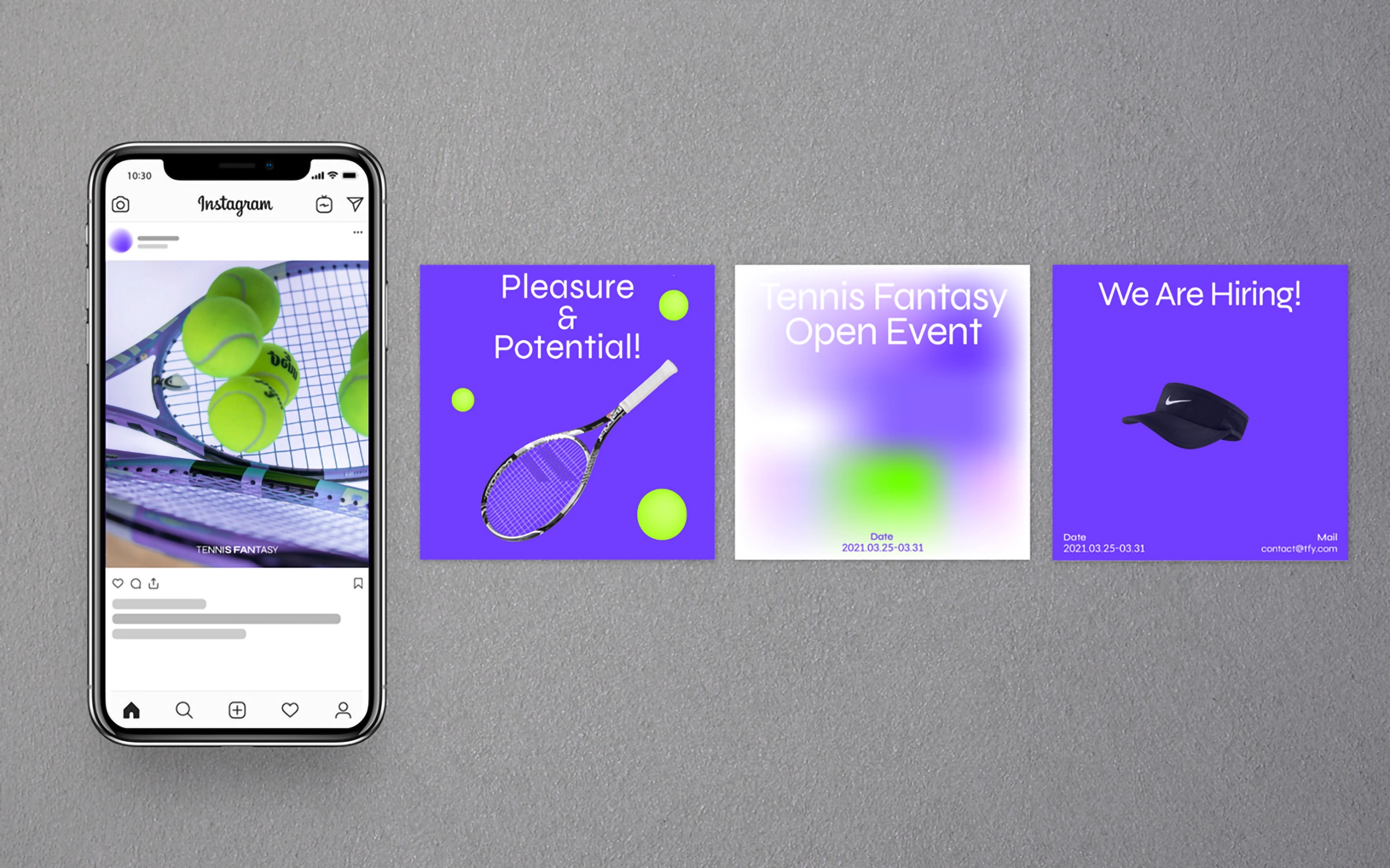
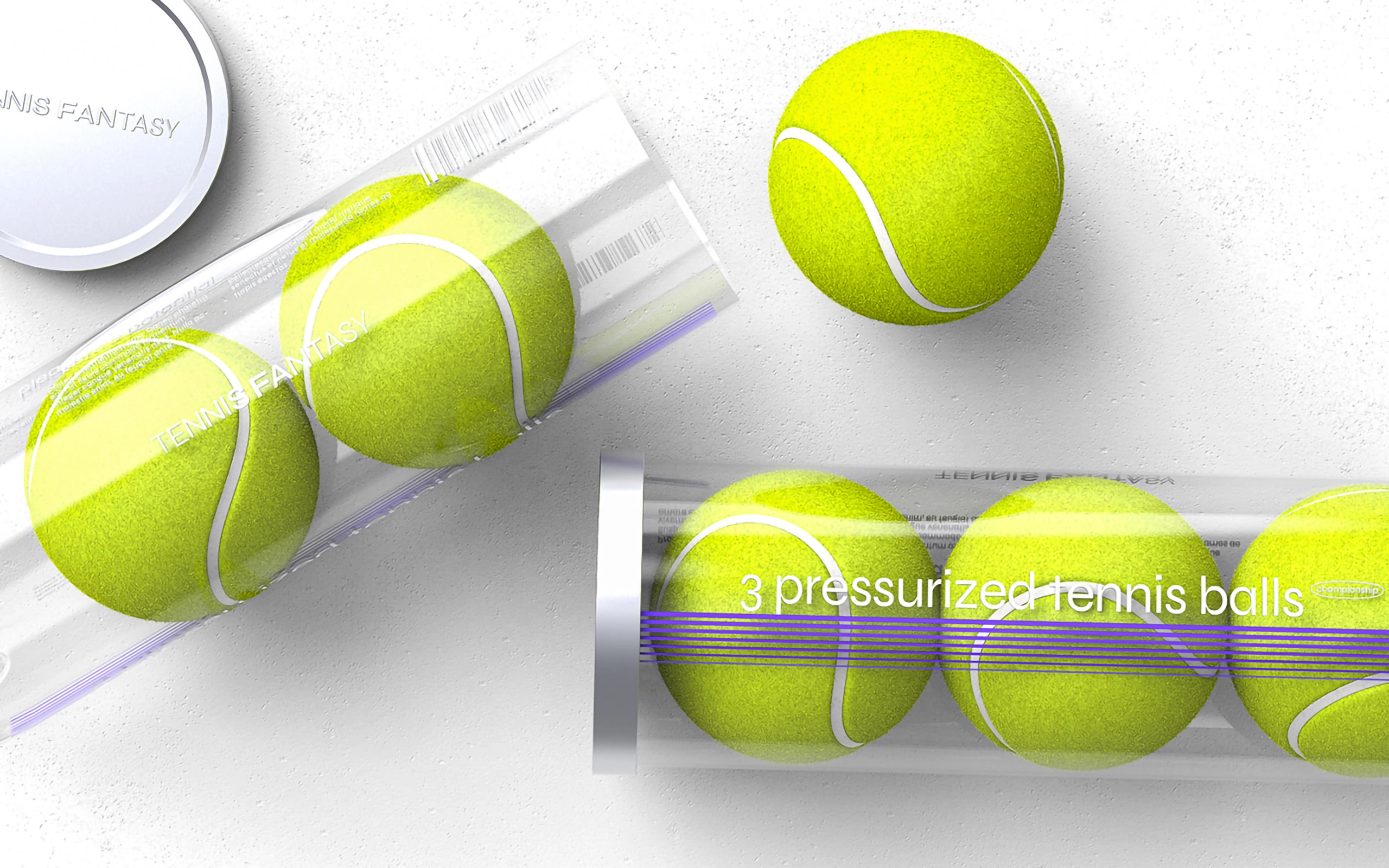
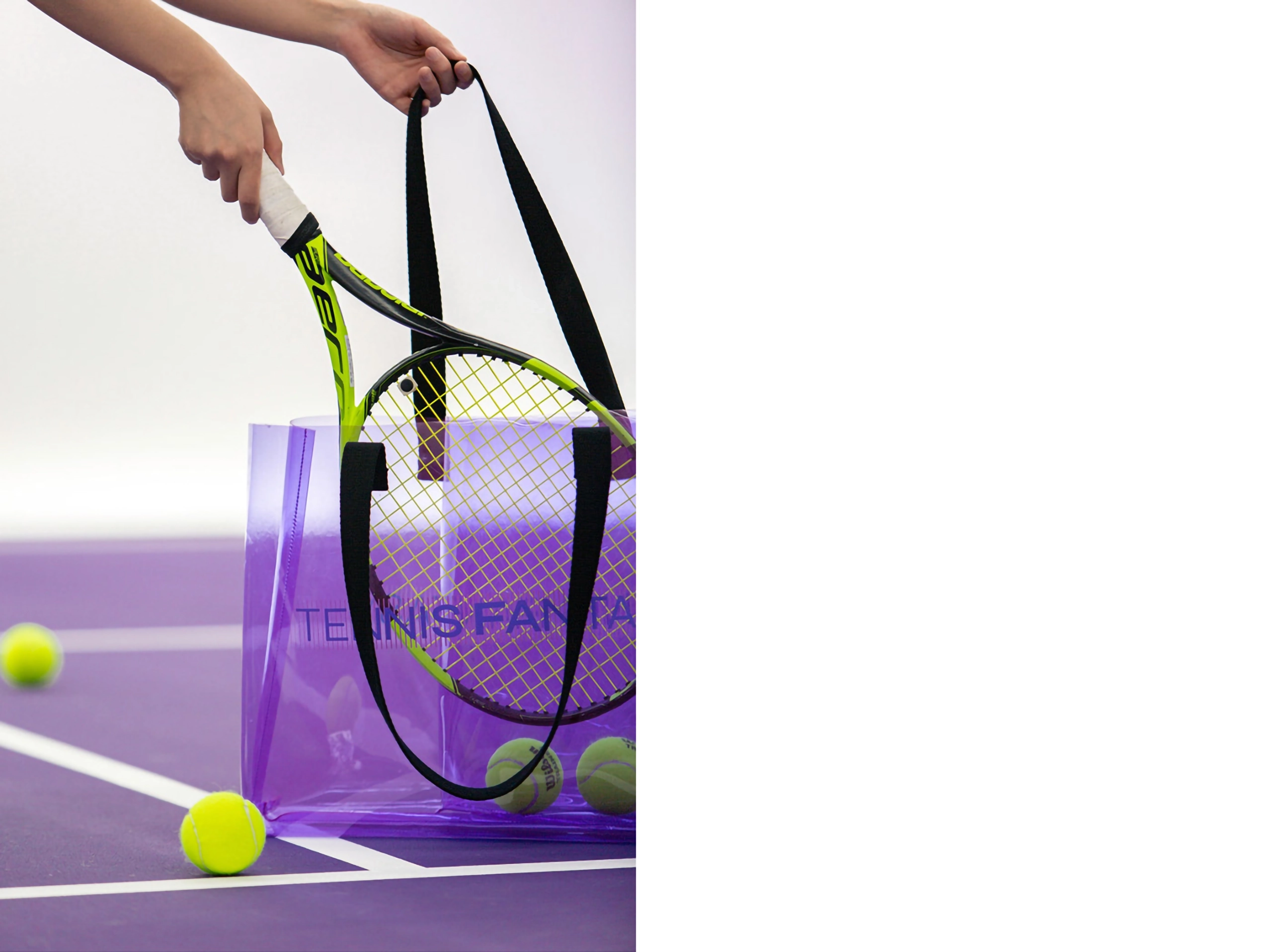
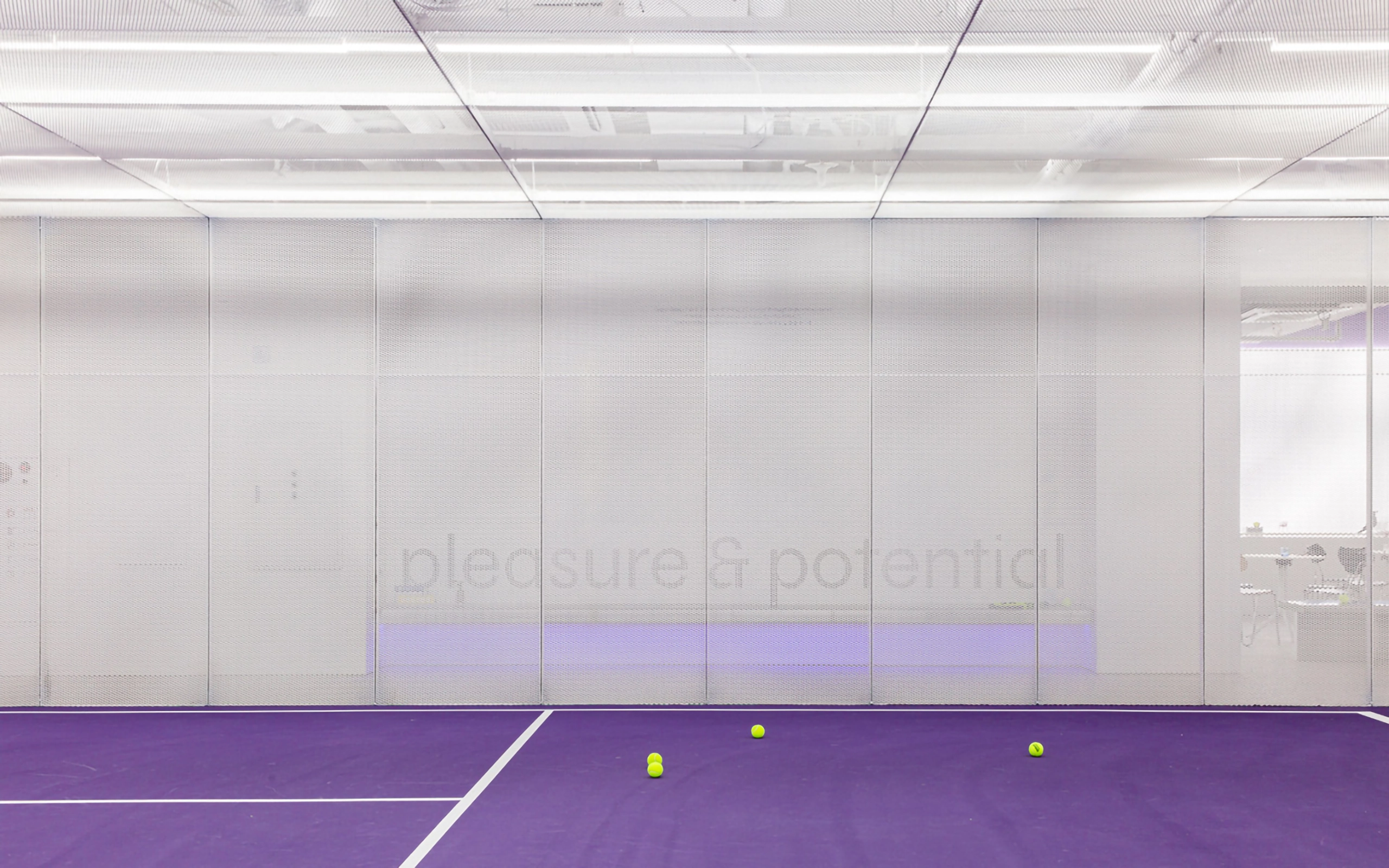
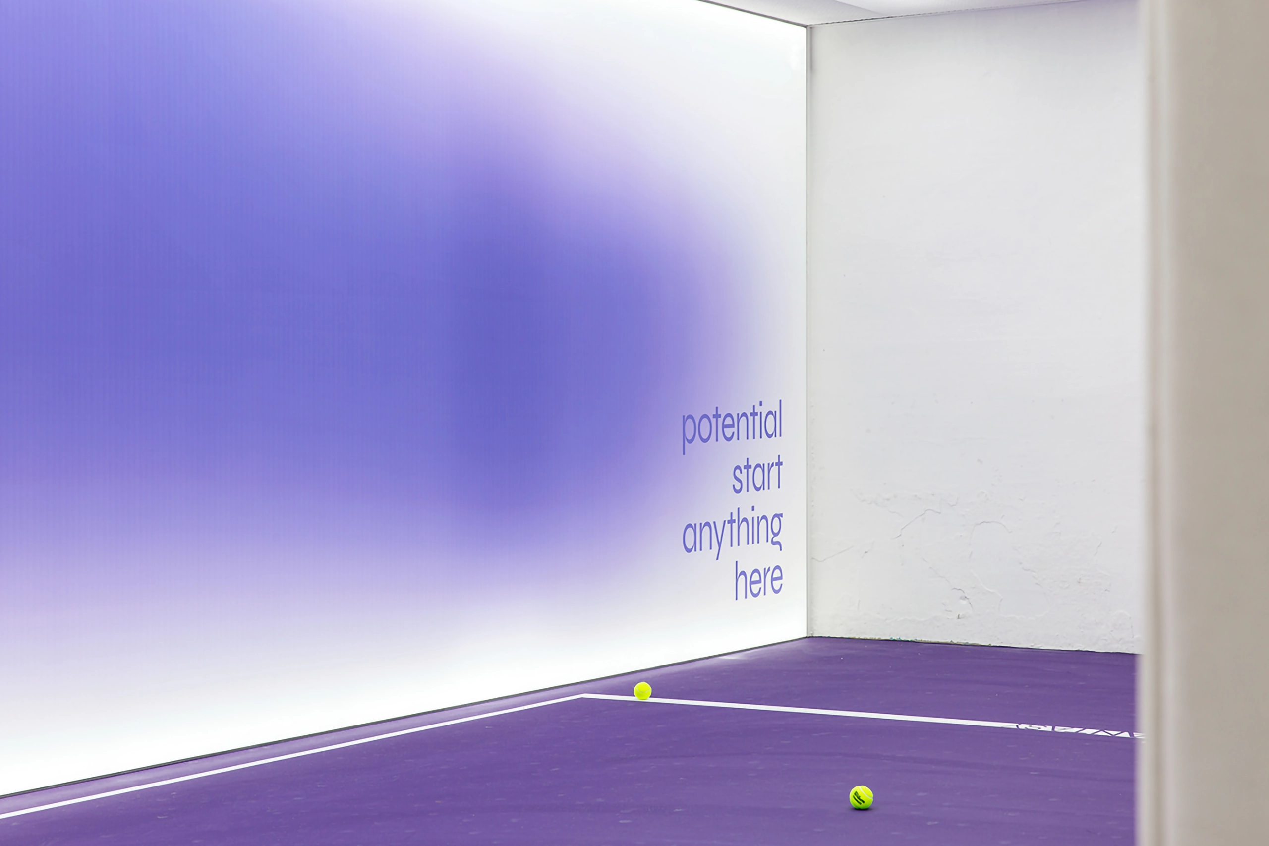
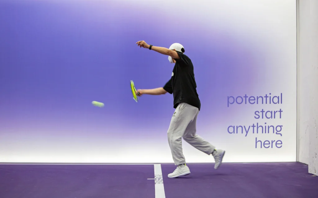
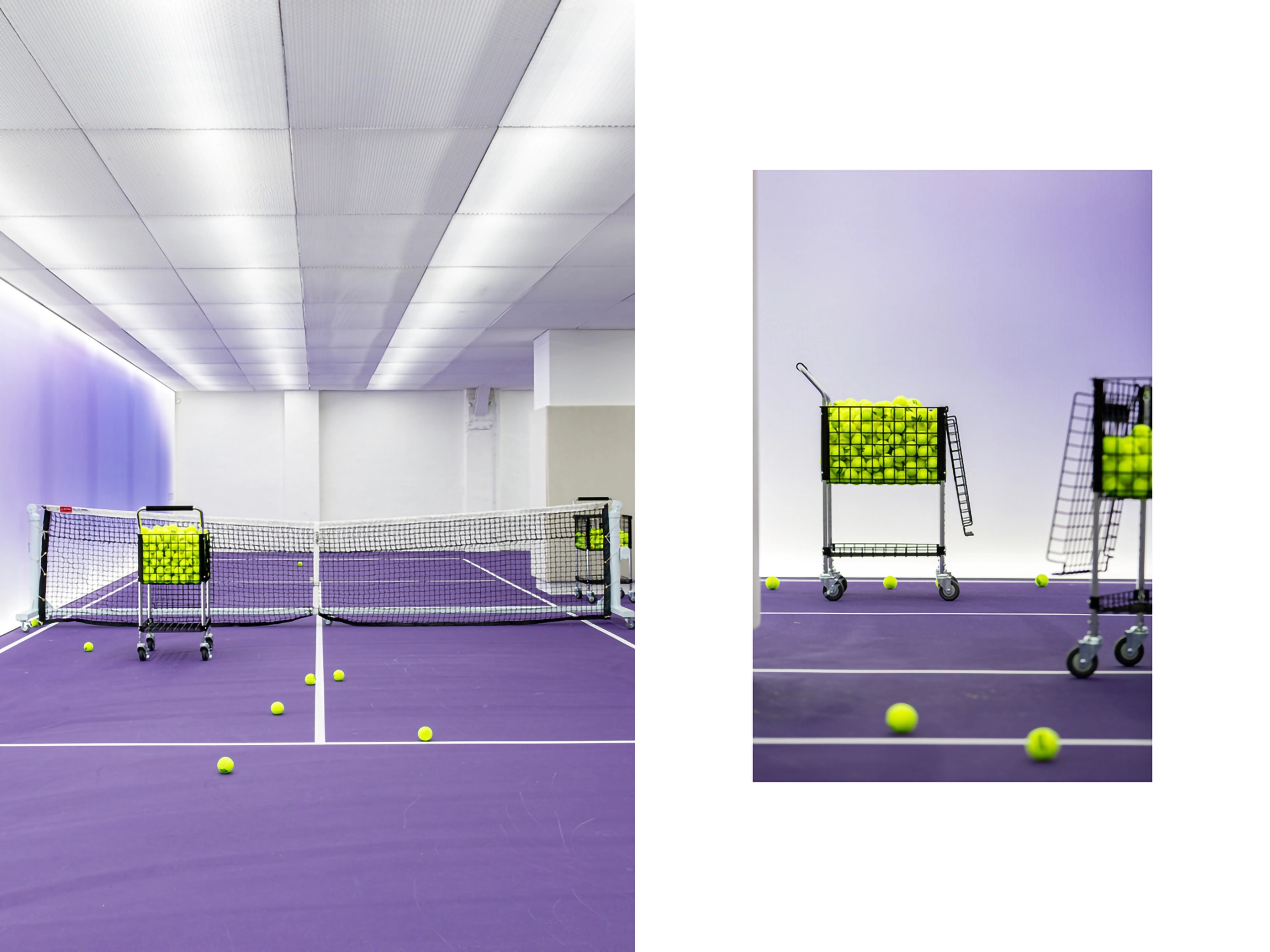
We designed the brand identity for Tennis Fantasy. Tennis Fantasy is a large-scale indoor tennis center located in Seocho-gu. We defined it as a space where the joy of moving your body and the possibility that beginners can learn easily coexist.
Tennis Fantasy becomes a healthy medium for people to experience the tennis they vaguely dream about in their daily lives and get to know various people. It is an ideal space that proposes healthy enjoyment in everyday life through lively exchanges that extend to me, you, and us.
테니스판타지의 브랜드 아이덴티티 디자인을 진행했습니다. 테니스판타지는 서초구에 위치한 넓은 규모의 실내 테니스장입니다. 몸을 움직이는 즐거움과 초심자도 이곳에선 쉽게 배울 수 있다는 가능성이 공존하는 공간으로 정의했습니다.
테니스판타지는 일상에서 막연히 꿈꾸었던 테니스를 재미있게 경험하고 다양한 사람들과 서로를 알아가는 건전한 매개체가 됩니다. 나와 너, 우리로 확장된 활기찬 교류를 통해 일상 속 건강한 즐거움을 제안하는 이상적 공간입니다.

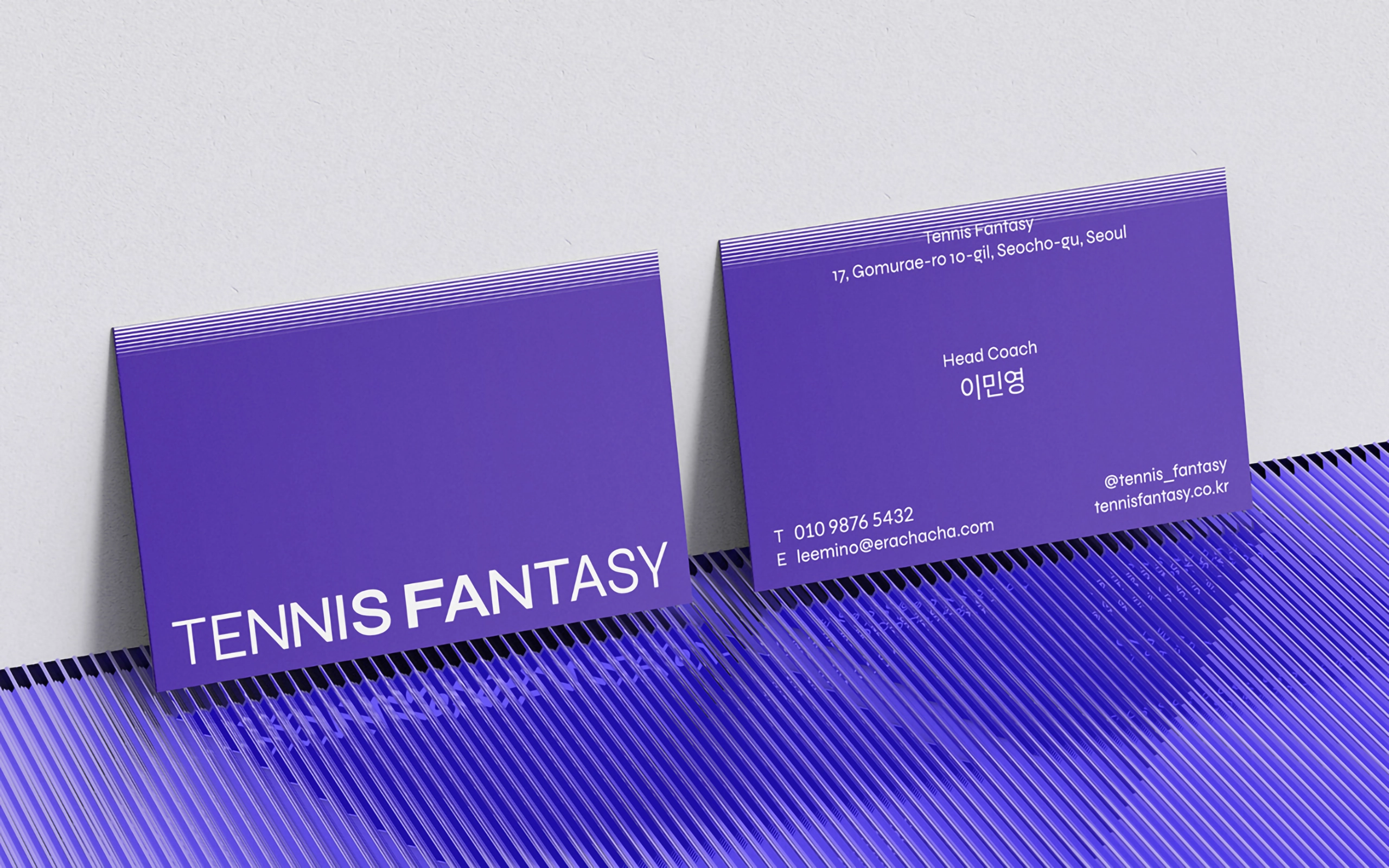
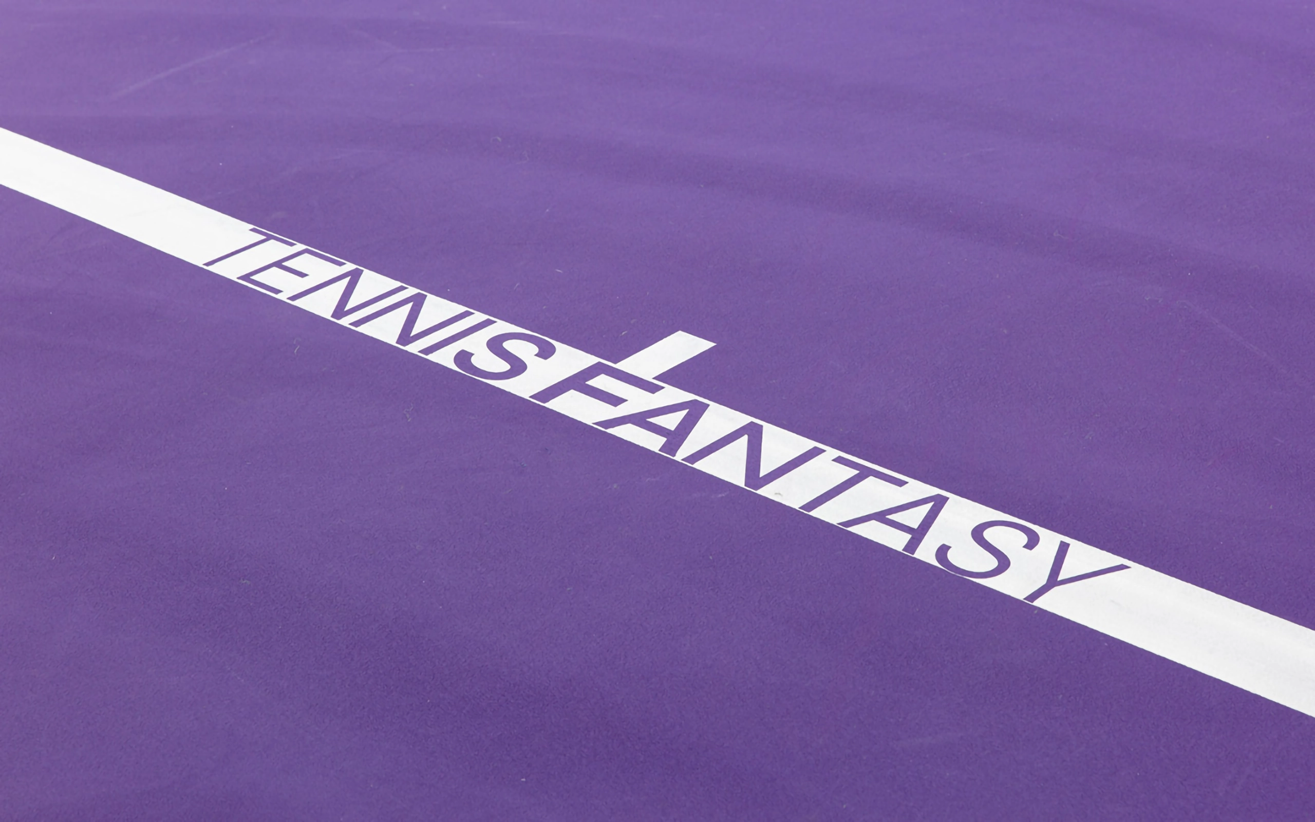
Logotype
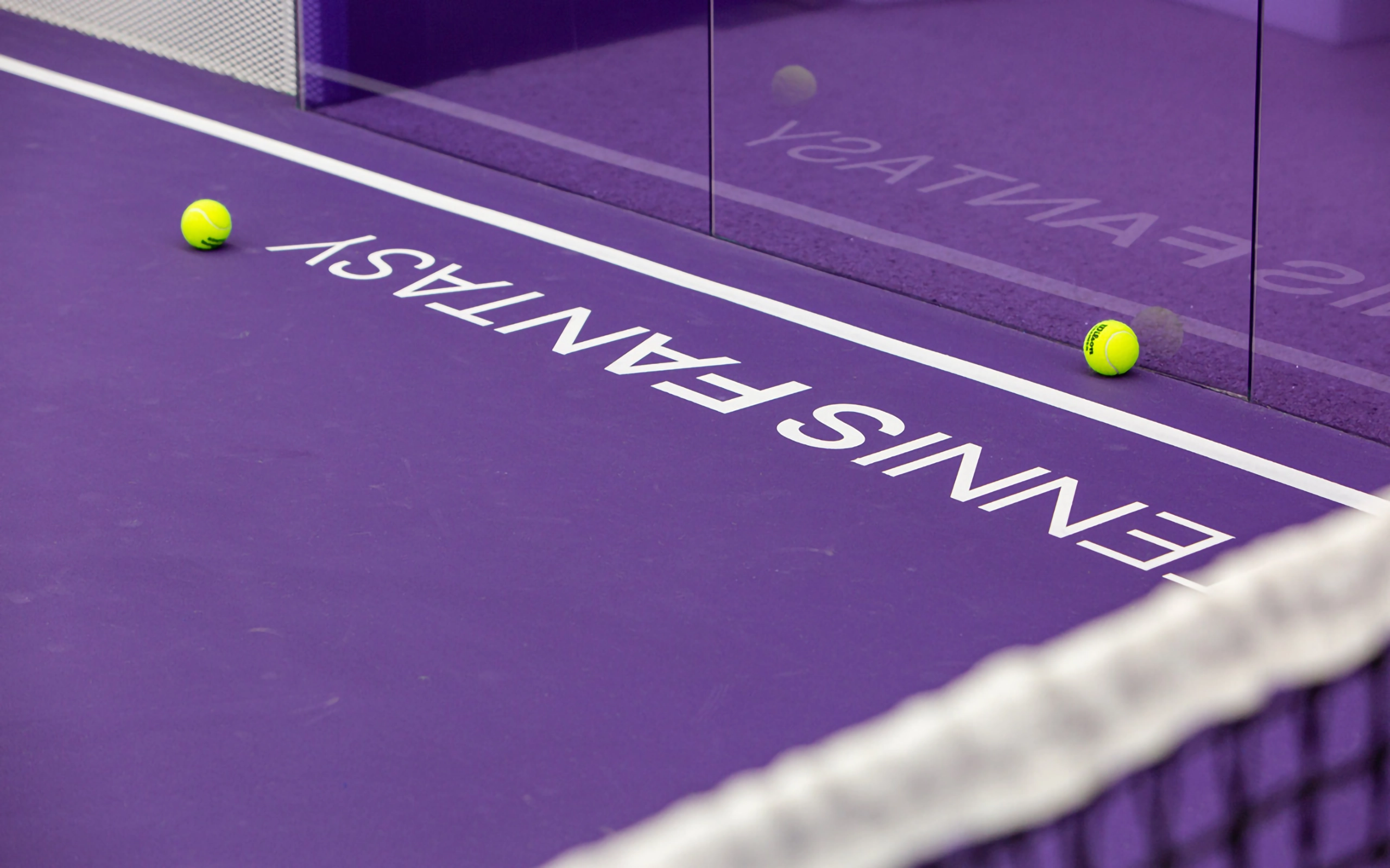
It expressed the personality of tennis fantasy with both pleasure and possibility in gradation. For the logo type, the thickness of the letter is different and expressed in density.
즐거움과 가능성이 공존하는 테니스판타지의 성격을 그라데이션으로 표현했습니다. 로고타입의 경우, 글자의 굵기를 달리해 밀도로 표현했습니다.
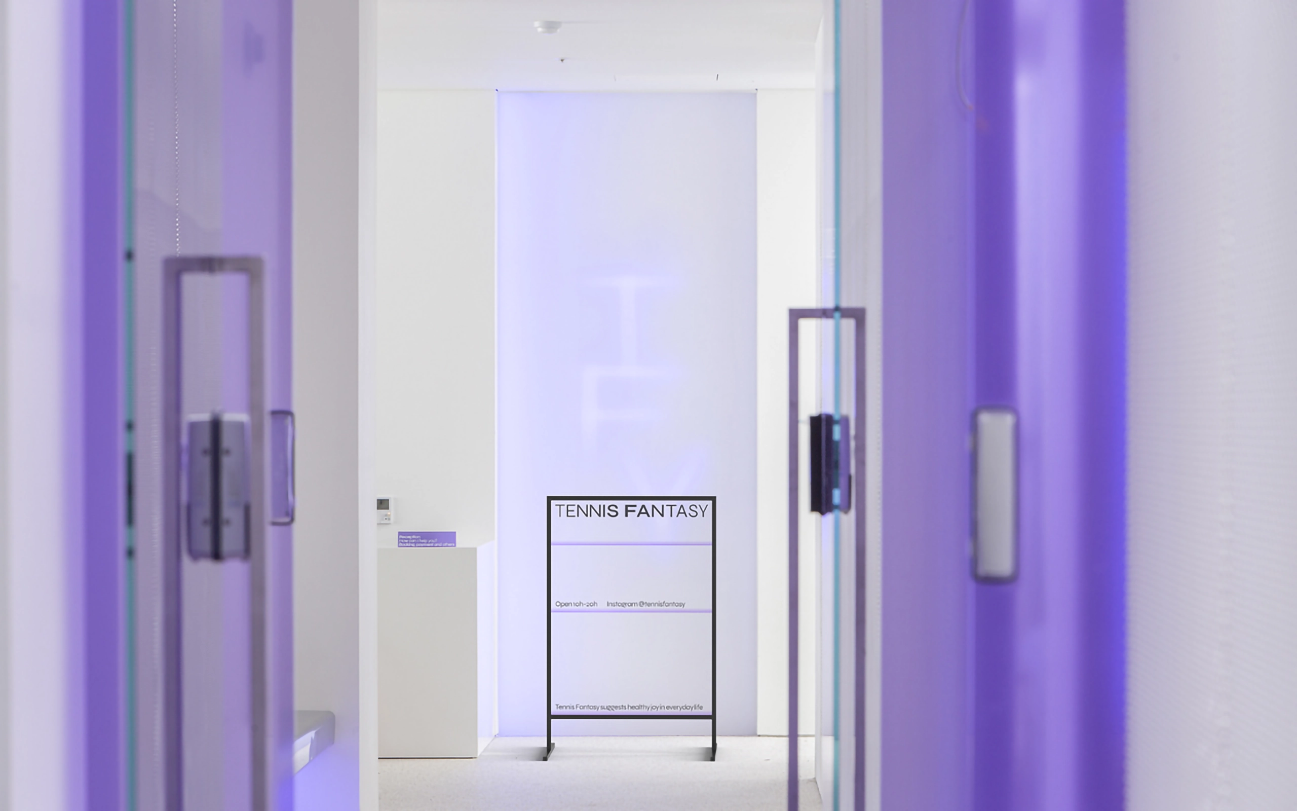
Typeface
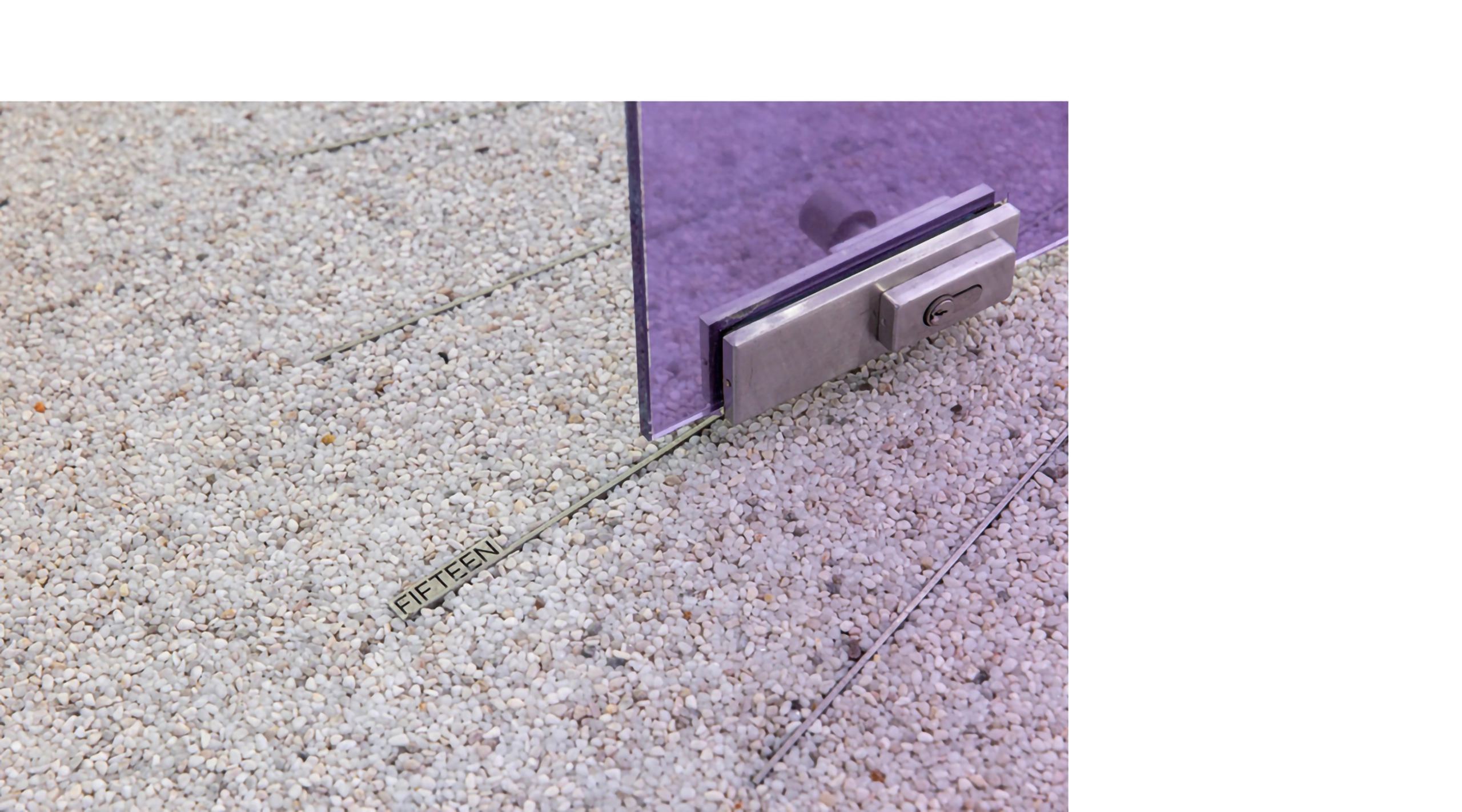
The typeface was chosen because it seemed to rise from a gap in the floor.
Tennis Fantasy uses lowercase letters first, except the first letter of the sentence, because the characteristics are strong in the descender of the magnet.
바닥 틈새로부터 올라오는 듯한 인상의 서체를 선택했습니다. 자소의 디센더에서 특징이 강하게 나타나기 때문에 테니스판타지는 문장 가장 앞글자를 제외한 글자는 소문자를 우선으로 사용합니다.