Client
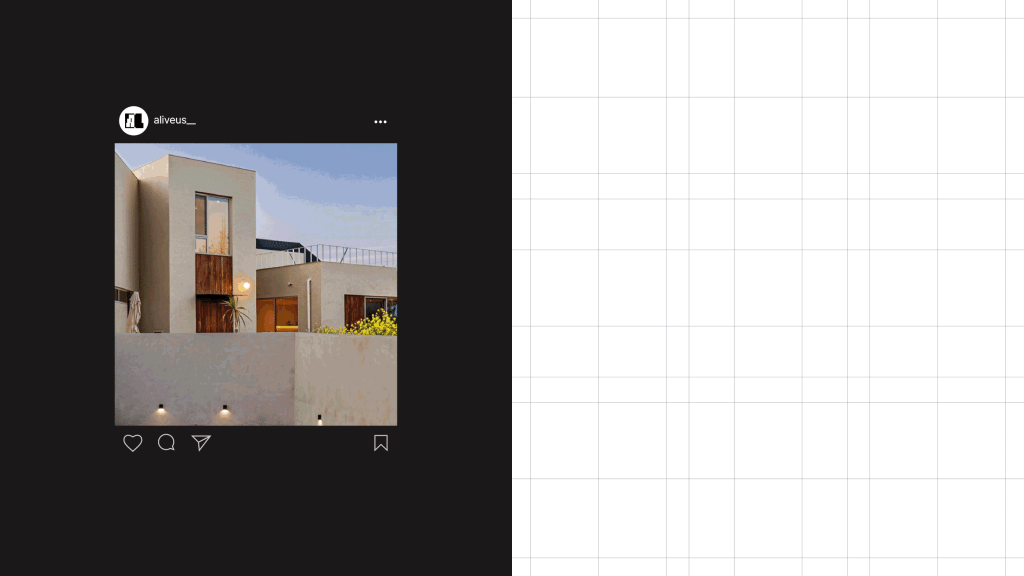
ALIVEUS 얼라이브어스
Workscope
Brand Identity, Verbal Identity, Logotype, Symbol, Application
Manual Graphics
Director – Seongkyun Lee
Design – Bomi Yang, Hyewon Lee, Seongeun Kim, Jaewook Kim
Photography – Hanyeon Lee, Taeyoon Jeong
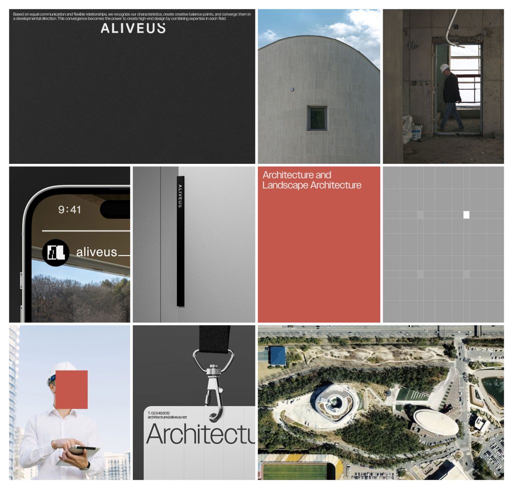
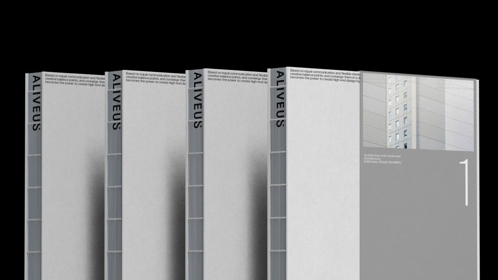
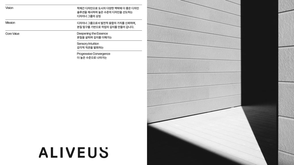
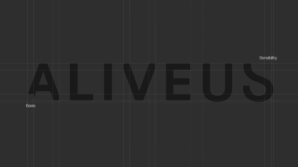
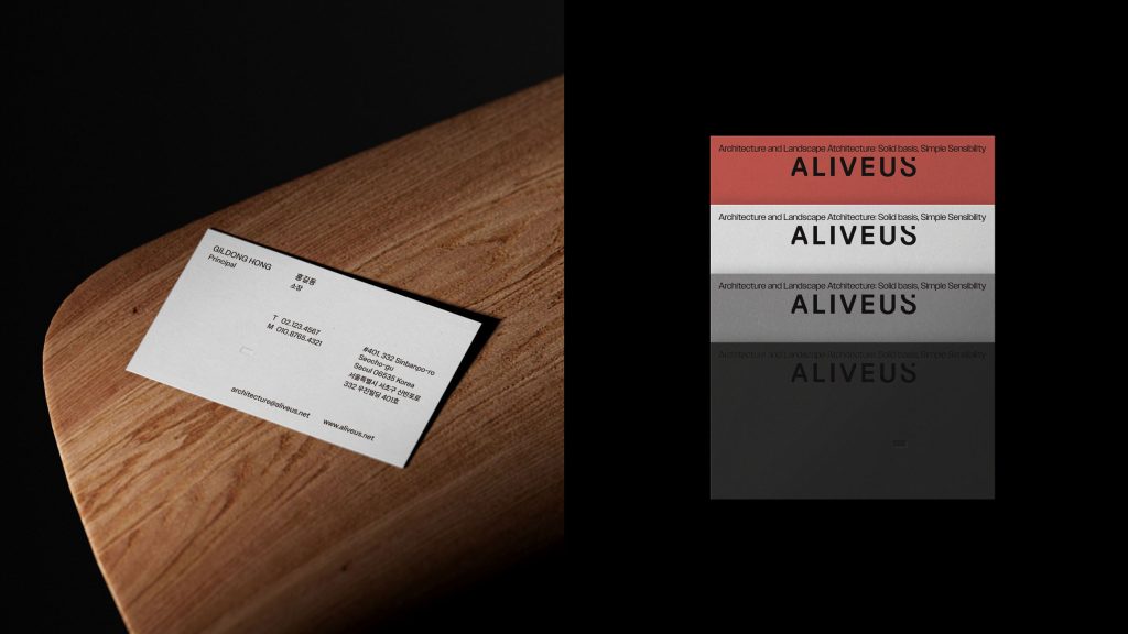
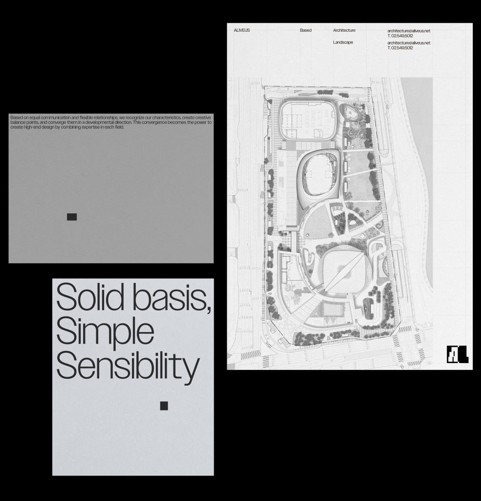
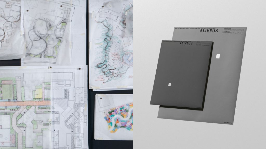
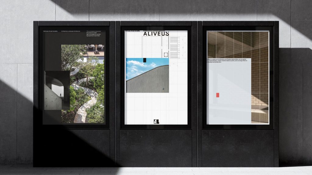
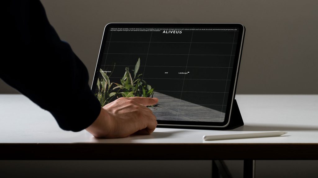
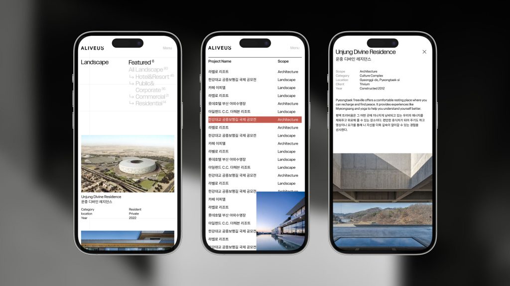
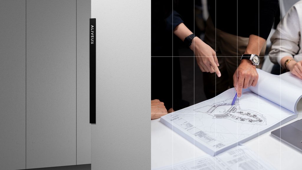
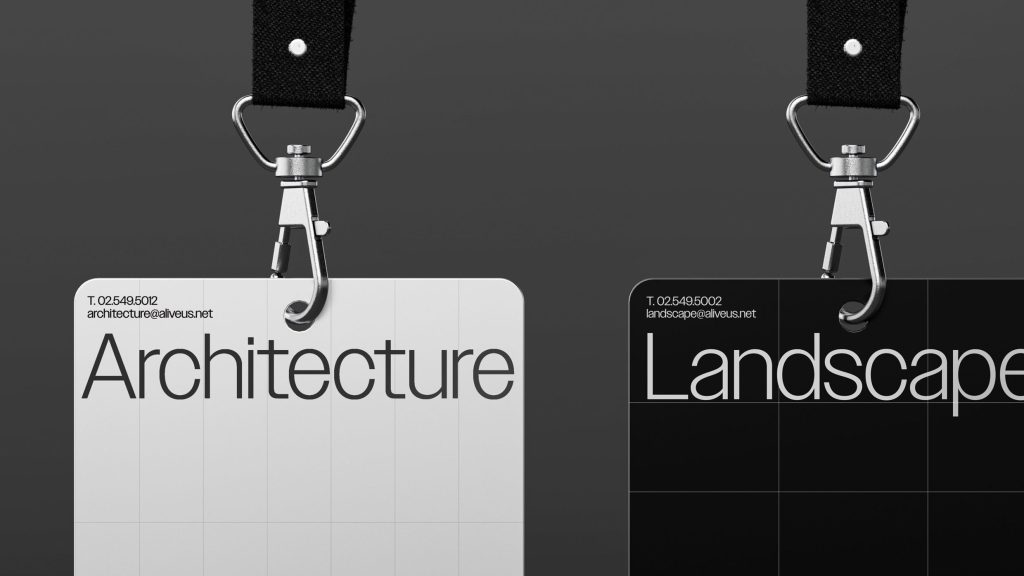
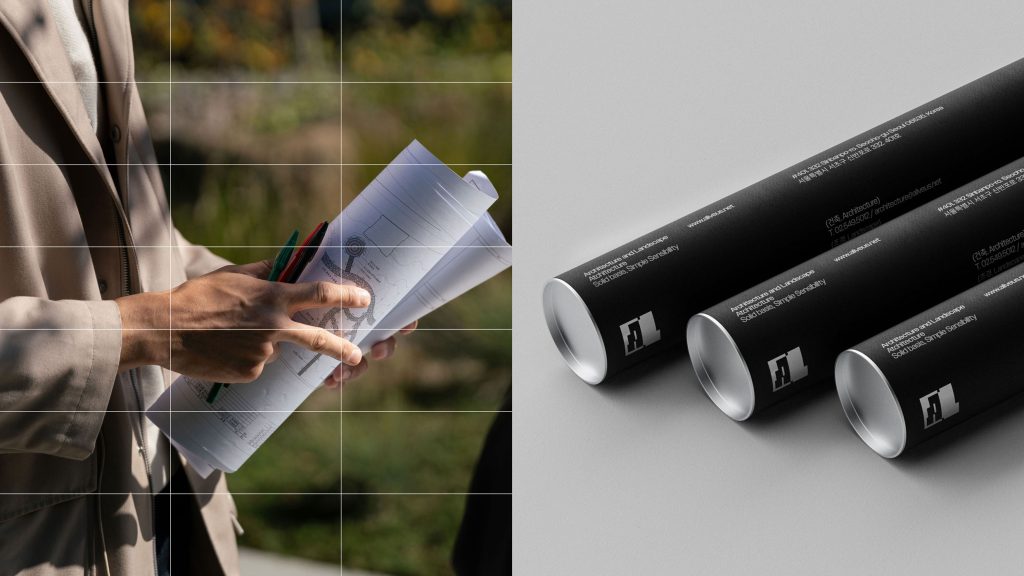
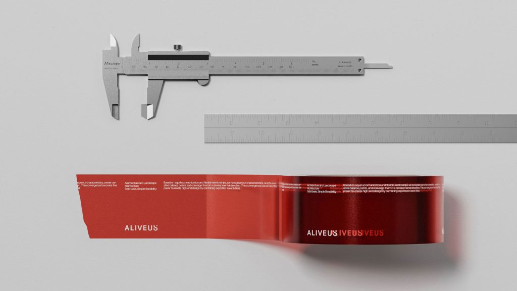
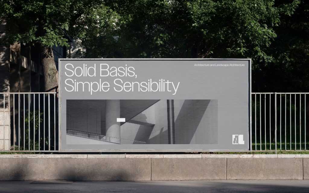
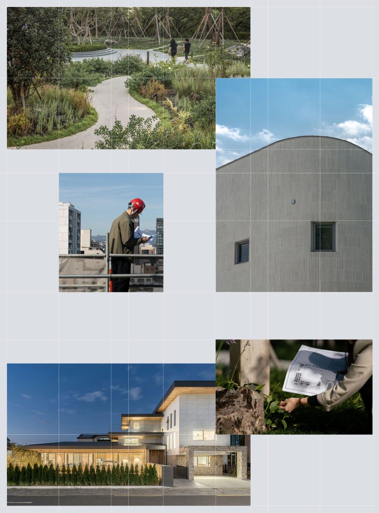
ALIVEUS is a designer group focused on architecture, landscaping, urban rege-neration, and cultural planning that shapes modern cities. To develop its brand identity, Manual Graphics first established ALIVEUS’s brand verbal identity, embodying its values and attitude. The redefined core value, “Essential Depth,” was integrated into the brand identity through ALIVEUS’s unique grid system, creating a distinctive message and a consistent brand impression. Within the brand identity system, various elements were harmoniously arranged, with the Dot motif symbolizing ALIVEUS’s “Sensory Intuition.”
얼라이브어스(ALIVEUS)는 현대 도시를 만들어 가는 건축, 조경, 도시재생, 문화 기획에 기반한 디자이너 그룹입니다. 매뉴얼 그래픽스는 브랜드 아이덴티티를 개발하기 위해 먼저 얼라이브어스가 가진 가치와 태도를 담아 브랜드 버벌 아이덴티티를 확립하였습니다. 재정립한 핵심 가치 ‘본질적 깊이’는 얼라이브어스만의 그리드 시스템으로 브랜드 아이덴티티에 녹여 차별화된 메시지를 구축하며 일관된 브랜드 인상을 만들어 냅니다. 브랜드 아이덴티티 시스템 안에서 다양한 요소들을 조화롭게 배치하고, 그 위에 찍어 낸 Dot 모티프를 통해 얼라이브어스만의 ‘감각적 직관’을 나타냈습니다.