Client
Galleries Association of Korea 한국화랑협회
Workscope
Web Planning, Wireframe, Web Design, Web Development
Manual Graphics
Director – Seongkyun Lee
Design – Seongeun Kim, Yeonkyung Kim
Web Development – Seongkyun Lee
Support & Motion – Jaemin Ha
일부 사진과 콘텐츠는 한국화랑협회로부터 제공받아 사용하였습니다.
© Galleries Association of Korea
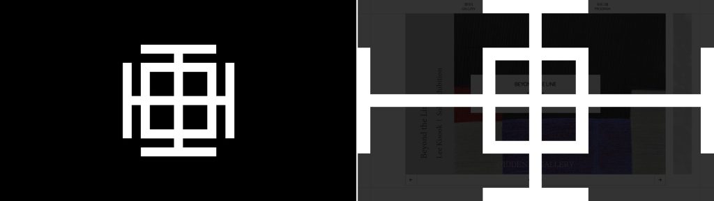
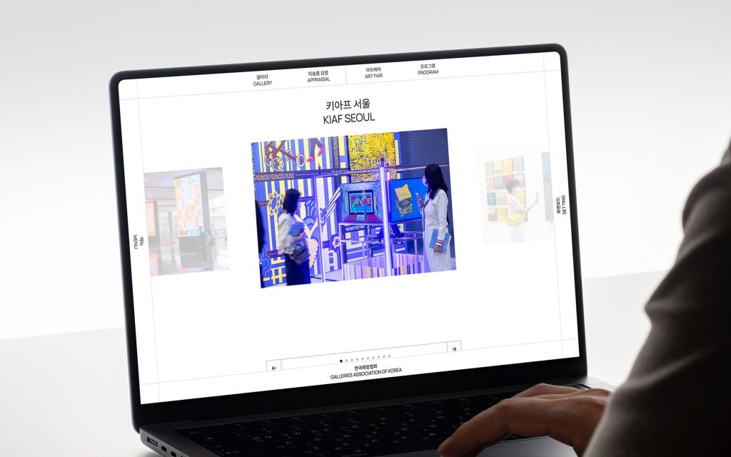
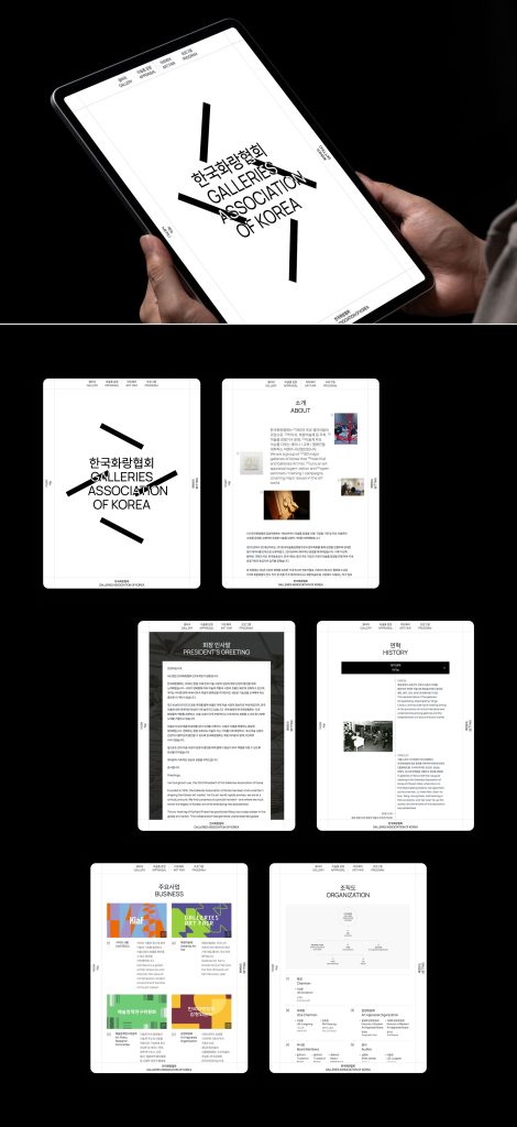
The Galleries Association of Korea is a non-profit corporation made up of 180 major galleries that organizes art festivals such as Kiaf and Hwarang Art Festival, operates an art appraisal organization, and holds seminars/education/campaigns dealing with major issues in the art world. To develop the website, Manual first expanded and transformed the letter ‘E’, the core concept and symbol of the Galleries Association of Korea, and reflected it in the layout to express the history and identity of the association and its flexible response to changes in the times.
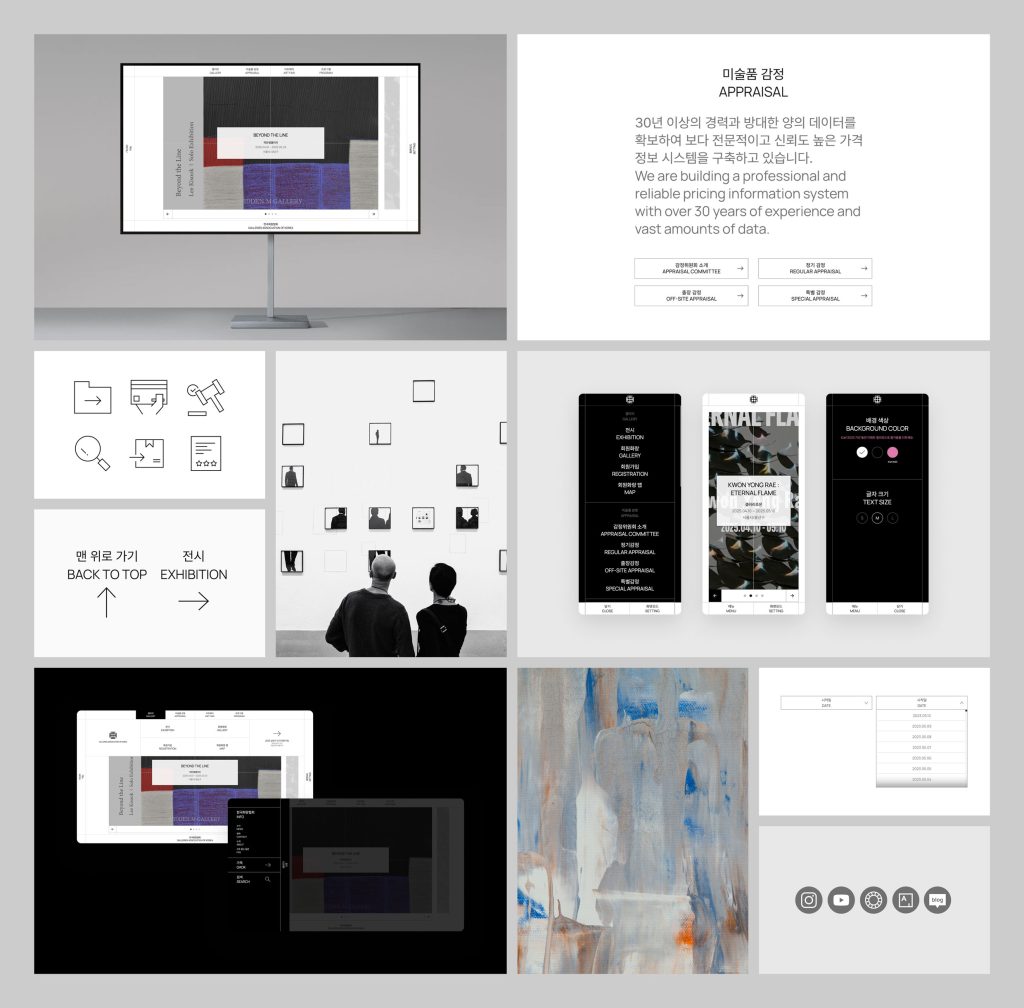
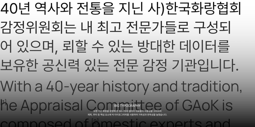
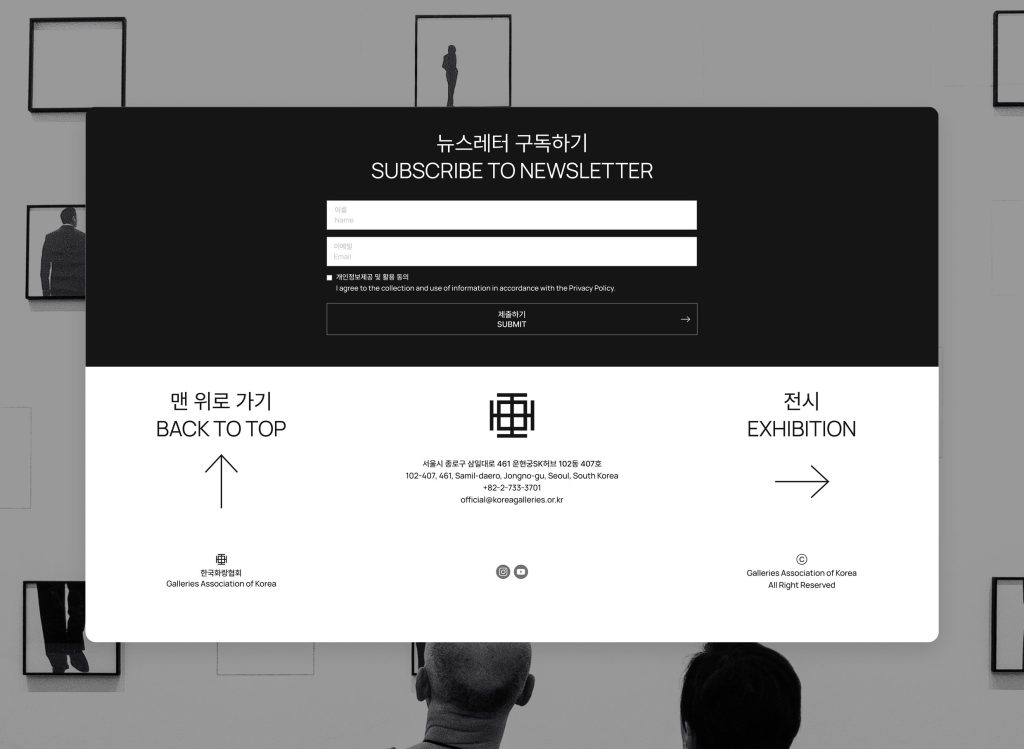
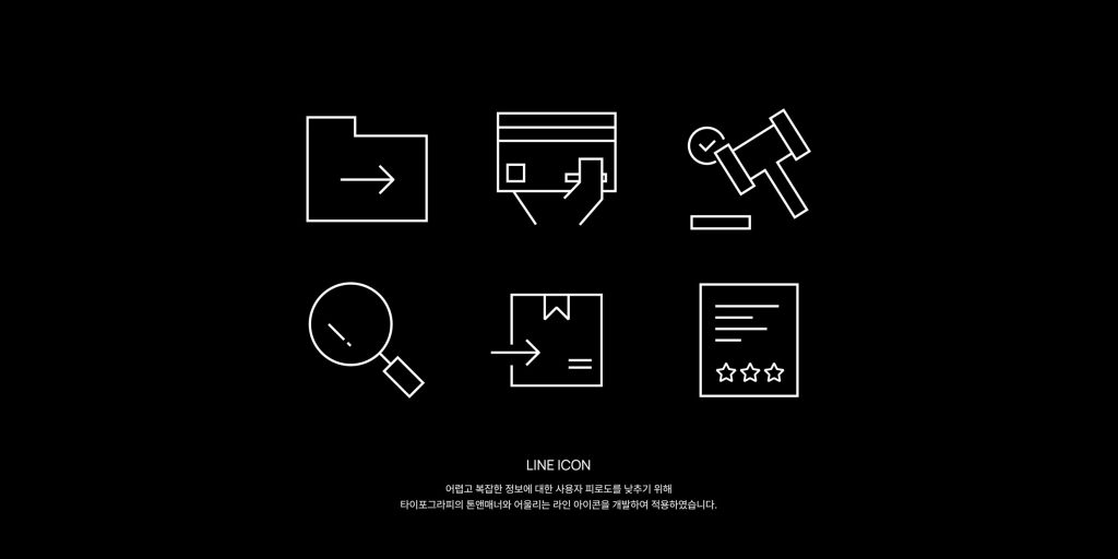
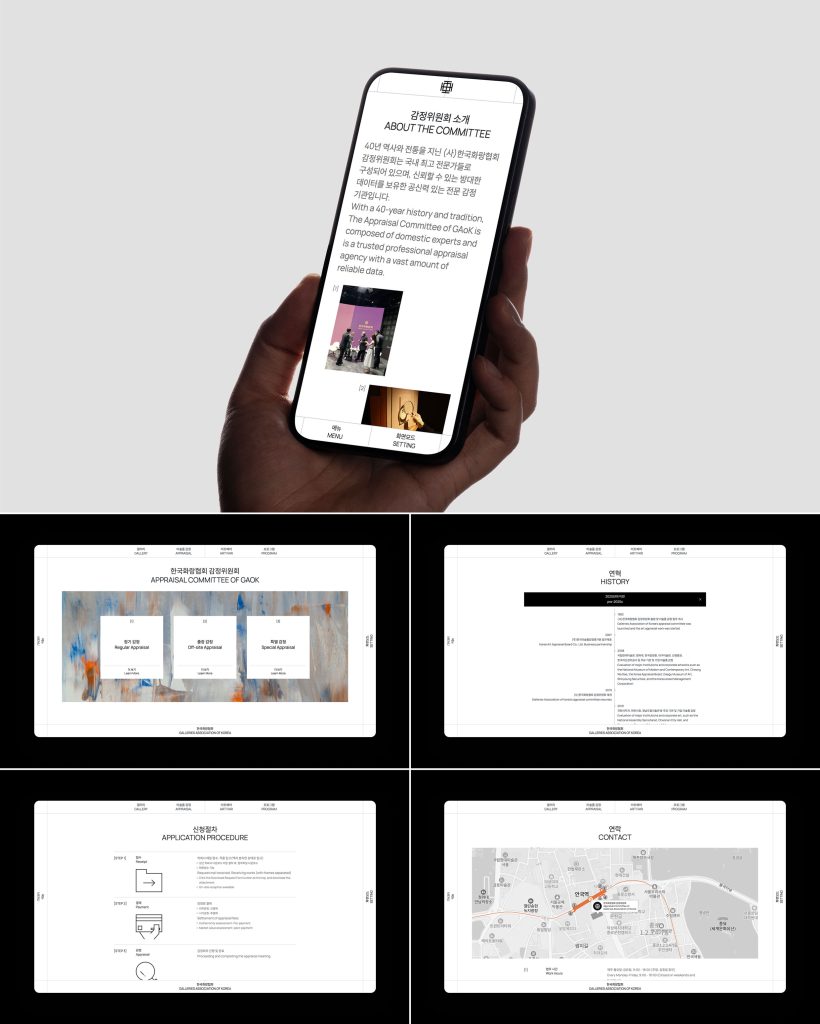
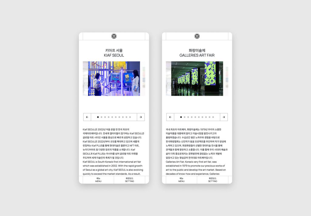
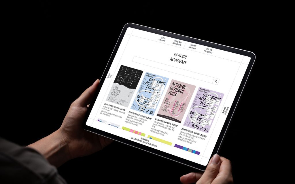
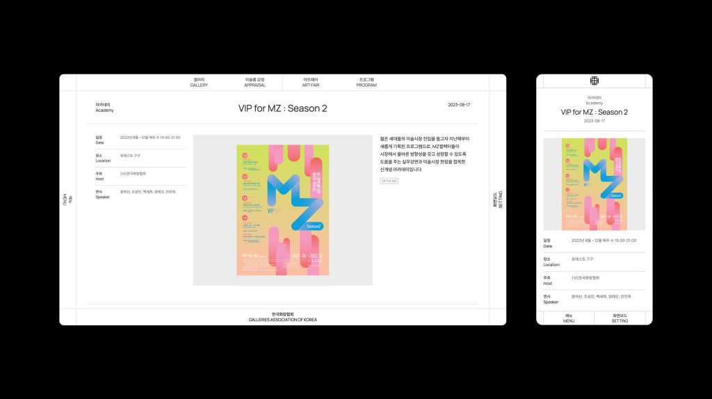
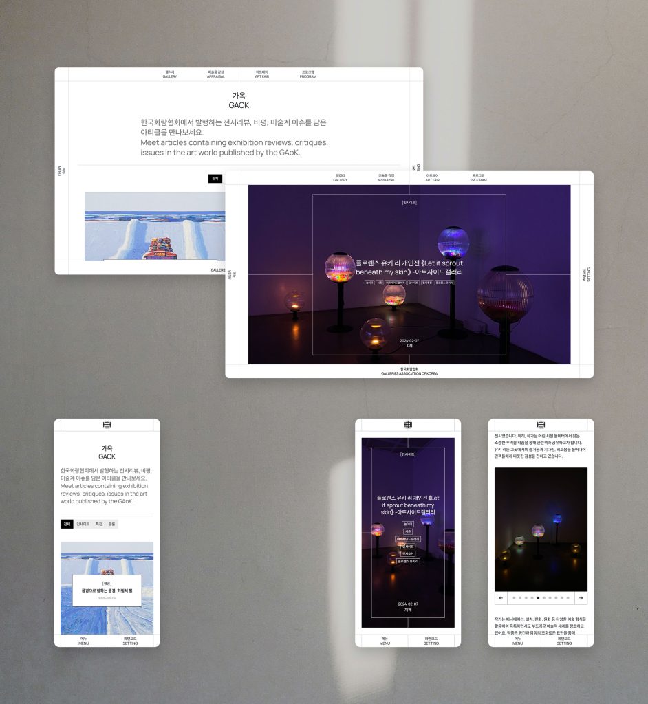
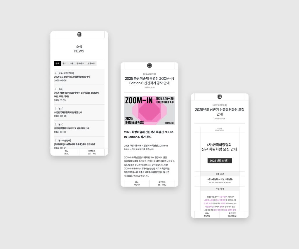
In particular, the GNB structure, which is the core of the website, extends from each side of the outer border of the symbol to symbolize its role as a public interest art organization that forms the framework for a healthy art market. The content area that unfolds in the center of the screen represents the association as a place for solidarity and exchange through a variety of art-related content. Considering the age range of the users, we used big typography and line icons throughout the site to increase readability and legibility. We used a graduated use of gray and placed weighty content in the center of a four-tiered grid to convey an overall sense of stability.
한국화랑협회는 180여 주요 갤러리들의 모임으로, 키아프, 화랑미술제 등 주최, 미술품 감정 기구 운영, 미술계 주요 이슈를 다루는 세미나 / 교육 / 캠페인을 개최하는 비영리 사단법인입니다. 매뉴얼은 웹사이트를 개발하기 위해 먼저 한국화랑협회의 핵심 개념이자, 역사를 함께해 온 심볼인 ‘그림 화’(E)자를 확장 및 변형해 레이아웃에 반영하여, 화랑협회가 쌓아온 역사와 정체성, 시대의 변화에 유연하게 대응하는 협회의 성격을 표현하였습니다.
특히 웹사이트의 핵심인 GNB 구조는 심볼 바깥 테두리의 각 변으로부터 확장된 형태를 통해 건전한 미술 시장의 틀을 형성하는 공익 예술 단체로서의 역할을 상징합니다. 화면 중심에서 전개되는 콘텐츠 영역은 다양한 예술 관련 콘텐츠를 통해 연대 및 교류하는 장으로서의 협회를 나타냅니다. 사용자 연령대를 고려하여 사이트 전반에 빅 타이포그래피와 라인 아이콘을 사용하여 가독성과 판독성을 높였습니다. 회색을 단계별로 사용하고 4단 그리드 중앙에 무게감 있는 콘텐츠를 배치하여 전반적으로 안정적인 인상을 전달하고자 하였습니다.