Client
PharmaResearch 파마리서치
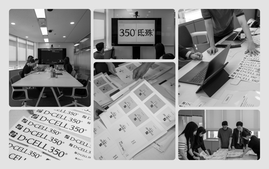
Workscope
Visual Asset Refinement, Brand Guidelines, Motion
Manual Graphics
Director – Seongkyun Lee
Design Lead – Minji Ko
Identity Design – Yeonkyung Kim
Design Assist – Hoyeon Won
Project Management – Minji Ko, Seohee Park
Motion – Yeonkyung Kim, Heewoong Gu
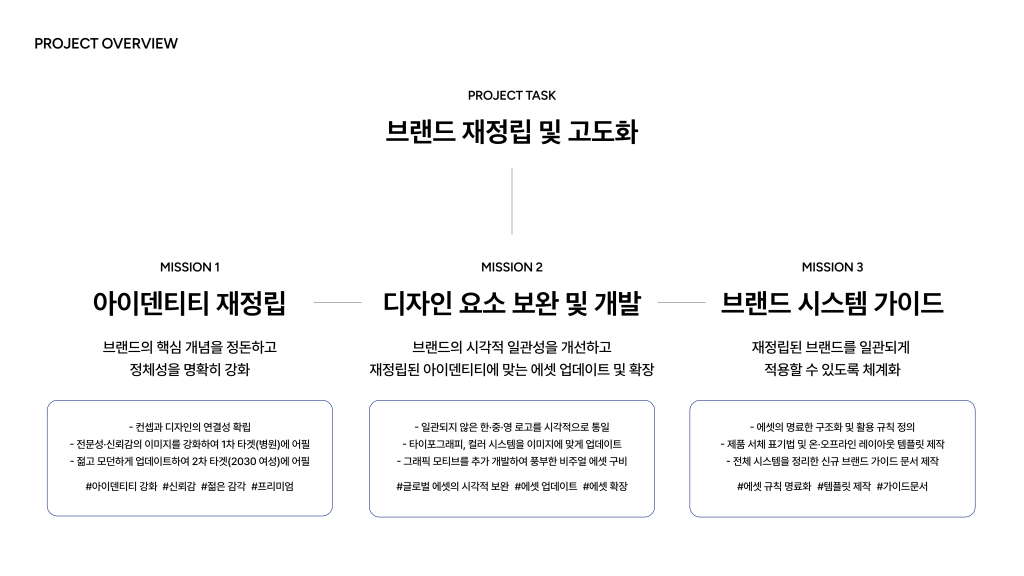
Project Overview
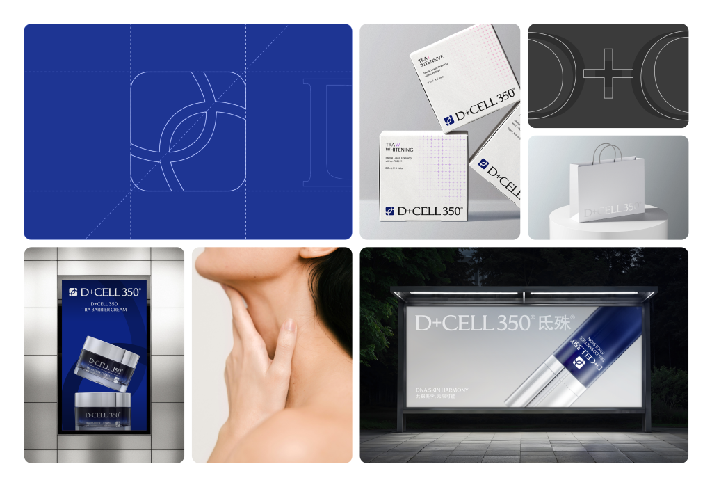
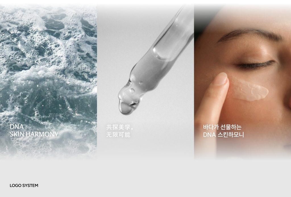
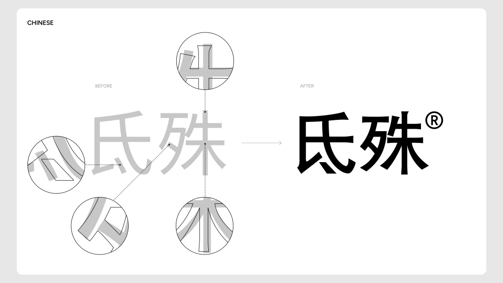
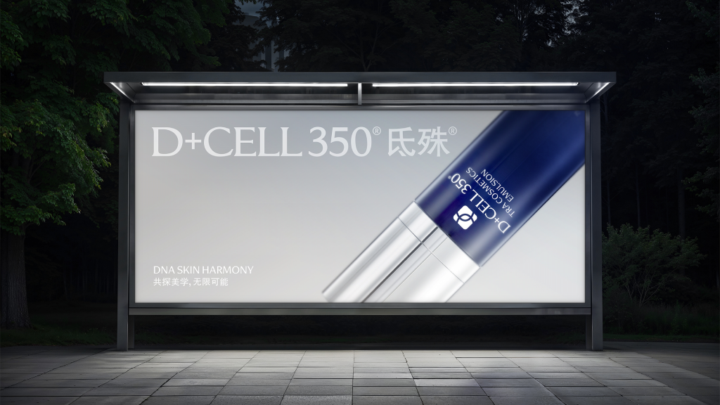
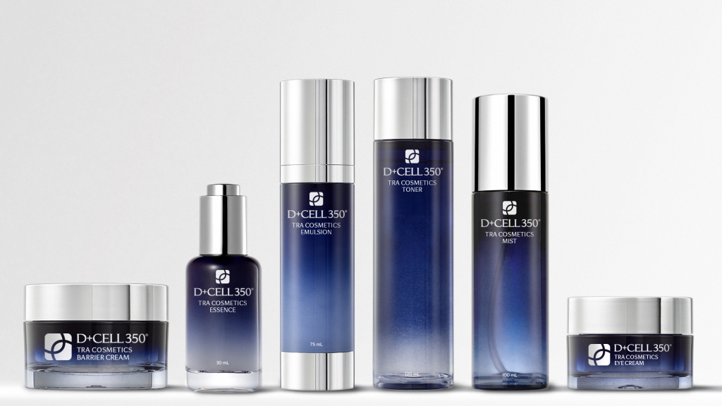
D+CELL 350 is a cosmetic brand by PharmaResearch, dedicated to restoring the skin’s natural health and beauty. The brand has grown primarily in the Chinese market, building its expertise through hospital distribution channels. However, to strengthen its position in the global market, there was a clear need to improve design consistency and elevate the overall visual identity.
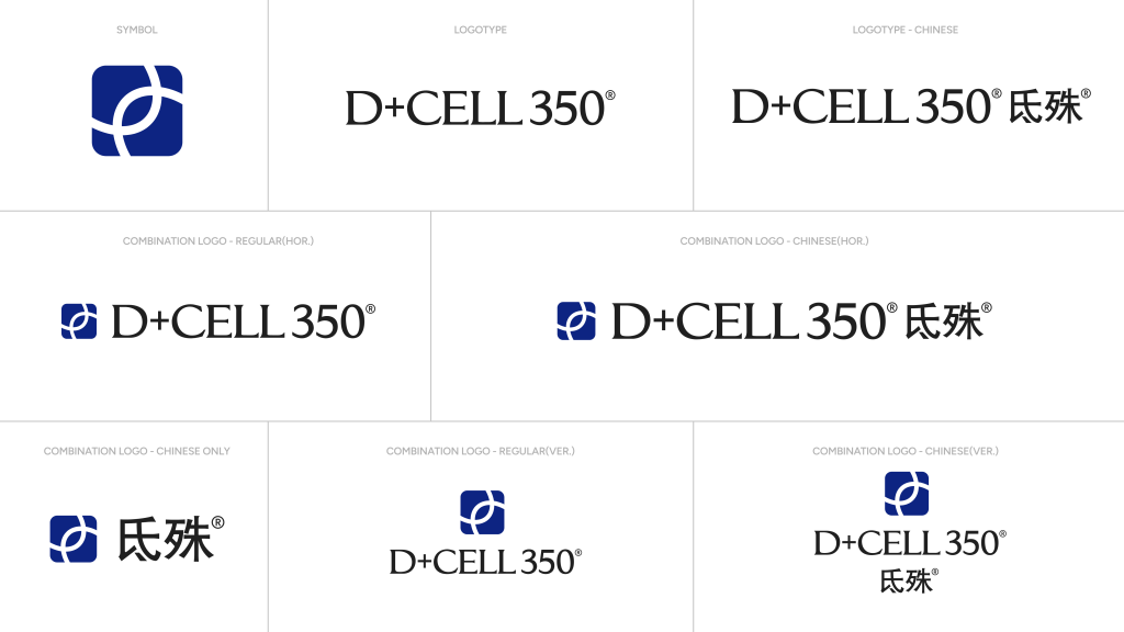
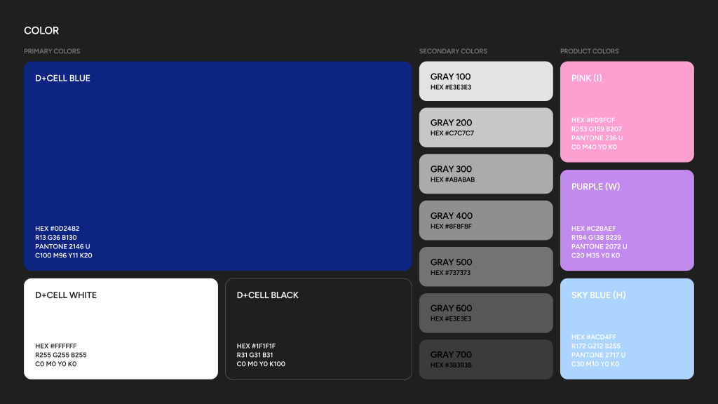
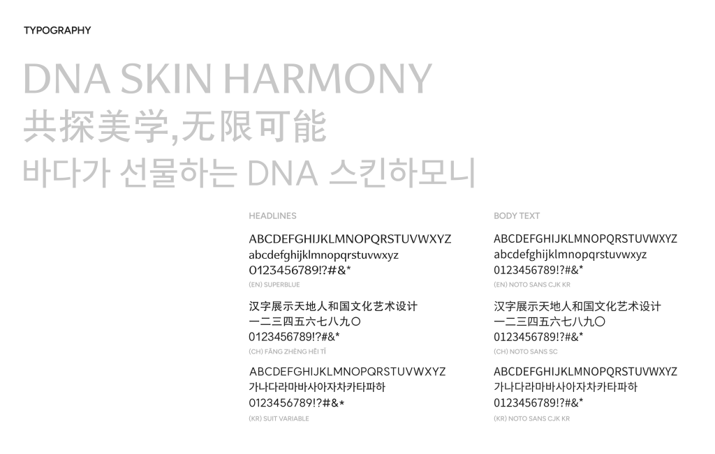
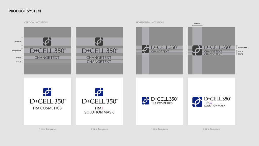
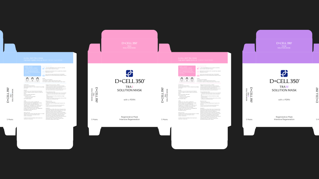
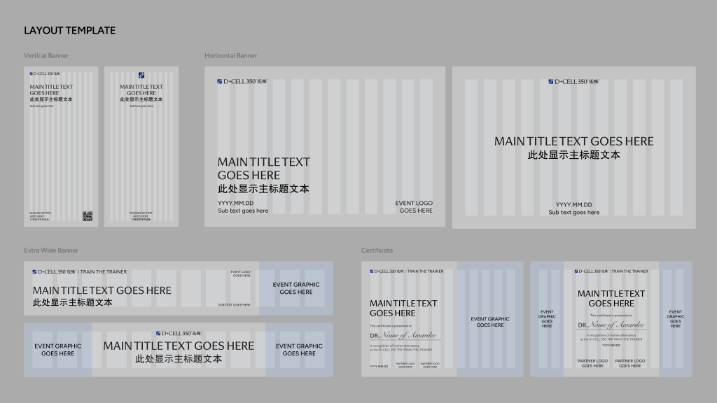
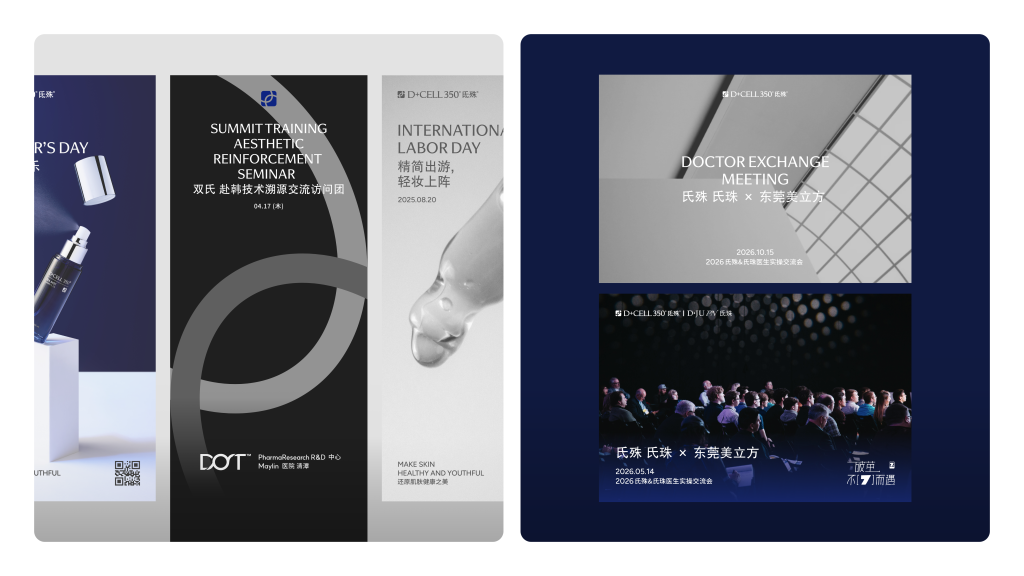
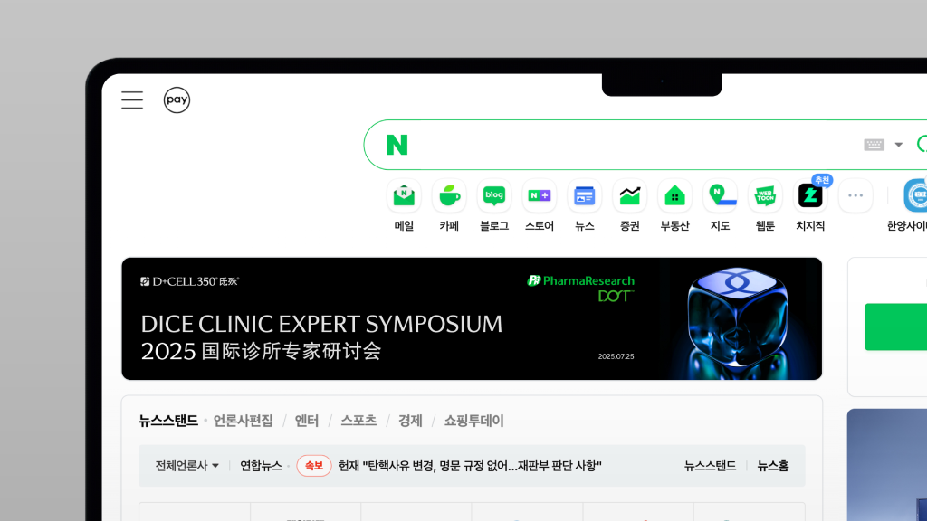
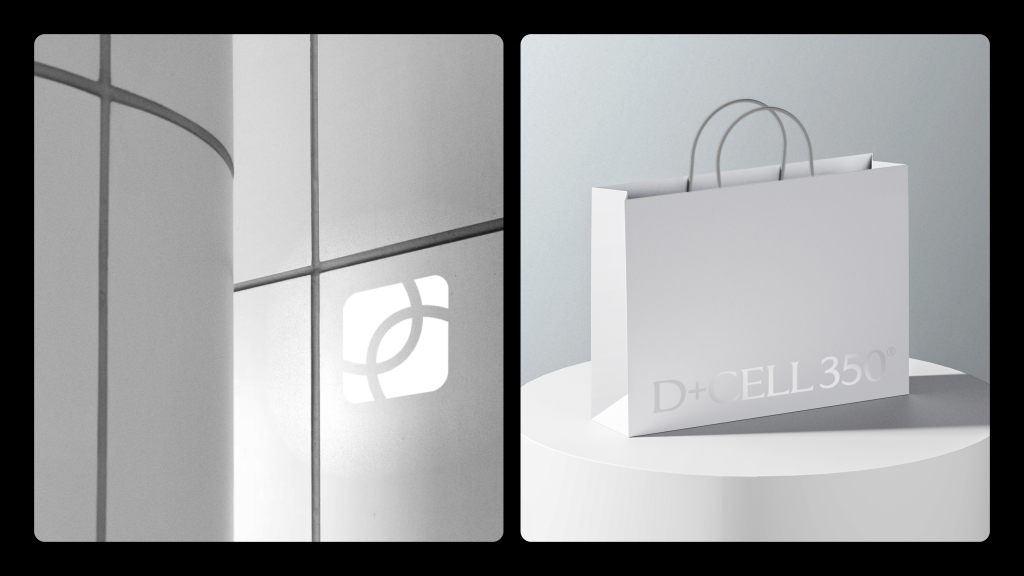
Manual Graphics refined D+CELL’s identity by preserving its core impression while adding professionalism, modern sensibility, and a premium tone. By systematizing visual elements into a comprehensive brand guideline, we enabled the the brand to build a consistent identity and enhance its competitiveness in the global market.
디셀(D+CELL 350)은 피부 본연의 건강과 아름다움을 연구하는 파마리서치의 전문 코스메틱 브랜드입니다. 중국 시장을 중심으로 성장해 왔으며 병원 유통채널을 기반으로 전문성을 갖추고 있습니다. 하지만 글로벌 시장에서 브랜드 가치를 강화하기 위해서는 일관성 부족 문제를 개선하고 전반적인 비주얼 업그레이드가 필요했습니다.
매뉴얼 그래픽스는 이러한 필요성에 맞춰 디셀의 브랜드 리파인 프로젝트를 진행했습니다. 브랜드의 핵심 정체성을 재정립하는 것 부터 시작해, 기존 아이덴티티의 기본 인상은 유지하면서도, 전문성과 현대적인 감각, 그리고 프리미엄 톤을 더했습니다. 또한 로고, 타이포그래피, 컬러, 그래픽 모티브 등 시각적 요소를 일관되게 사용할 수 있는 가이드를 구축하여, 디셀이 글로벌 시장에서도 경쟁 력을 갖춘 브랜드로 자리매김할 수 있도록 하였습니다.