Client
CND PLANNING 씨앤디플래닝
Workscope
Brand Identity, Application Design, Signage Design, Responsive Web Design and Development, UI/UX Design
Output
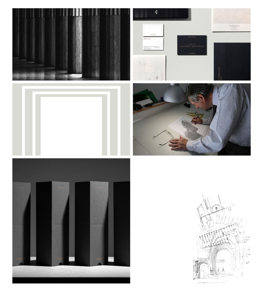
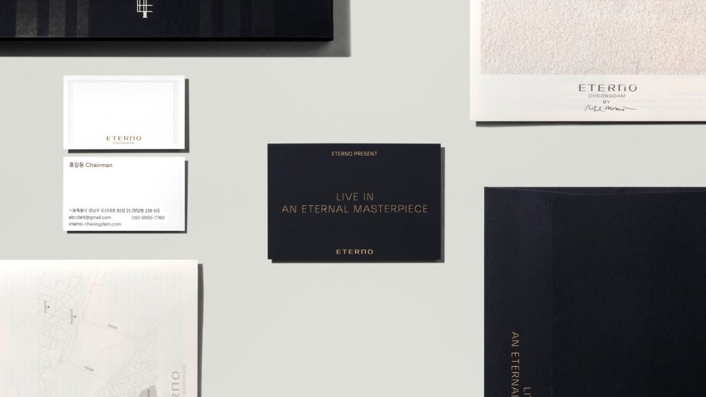
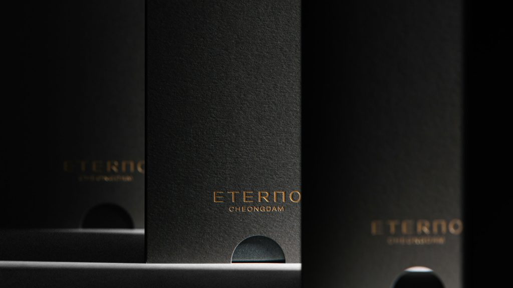
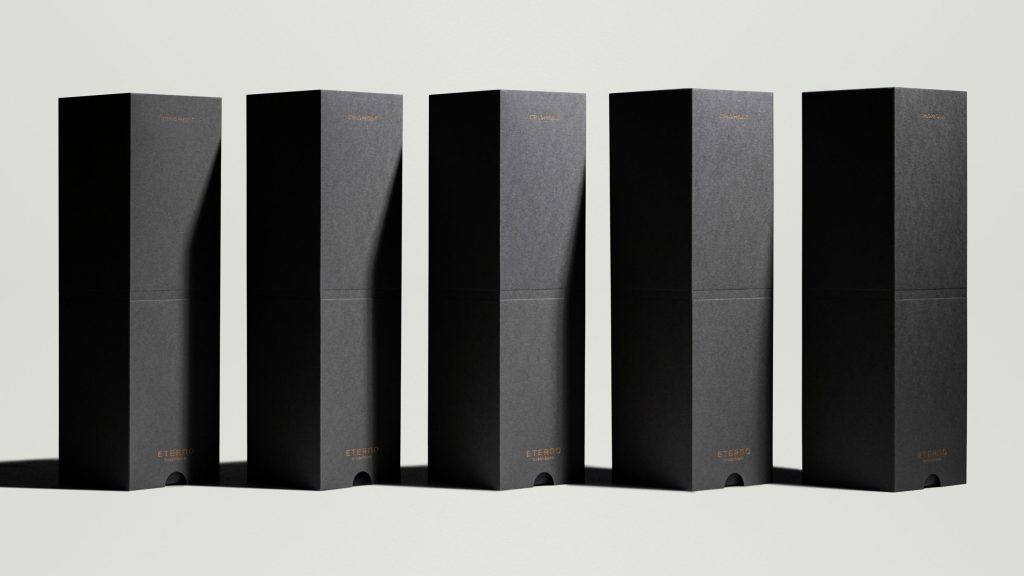
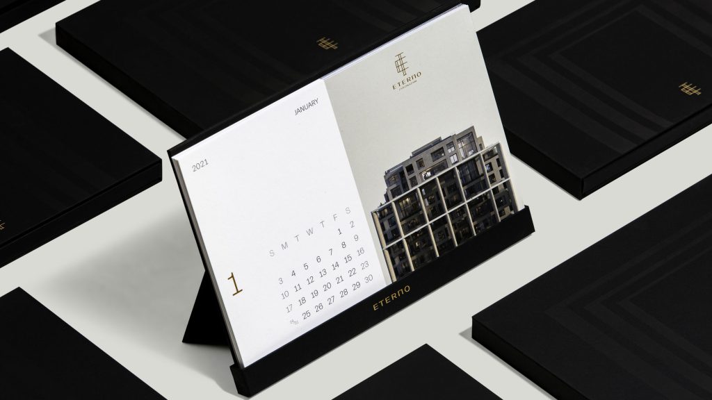
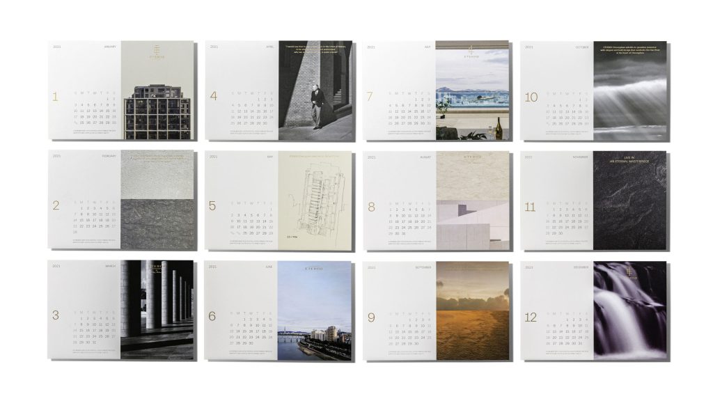
Logotype, Slogan, Brand Keyword, Symbol Mark, Signature, Emblem, Color System, Graphic Motif System, Layout System, Pattern, Business Card, Calendar, Gallery Reflet, Gallery Signage, Wine Package, Website, Documents
일부 사진은 에테르노로부터 제공받아 사용하였습니다.
© CND PLANNING
project overview
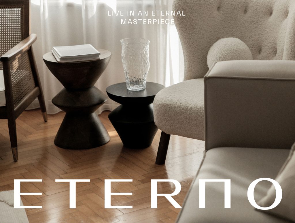
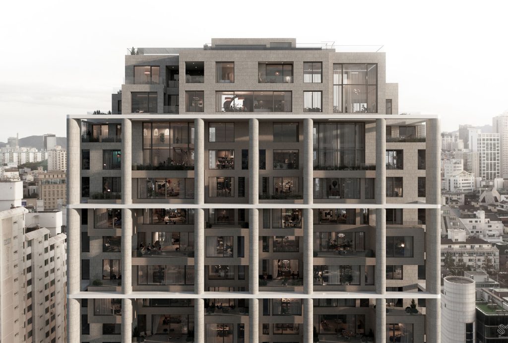
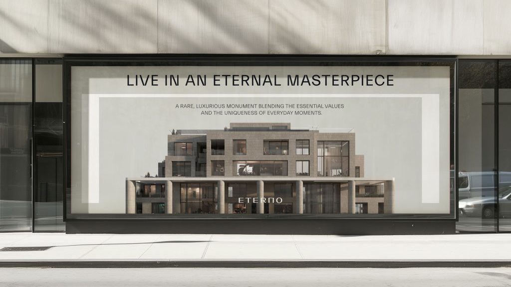
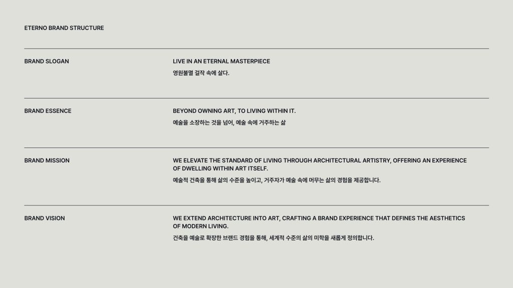
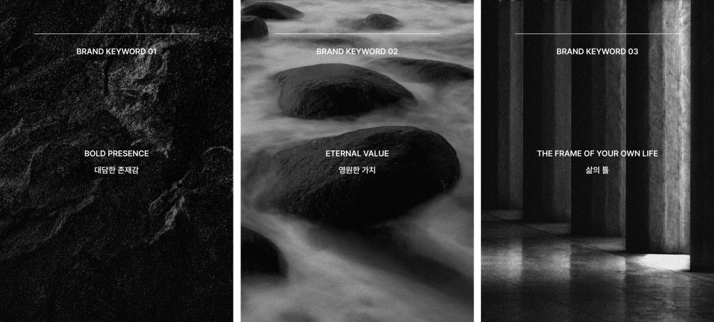
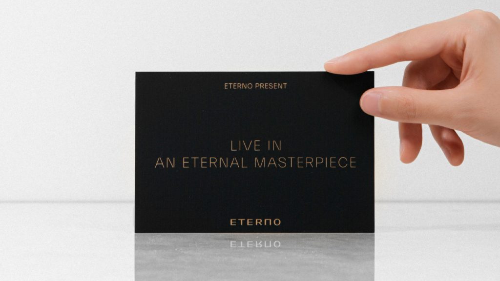
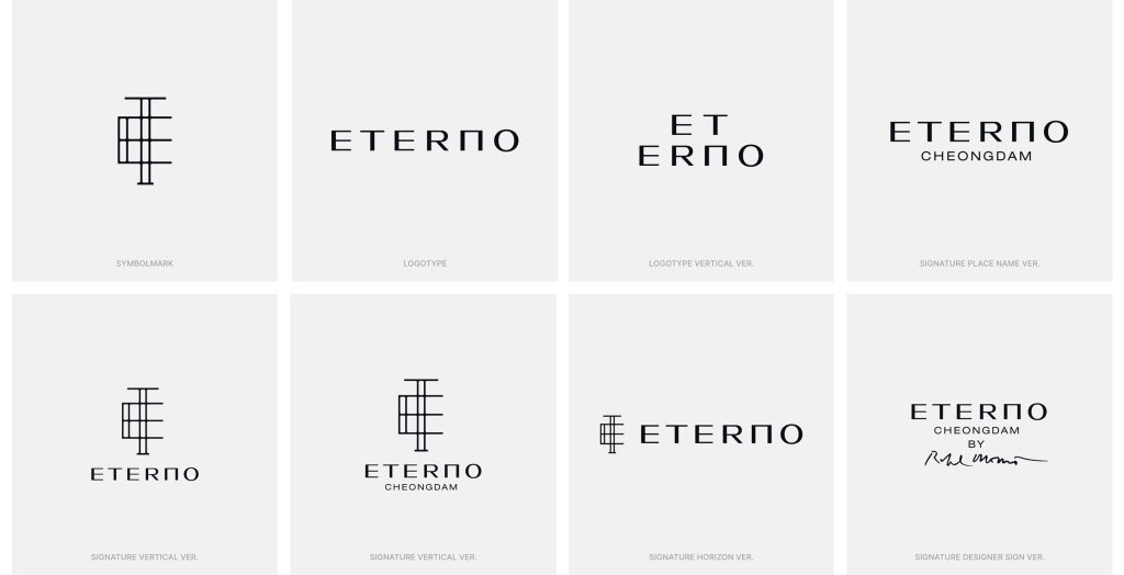
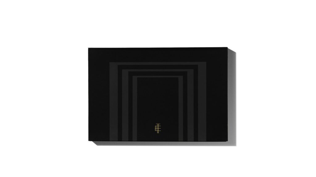
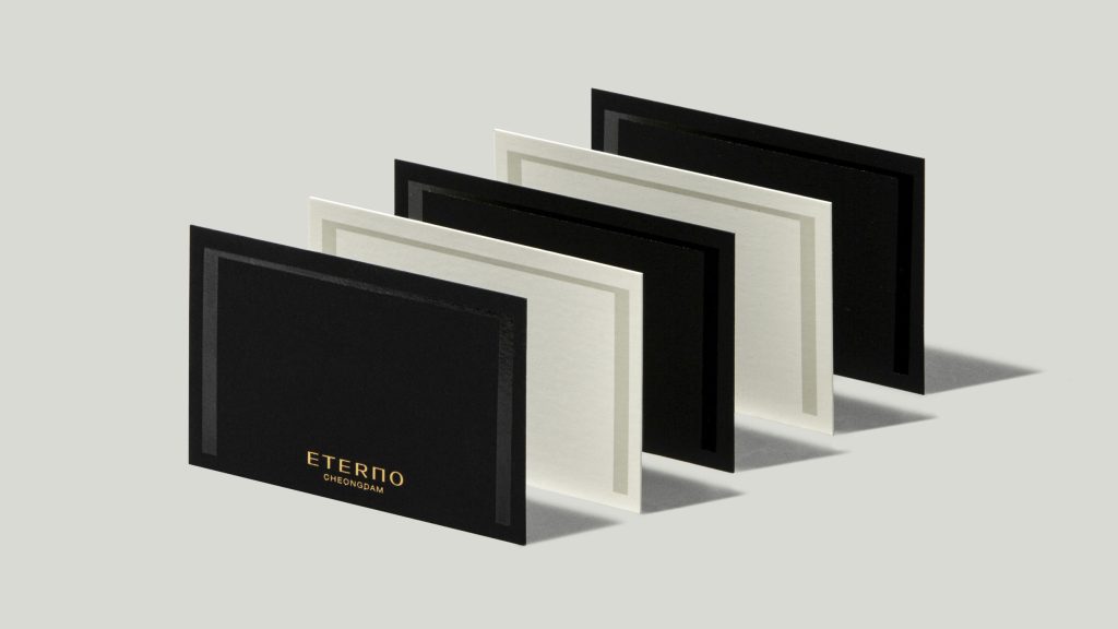
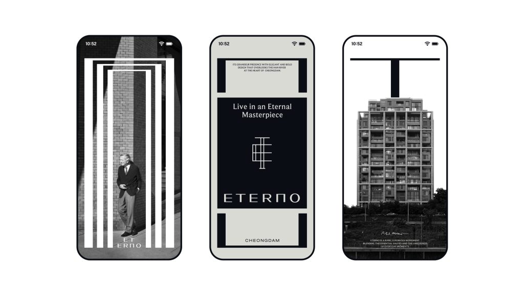
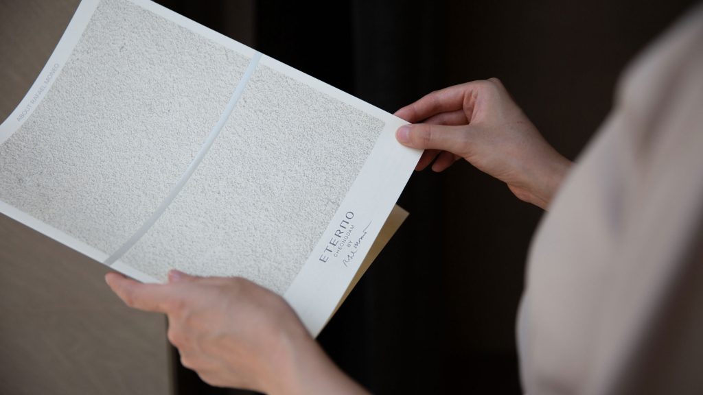
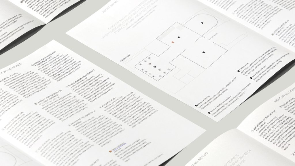
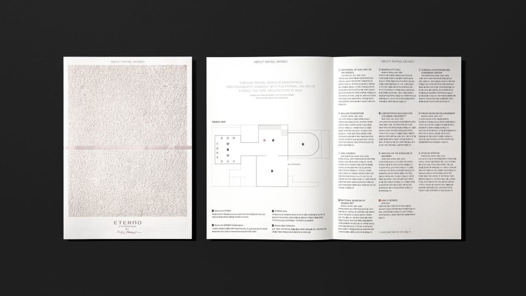
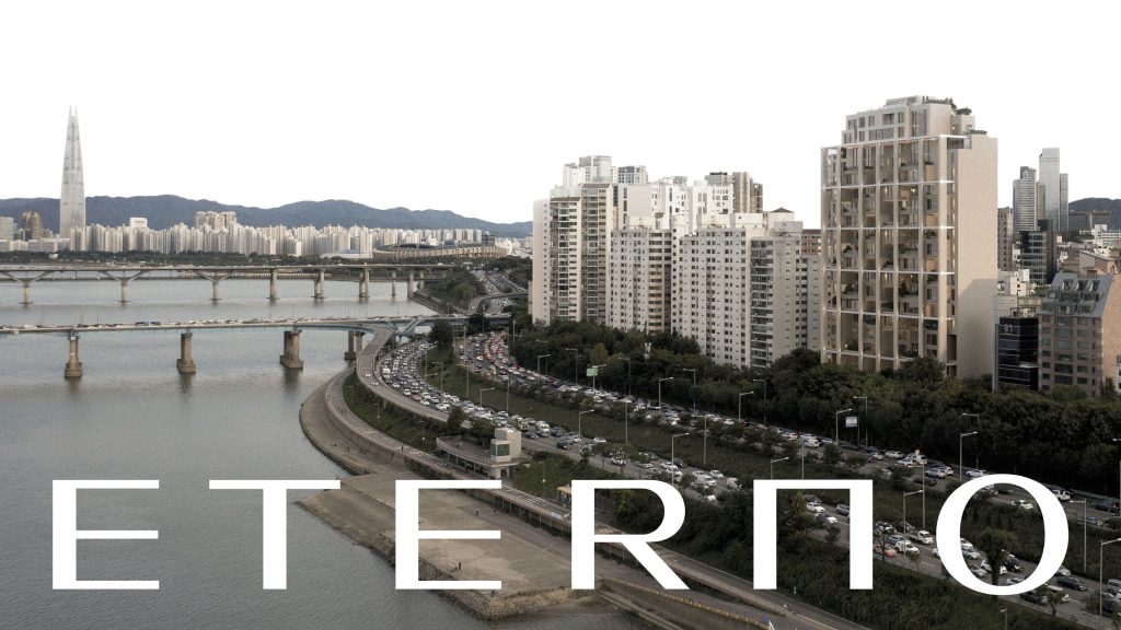
Manual Graphics designed ETERNO Cheongdam brand identity. We tried to incorporate the concepts of eternal immortality, meaning ETERNO, and Rafael Monet’s masterpiece, into the brand identity system as motifs. We used graphic elements as passively as possible to convey the firm, soft, and lasting characteristics of the brand and chose colors that could look less contrasting. The layout mainly used the middle array. We selected heavy and rough materials as if they were carved in stone that did not change for a long time, or we excluded finishing such as coating on the surface to convey the unique properties of the material.
에테르노 청담의 브랜드 아이덴티티 디자인을 진행했습니다. 스페인어 ‘에테르노’의 의미인 ‘영원불멸’과 라파엘 모네오의 ‘걸작’의 개념을 모티프로 브랜드 아이덴티티 시스템에 담아내고자 노력했습니다. 단단하되 부드럽고 영속적인 브랜드의 성격이 전달되도록 가능한 한 그래픽 요소를 소극적으로 사용했고, 대비감이 적어 보일 수 있는 색상을 선택했습니다. 레이아웃은 가운데 배열을 주로 사용했습니다. 오랜 시간이 지나도 변치 않는 돌에 새기듯 무겁고 러프한 소재를 선정하여 디보싱을 하거나, 재질 고유의 물성을 전달하고자 표면의 코팅 등의 마감은 배제했습니다.