Client
CND Planning 씨앤디플래닝
Workscope
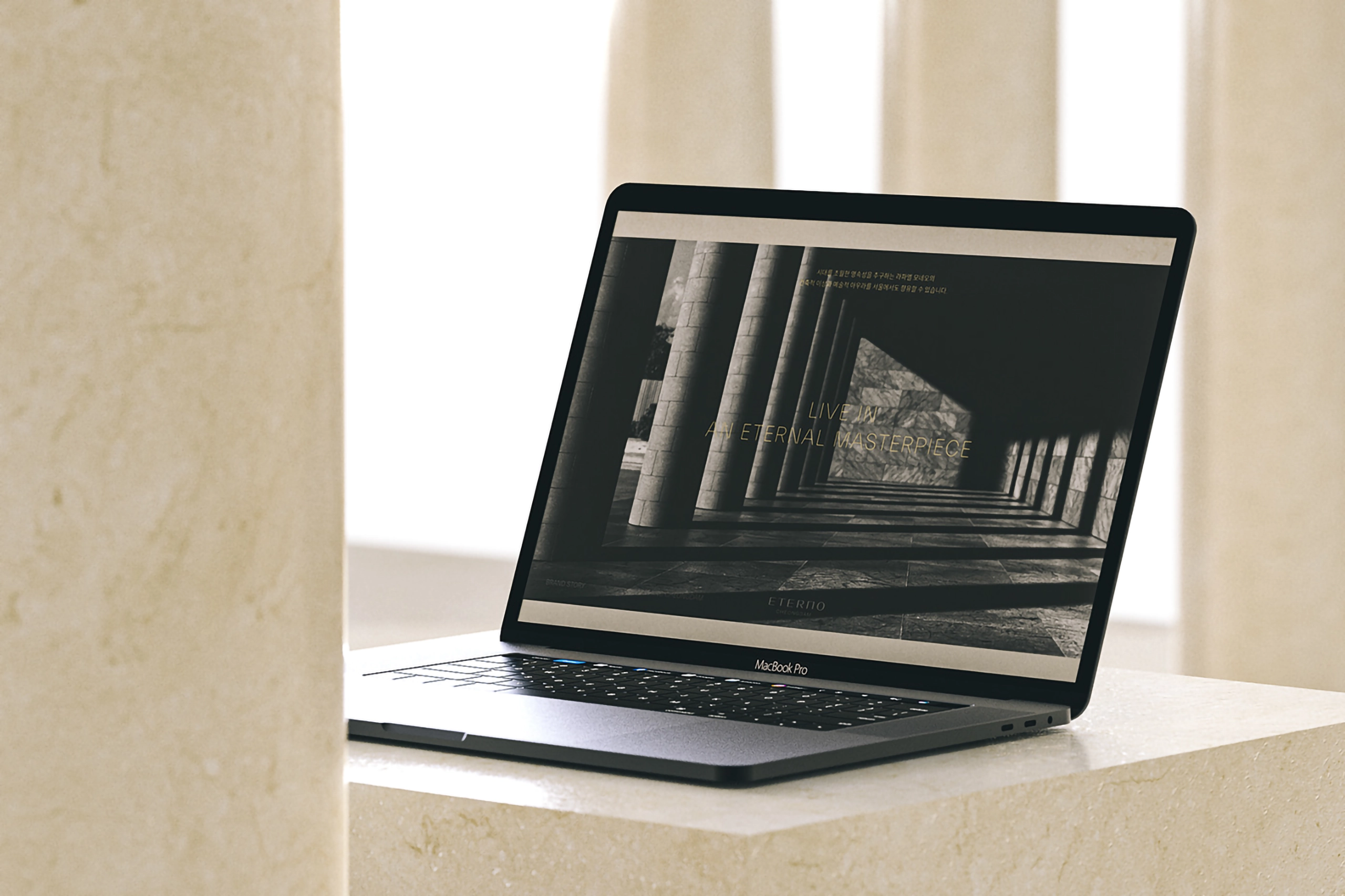
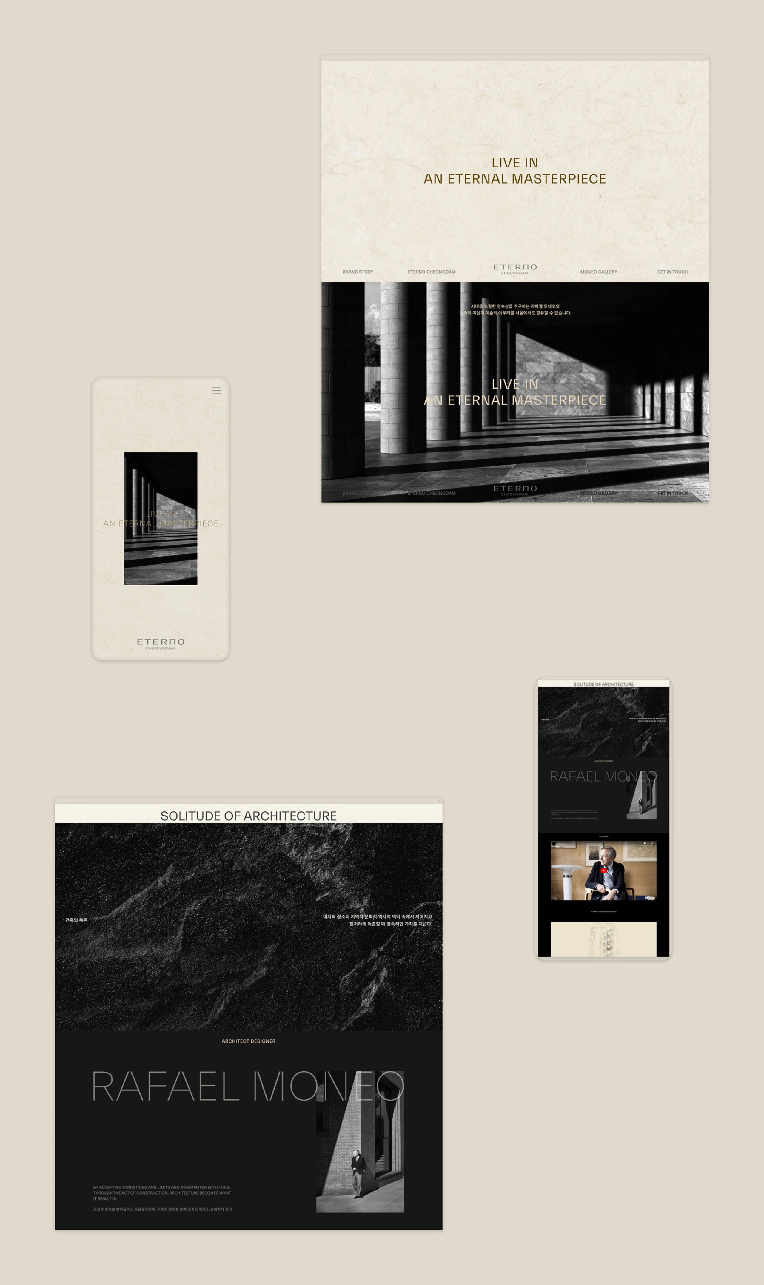
Brand Identity, Application Design, Signage Design, Responsive Web Design And Development, UI/UX Design
Nexpress 넥스프레스
Output
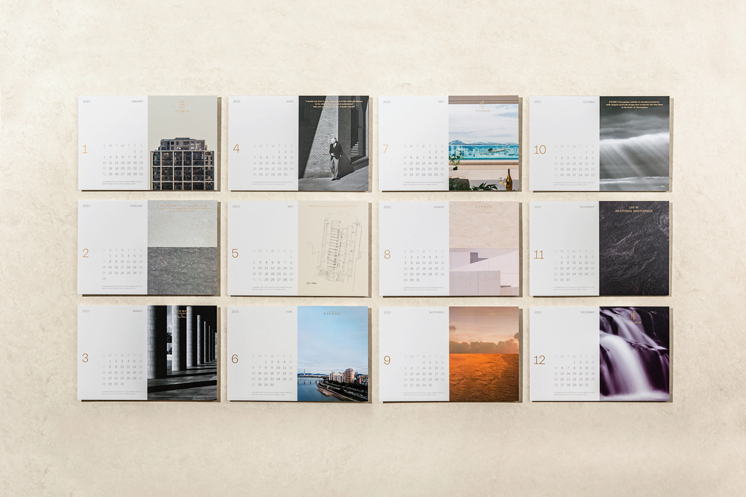
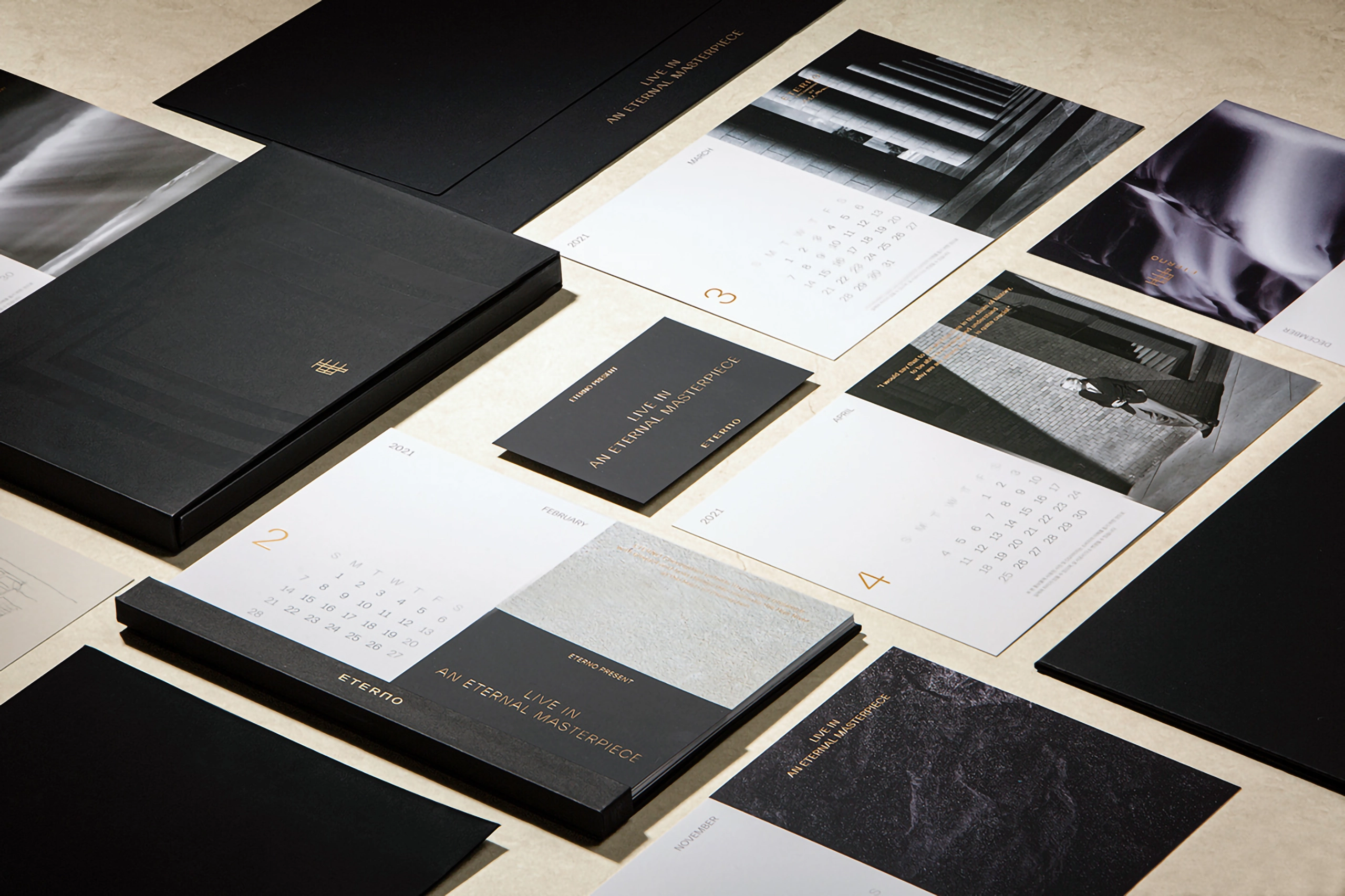
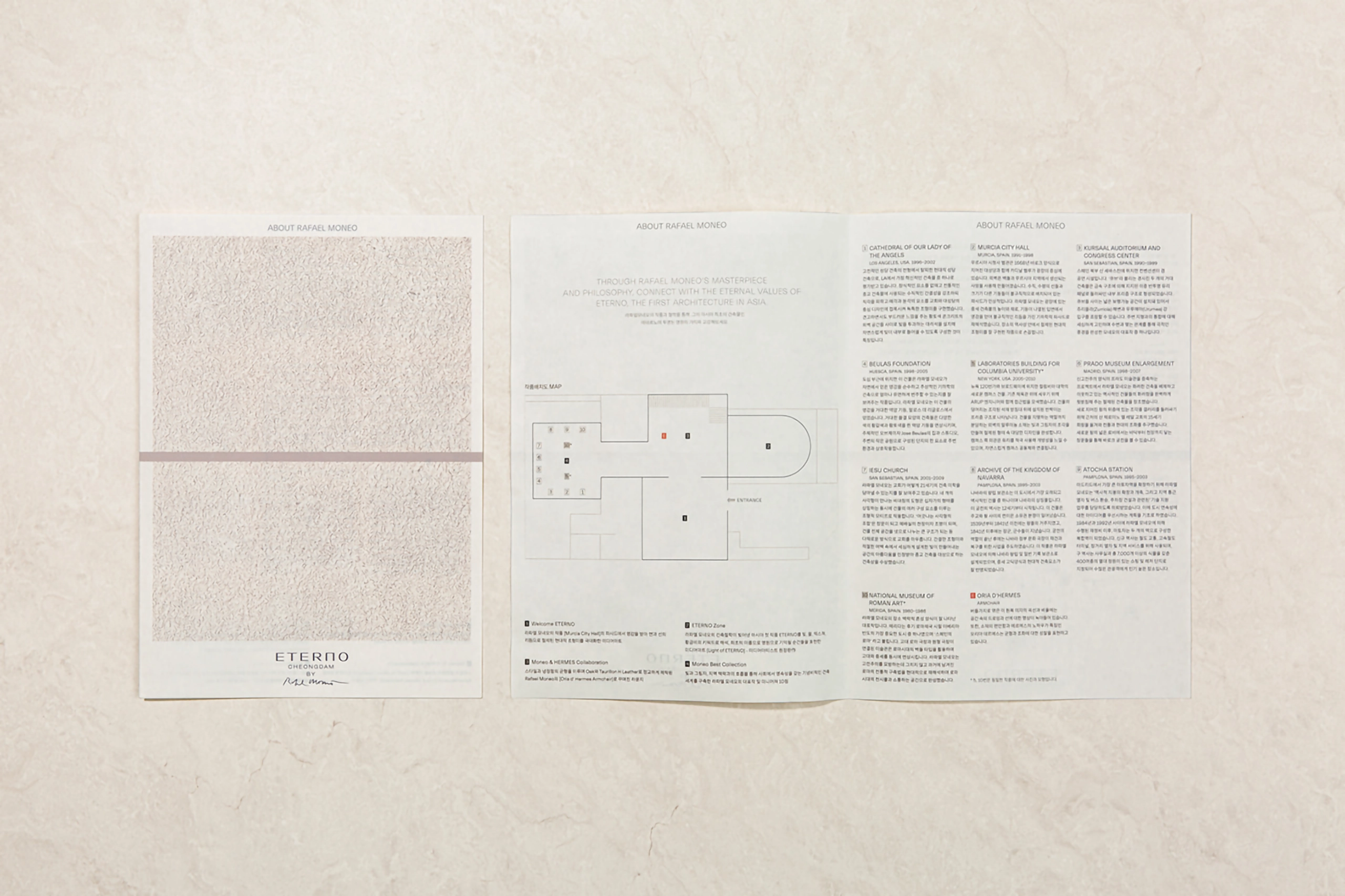
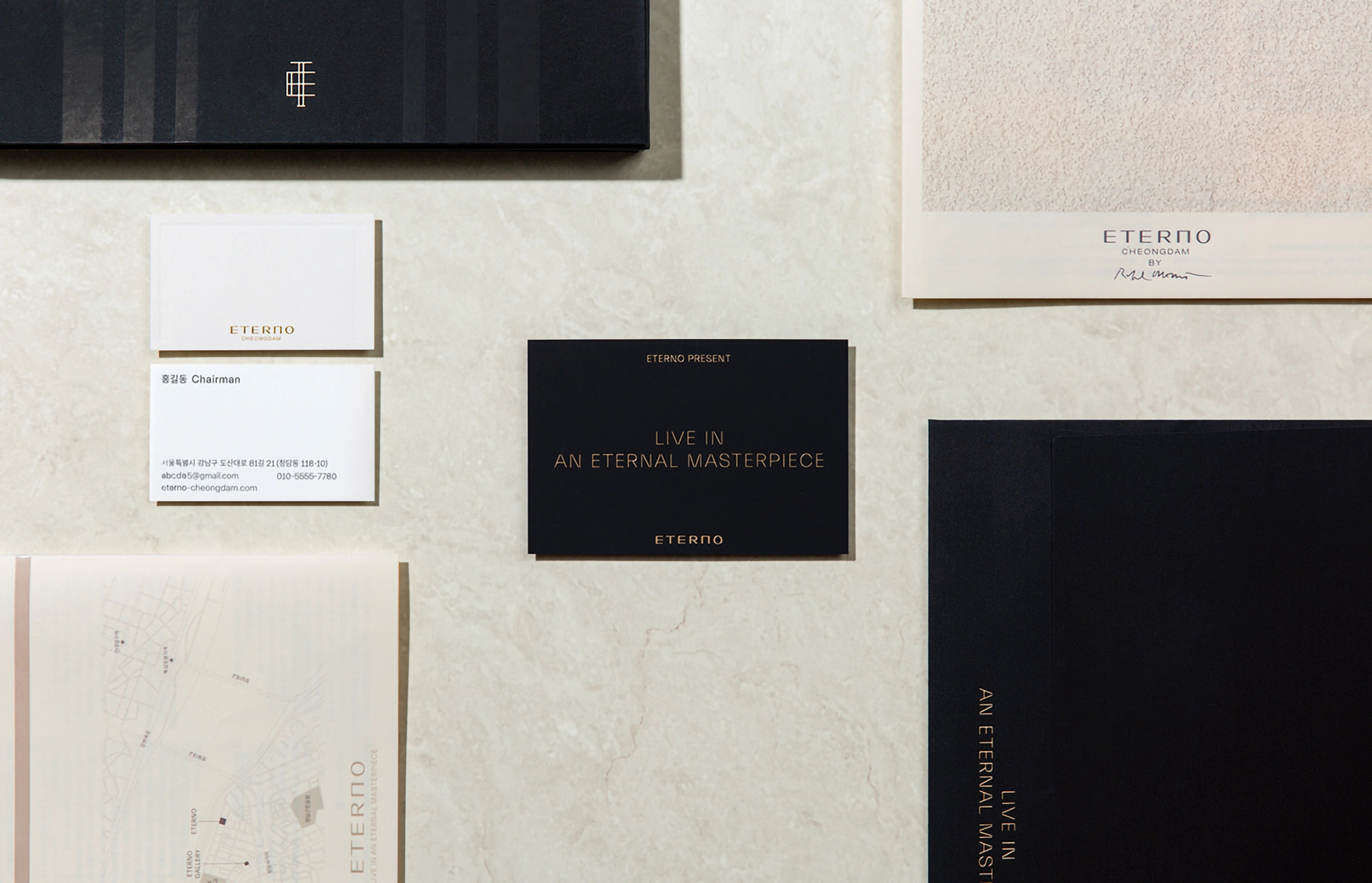
Logotype, Slogan, Brand Keyword, Symbolmark, Signature, Emblem, Color System, Graphic Motif System, Layout System, Pattern, Business Card, Calendar, Gallery Reflet, Gallery Signage, Wine Package, Website, Documents
Project Overview
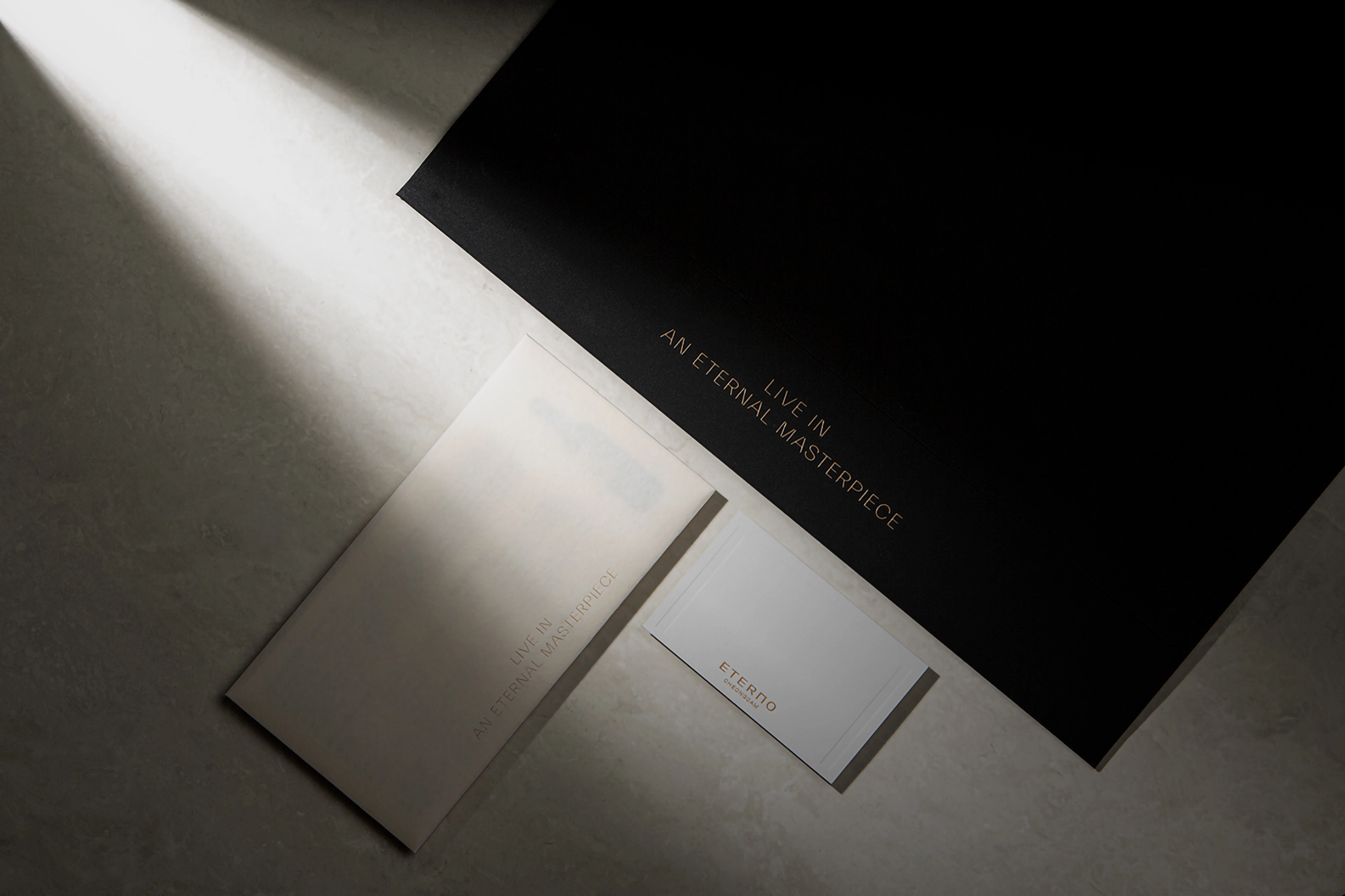
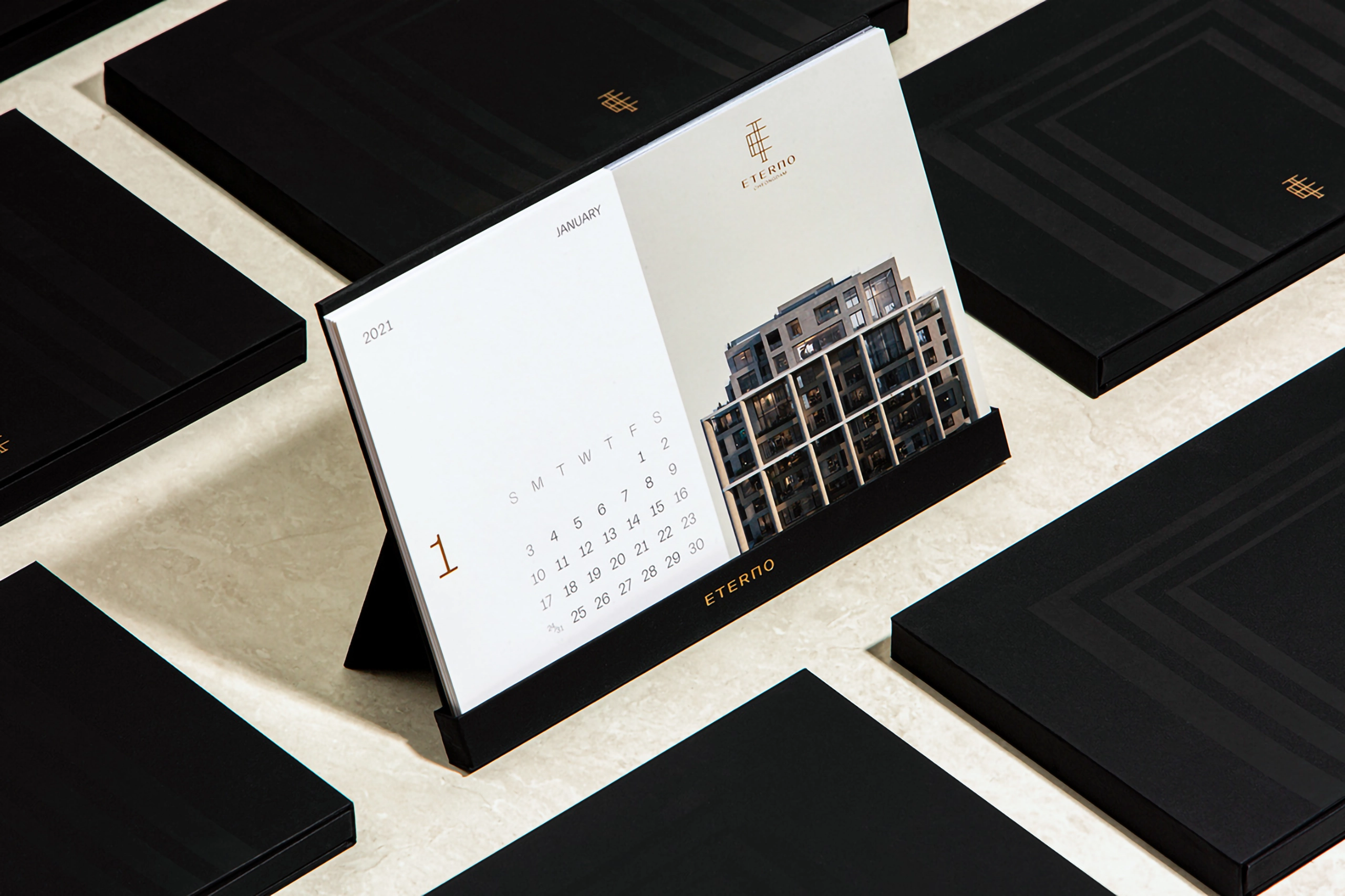
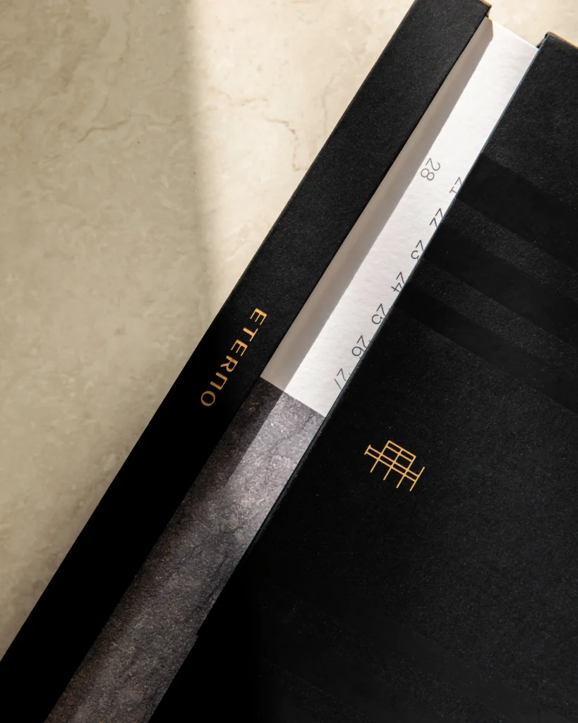
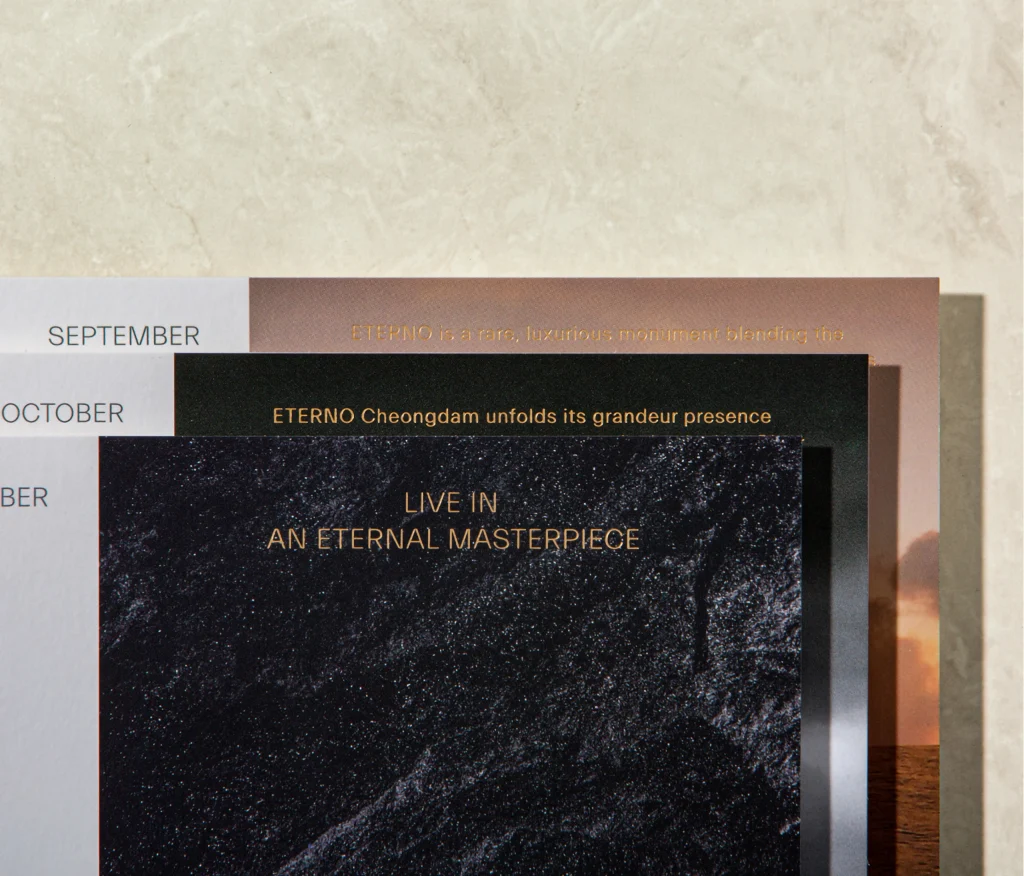
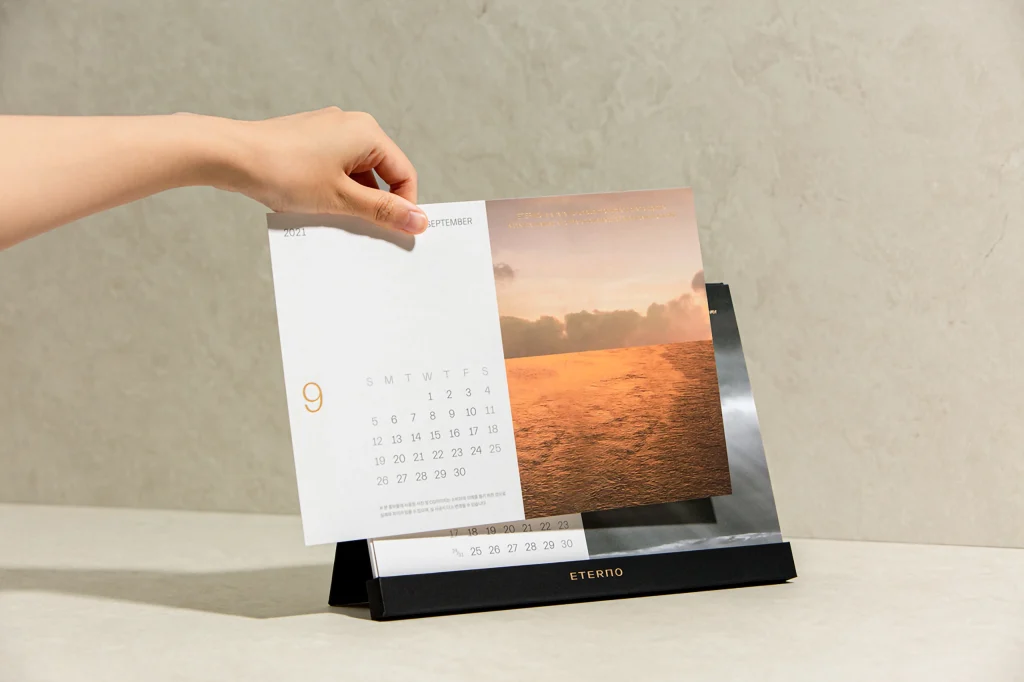
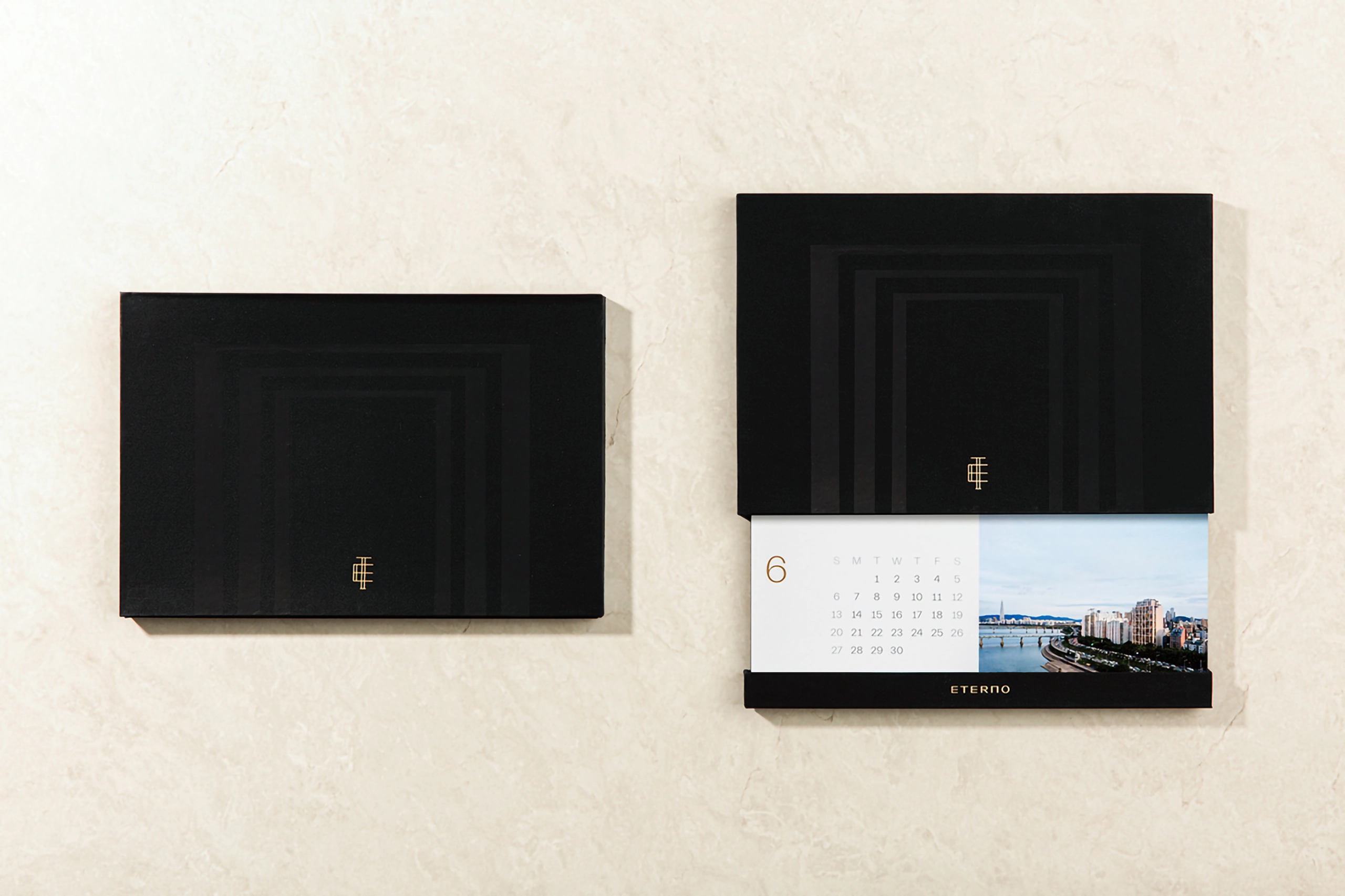
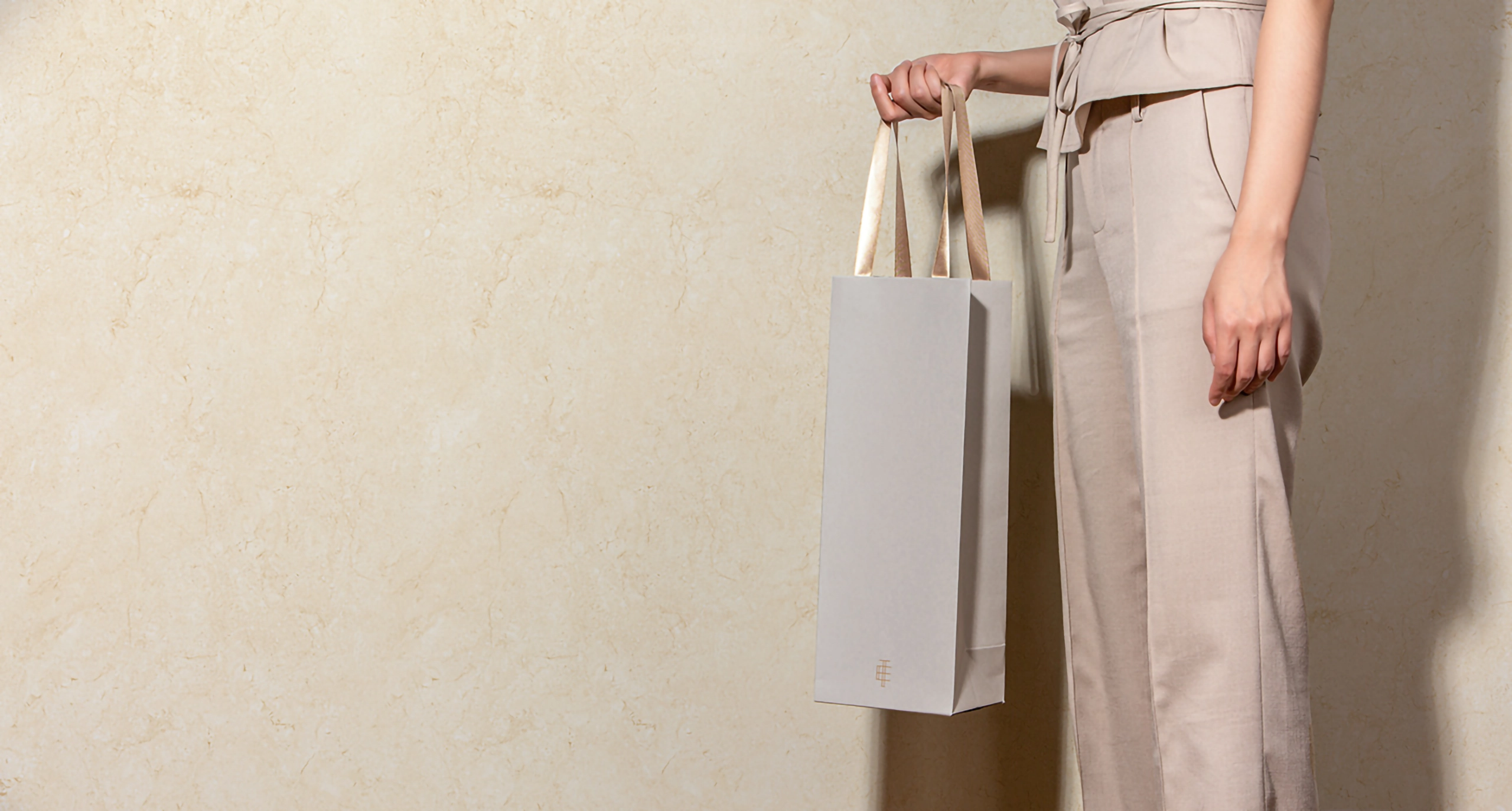
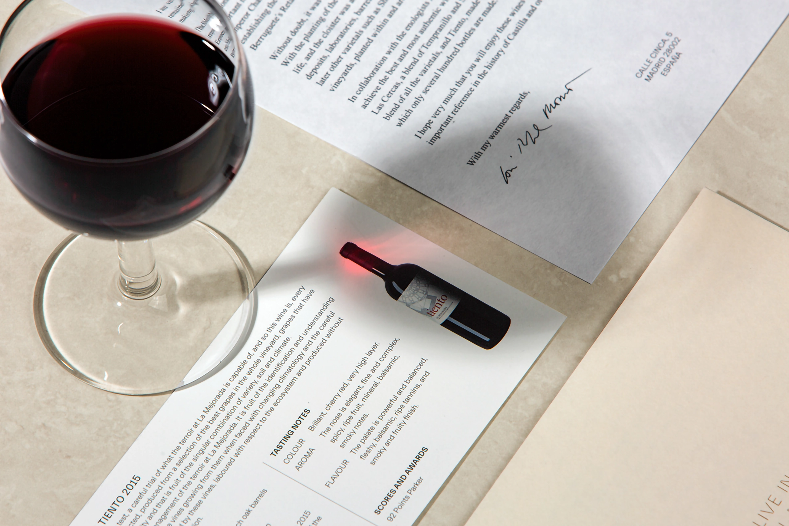
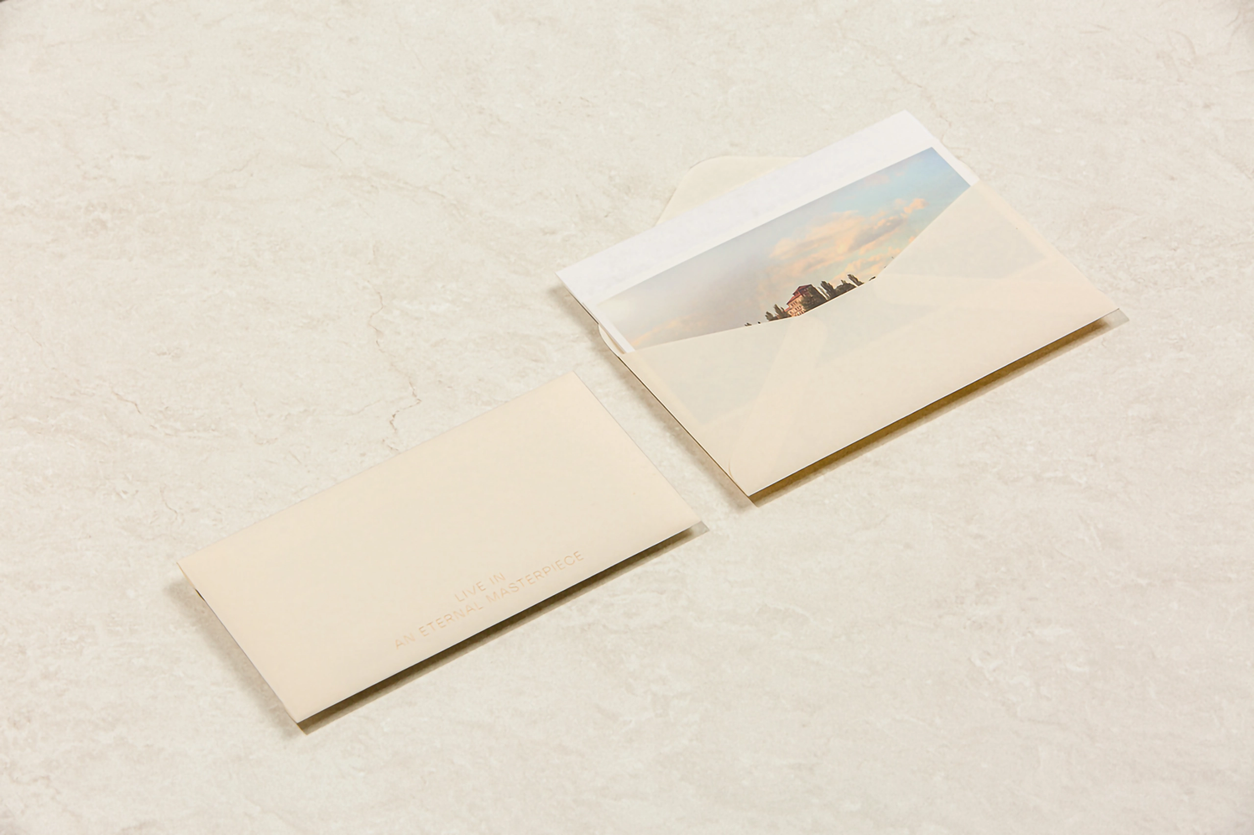
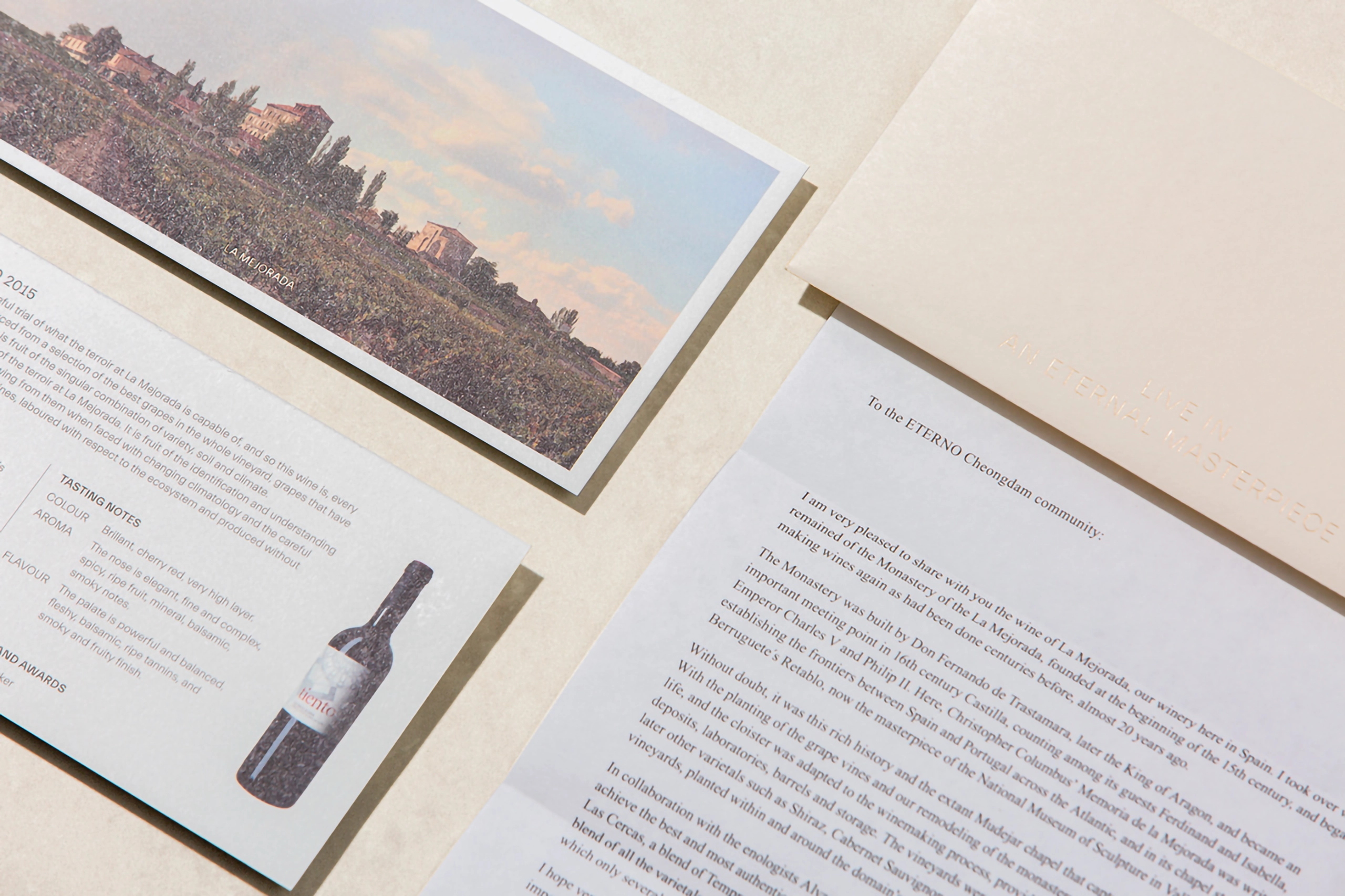
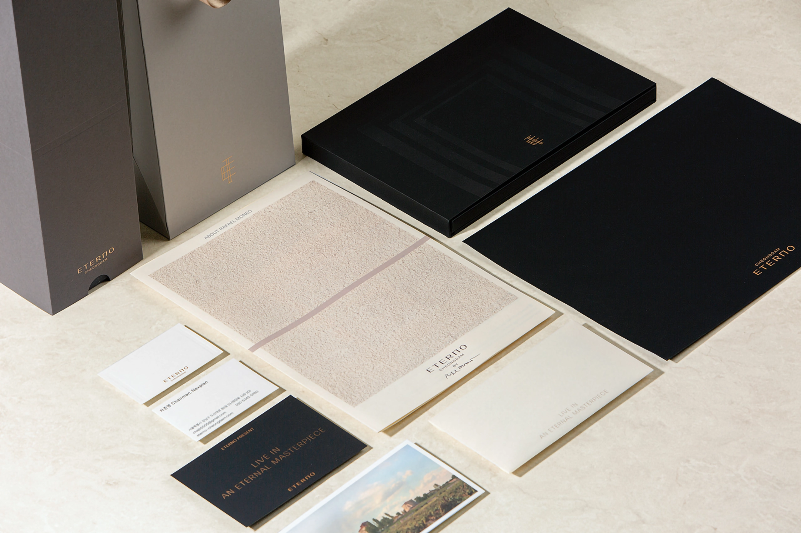
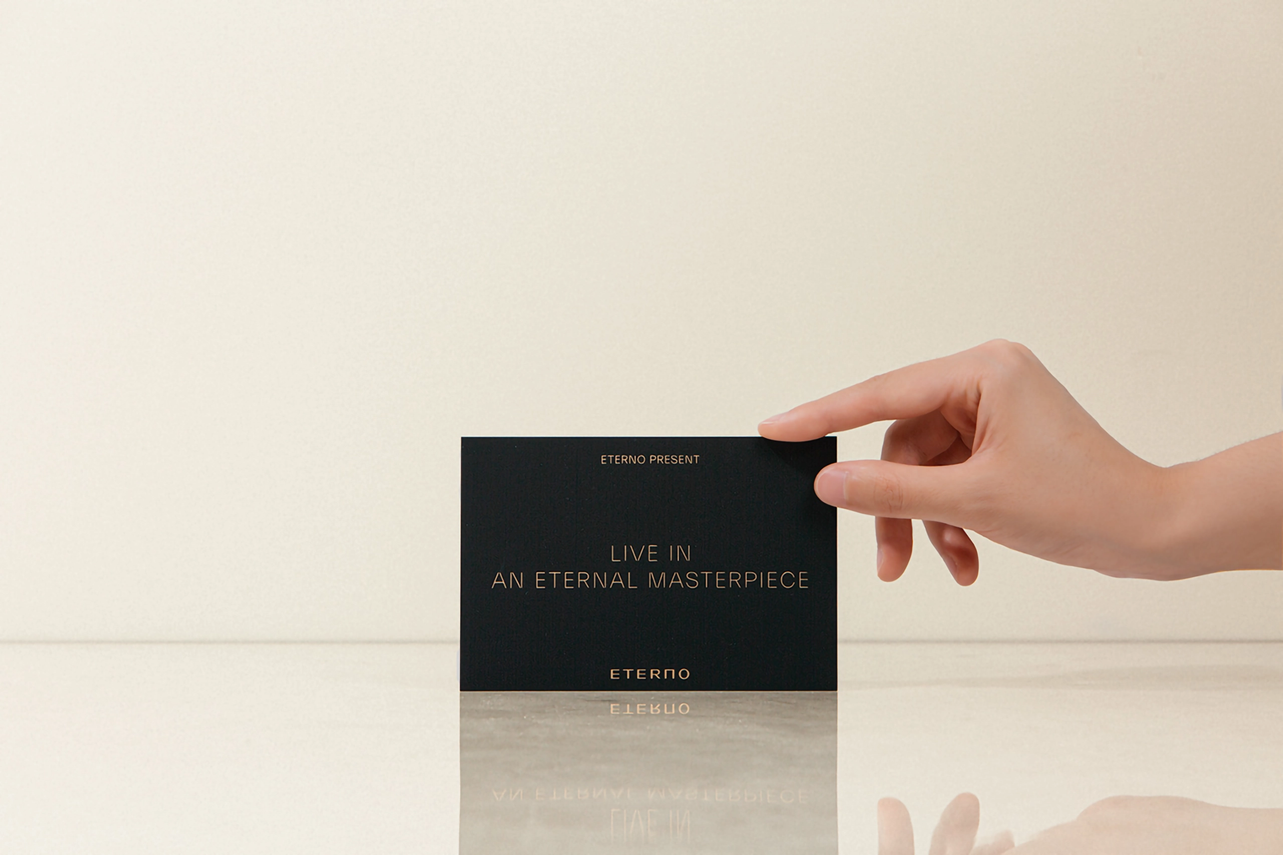
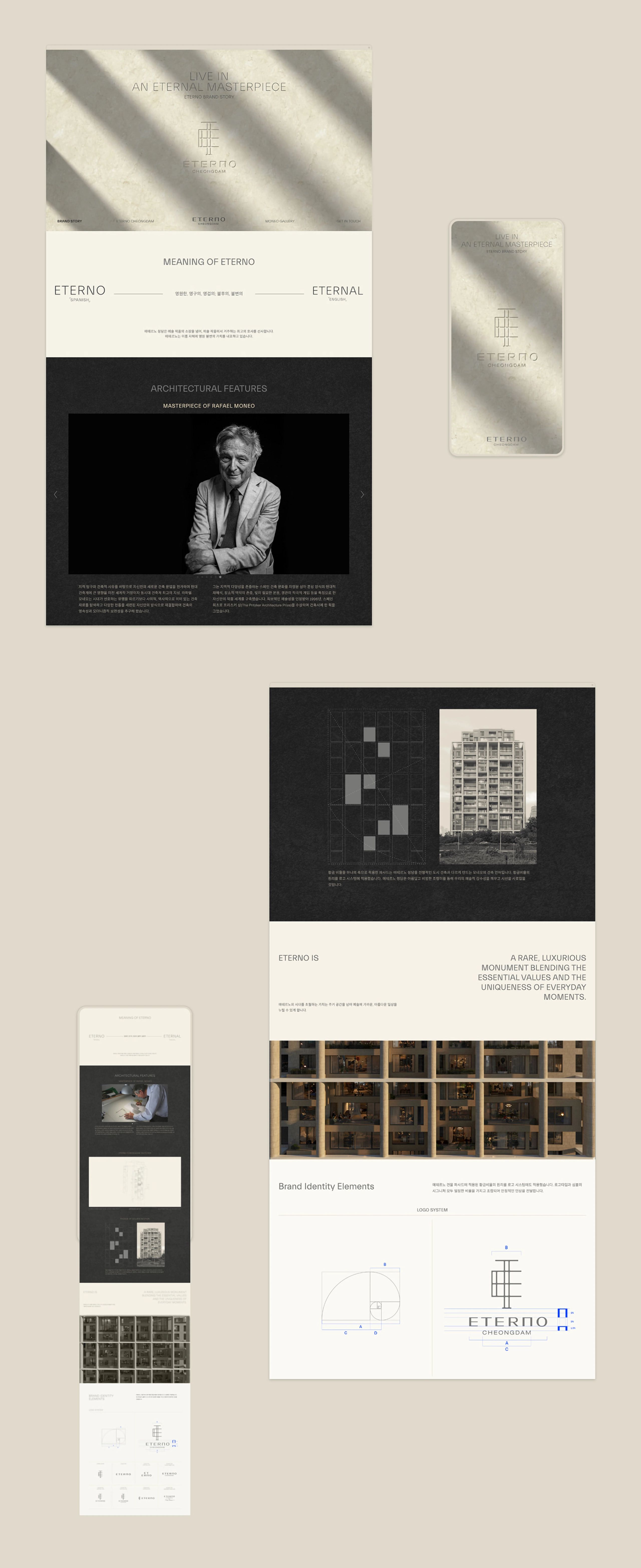
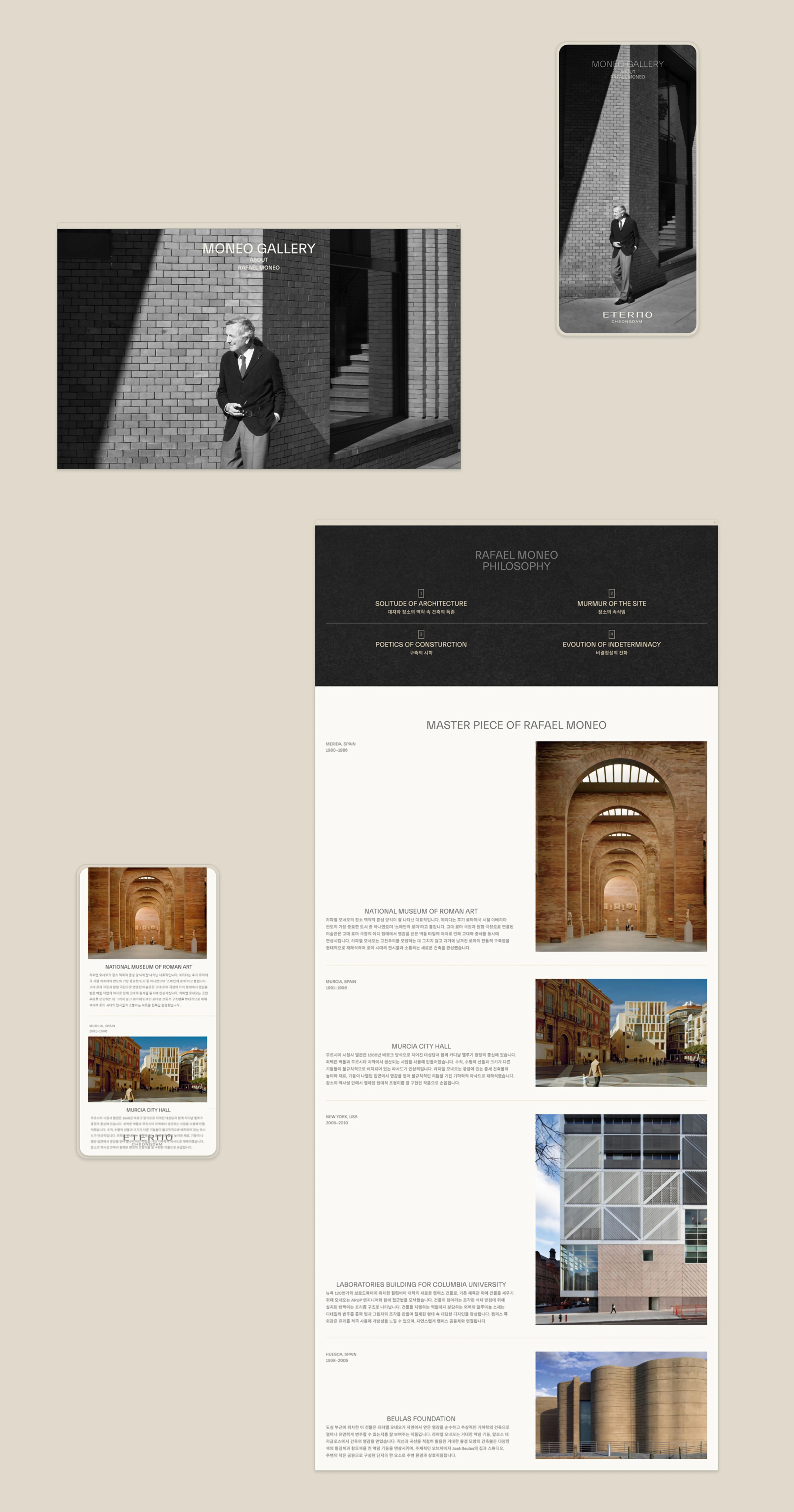
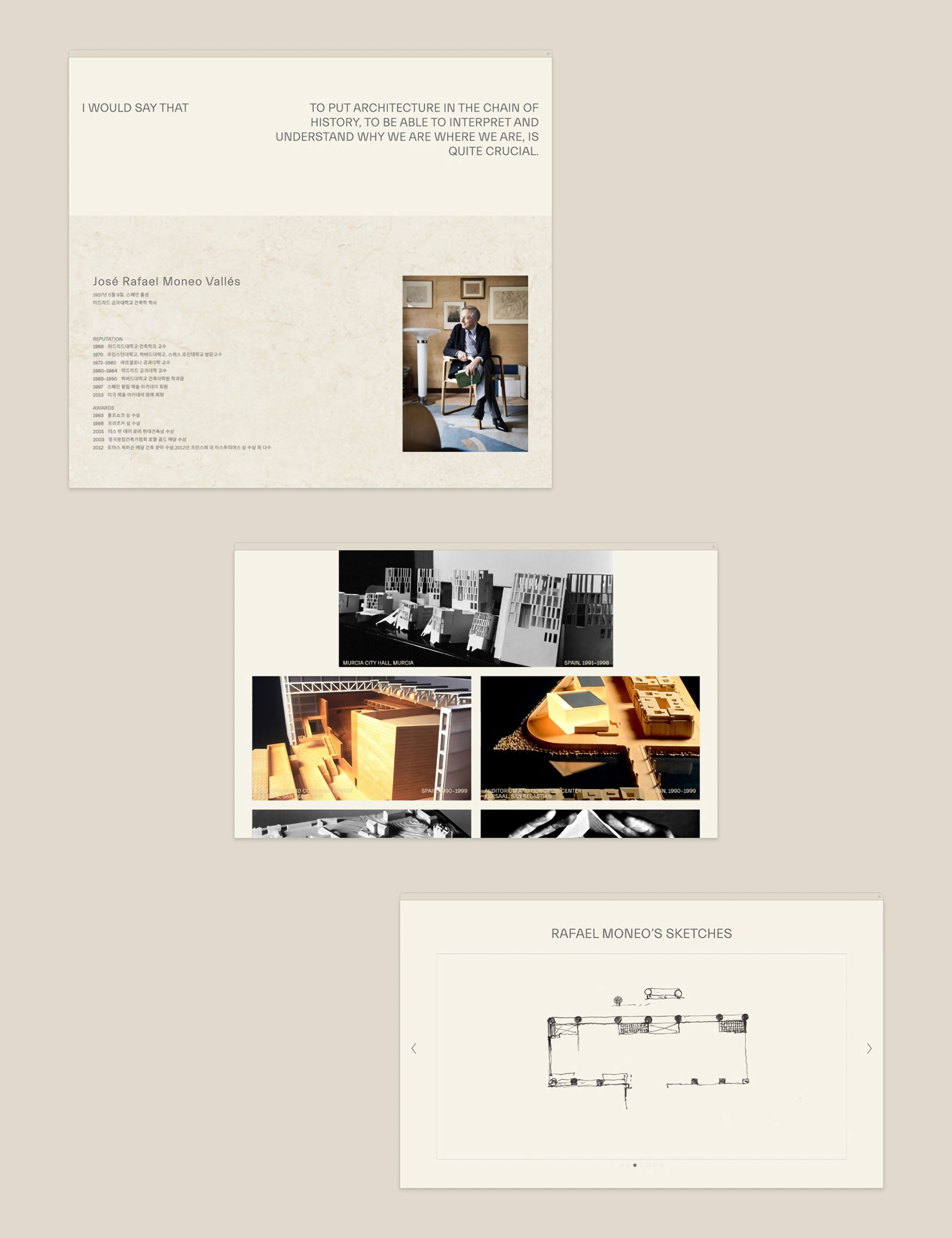
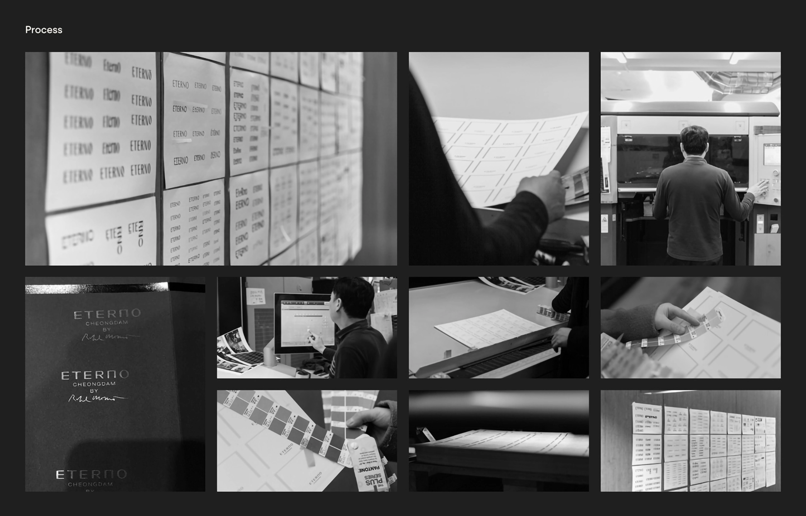
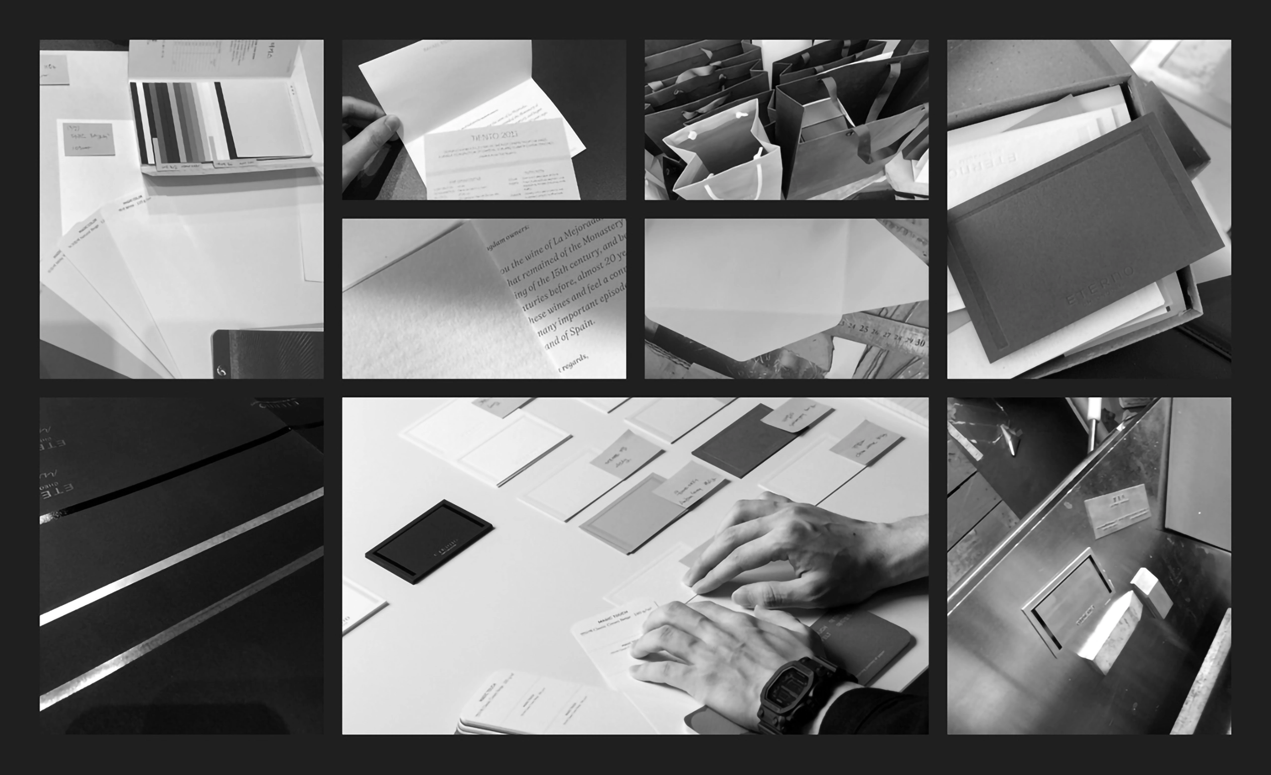
Manual Graphics designed ETERNO Cheongdam brand identity. We tried to incorporate the concepts of eternal immortality, meaning ETERNO, and Rafael Monet’s masterpiece, into the brand identity system as motifs. We used graphic elements as passively as possible to convey the firm, soft, and lasting characteristics of the brand and chose colors that could look less contrasting. The layout mainly used the middle array. We selected heavy and rough materials as if they were carved in stone that did not change for a long time, or we excluded finishing such as coating on the surface to convey the unique properties of the material.
매뉴얼 그래픽스는 에테르노 청담 브랜드 아이덴티티를 디자인했습니다. 영원한 불멸을 의미하는 ETERNO와 라파엘 모네의 명작을 모티브로 브랜드 아이덴티티 체계에 녹여내려고 노력했습니다. 브랜드의 견고하고 부드러우며 오래 지속되는 특성을 전달하기 위해 그래픽 요소를 최대한 소극적으로 사용했고, 대비가 덜한 색상을 선택했습니다. 레이아웃은 주로 가운데 배열을 사용했습니다. 오랜 시간 변하지 않는 돌에 새긴 듯 무겁고 거친 소재를 선택하거나 표면에 코팅 등의 마감 처리를 배제해 소재 고유의 특성을 전달하고자 했습니다.
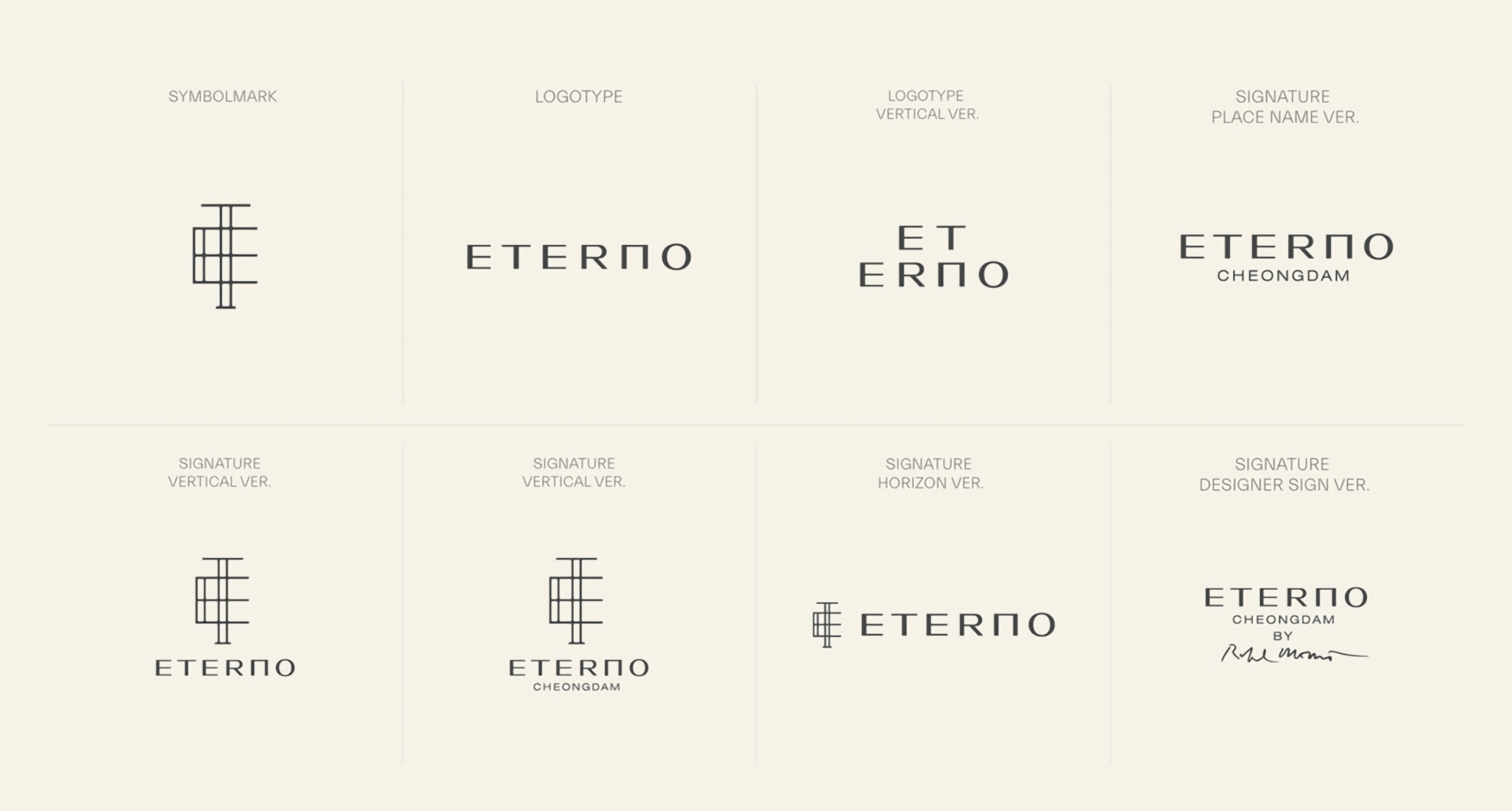
Symbol
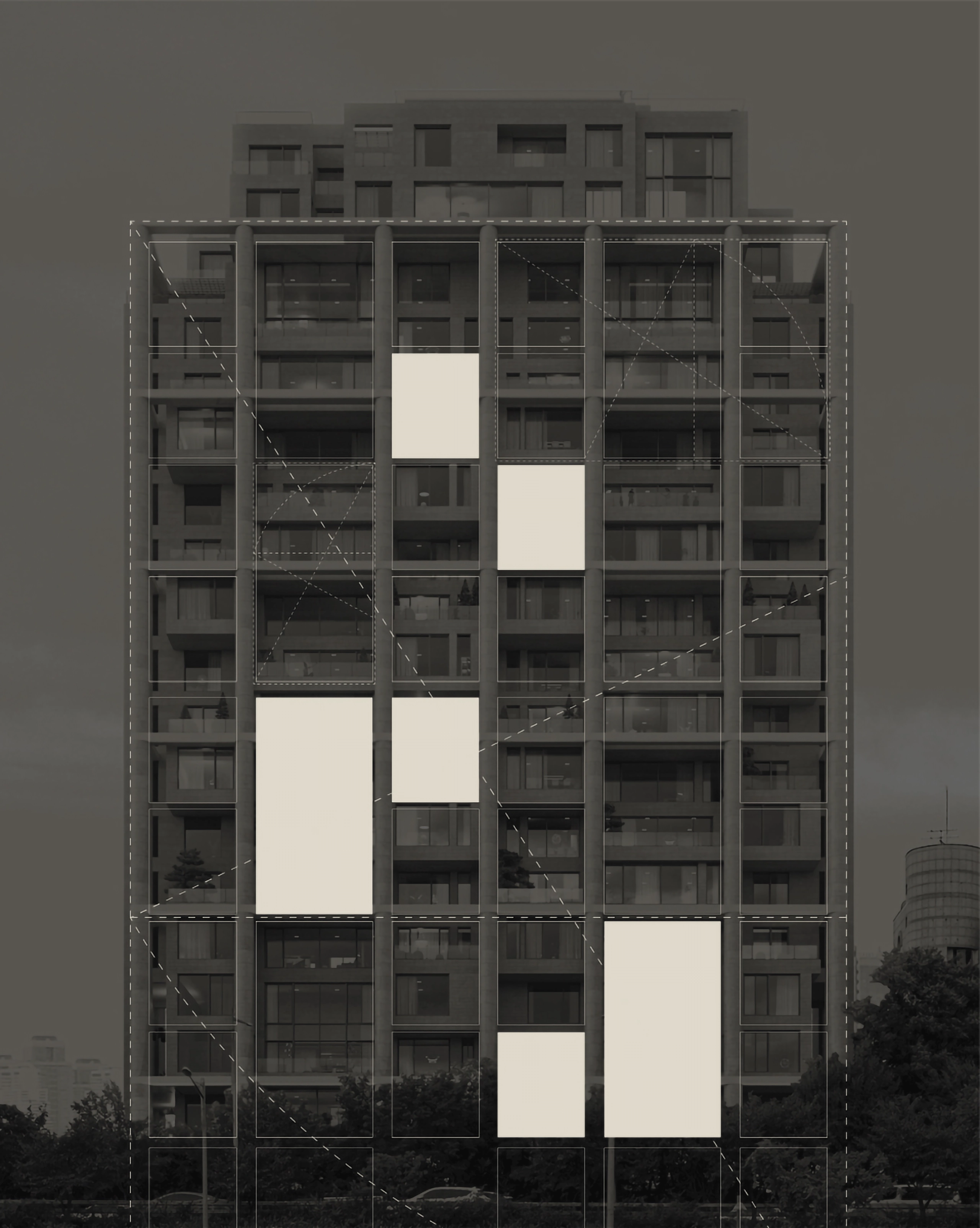
The main characters of the logotype are overlapped and aligned in the middle, and the impression of ETERNO facade was applied.
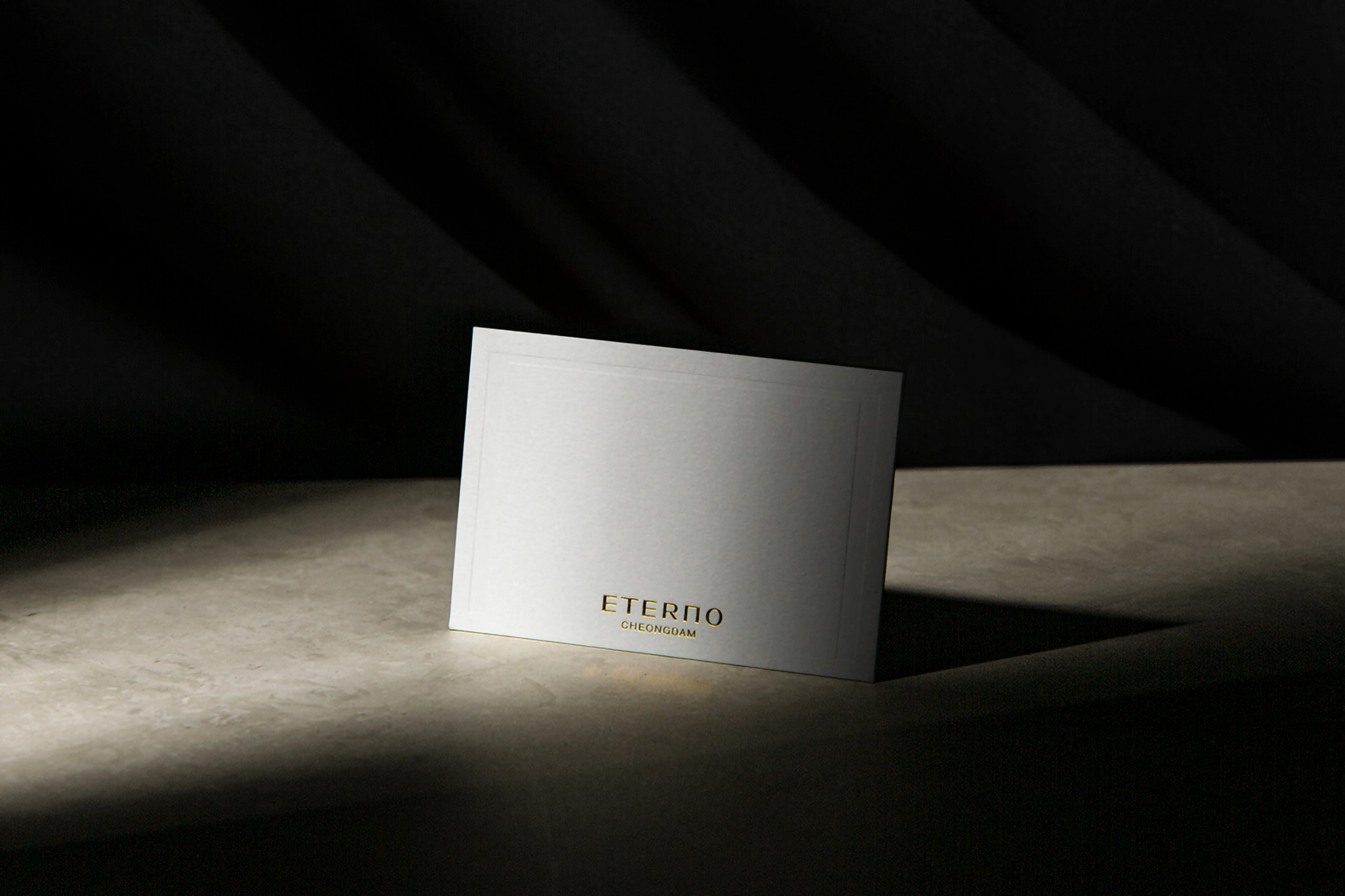
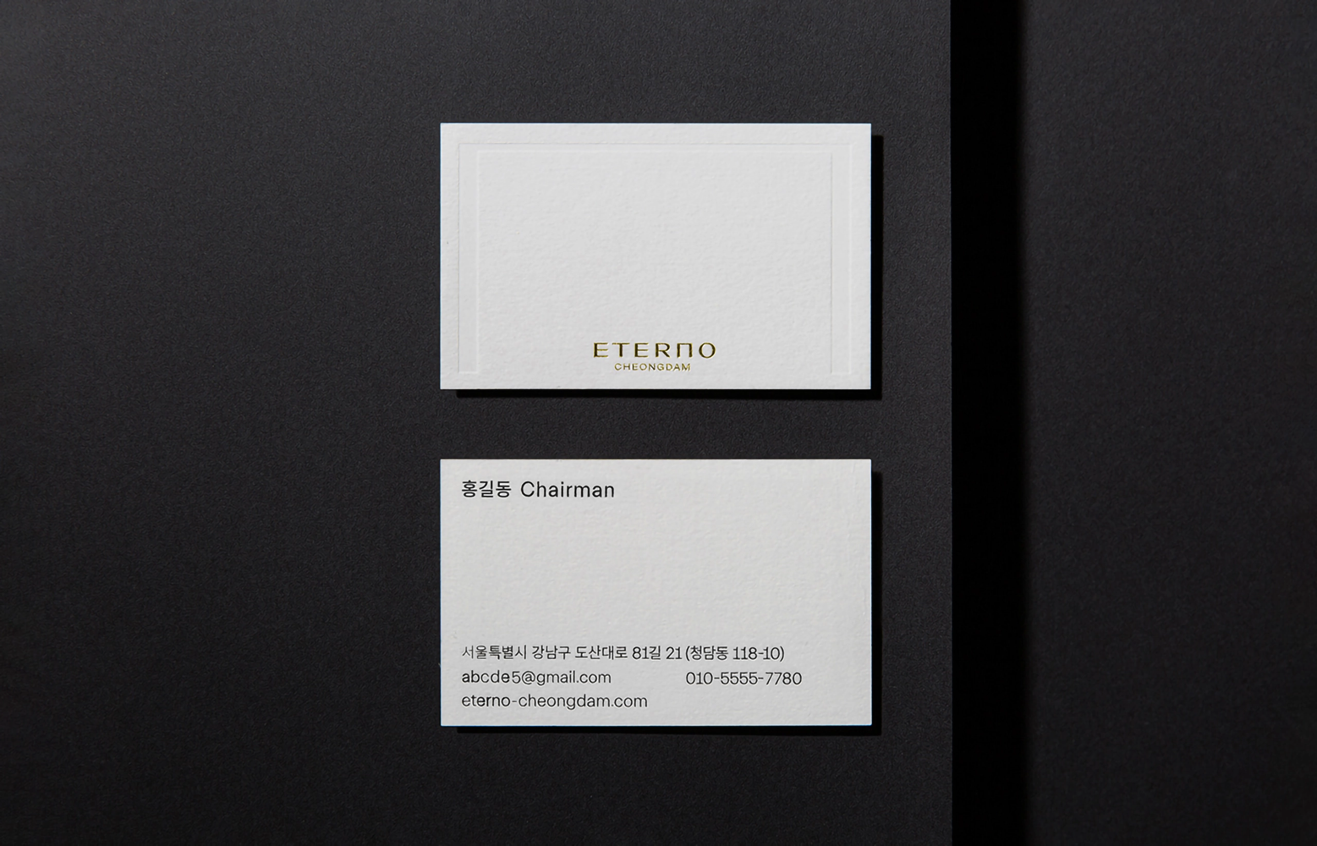
Logotype
ETERNO’s firm and enduring character are expressed in generous and angular letters. We applied the top impression of the building and the frame motif to ‘N’. We wanted to express a relaxed and luxurious look by giving plenty of space.
Signature System
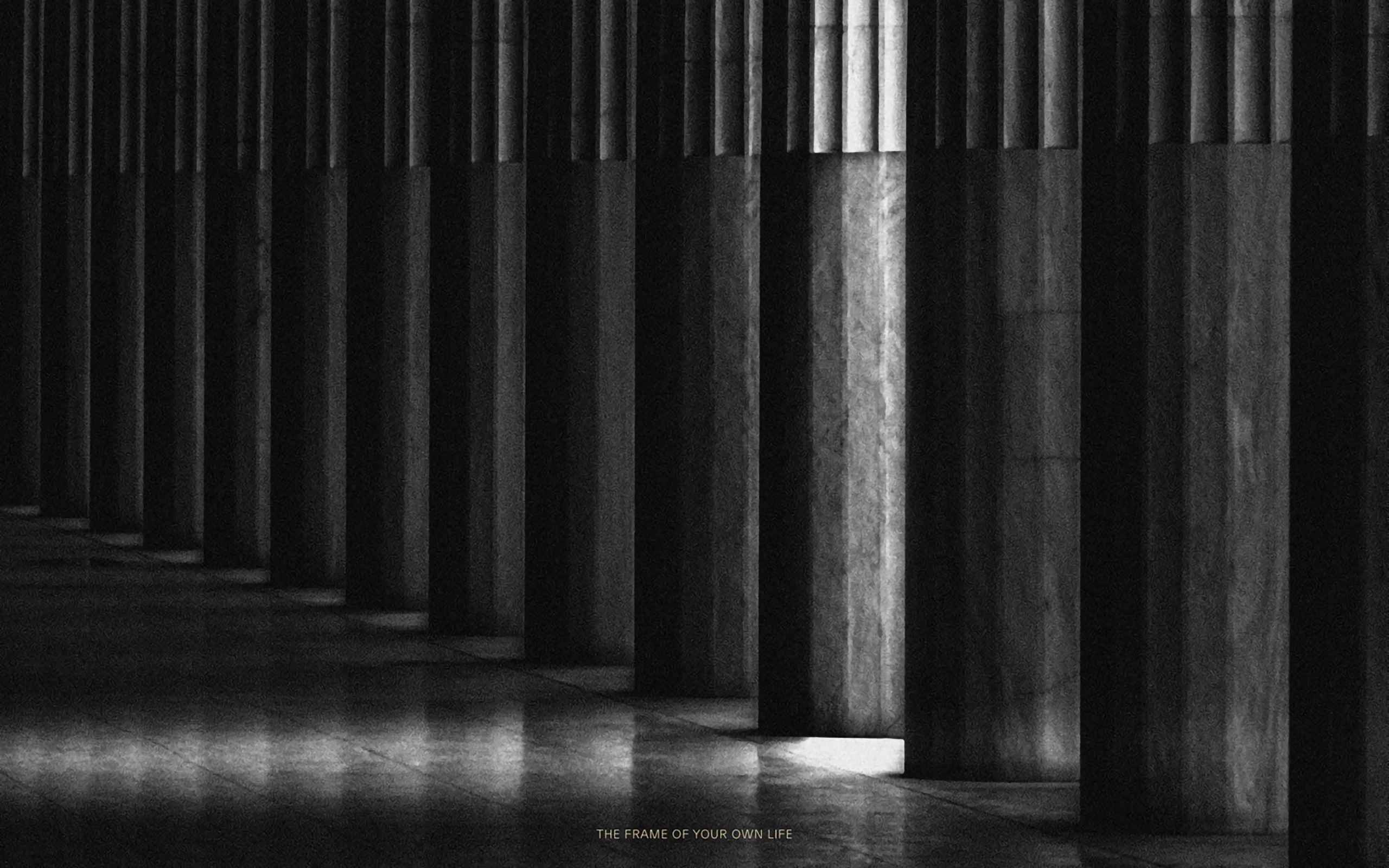
Just like the facade of a building with the golden ratio, the logo system of Eterno was also applied with the golden ratio.
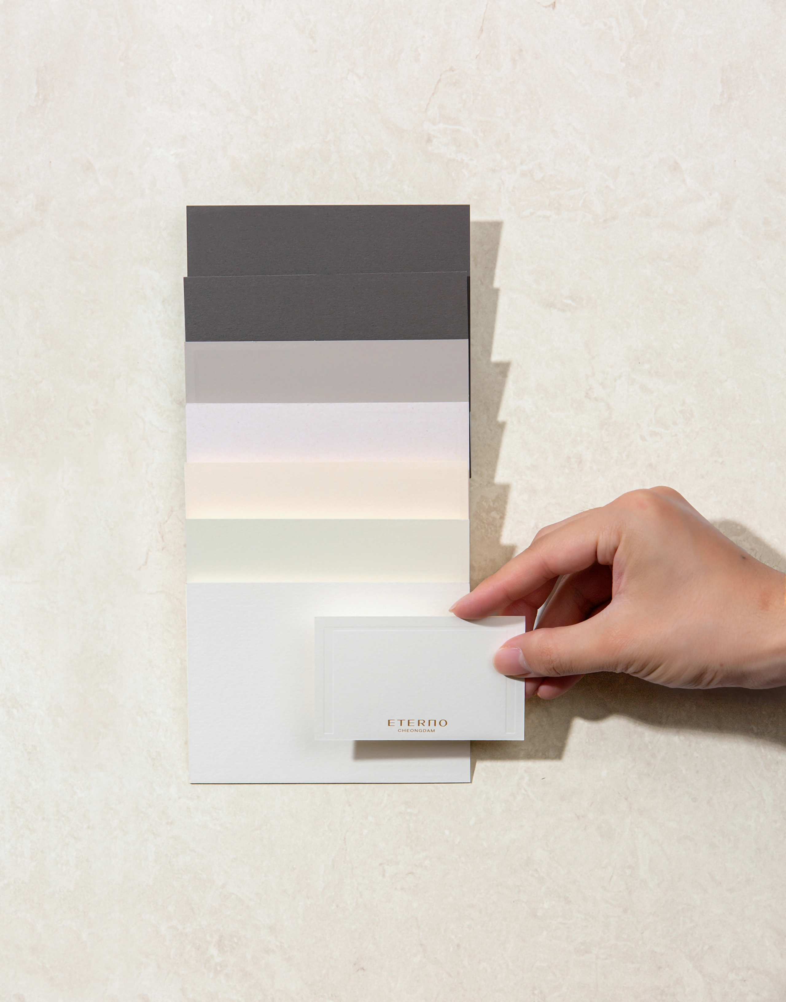
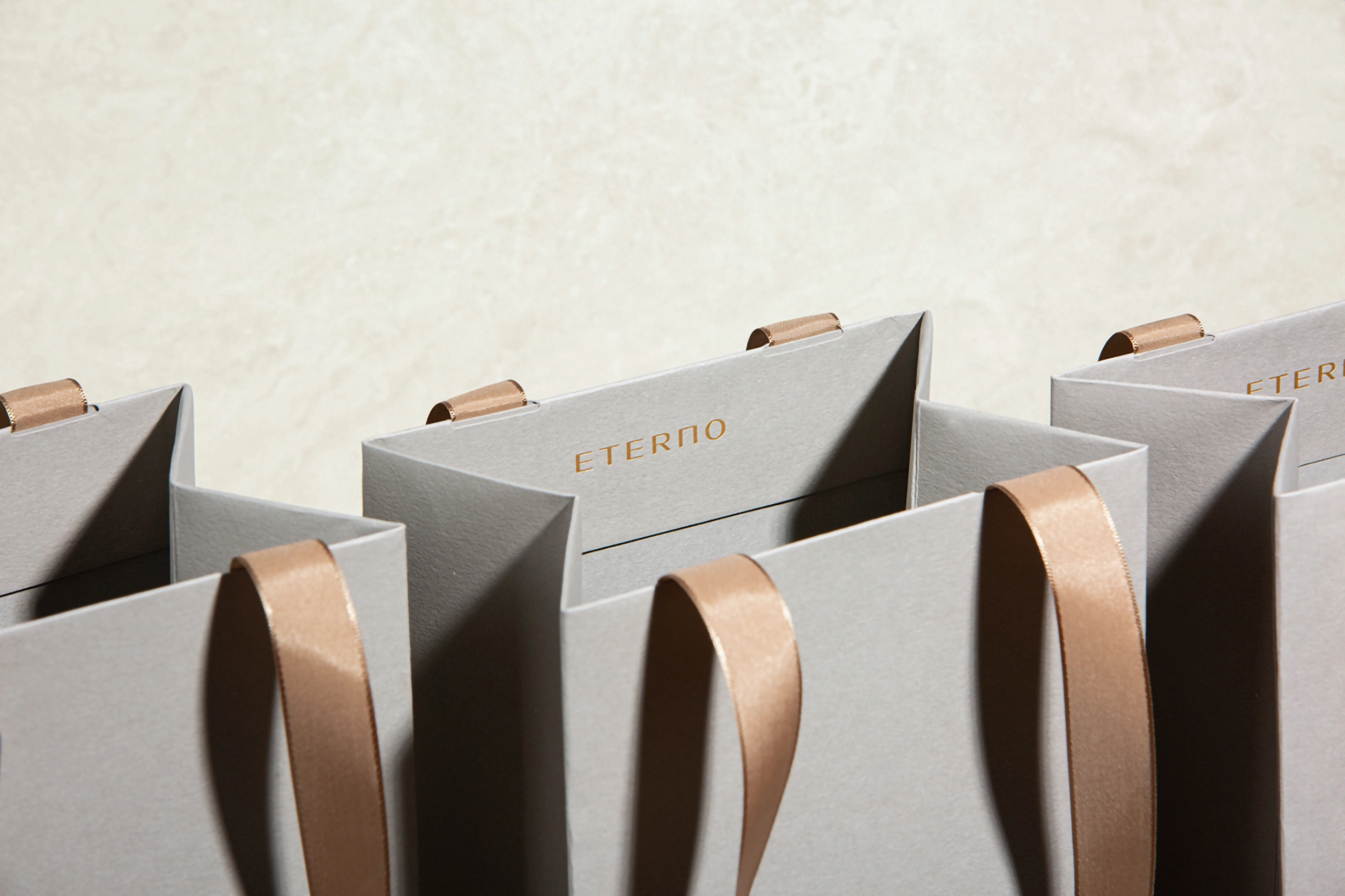
Color & material ・ Finishing
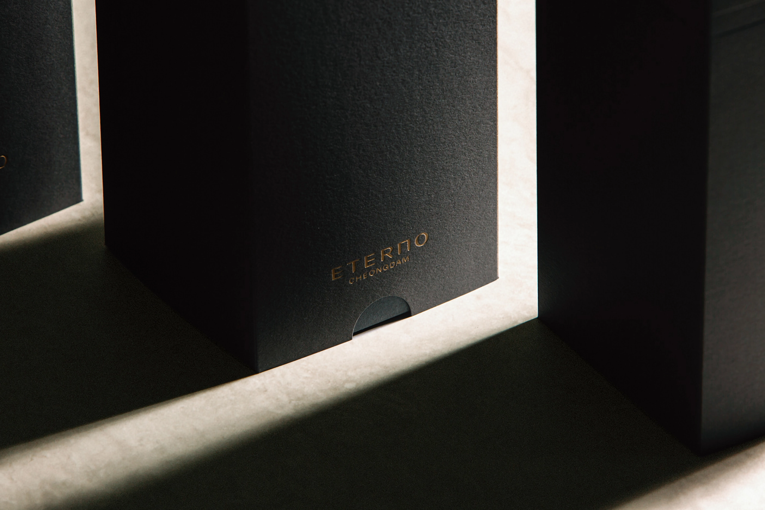
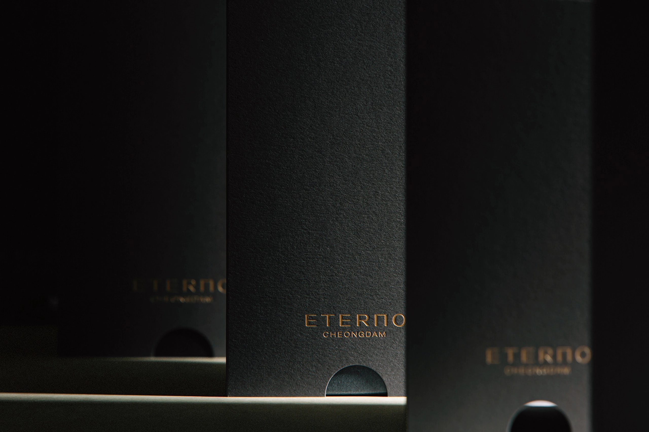
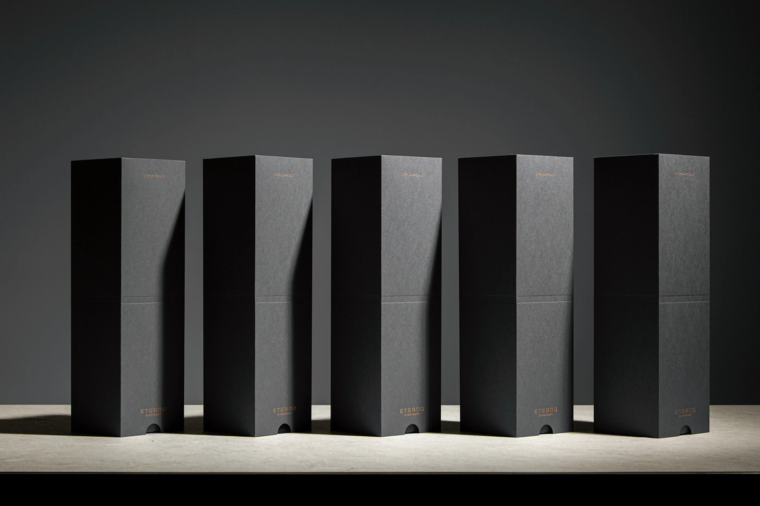
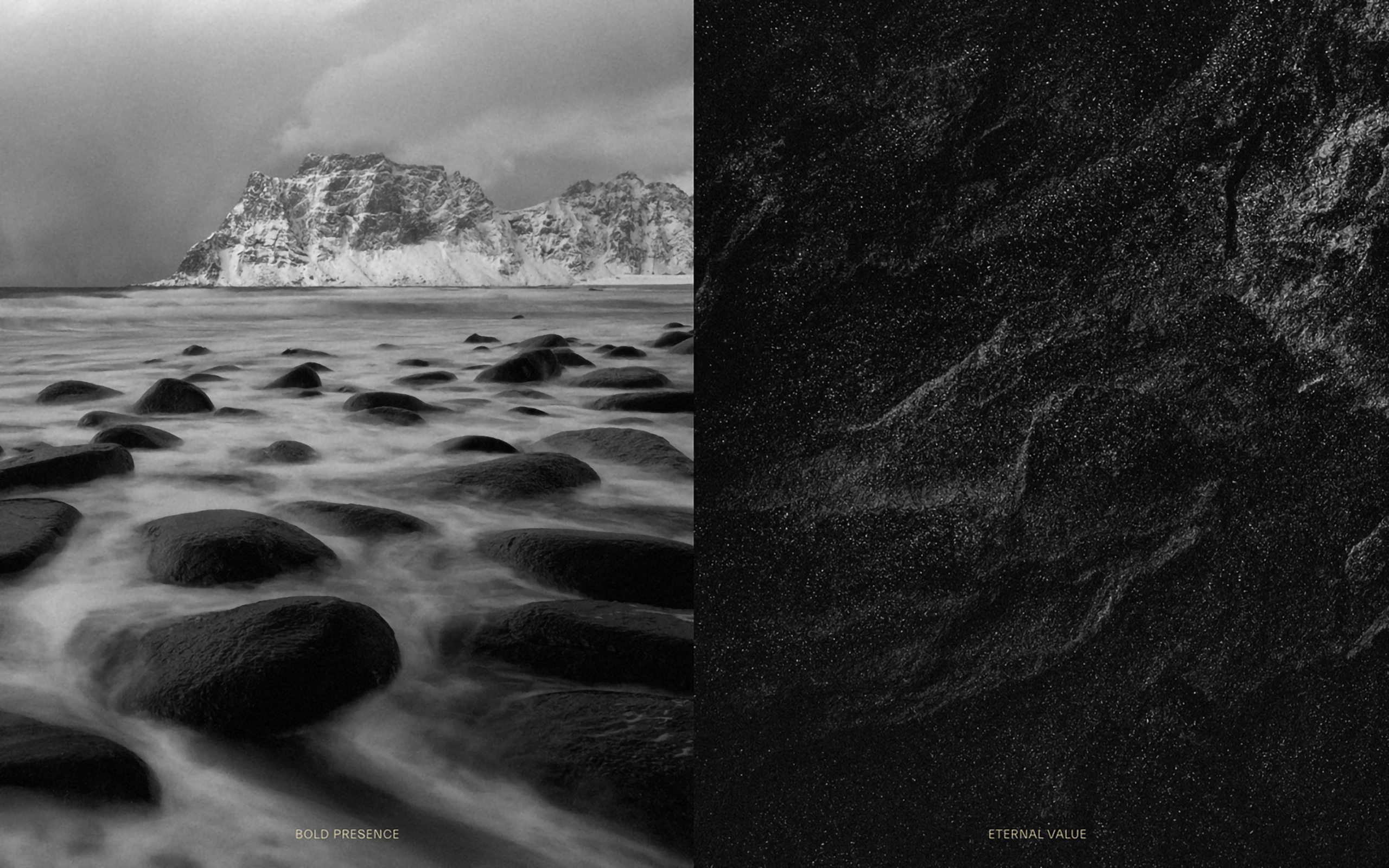
We selected heavy and rough materials as if they were carved in stone that did not change over a long time. To deboss or convey the material’s unique properties, we excluded finishing such as coating on the surface. It uses ETERNO’s representative beauty and eternity, the black symbolizing immutability, and the dark gray color that connects the two in harmony.