Client
GS
Workscope
Editorial. Identity. Logo. Naming. Signage
Manual Graphics
Director – Seongkyun Lee
Design – Seongeun Kim, Hyemin Son
Photography – Hanyeon Lee
Motion – Eunjung Kim
Space Design – GLAD
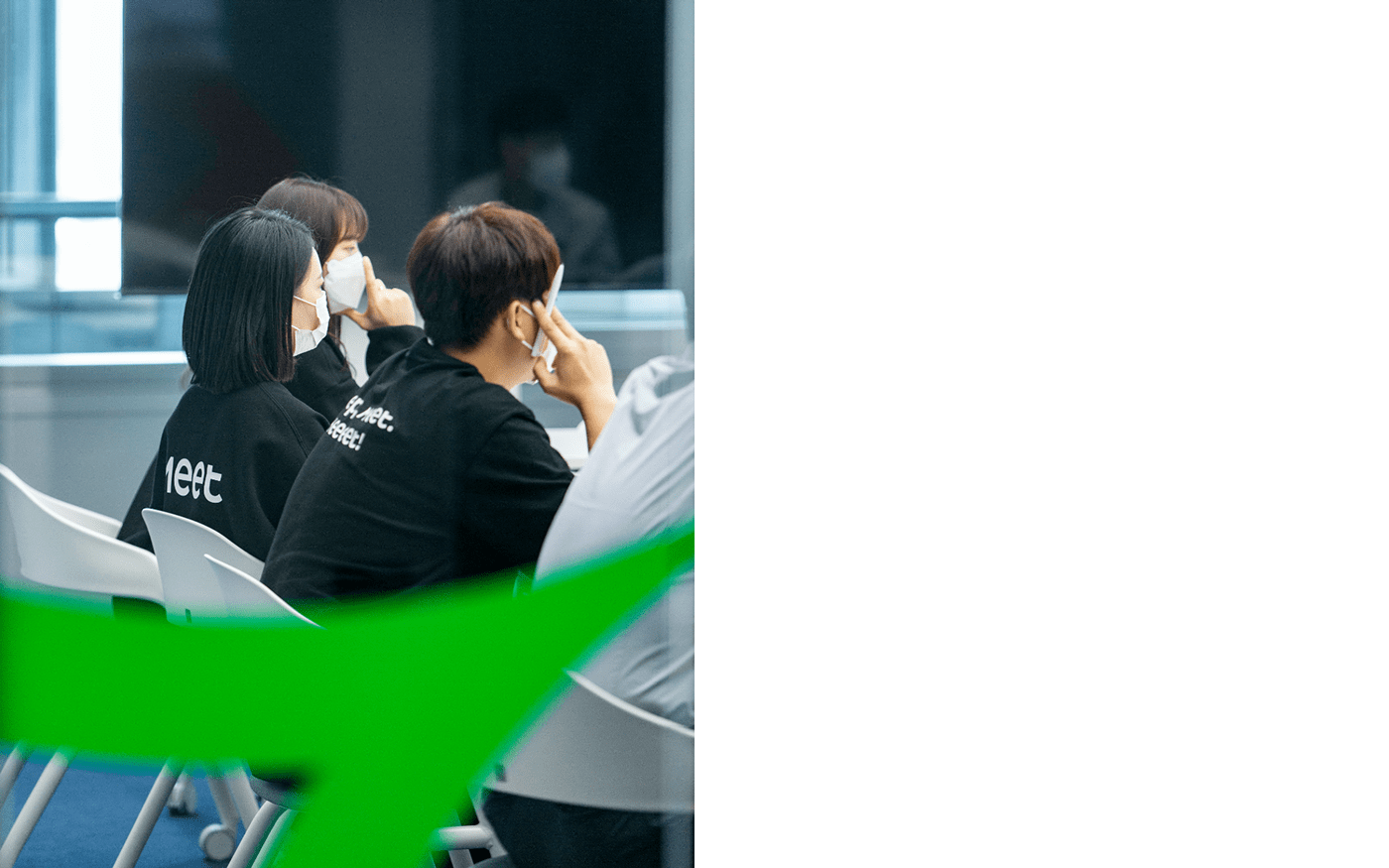
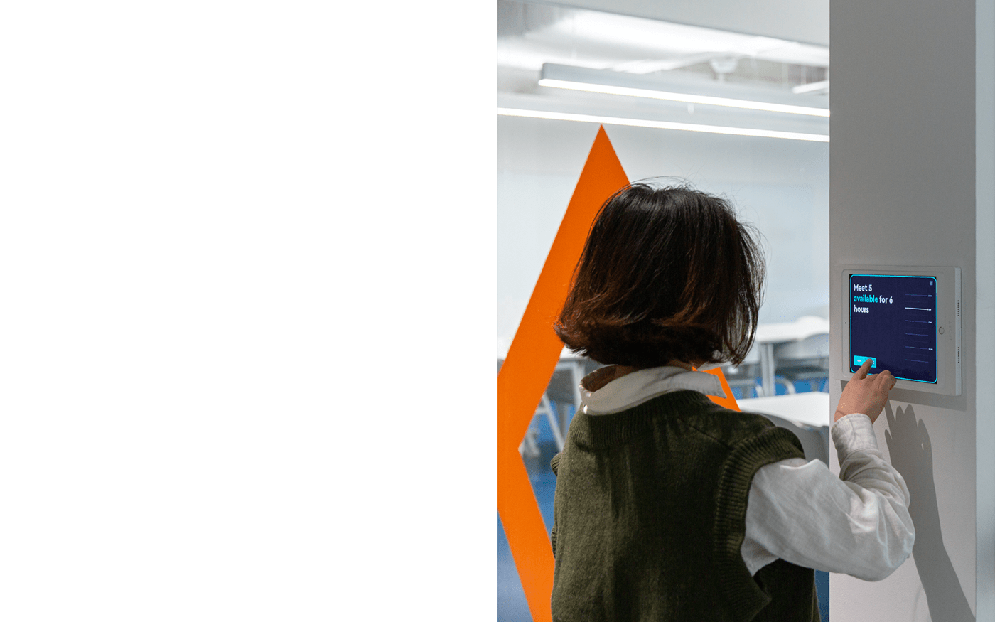
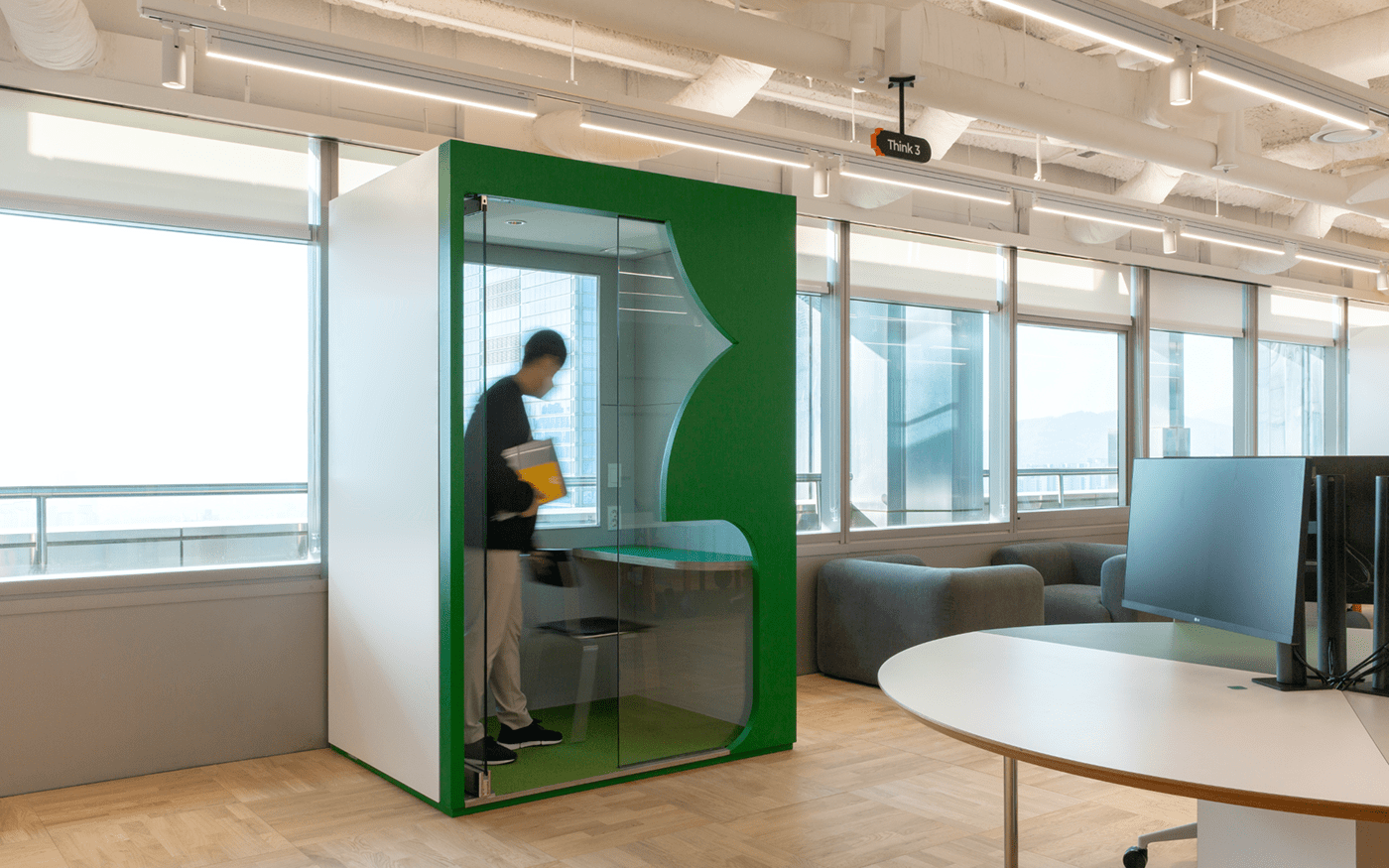
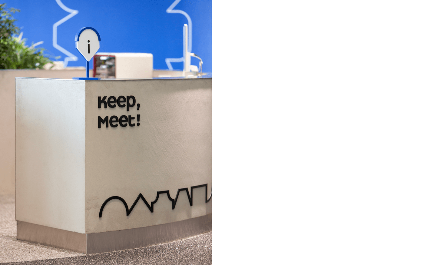
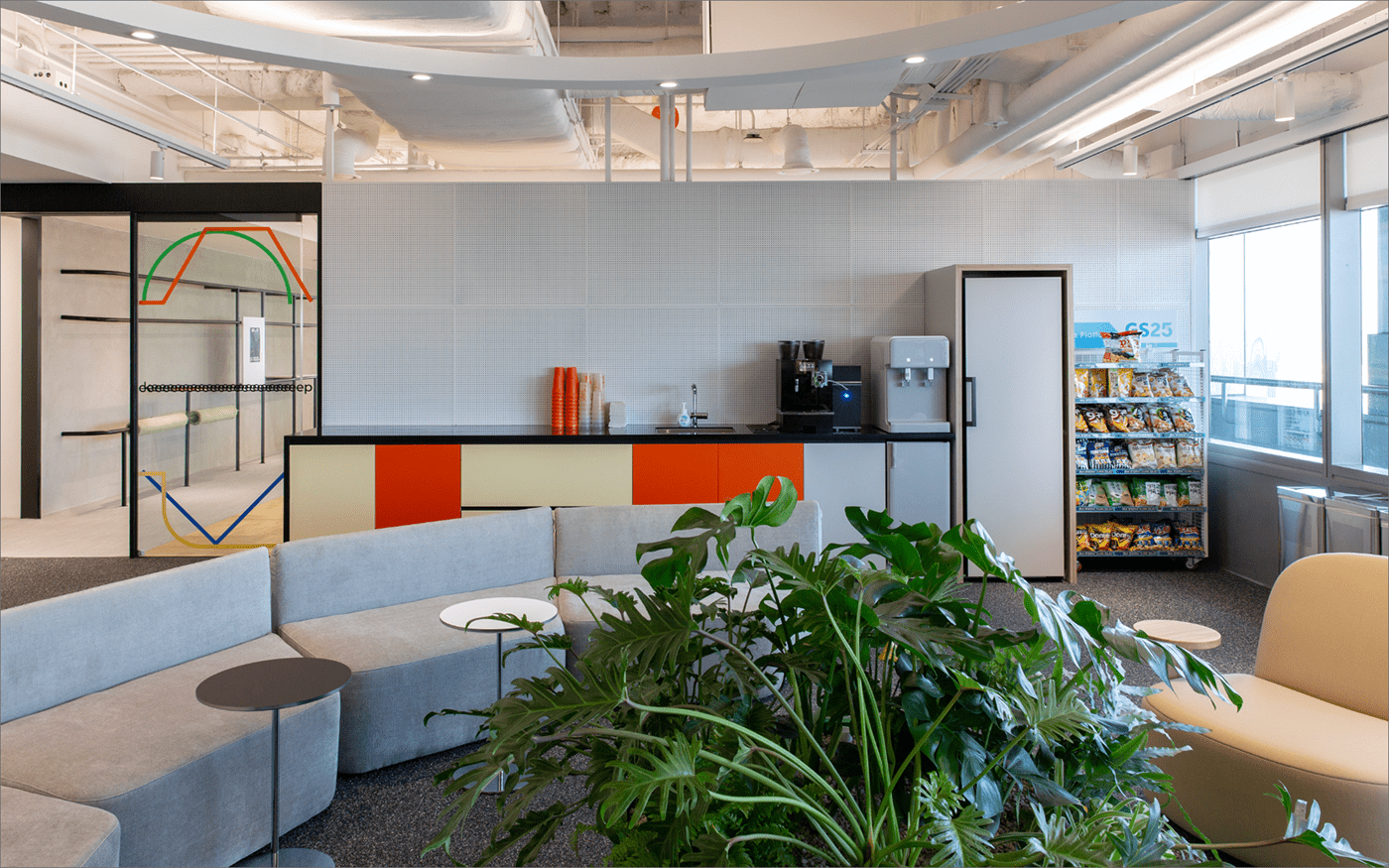
Keeeet is a collaboration space located on the 25th floor of GS Tower. It helps working smoothly together between inside members also outside personnel. It breaks away from the usual way of collaboration which is separated and vertical. It aims horizontal and complementary collaboration culture. We visualized flexible working culture and the positive energy people exchanged each other in Keeeet and applied it to brand identity.
킫은 GS타워 25층에 위치한 협업 공간입니다. 기존의 수직적이고 분업화 되어있던 협업에서 벗어나, 수평적이고 상호보완적인 협업 문화를 지향합니다. 킫에서 일어나는 유연하고 즐거운 협업의 성격과 상호간 주고받는 긍정적인 에너지를 시각화하여 브랜드 아이덴티티에 적용했습니다.
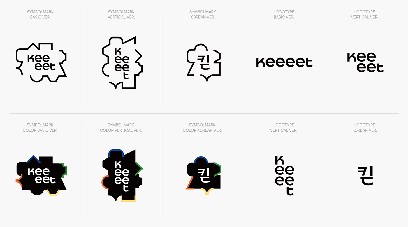
Logotype & Symbolmark
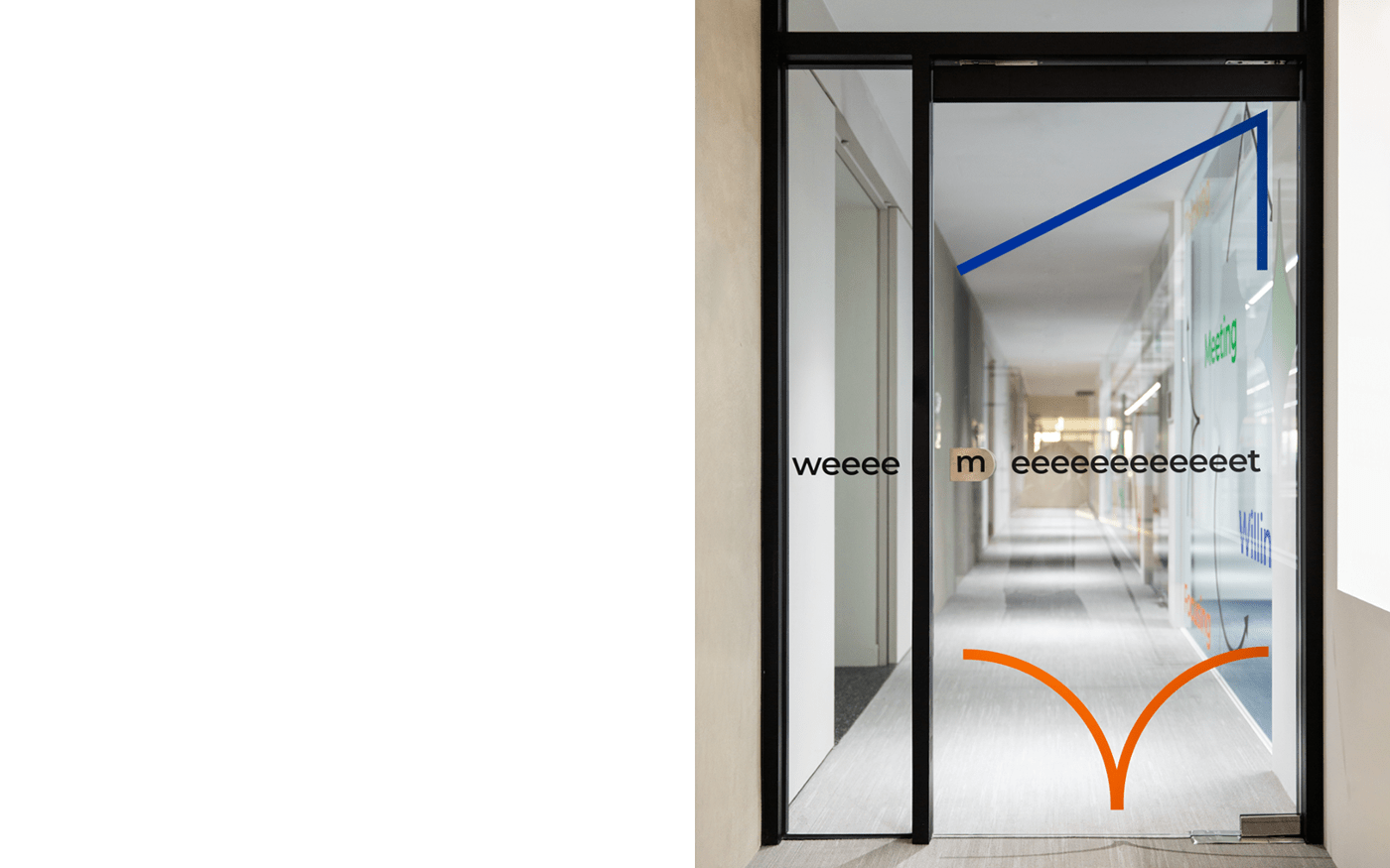
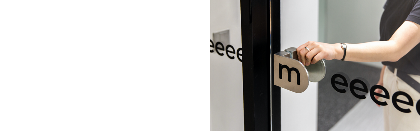
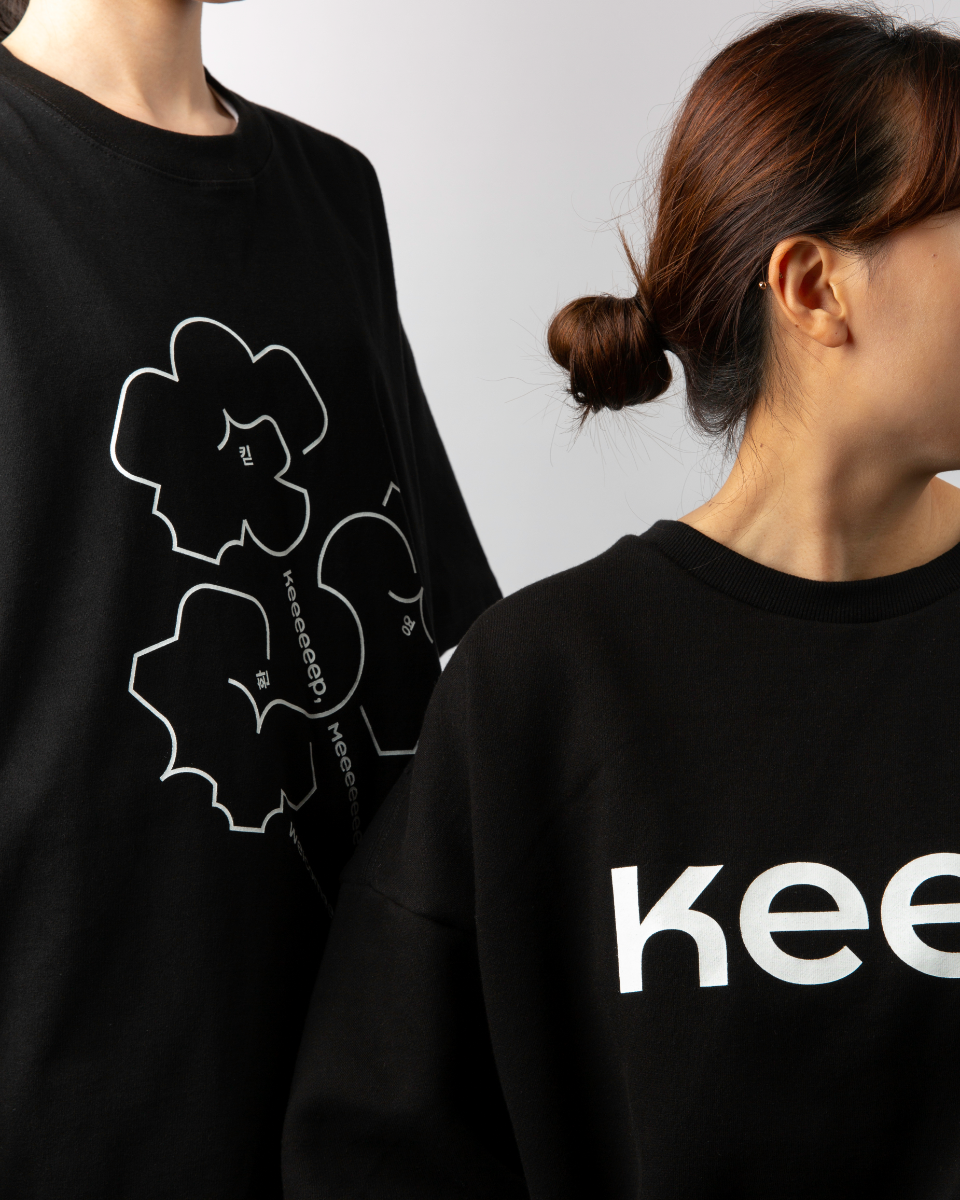
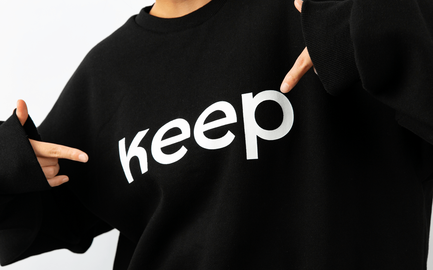
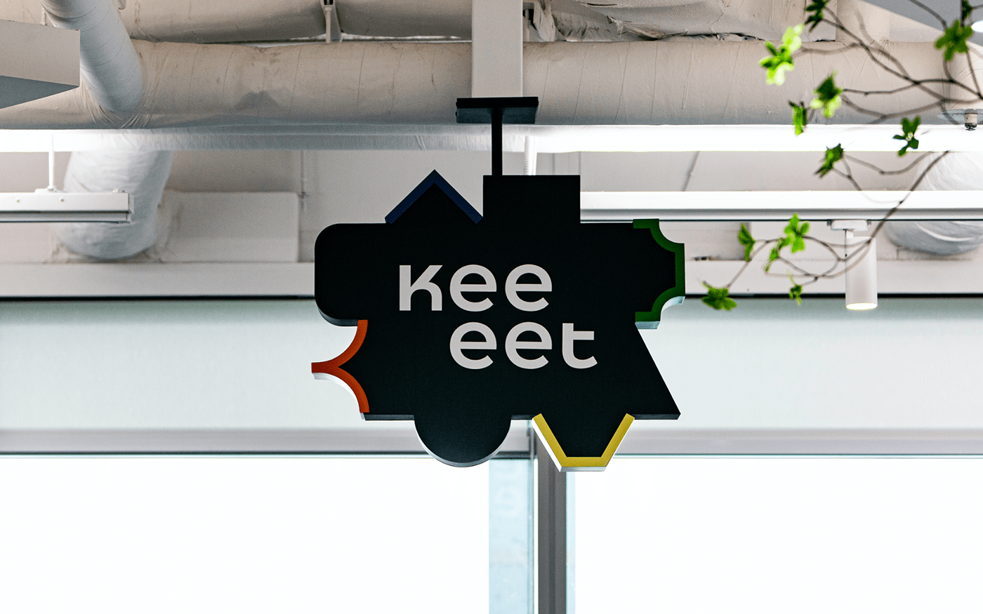
We develop a logotype expresses working together with close communication by morphological feature of ‘keeeet’ has 4 ‘e’ and decreasing the space between letters. The symbolmark created by combining various types of Keeeet cap means variety process of collaboration made by meeting of difference work methods, abilities and diversity of opinions.
Naming & Slogan
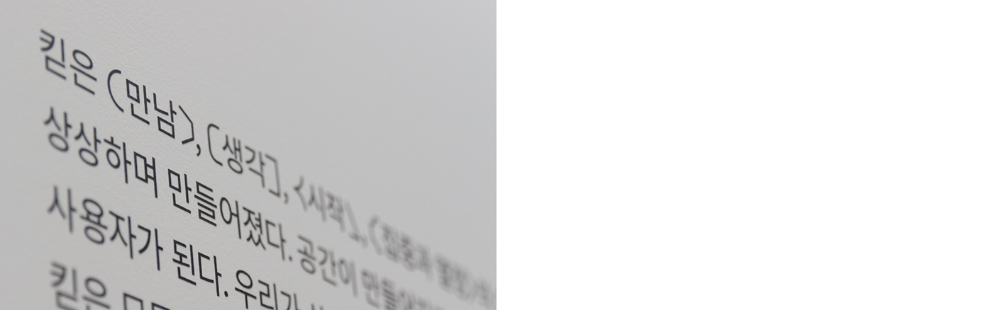
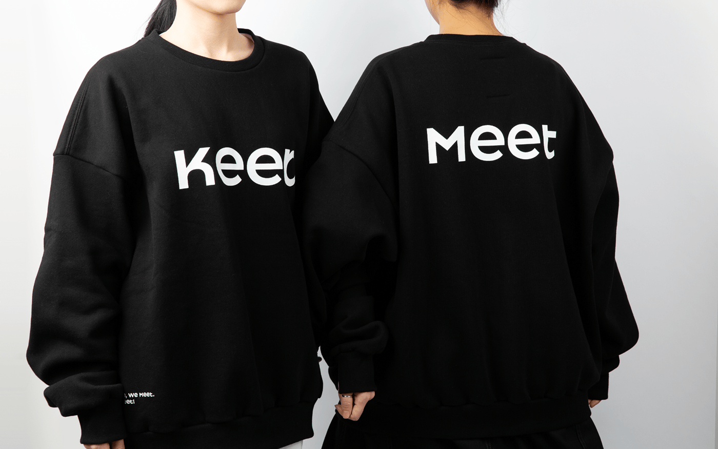
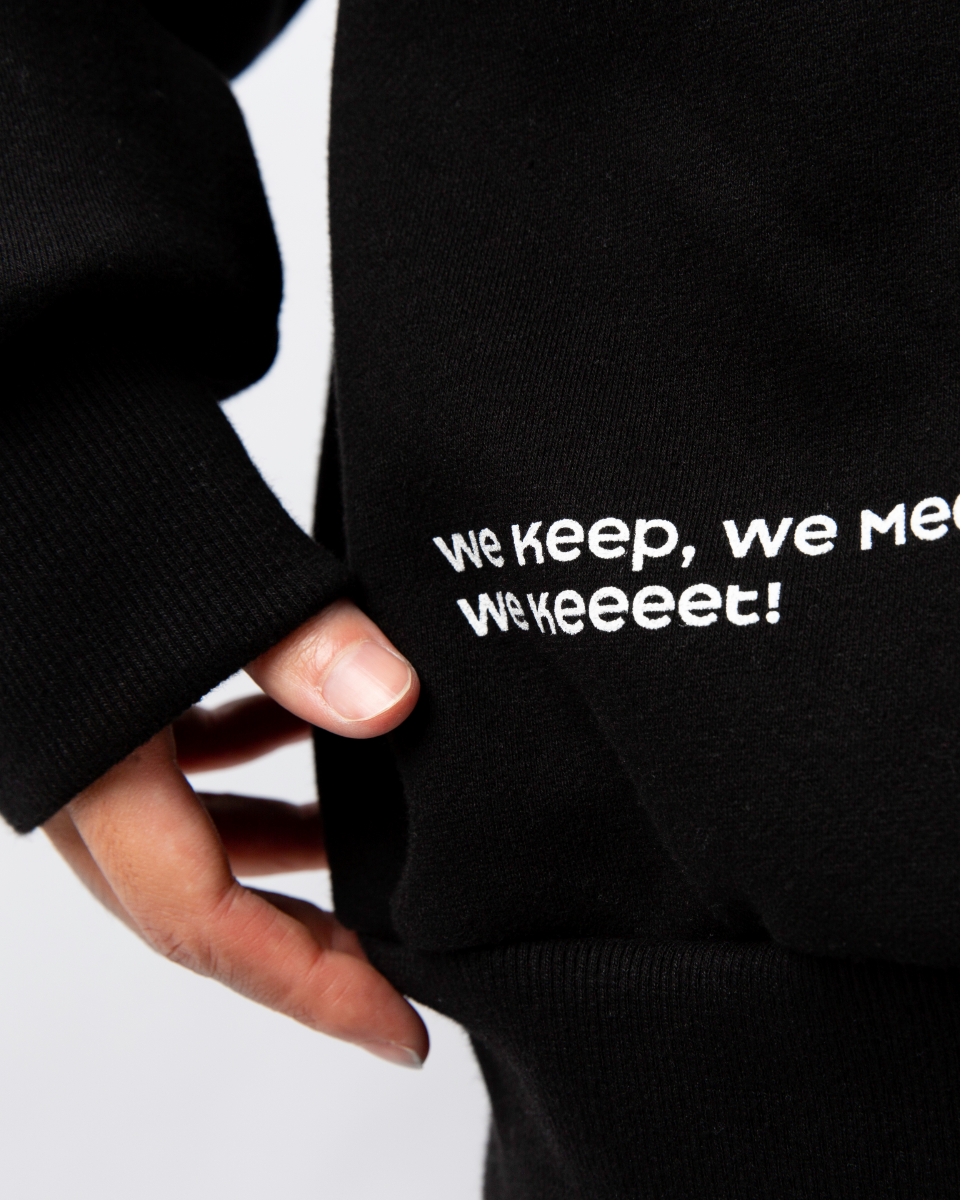
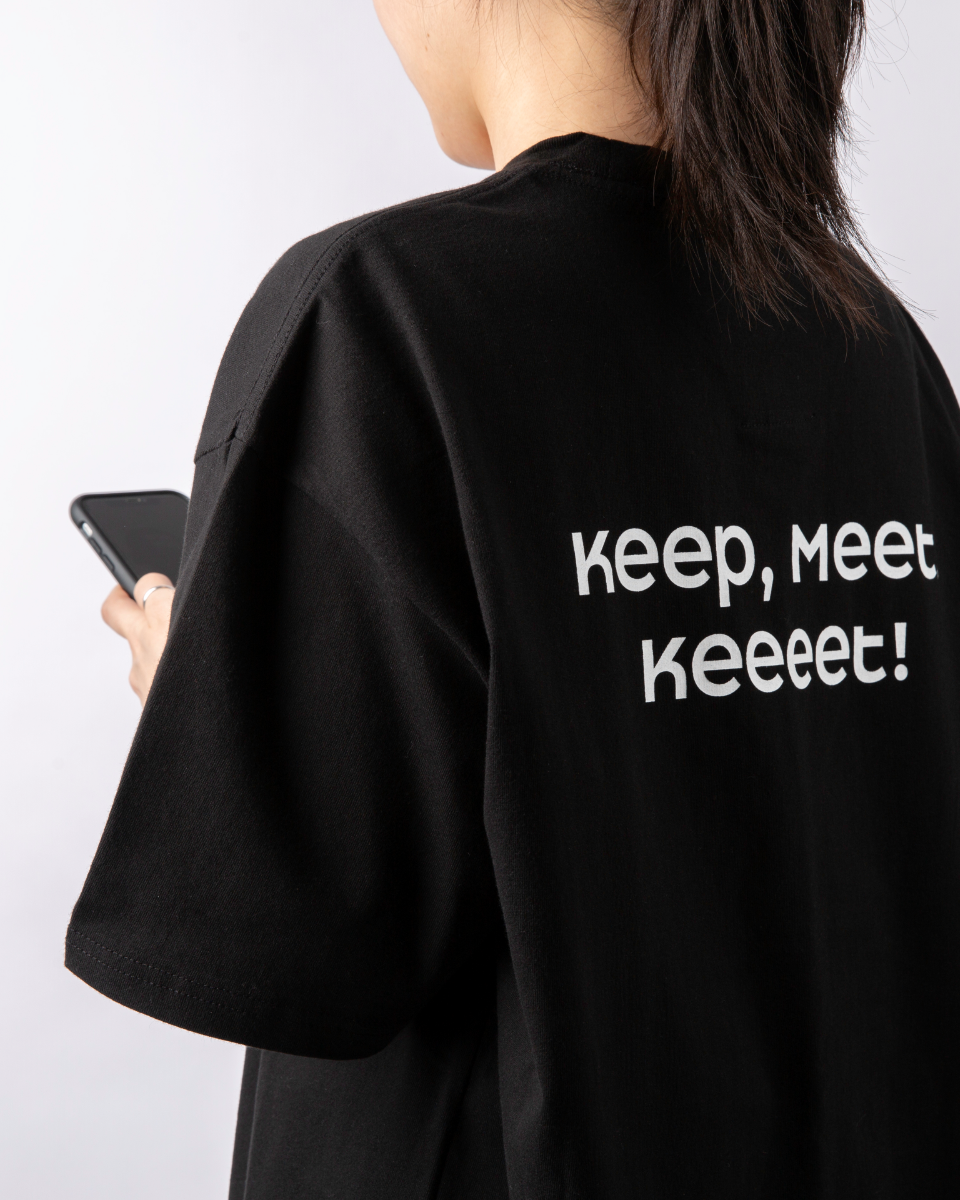
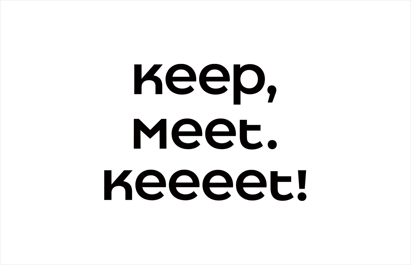
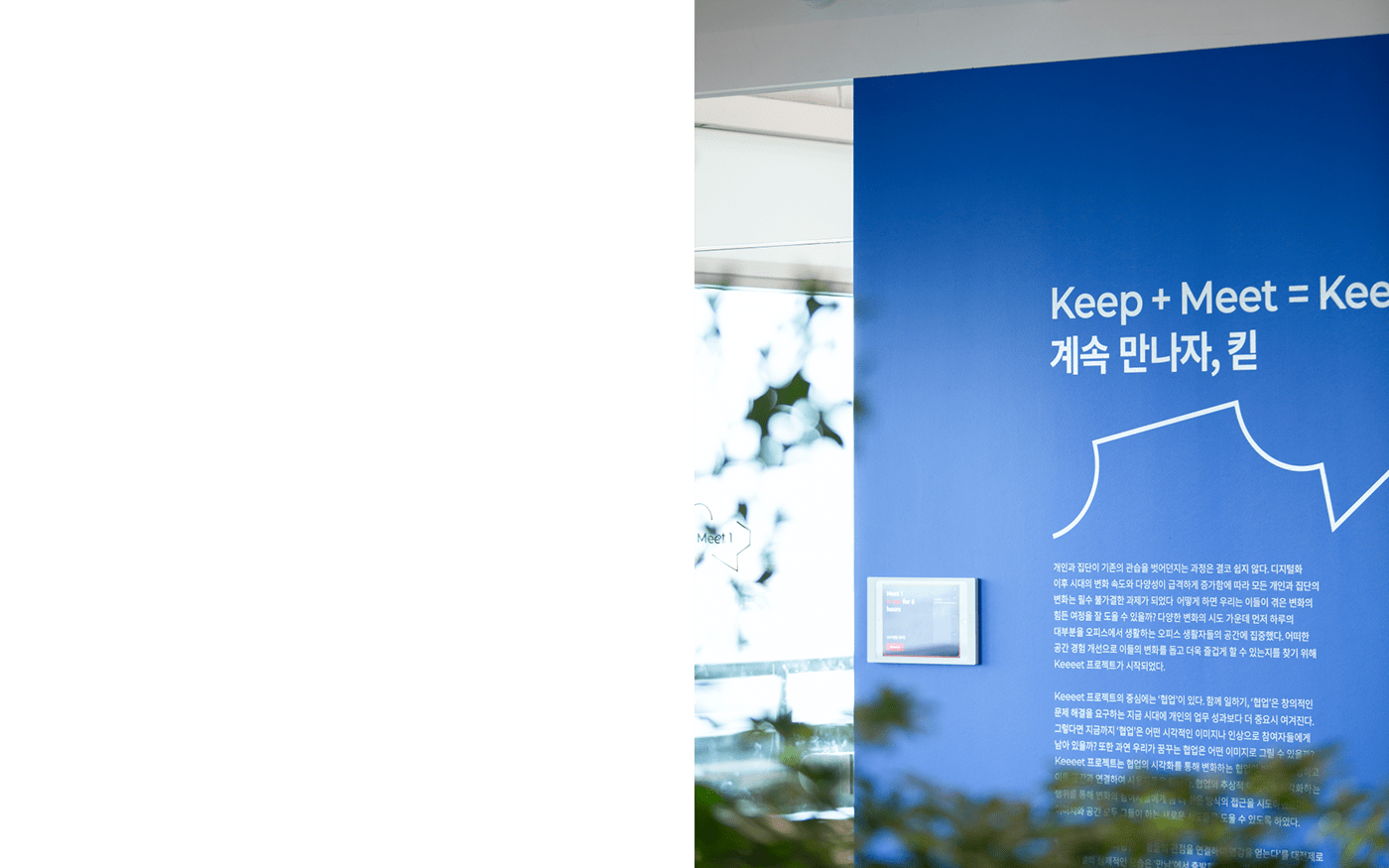
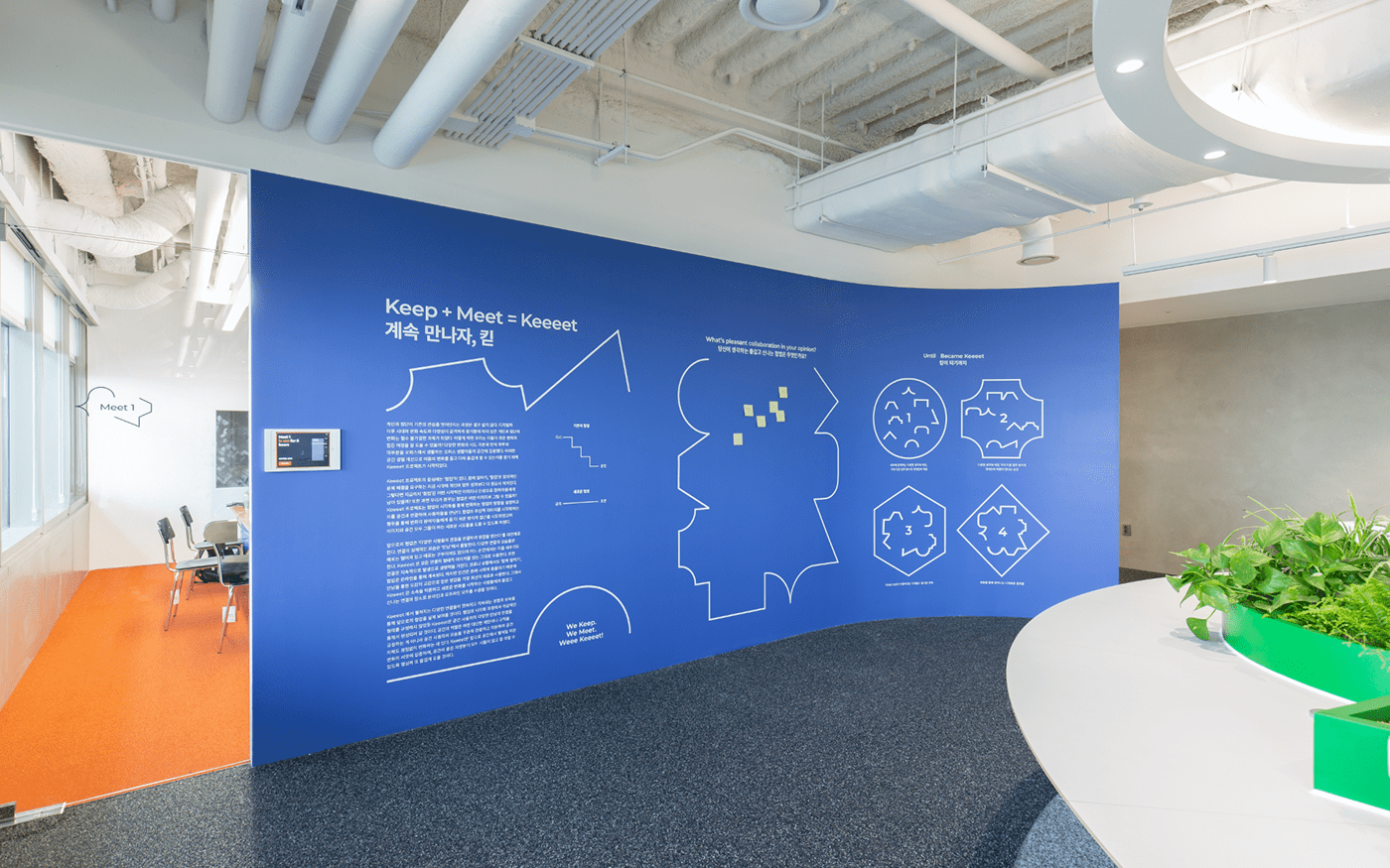
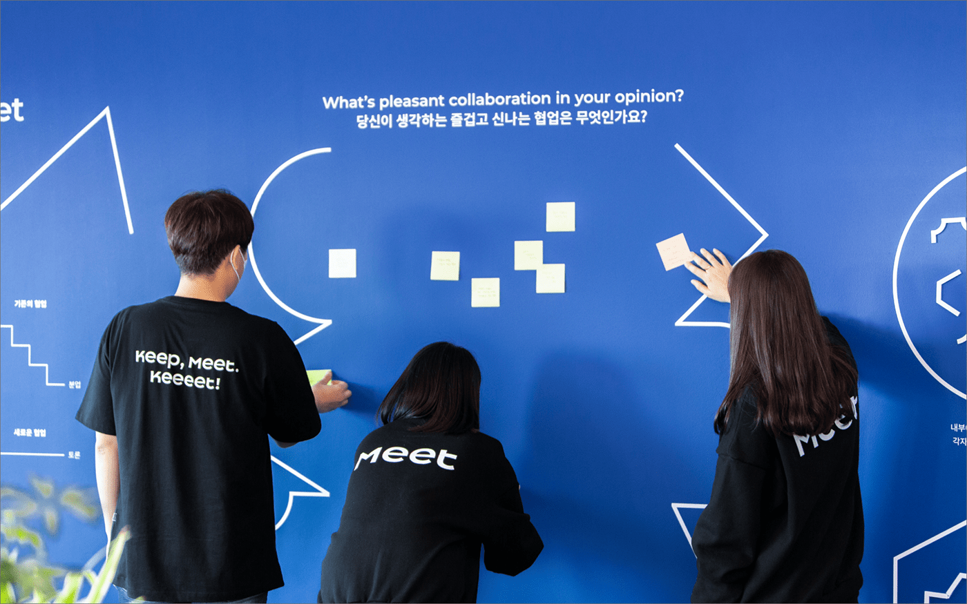
Keeeet is a compound word of ‘Keep’ and ‘Meet’. This means ‘continued meeting’, which is the core of collaboration. We named it with a pleasant perspective to suit the space wanted to be a fun and exciting place for people starting new changes. The shape of repeated ‘e’ represents gathering and the positive energy generated from that. And we also made an Intuitive slogan ‘Keep, Meet. Keeeet!’ to make up for the name could be a little unfamiliar. And it helps people to understand what’s Keeeet
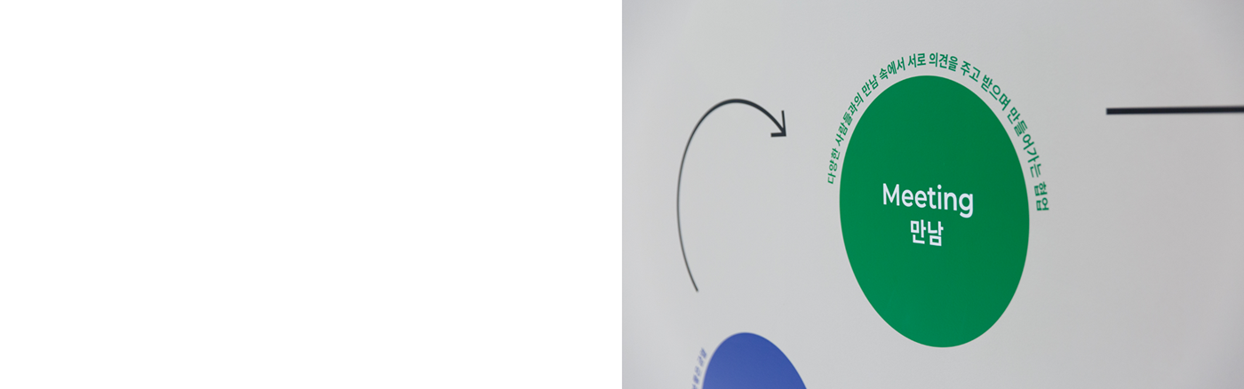
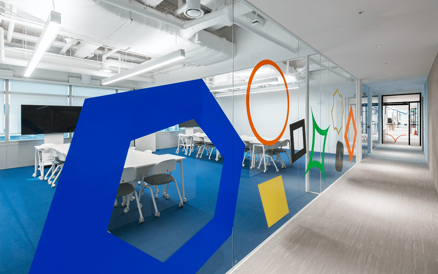
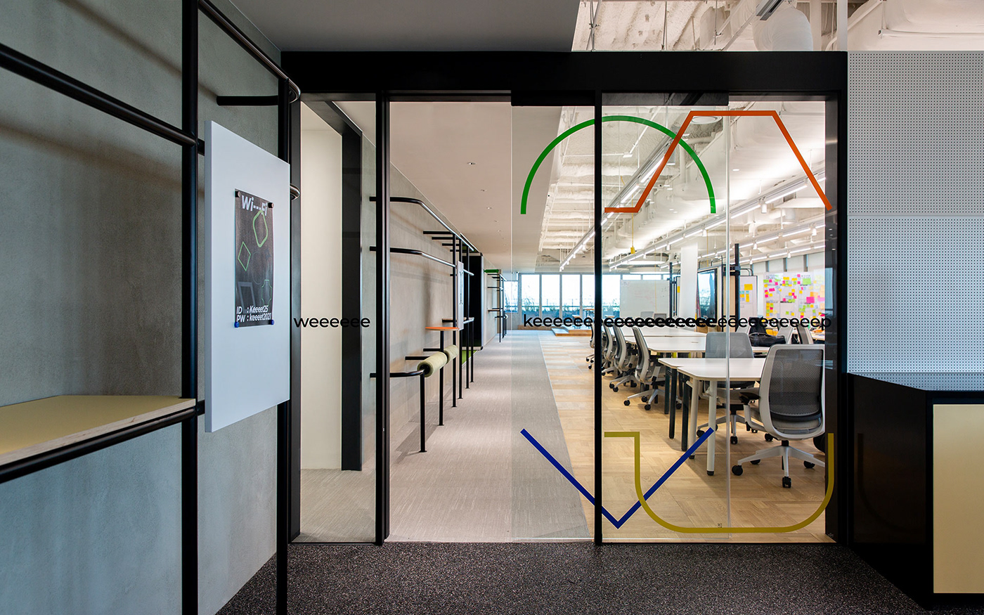
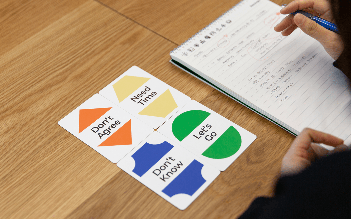
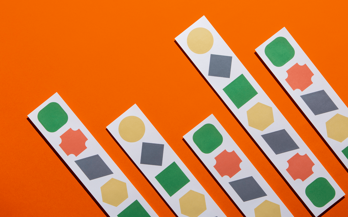
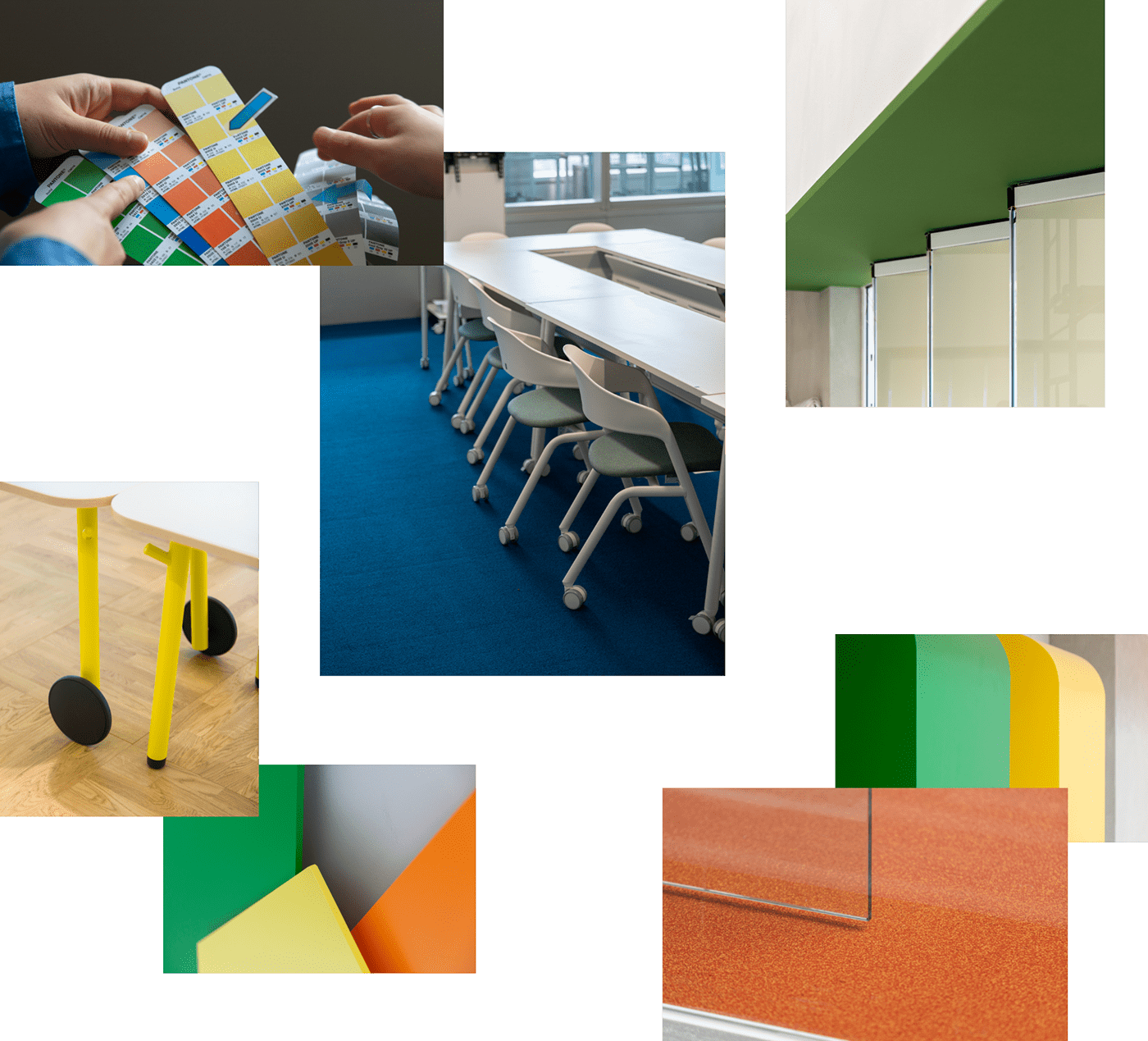
Color
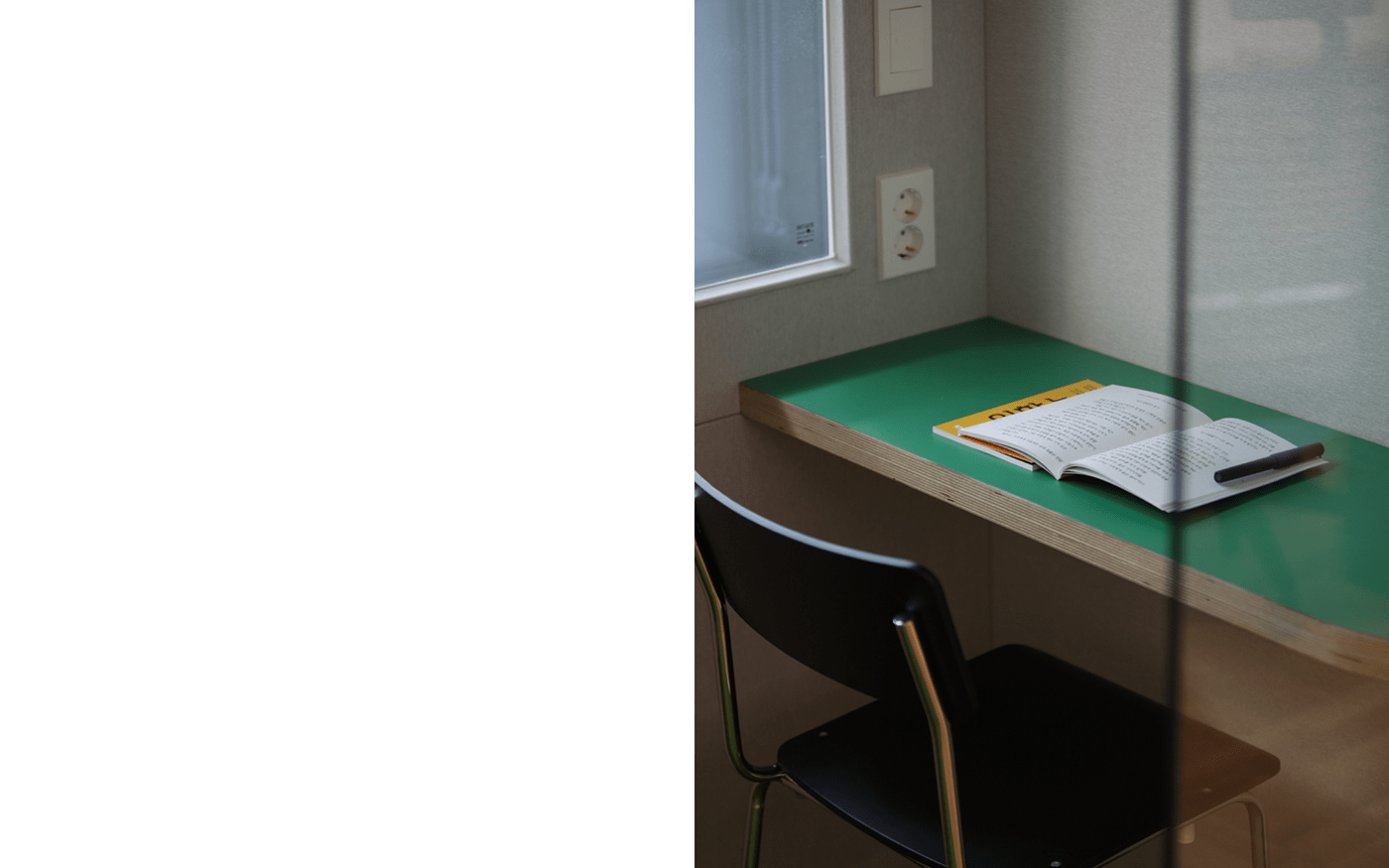
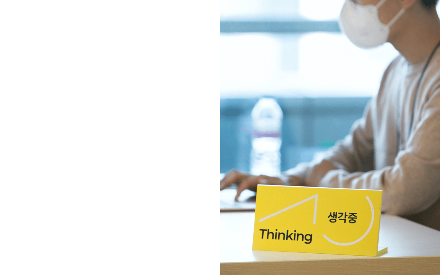
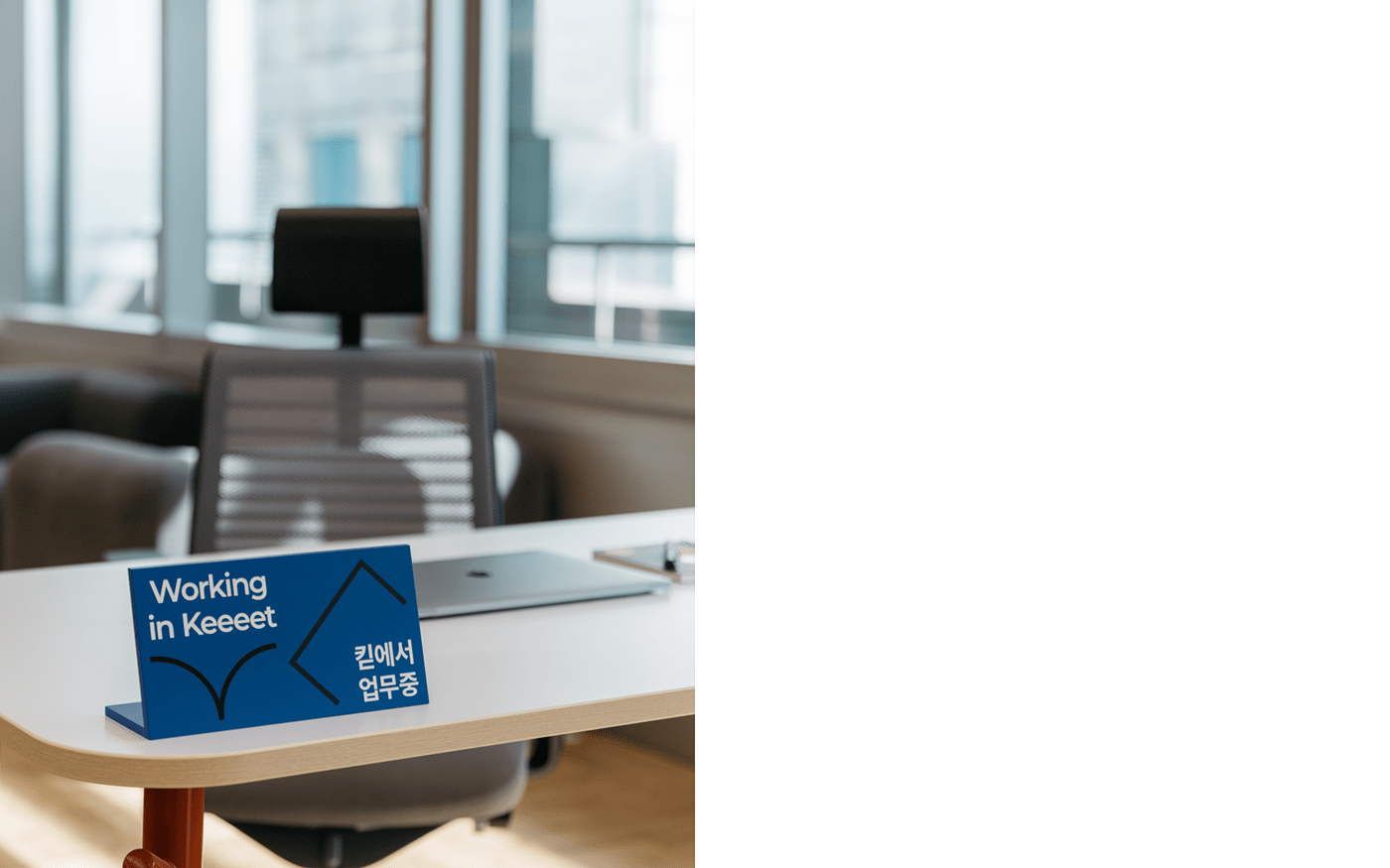
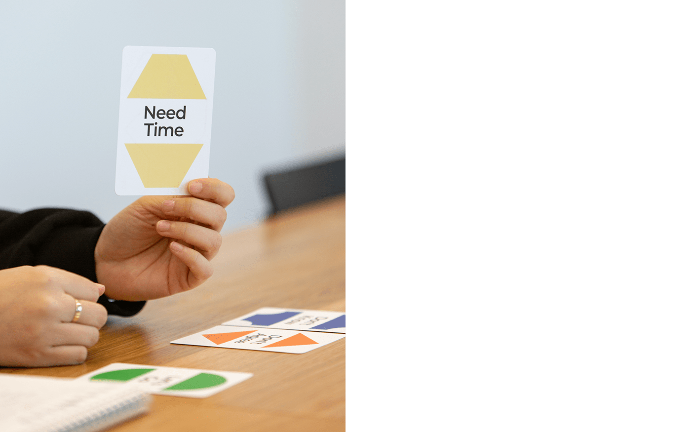
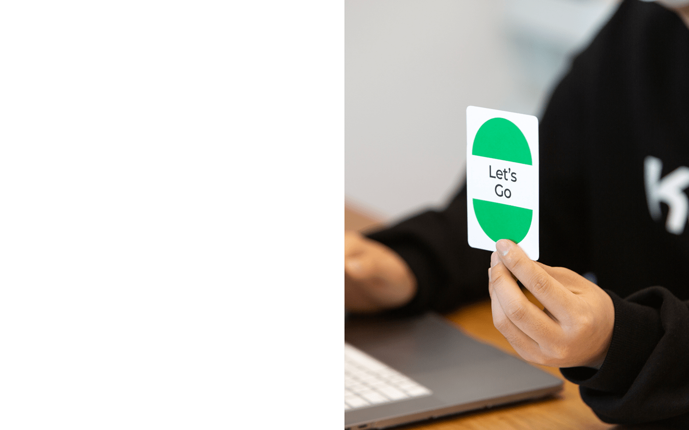
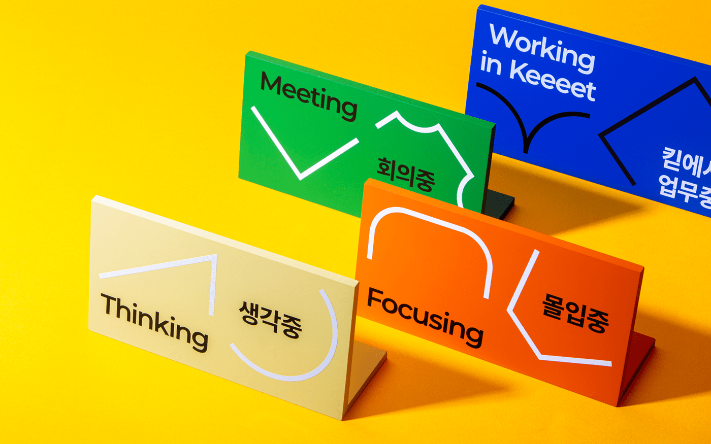
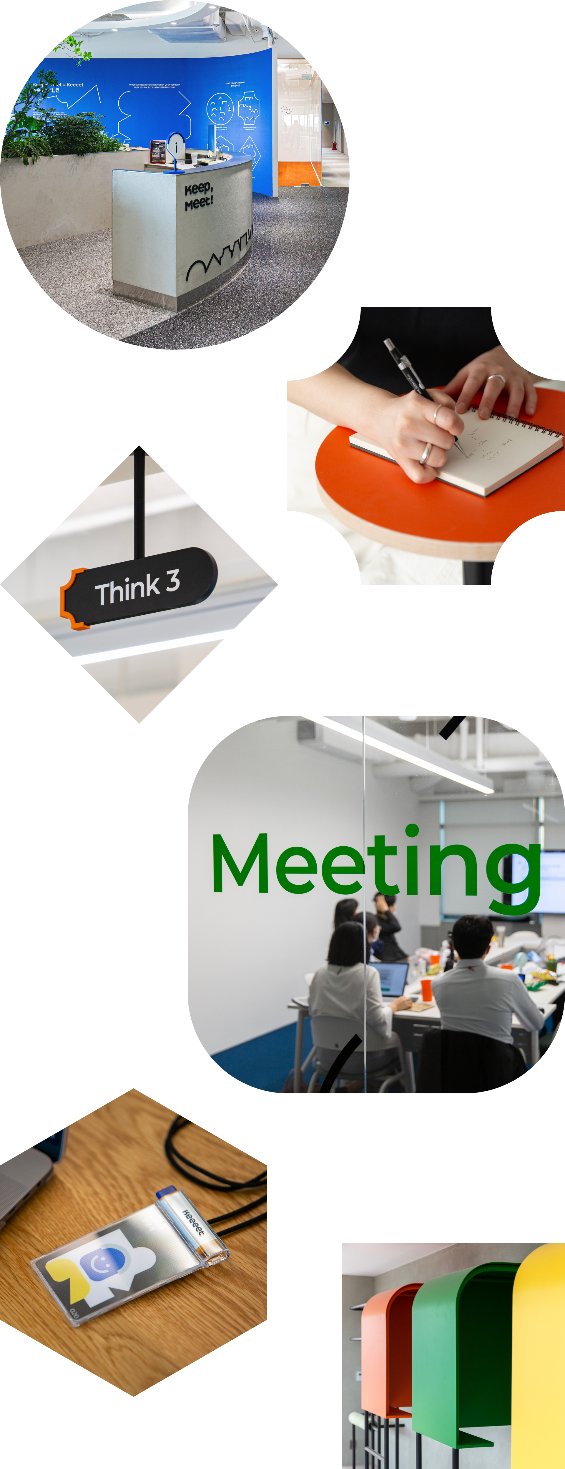
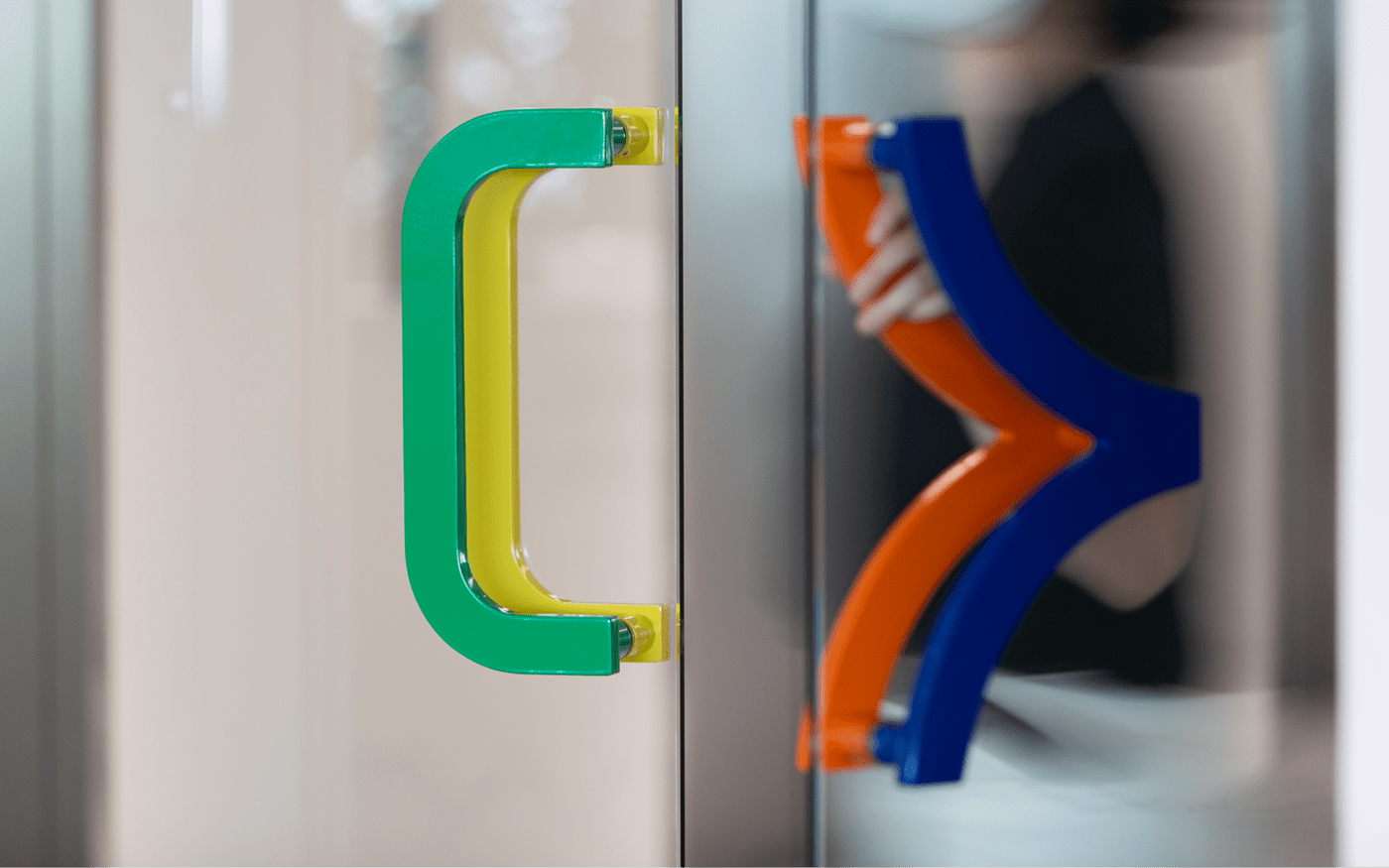
We classified the activities that happen in Keeeet and accordingly defined the colors. We use blue symbolizes a pleasant crack that breaks the framework of existing collaboration, green symbolizes meeting between various people. orange symbolizes the passion and concentration and yellow symbolizes the time to think for work as point color. And black and white symbolize embracing every activity and people there for main color. These 4 point colors naturally appear in the space and encourage their new tries
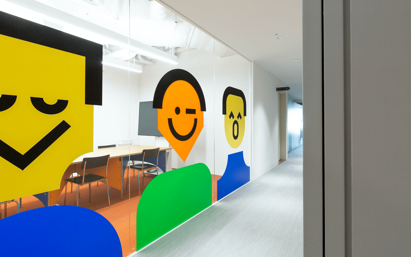
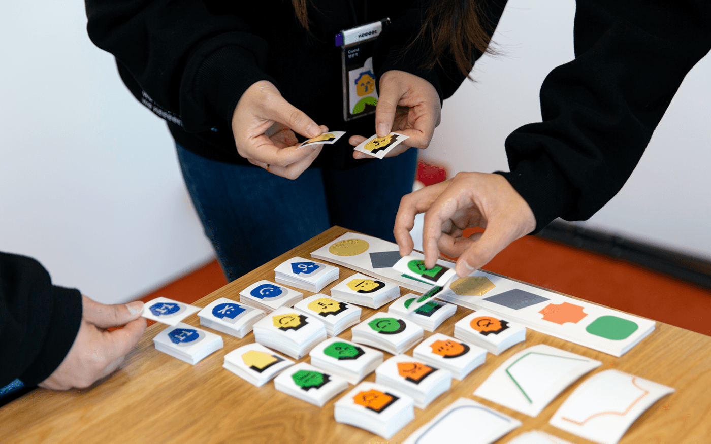
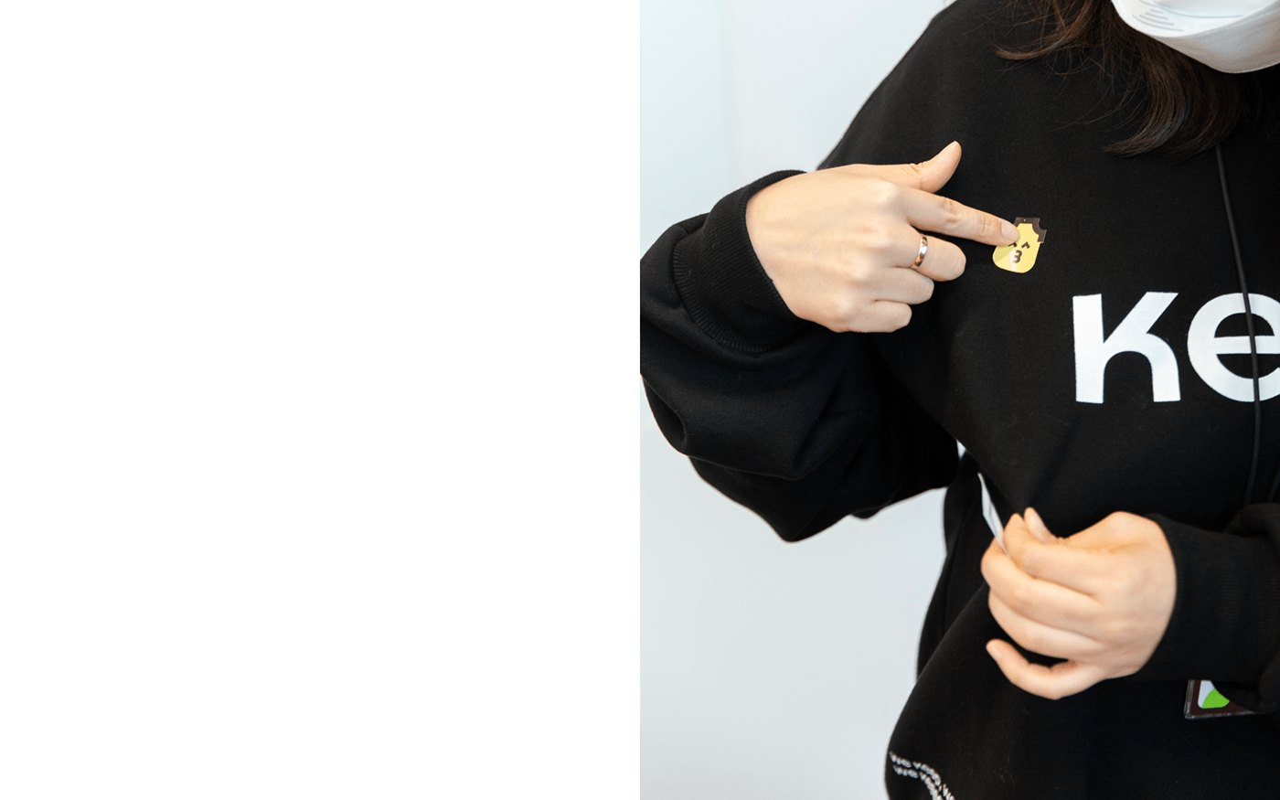
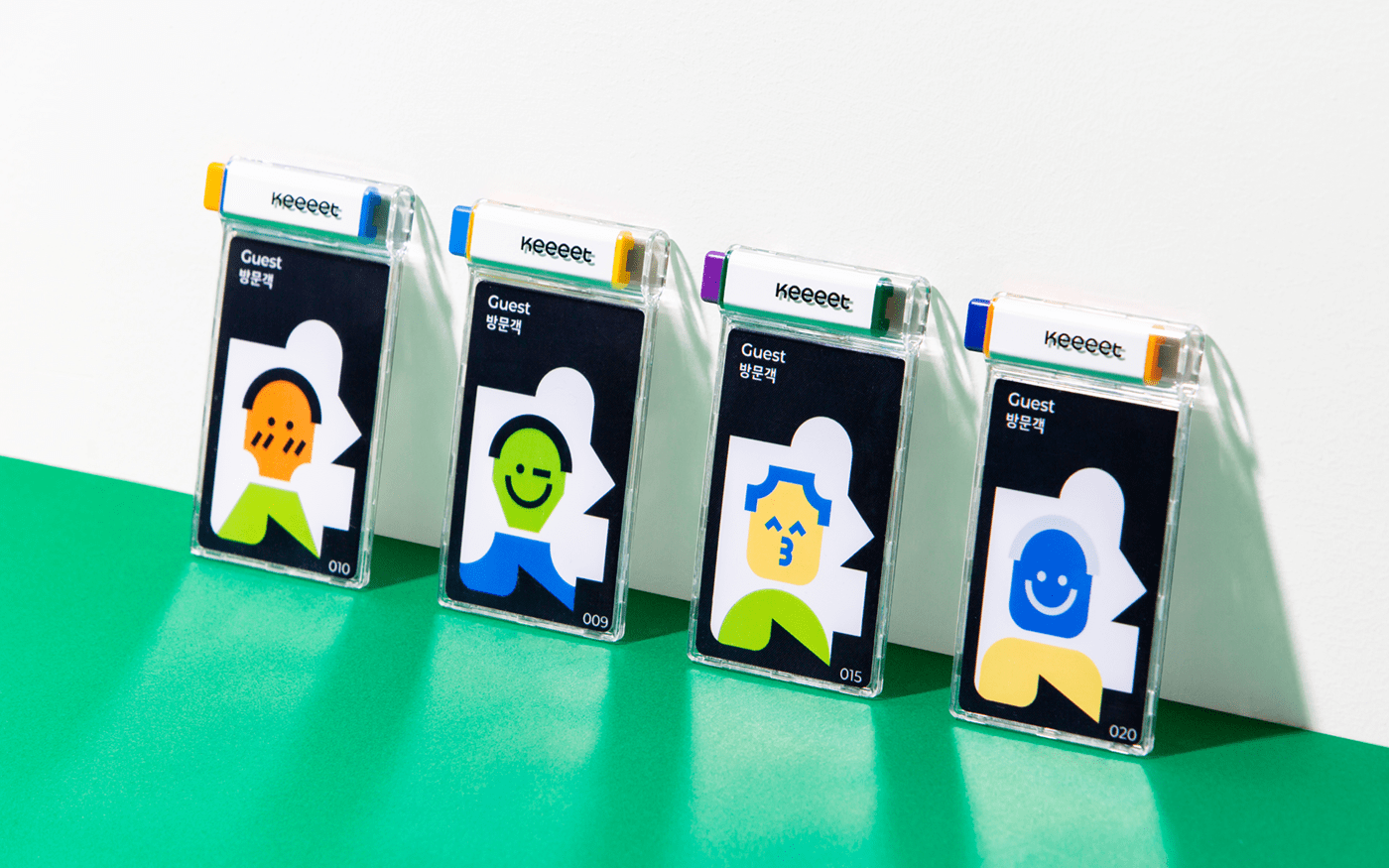
Keeeet-Cap
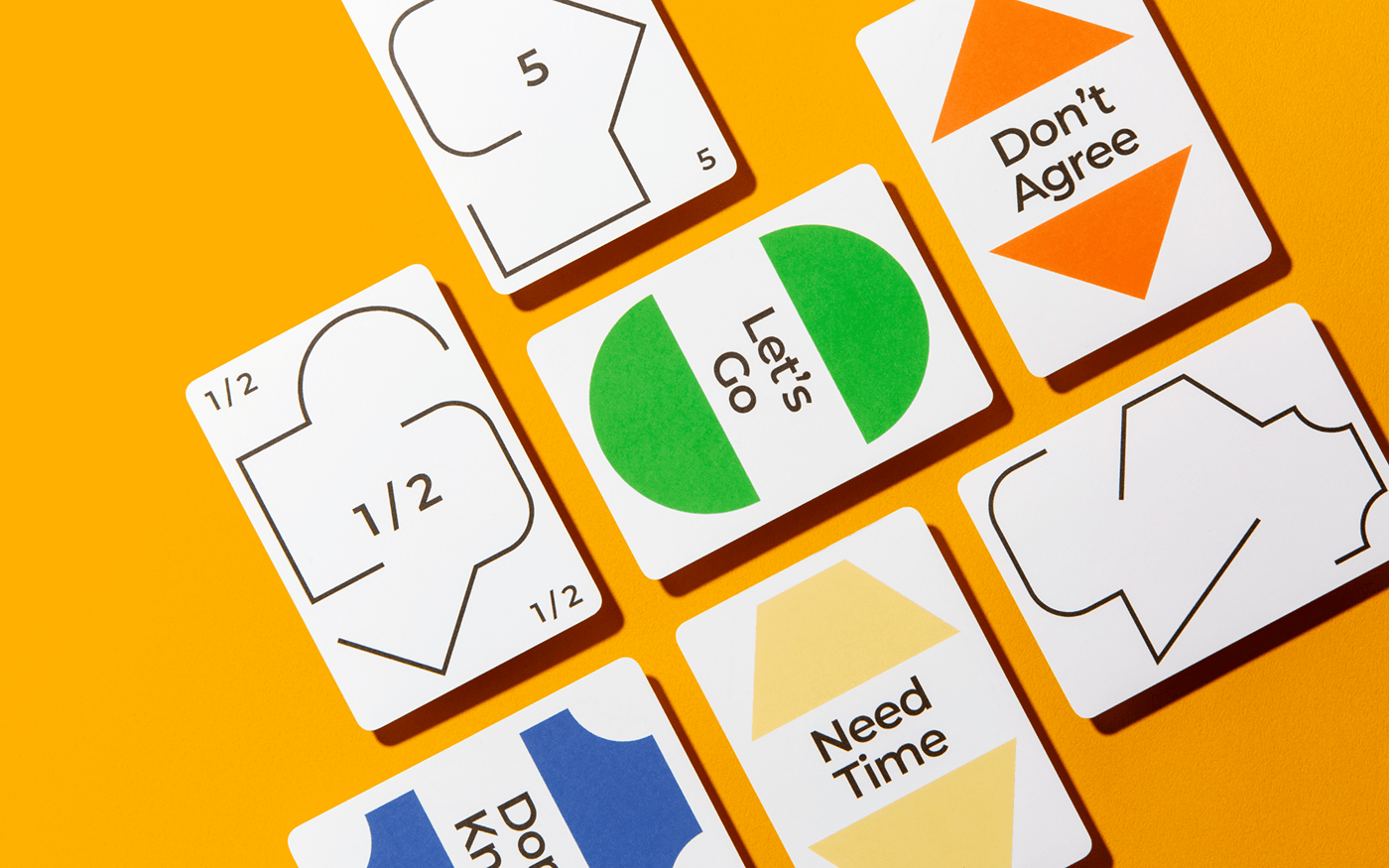
Keeeet-Cap graphic started from morphological feature of ‘keeeet’. And it symbolizes various thought, different method of working and capability of each person. When Keeeet-Cap freely combines, it makes colorful looks. Some parts of it’s opened and some part of it’s connected and some parts of it’s smooth and some part of it’s Angled. We want to show the changes made by meeting through this graphic.
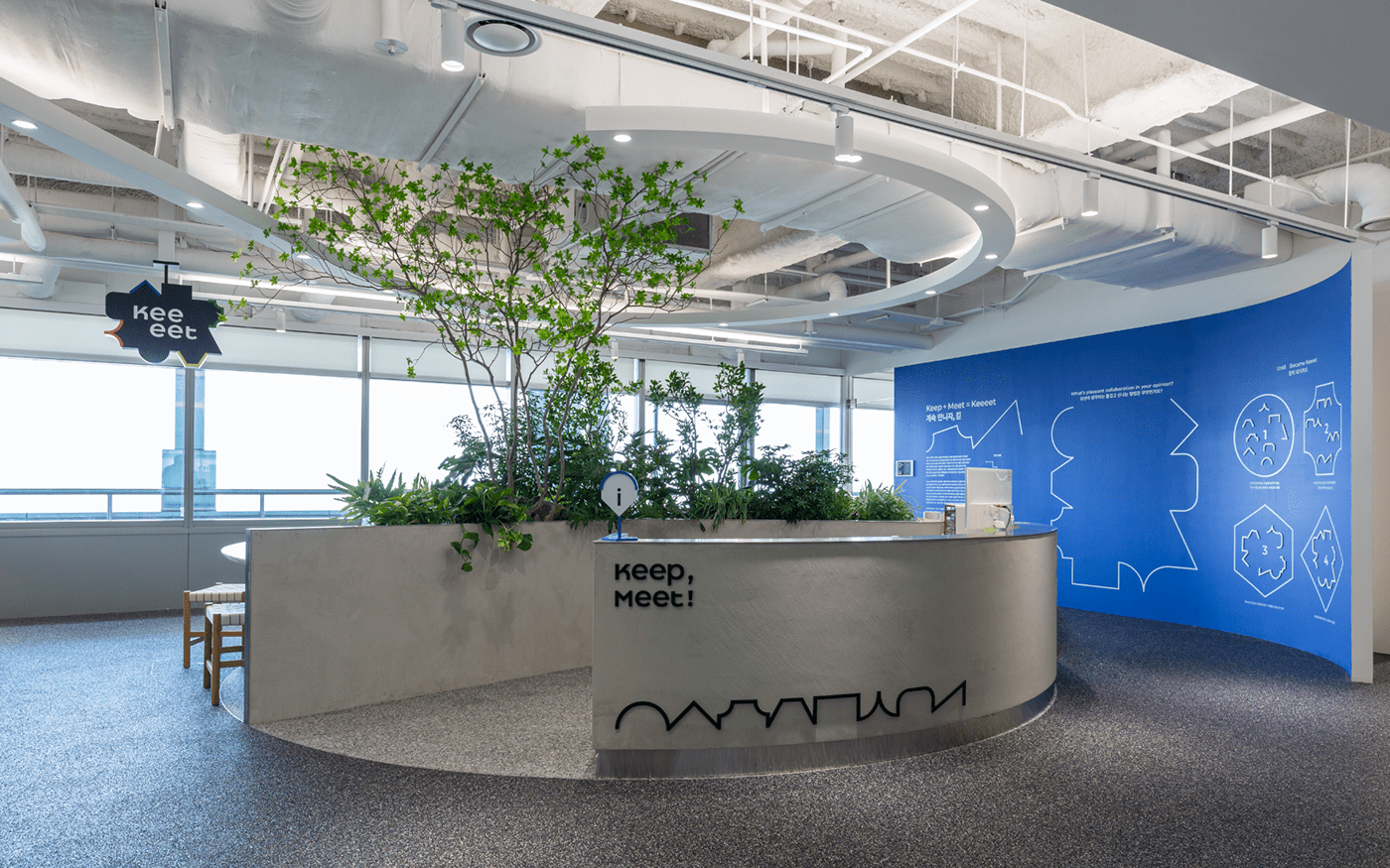
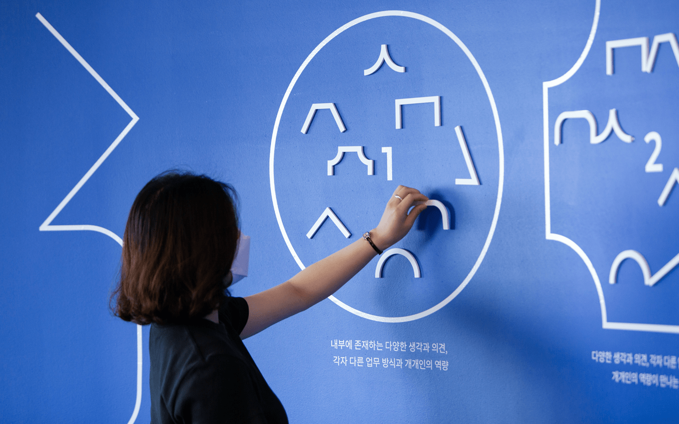
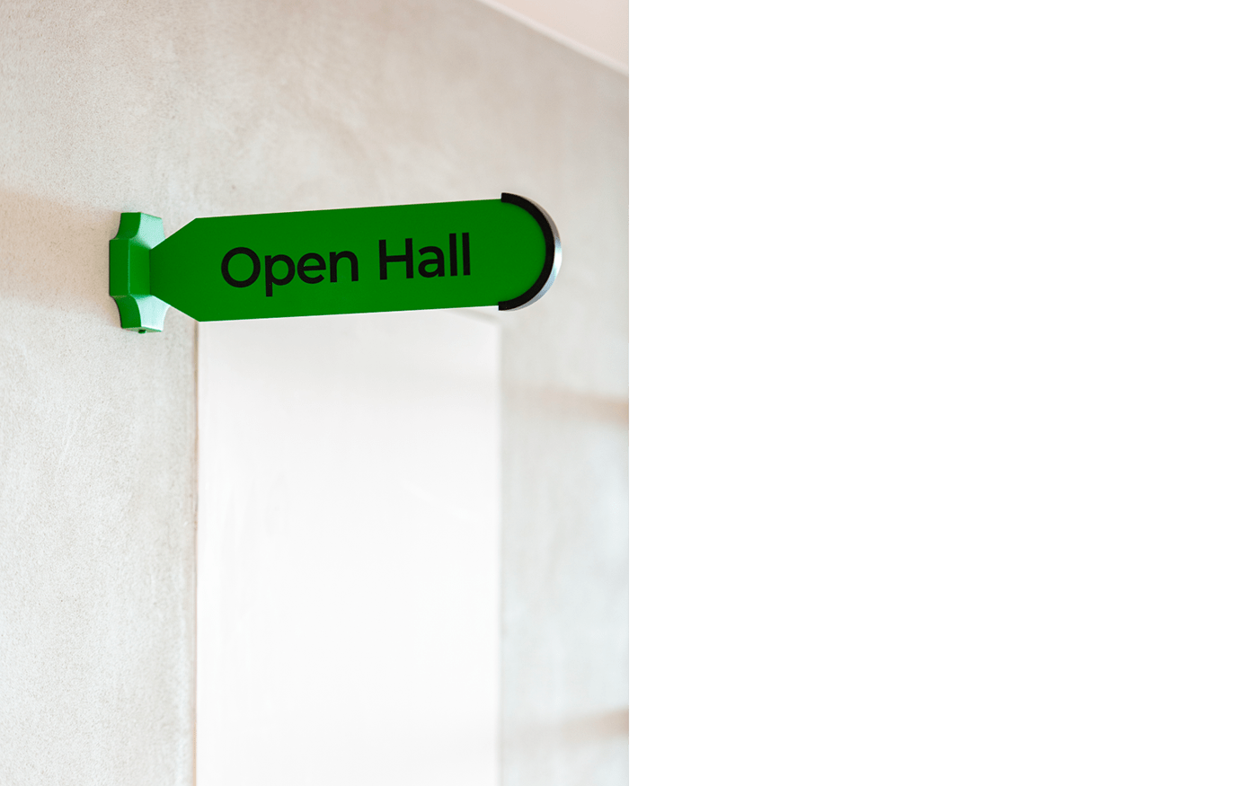
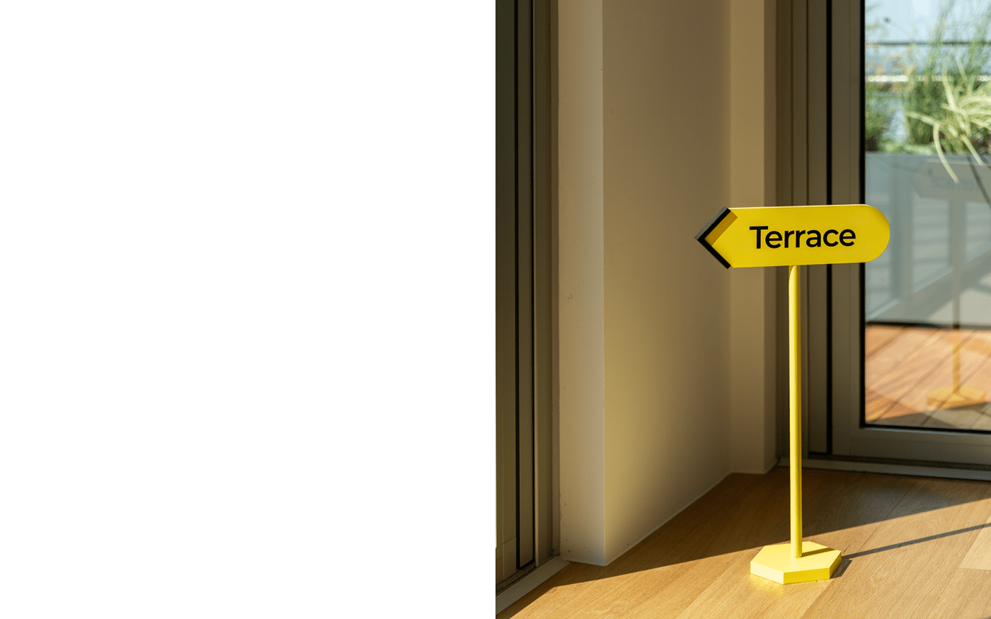
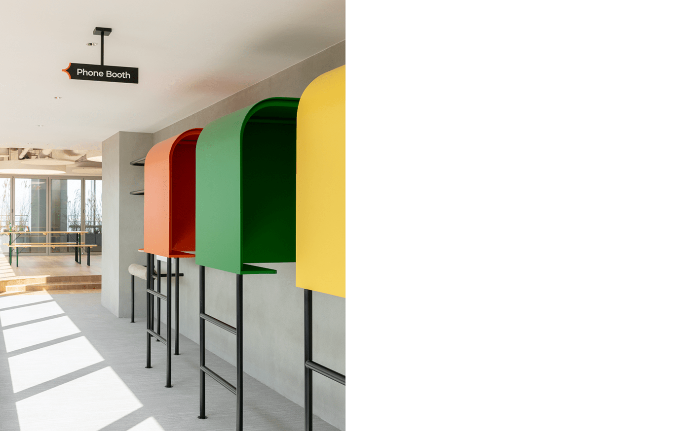
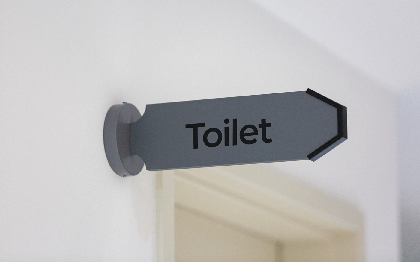
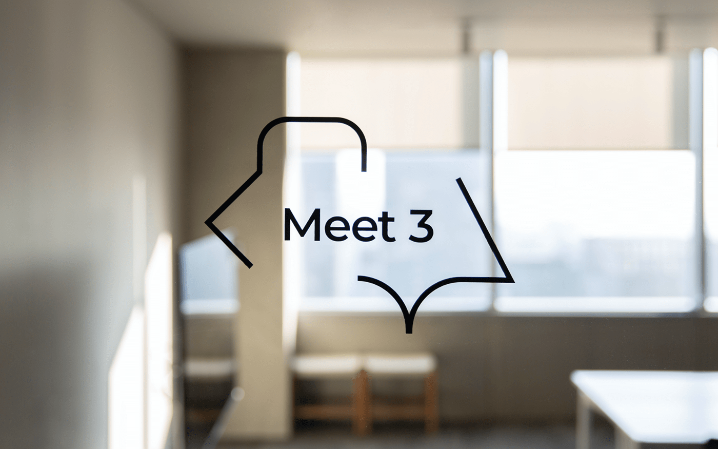
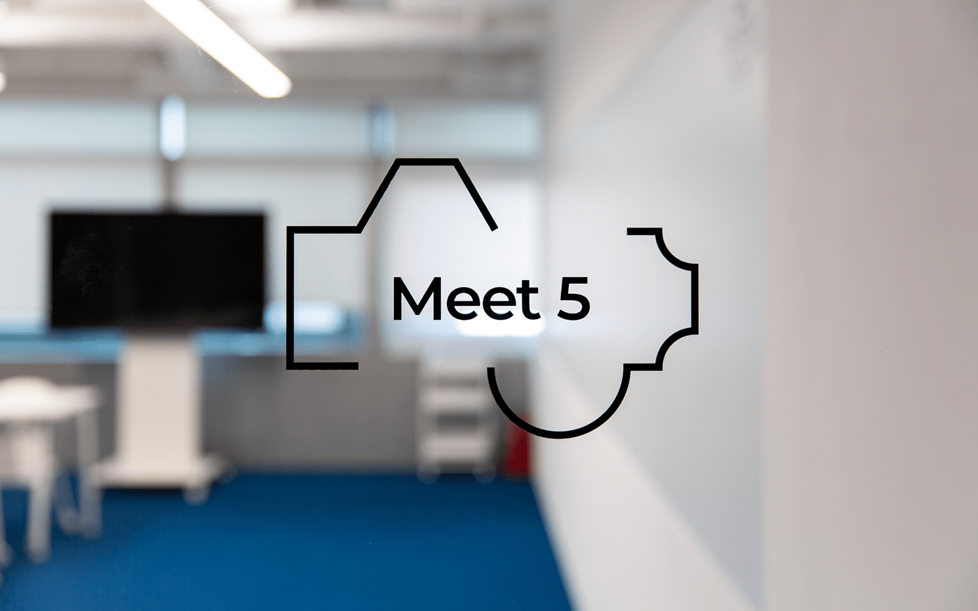
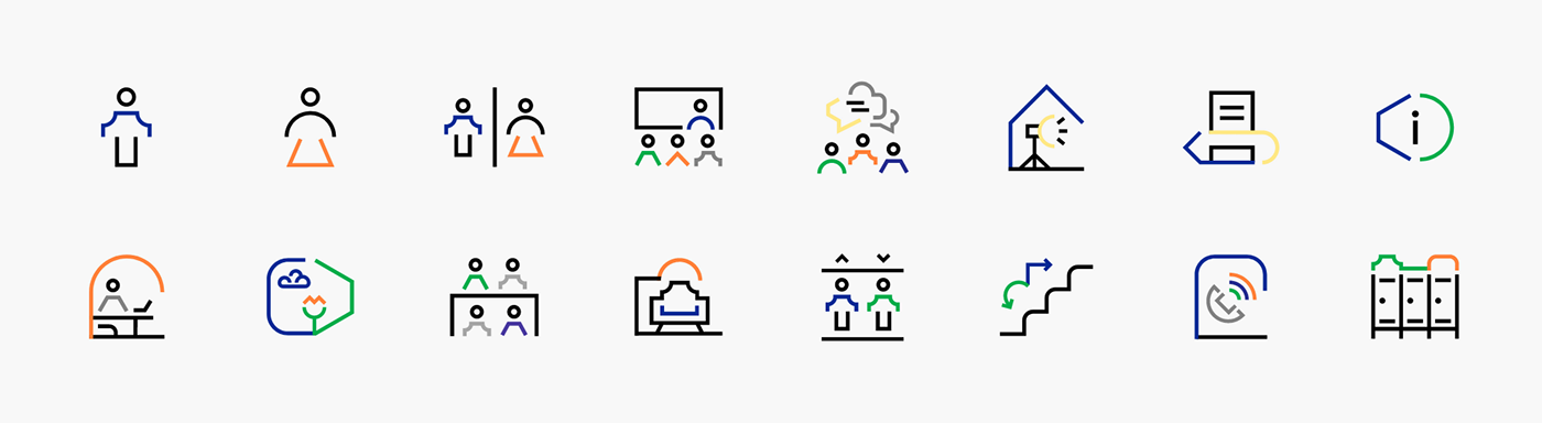
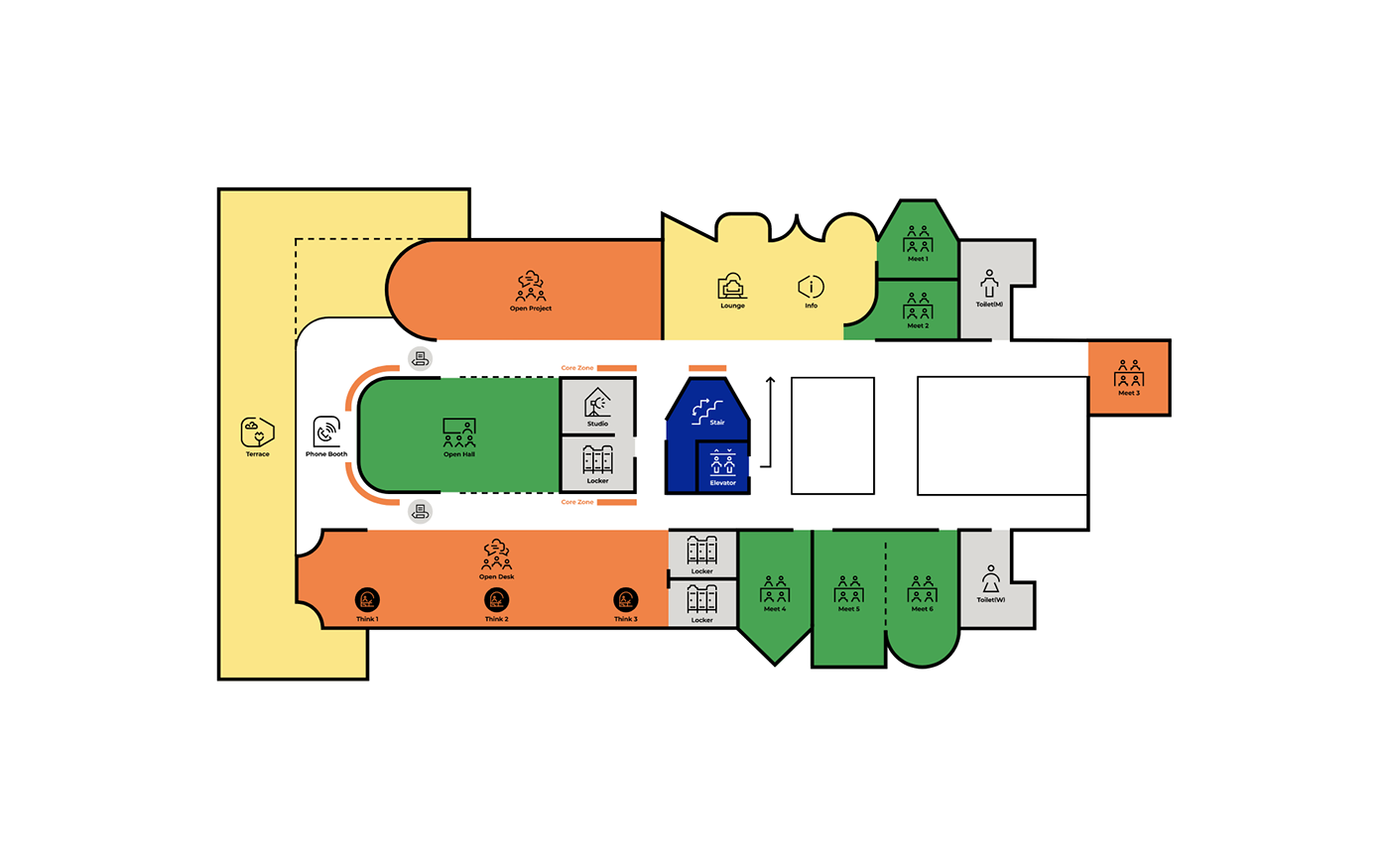
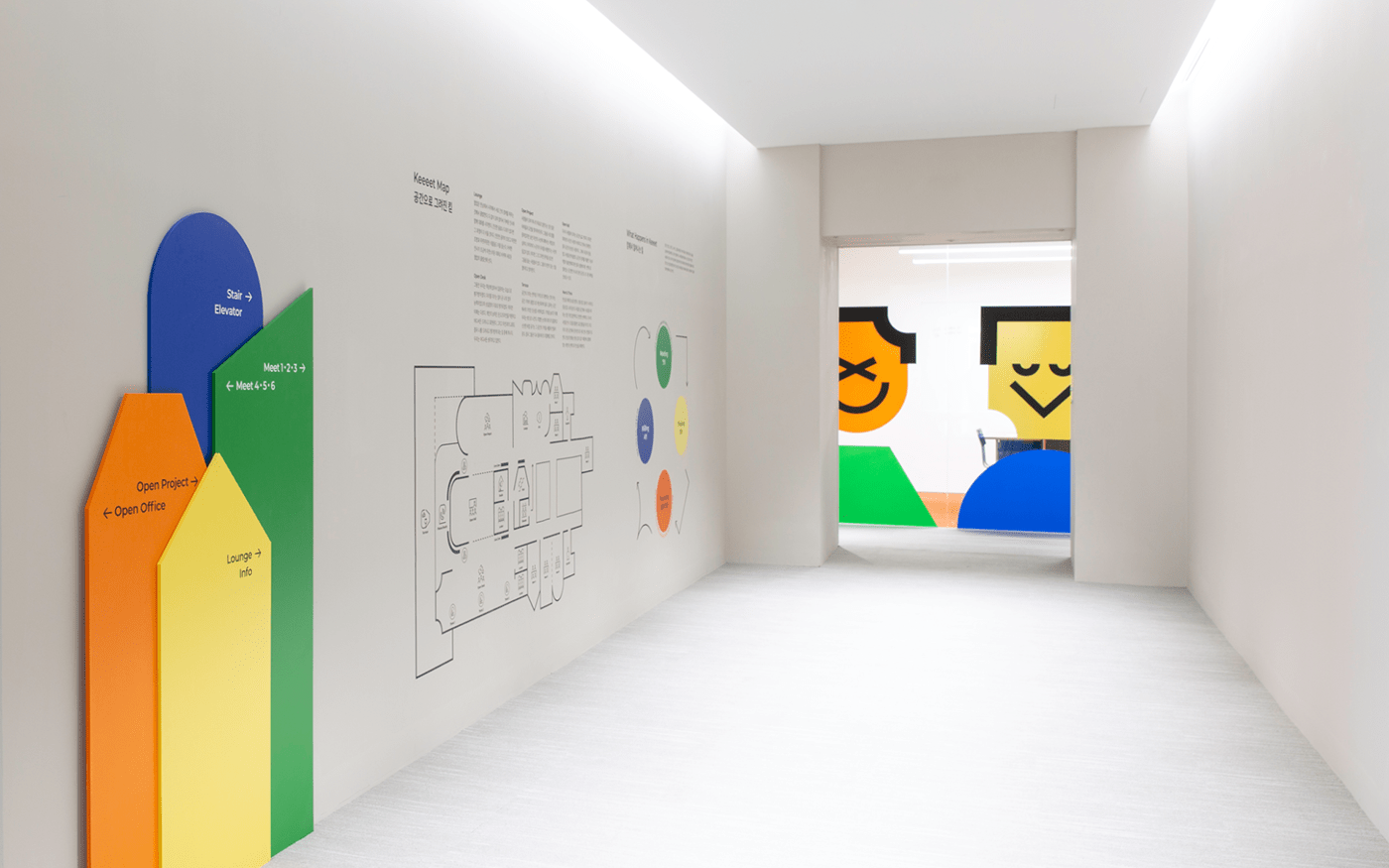
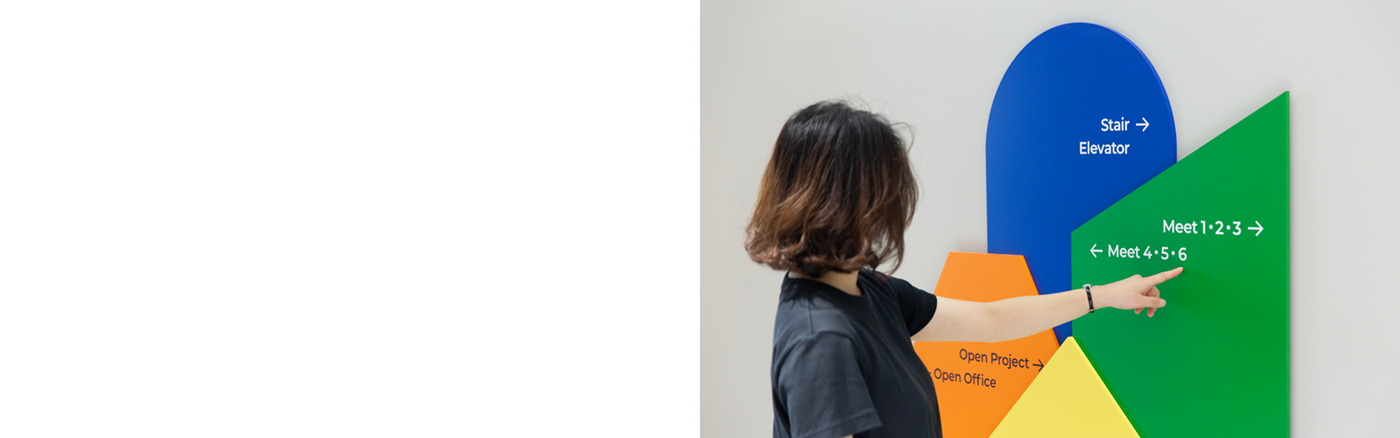
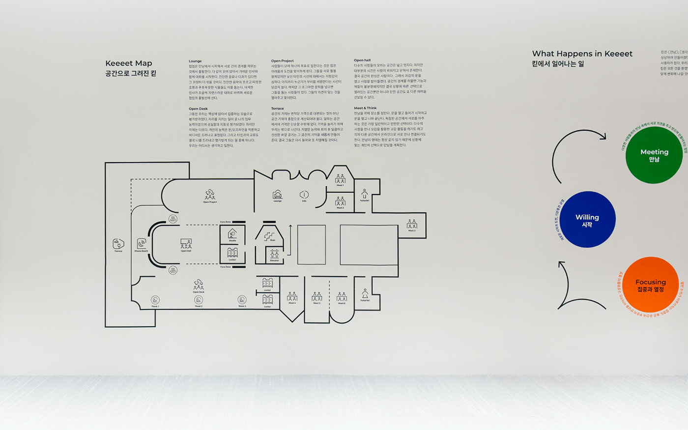
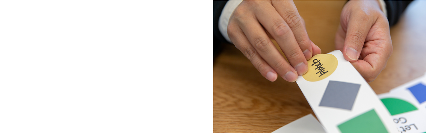
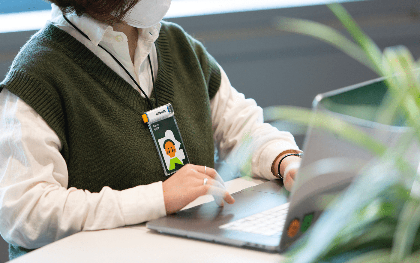
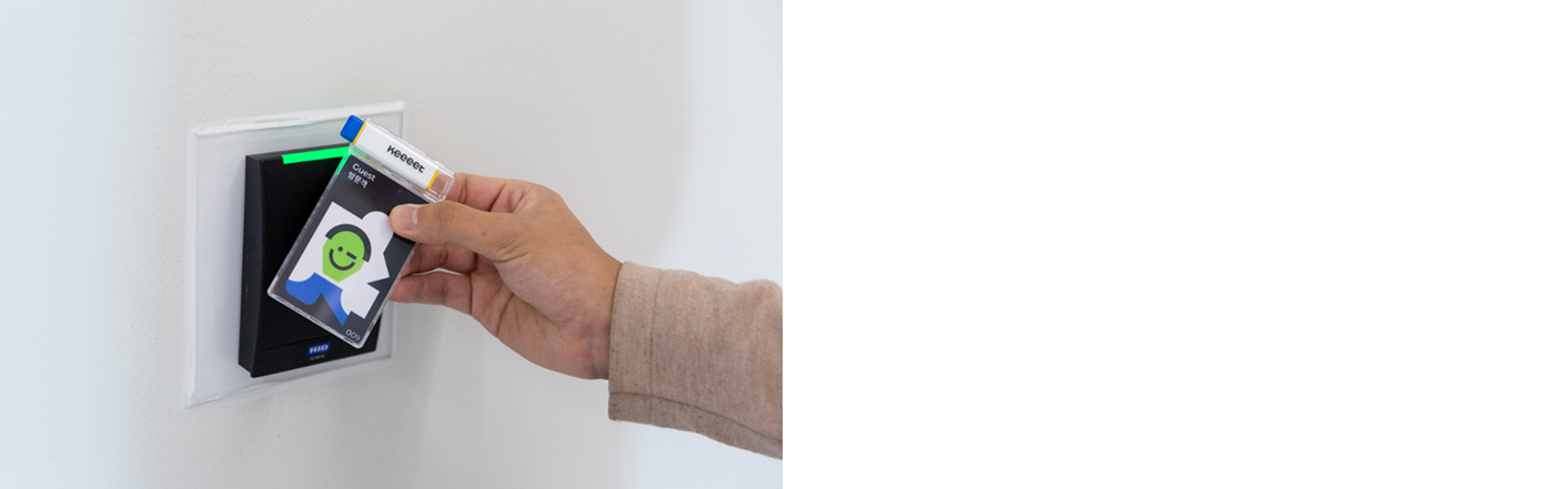
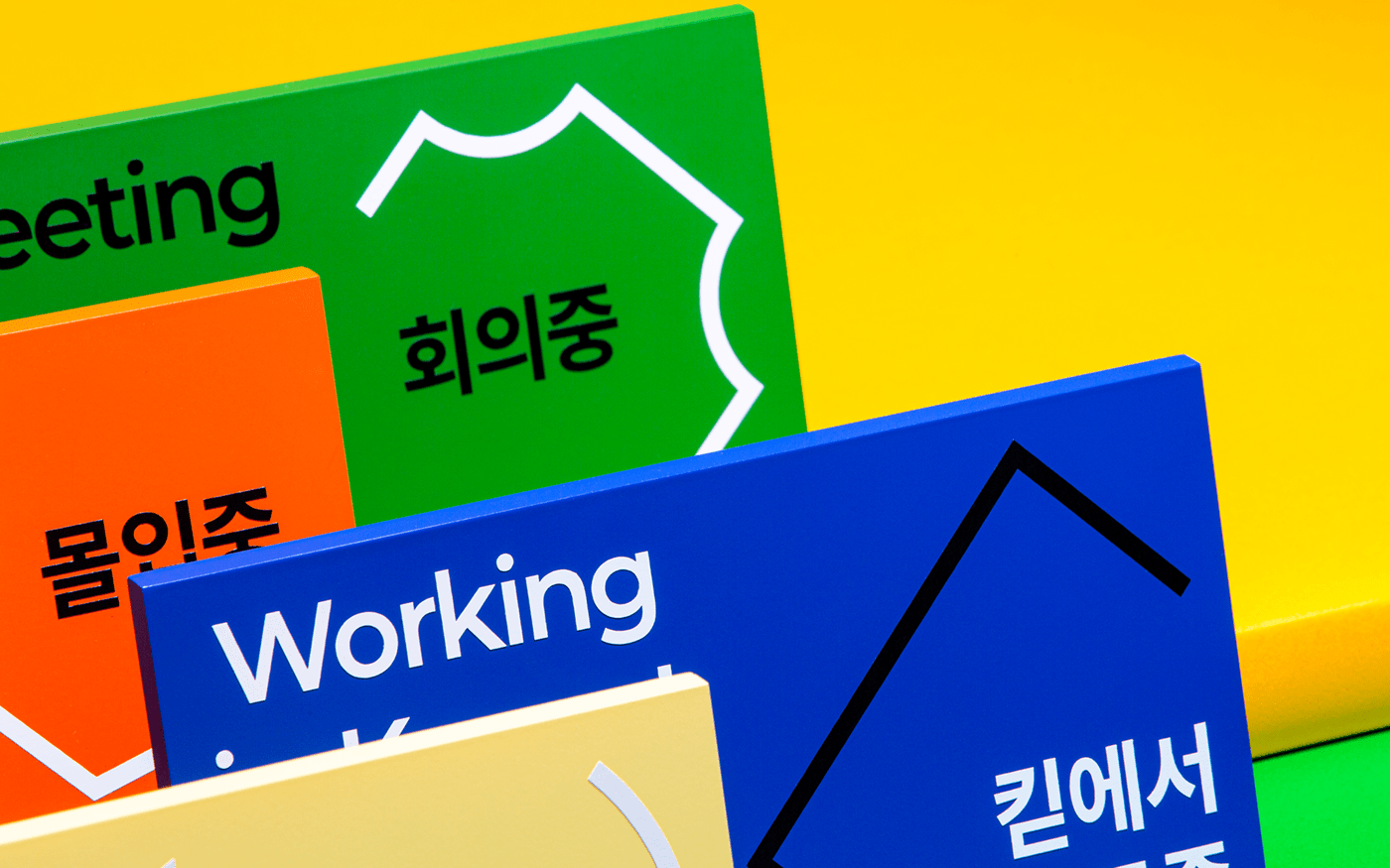
Pictogram & Map
We created a space map and pictograms have opened shape by combining various shapes of Keeeet cap. The map painted with the colors defined by the activities clarifies the space division and it tells us their spatial roles.