Client
Linetaste
Workscope
Visual Identity, Verbal Identity, Brand Application,
Web Design, Photography, Motion
Manual Graphics
Director – Seongkyun Lee
Identity Design – Seongeun Kim, Yeonkyung Kim
Photography – Hanyeon Lee
Motion – Yeonkyung Kim
Project Overview
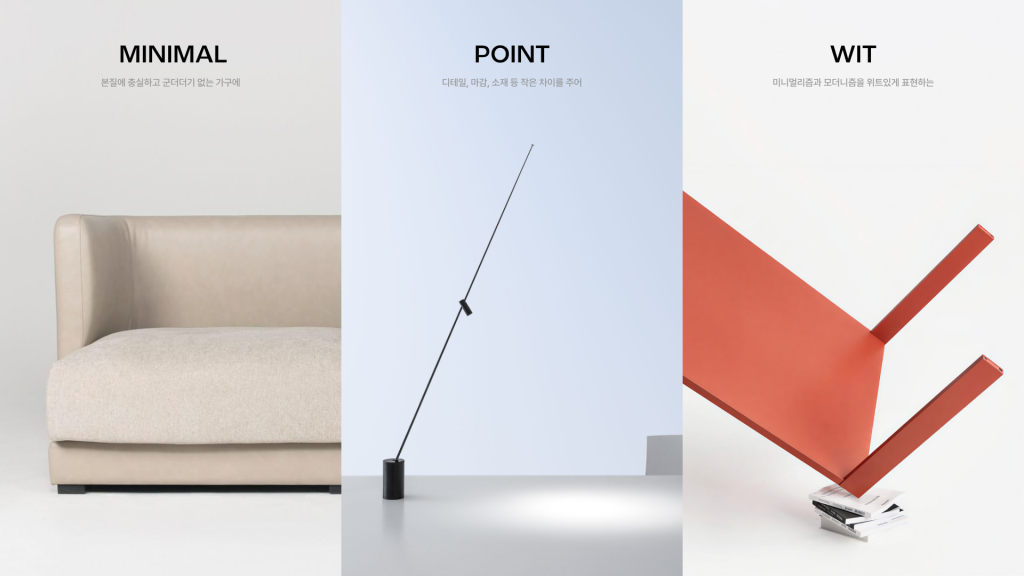
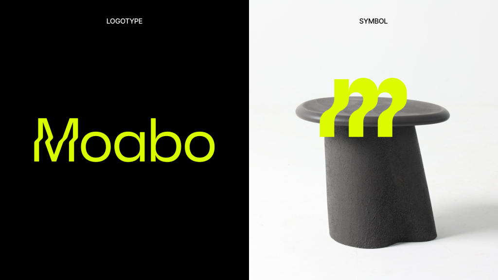
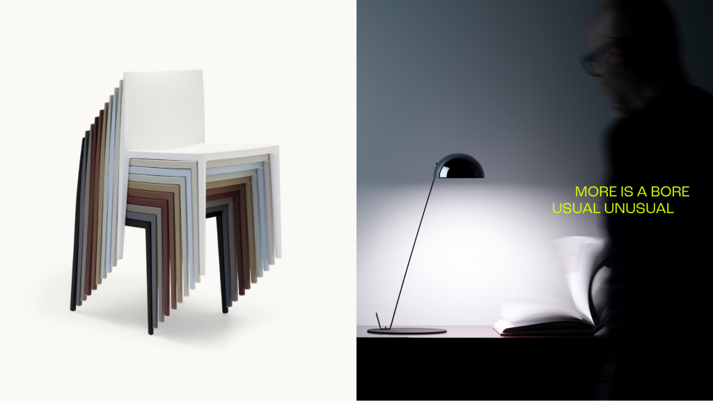
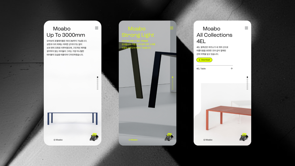
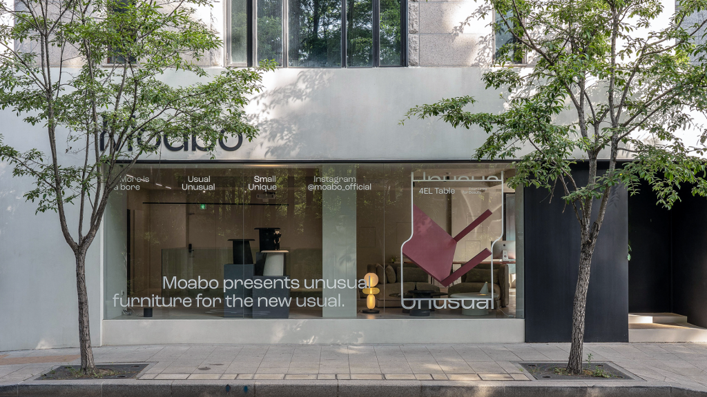
Moabo is a high-end furniture brand that reinterprets minimalism through a new lens, inspired by the phrase “More is a Bore.” Rooted in essential forms, the brand introduces subtle distinctions through details, finishes, and materials creating furniture that feels familiar yet unexpectedly distinctive.
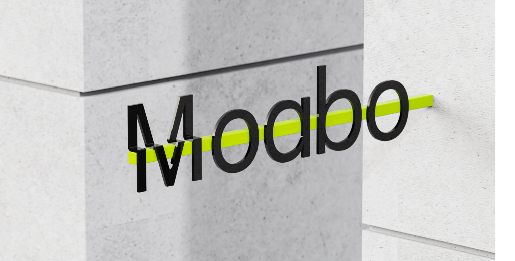
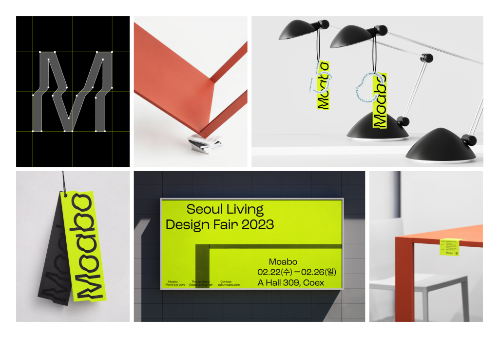
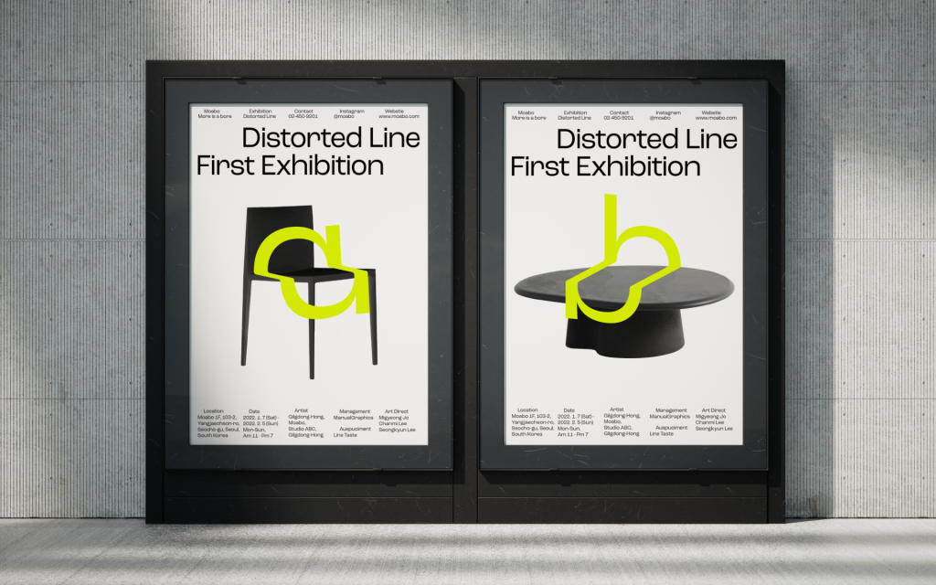
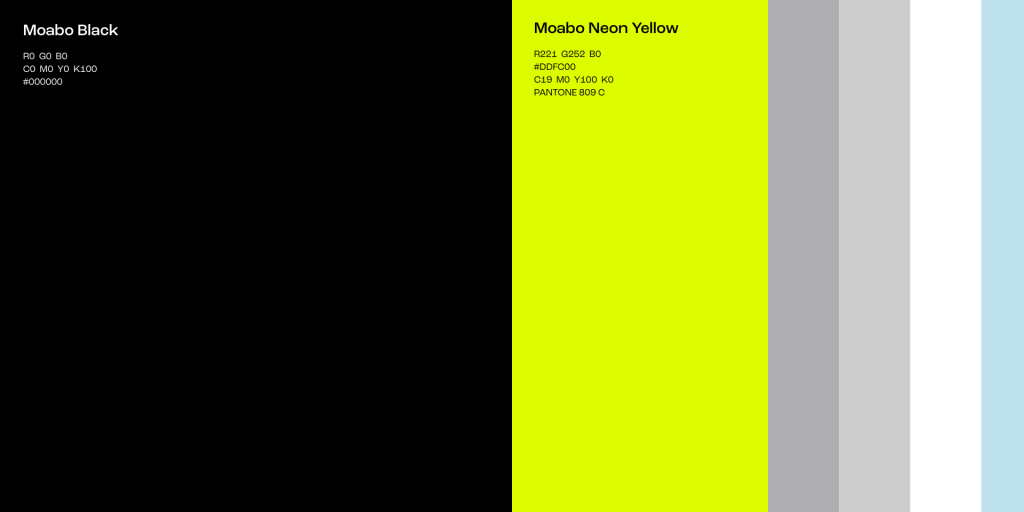
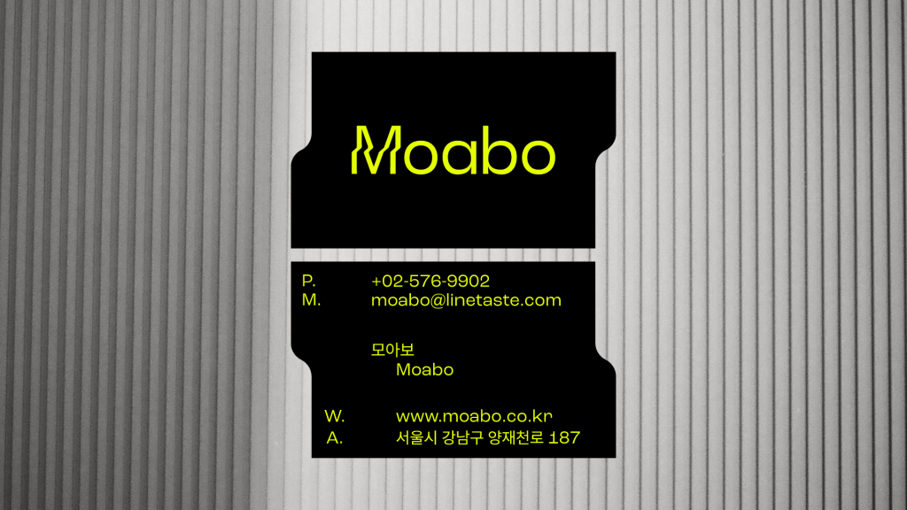
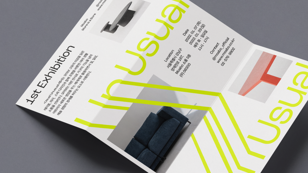
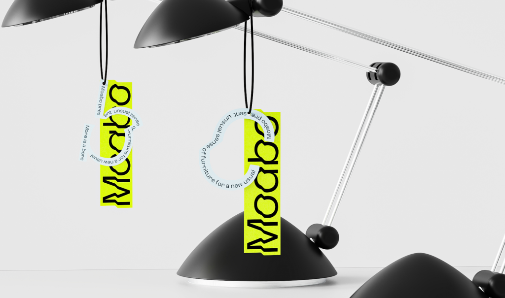
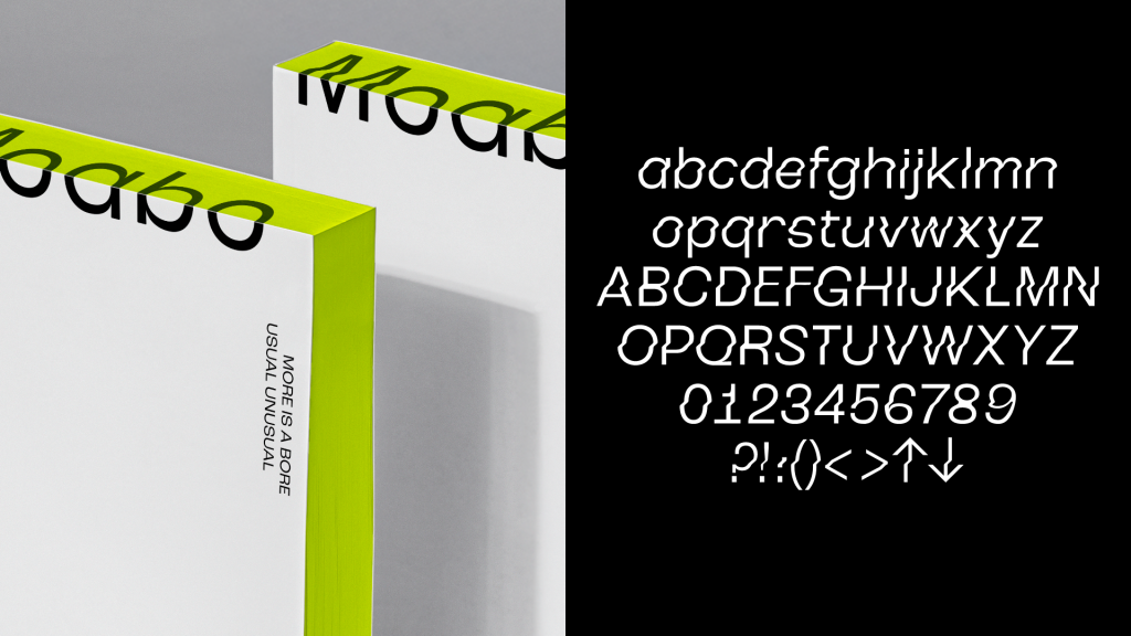
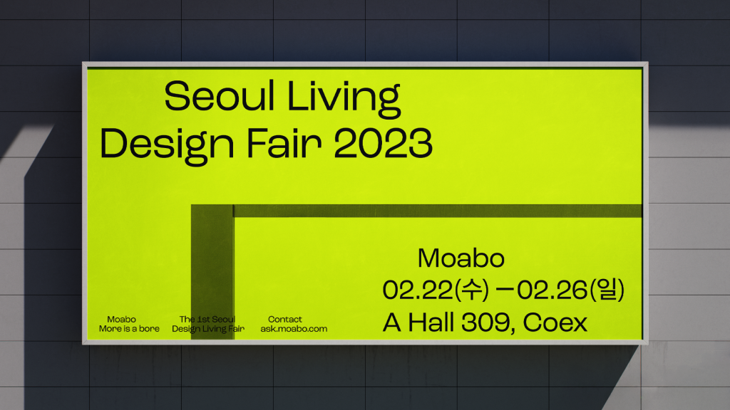
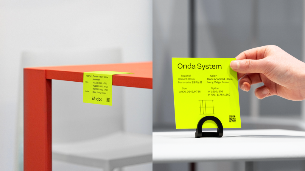
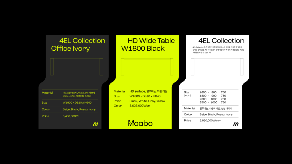
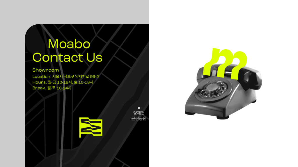
Manual Graphics translated this philosophy into a visual identity based on the concept, “Usual Unusual.” By extending parts of basic letterforms into new shapes, the graphic system expresses the potential and impact of small details. Combined with a striking neon yellow palette, the identity establishes a strong first impression for the new brand and enables Moabo to stand out quickly within an increasingly competitive market.
모아보는 ‘More is a Bore’에서 파생된 네이밍처럼, 미니멀리즘을 새로운 시각으로 풀어내는 하이엔드 가구 브랜드입니다. 현실적인 한계에 안주해 온 국내 가구 시장의 분위기에서 벗어나, 본질에 충실한 구조와 군더더기 없는 형태를 바탕으로 높은 심미성과 완성도를 갖춘 가구를 선보입니다. 디테일과 마감, 소재에서의 미묘한 차이를 통해 익숙하지만 쉽게 지나치기 어려운 감각을 만들어내며, 간과되기 쉬운 영역에서 예상 밖의 임팩트를 제안합니다.
매뉴얼 그래픽스는 이러한 모아보의 태도를 ‘Usual Unusual이라는 콘셉트로 시각화했습니다. 베이직한 알파벳의 일부가 늘어나며 새로운 형태로 확장되는 그래픽 시스템은 작은 변화가 만들어내는 가능성과 차별성을 상징합니다. 여기에 네온옐로우 컬러와 위트 있는 그래픽 플레이를 더해 신규 브랜드로서 강렬한 첫인상을 구축하고자 했습니다.