Client
PDM PARTNERS
Workscope
Visual Identity, Verbal Identity, Brand Application, Photography
Manual Graphics
Direction – Seongkyun Lee
Design Lead – Minji Ko
Identity Design – Yeonkyung Kim, Hoyeon Won, Minjung Kim
Strategy Lead – Seohee Park
Strategy – Moojin Kim
Project Overview
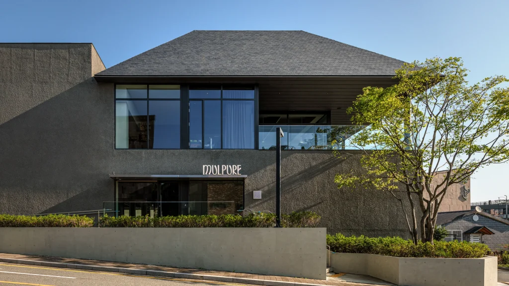
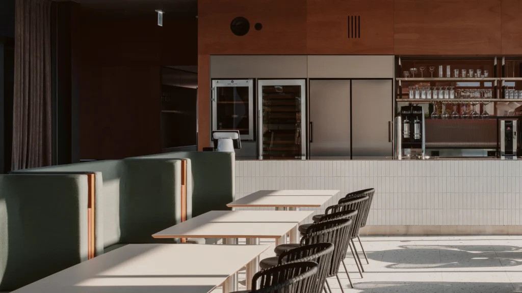
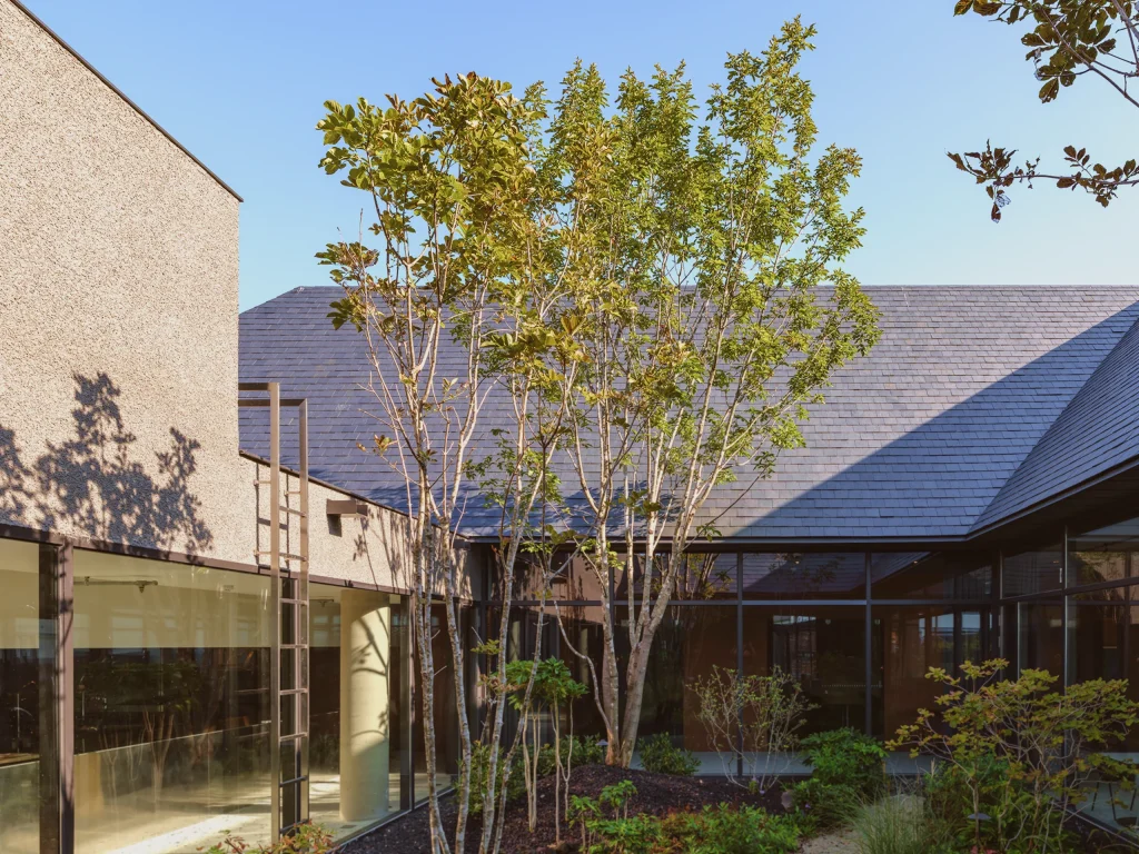
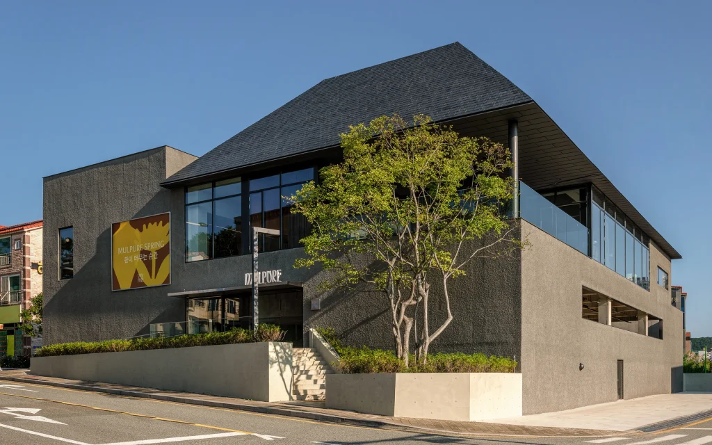
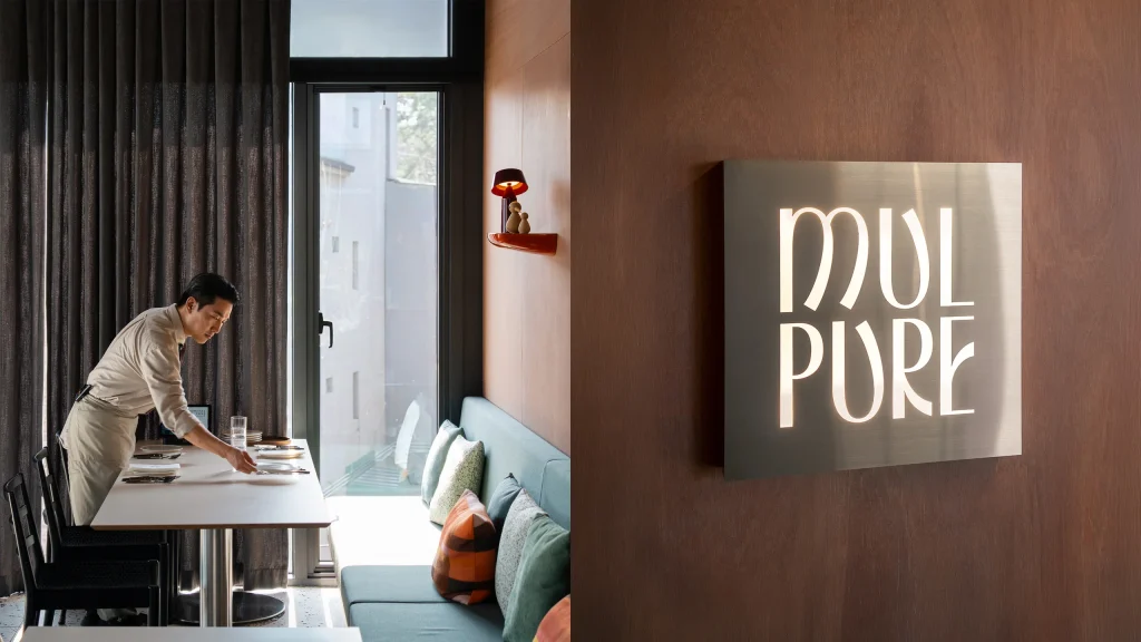
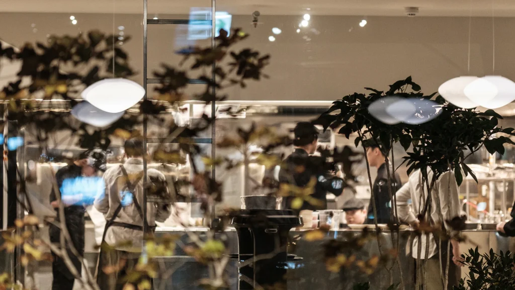
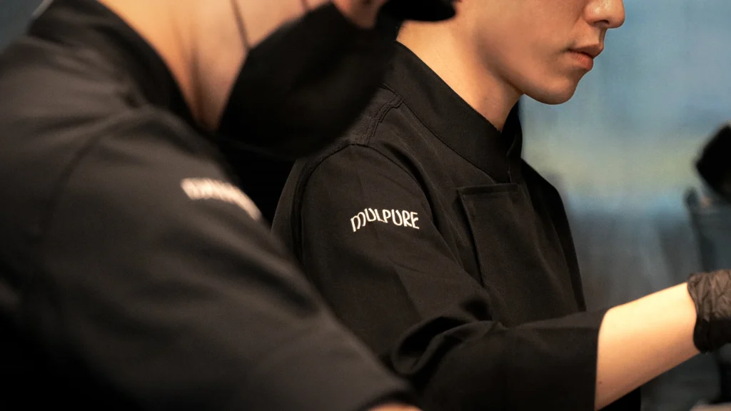
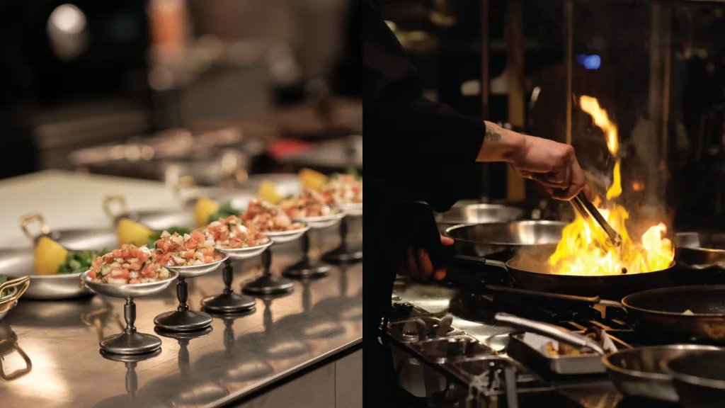
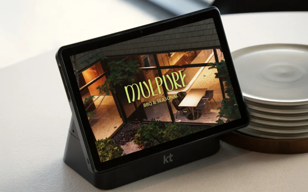
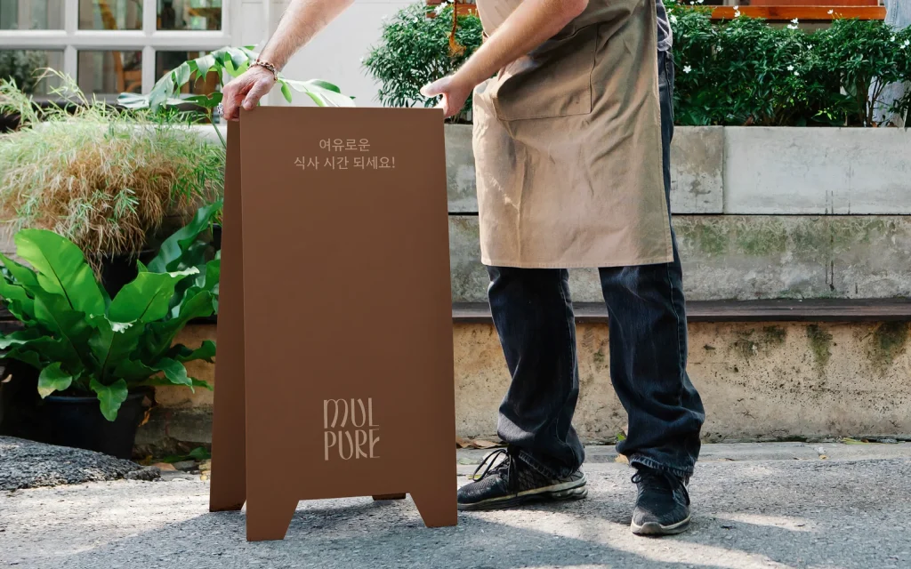
Mulpure is a casual dining restaurant in Gijang, Busan, where the sea meets the mountains, specializing in straw- fire barbecue. Designed by an architect, the space centers around an indoor courtyard with an ash tree, reflecting the brand’s core qualities of strength and flexibility. Through a disciplined approach to cooking and a warm, attentive sense of hospitality, Mulpure reinterprets local straw-fire grilling with seasonal ingredients, offering a calm dining experience that connects everyday life with nature.
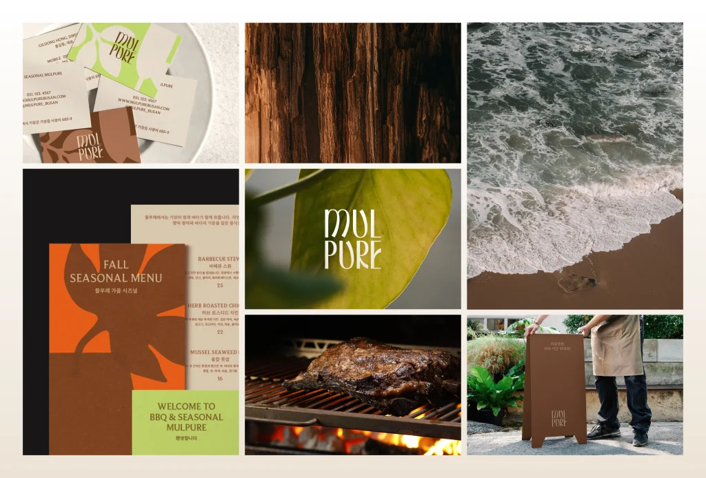
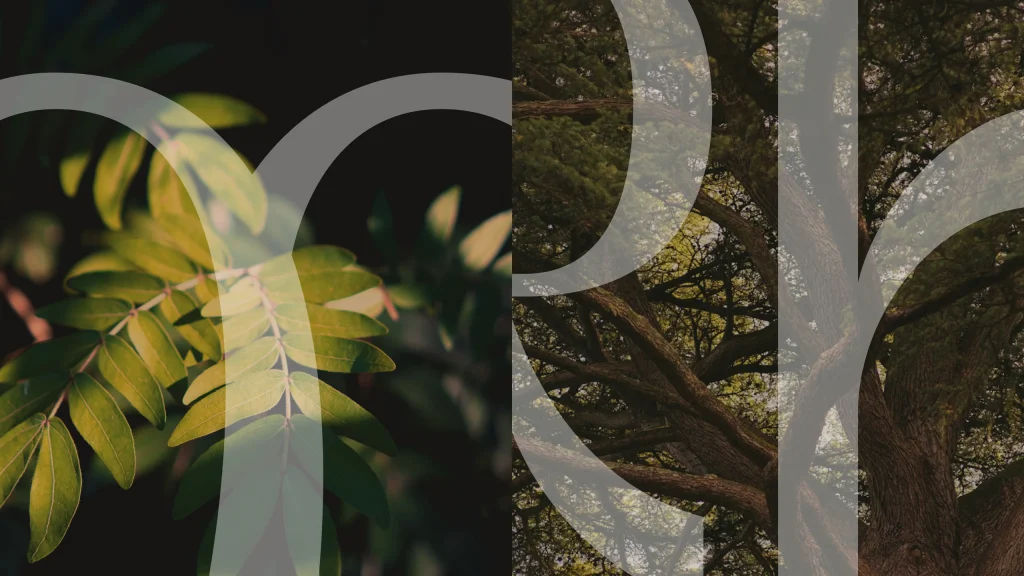
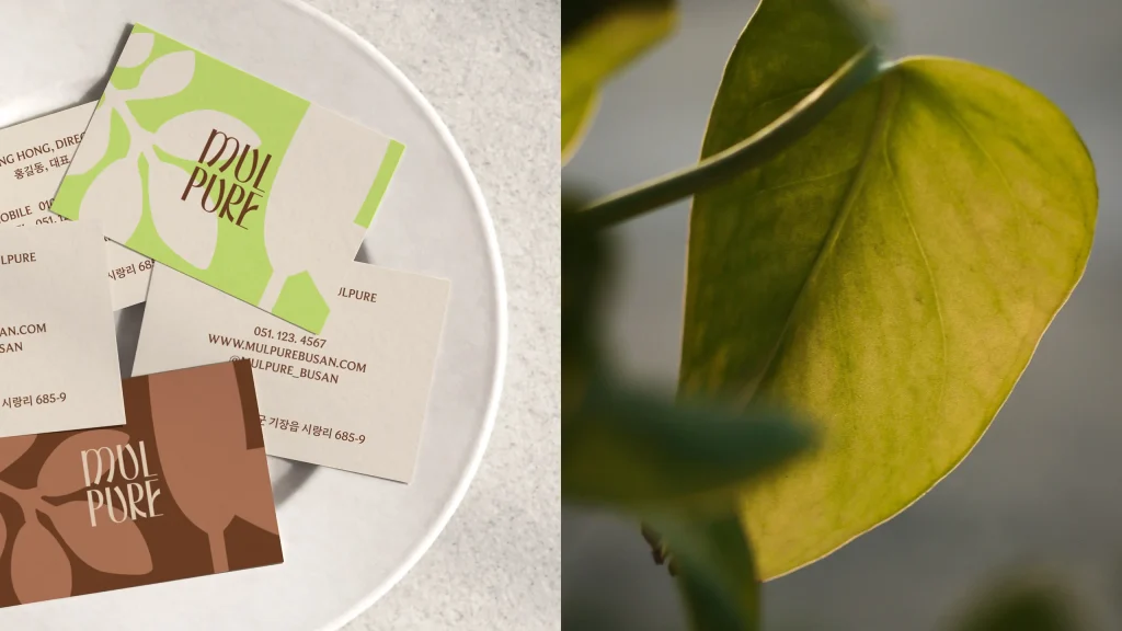
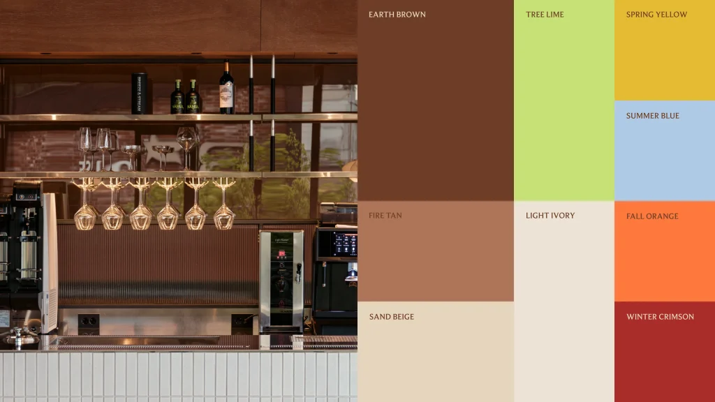
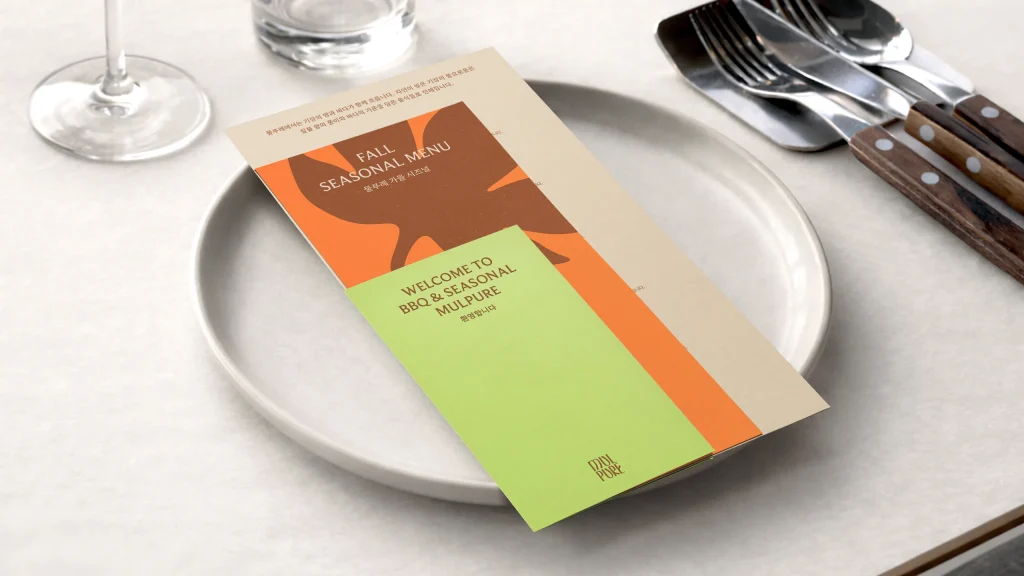
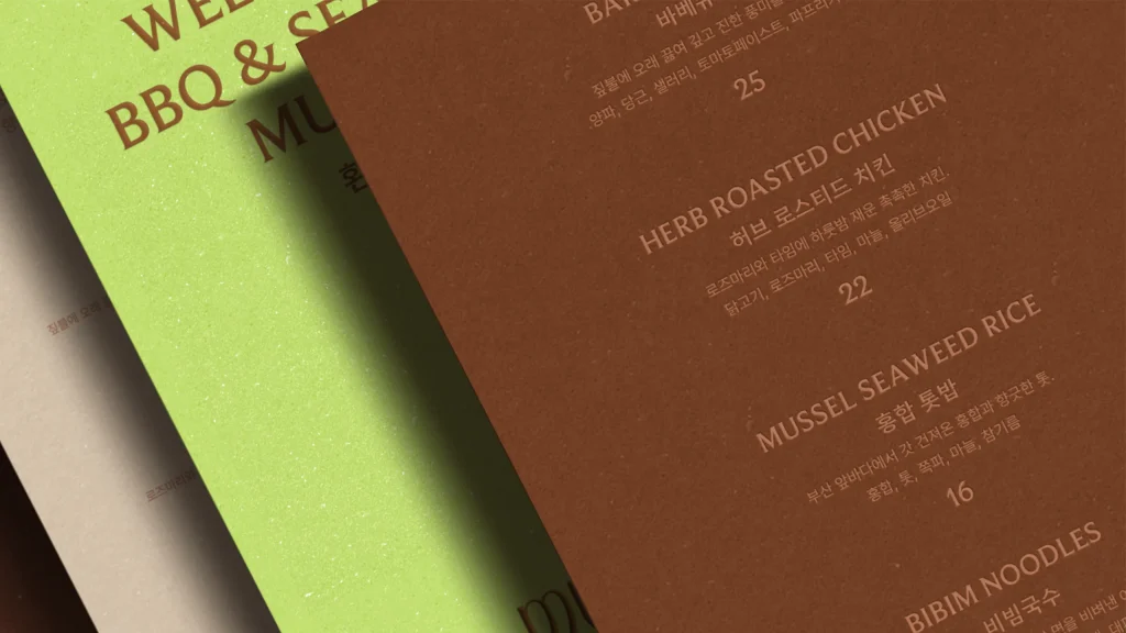
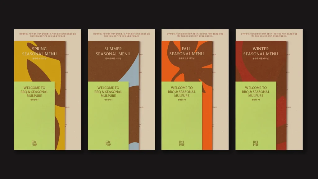
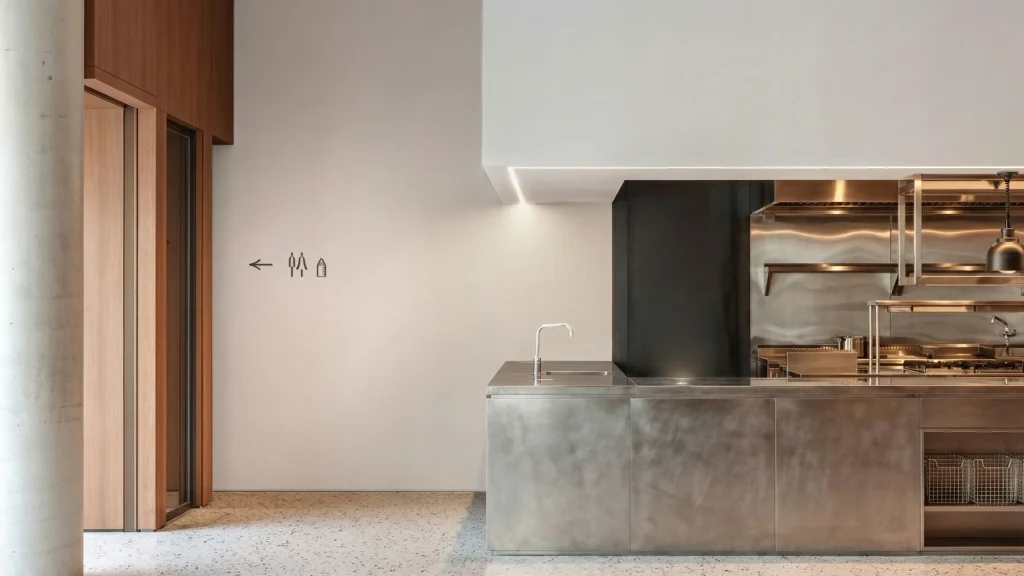
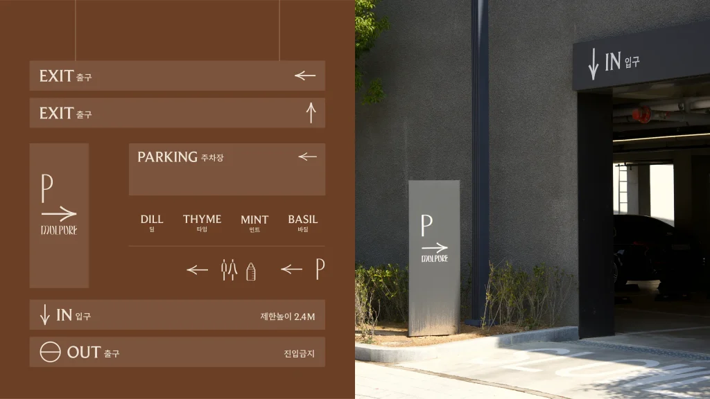
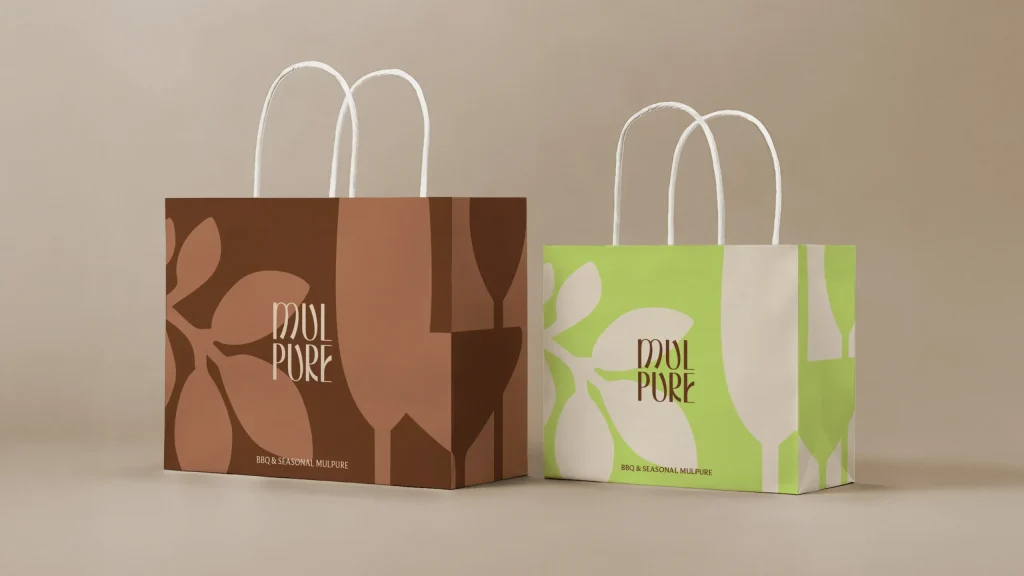
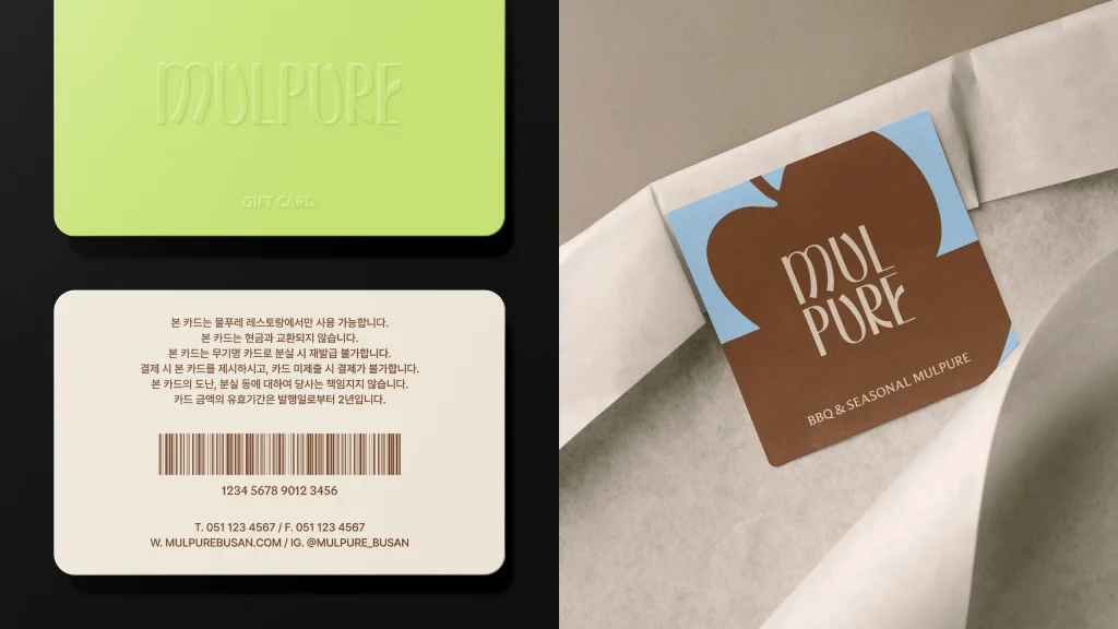
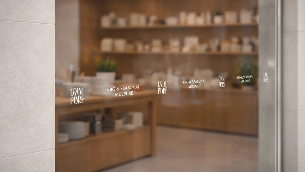
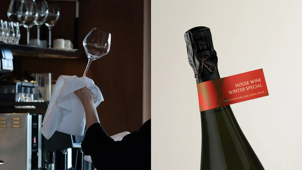
Manual Graphics translated this identity into the concept of natural harmony. The illustration-based graphic motif combines elements of nature with dining objects, expressing a balance between strength and softness. The main visual pairs a single ash leaf with wine glasses, symbolizing shared moments at the table within nature, while seasonal graphics reflect its changing rhythm. An earthy palette, accented with fresh lime tones, creates a mood that is both calm and vibrant.
물푸레는 바다와 산이 만나는 부산 기장에 위치한 짚불 바베큐 전문 캐주얼 다이닝 레스토랑입니다. 건축가가 설계한 공간으로, 중앙에 물푸레나무가 자리한 정원을 품고 있는 것이 특징입니다. 물푸레나무가 지닌 단단함과 유연함은 브랜드의 핵심적인 태도로 이어지며, 기본에 충실한 장인정신과 따뜻하고 유연한 환대로 표현됩니다. 기장의 전통적인 짚불구이 방식을 현대적으로 재해석하고, 제철 식재료를 통해 자연의 흐름을 담아낸 음식은 일상과 자연을 잇는 여유롭고 평화로운 식사의 경험을 제안합니다.
매뉴얼 그래픽스는 이러한 물푸레의 아이덴티티를 자연스러운 조화라는 개념으로 시각화했습니다. 일러스트를 기반으로 한 그래픽 모티프는 자연의 요소와 식기류를 결합하여, 단단함과 유연함이 공존하는 브랜드의 성격을 균형감 있게 드러냅니다. 메인 그래픽은 정원에 자리한 물푸레나무의 잎과 식사의 즐거움을 상징하는 와인잔을 결합한 형태로 만들어졌으며, 각 계절의 특징을 담아내는 서브그래픽을 통해, 자연의 흐름을 시각적으로 확장하였습니다. 여기에 흙을 연상시키는 자연의 베이스 컬러 위에 산뜻한 라임 톤을 더해, 자연과 경쾌한 무드를 전달하고자 했습니다.