Client
STRX 스트락스 어소시에이츠
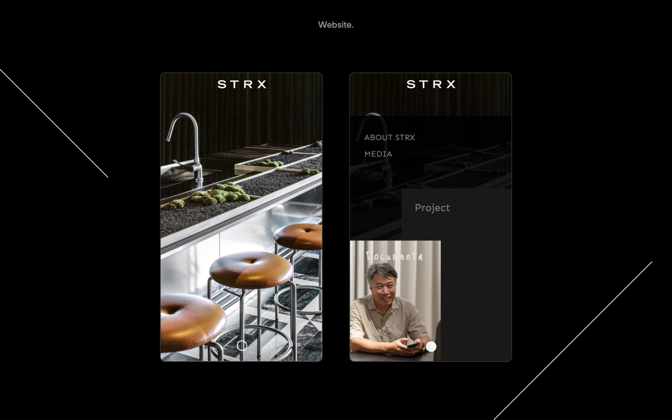
Workscope
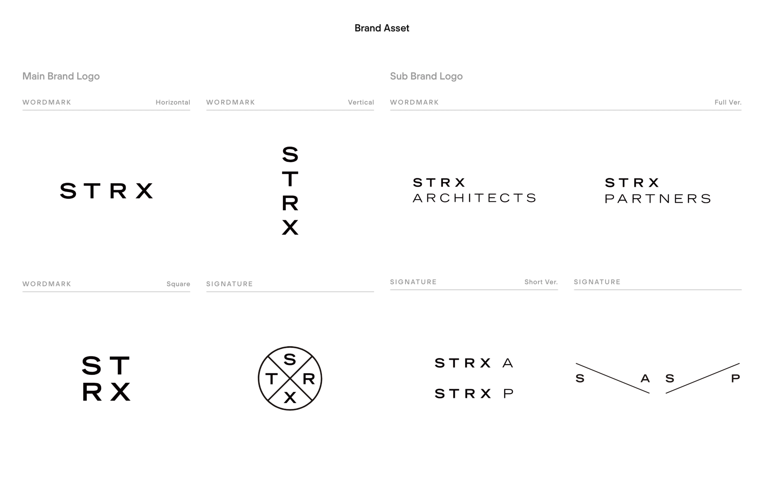
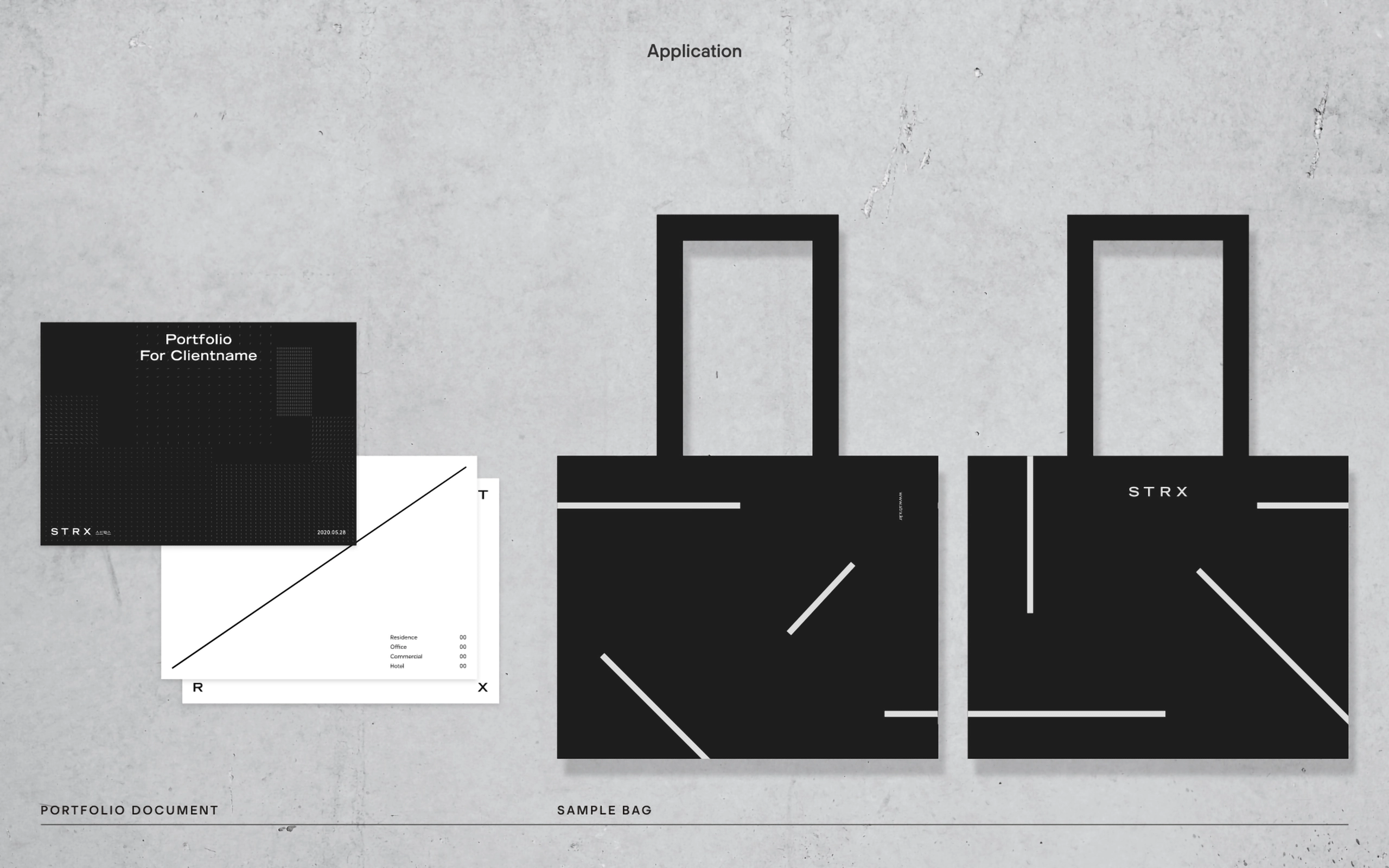
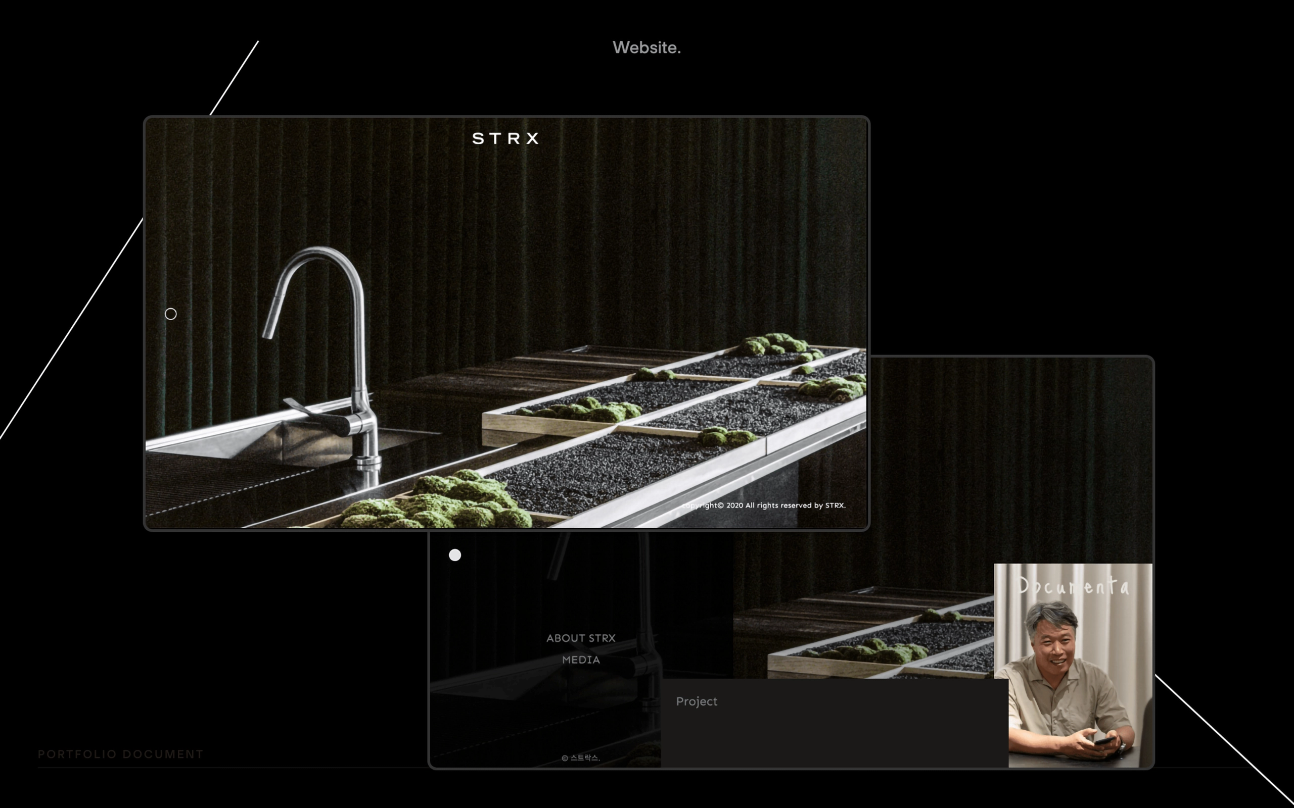
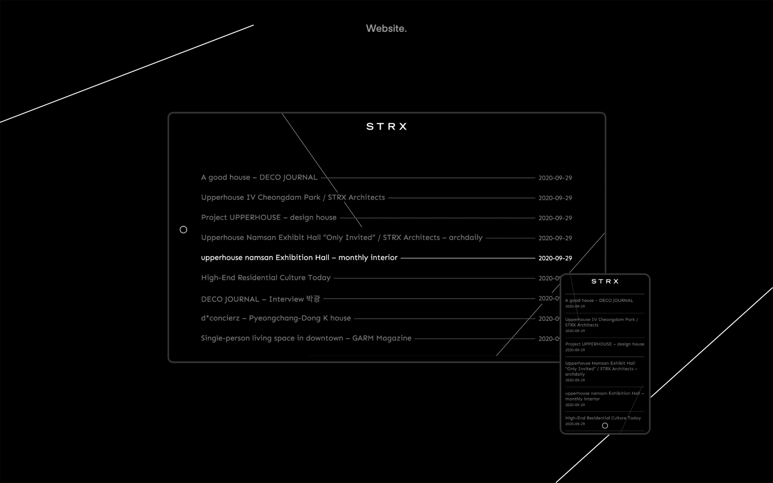
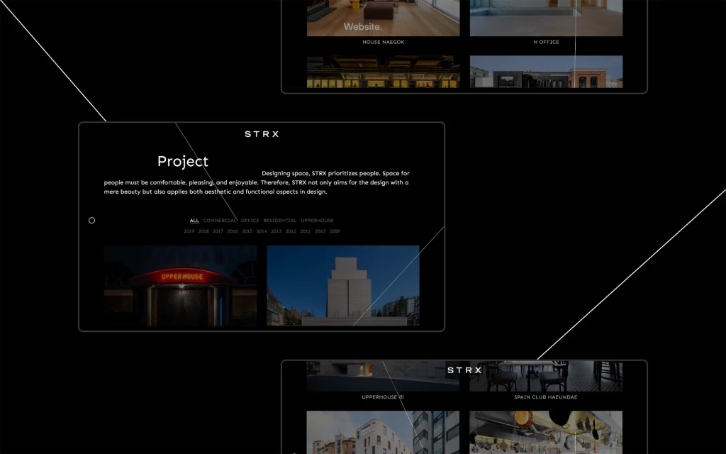
Brand Identity Design
Credit
디자인 – Manual Graphics
제작 – 문성기획, 넥스프레스, 디테마테, 세티가방
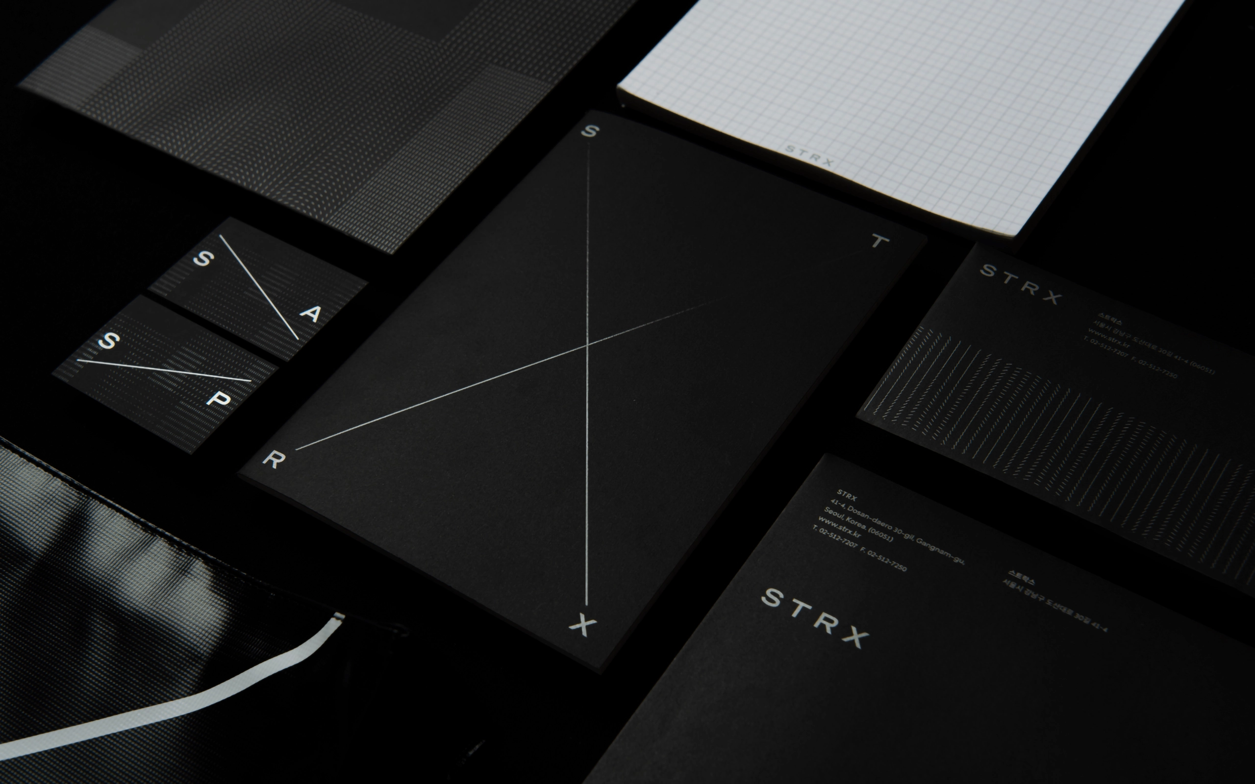
Project Overview
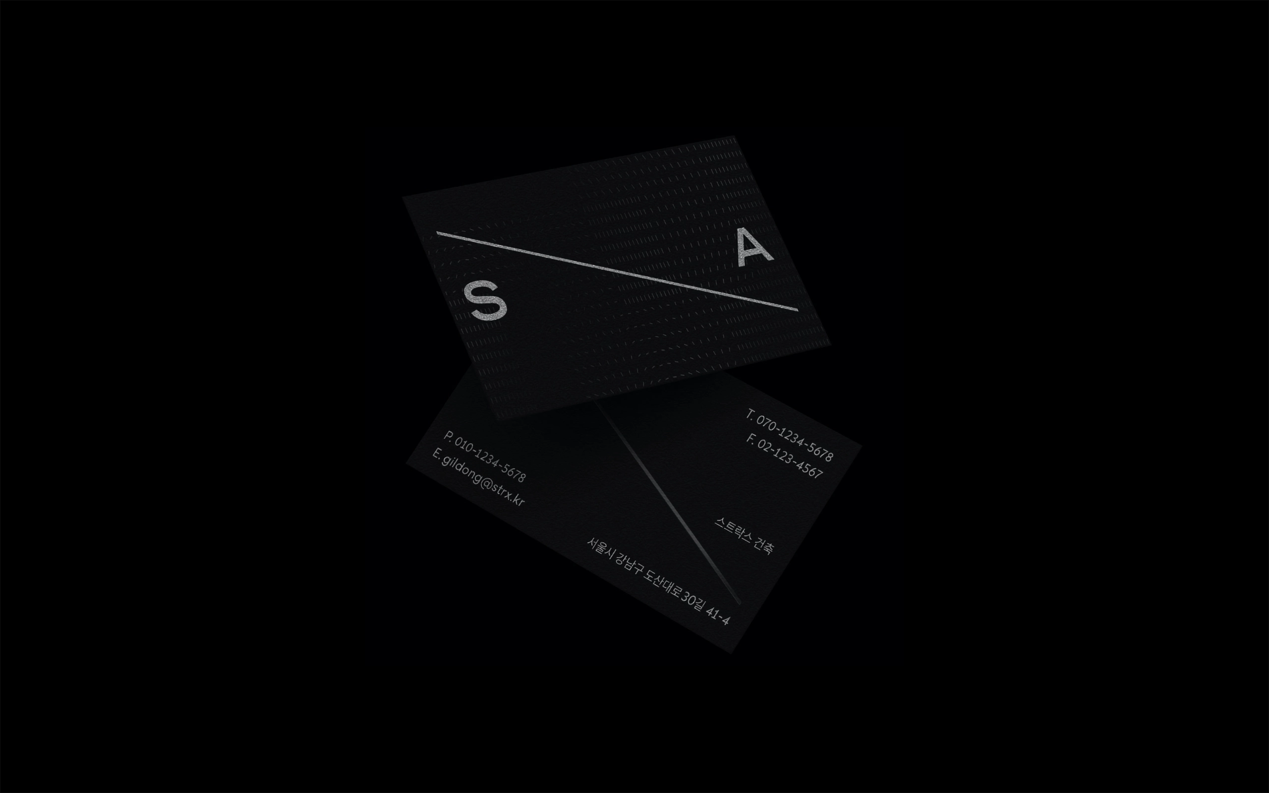
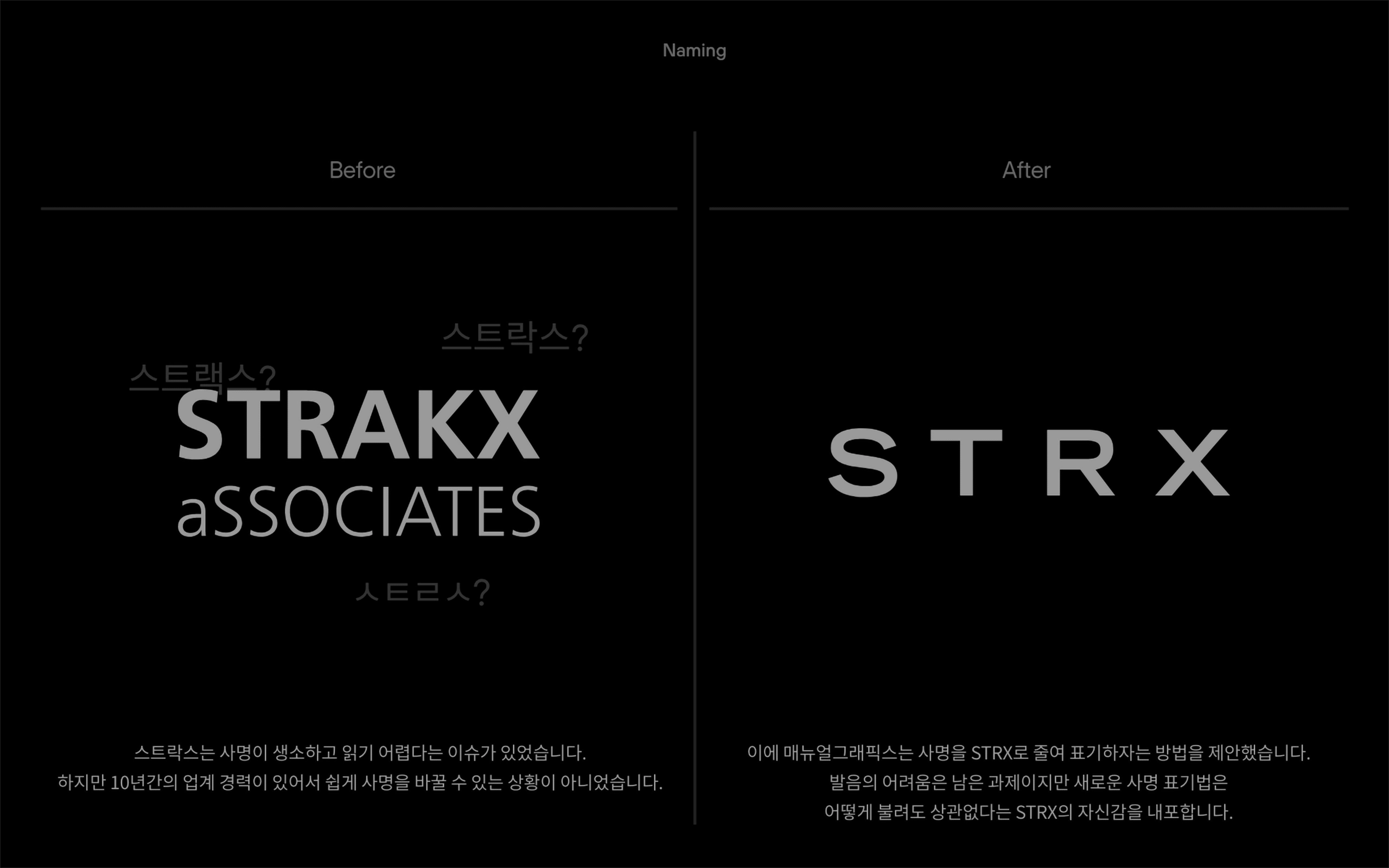
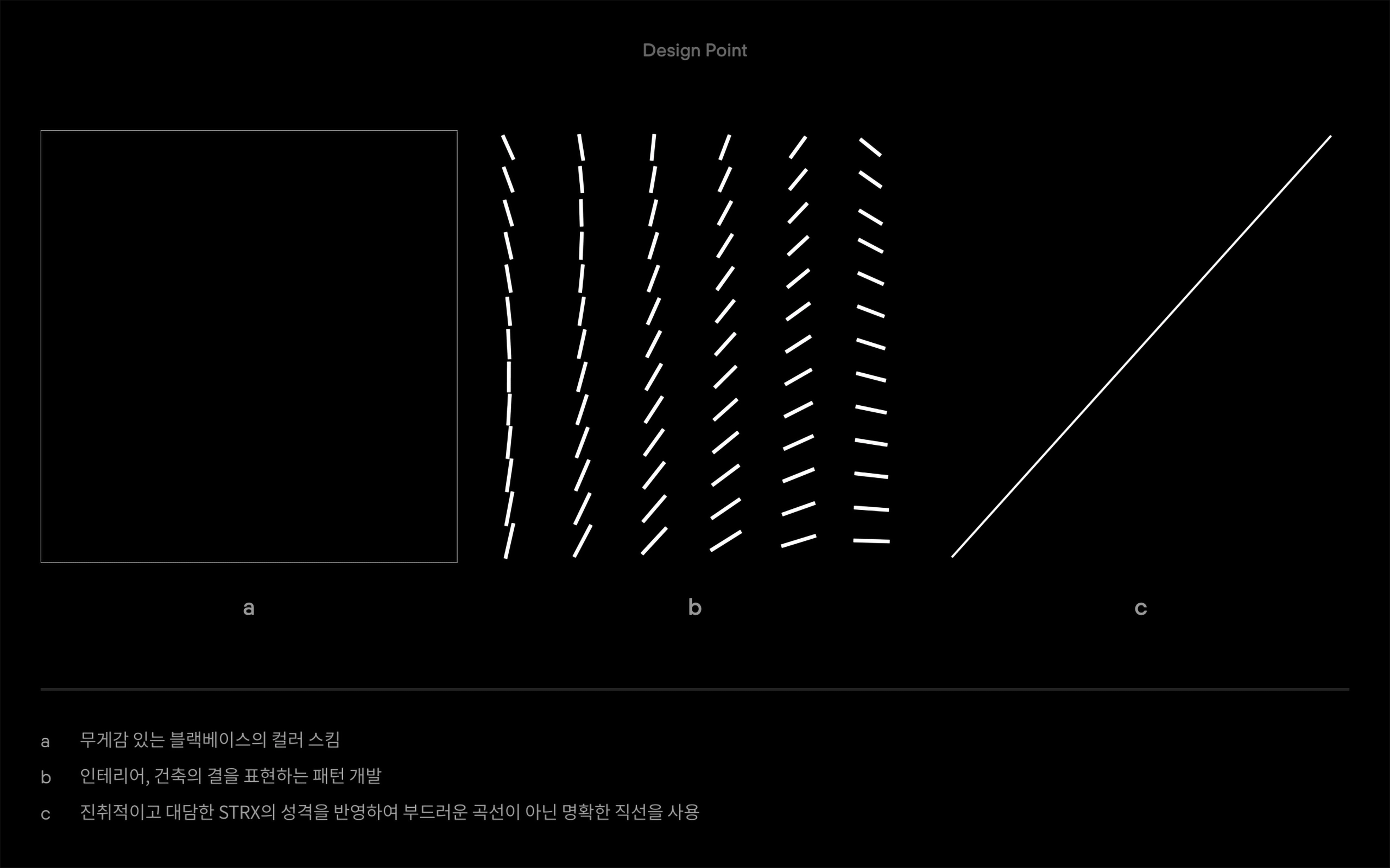
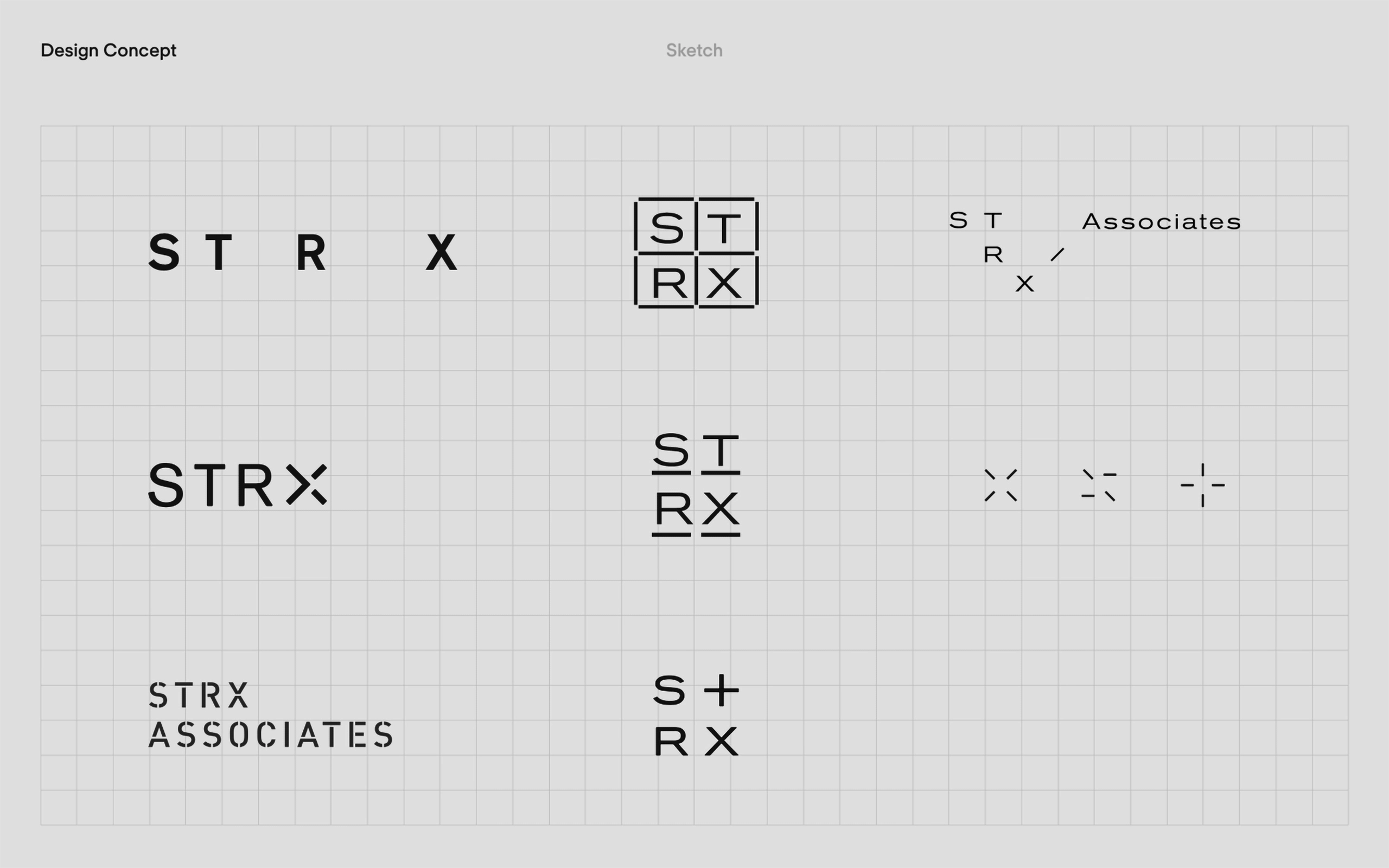
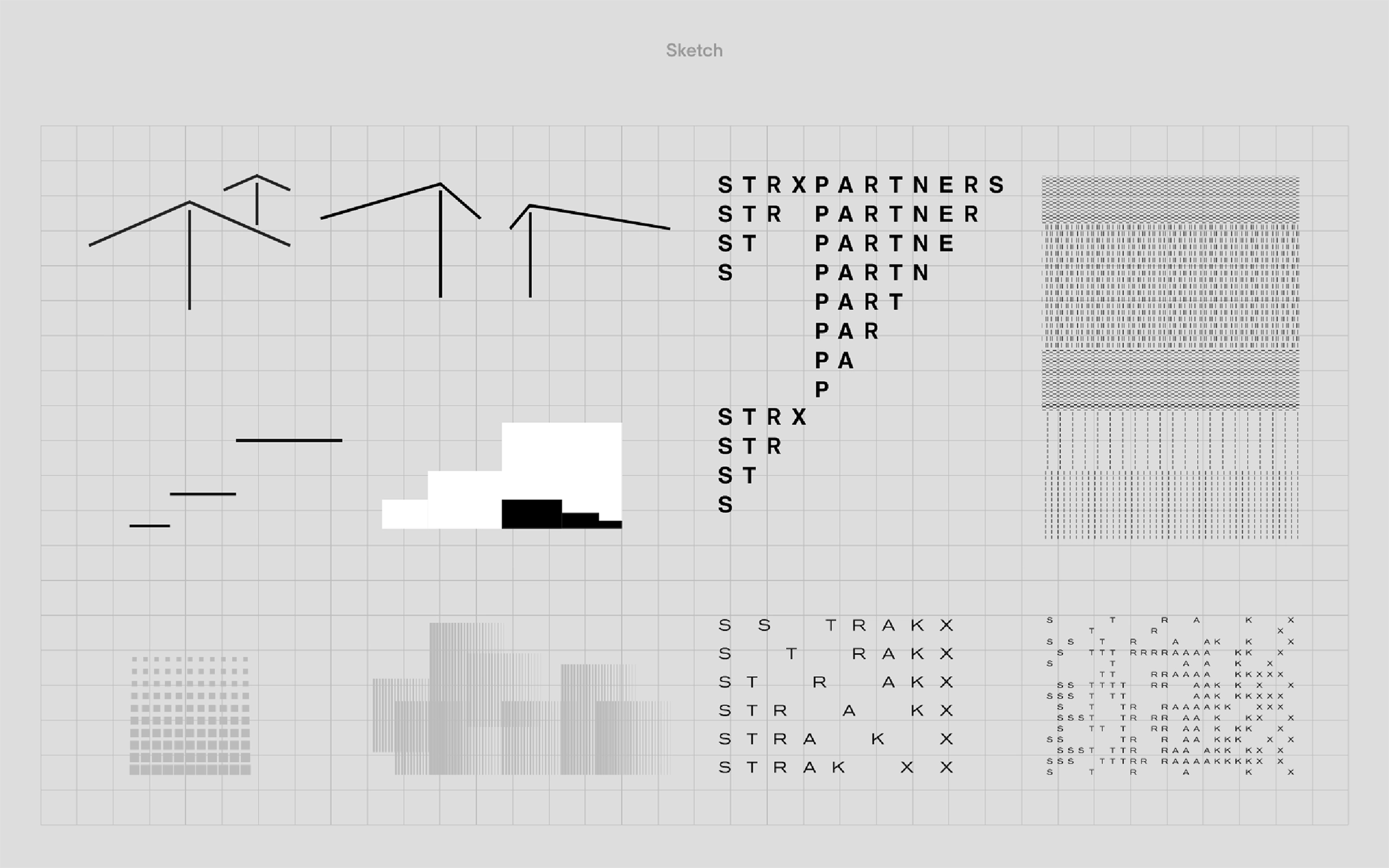
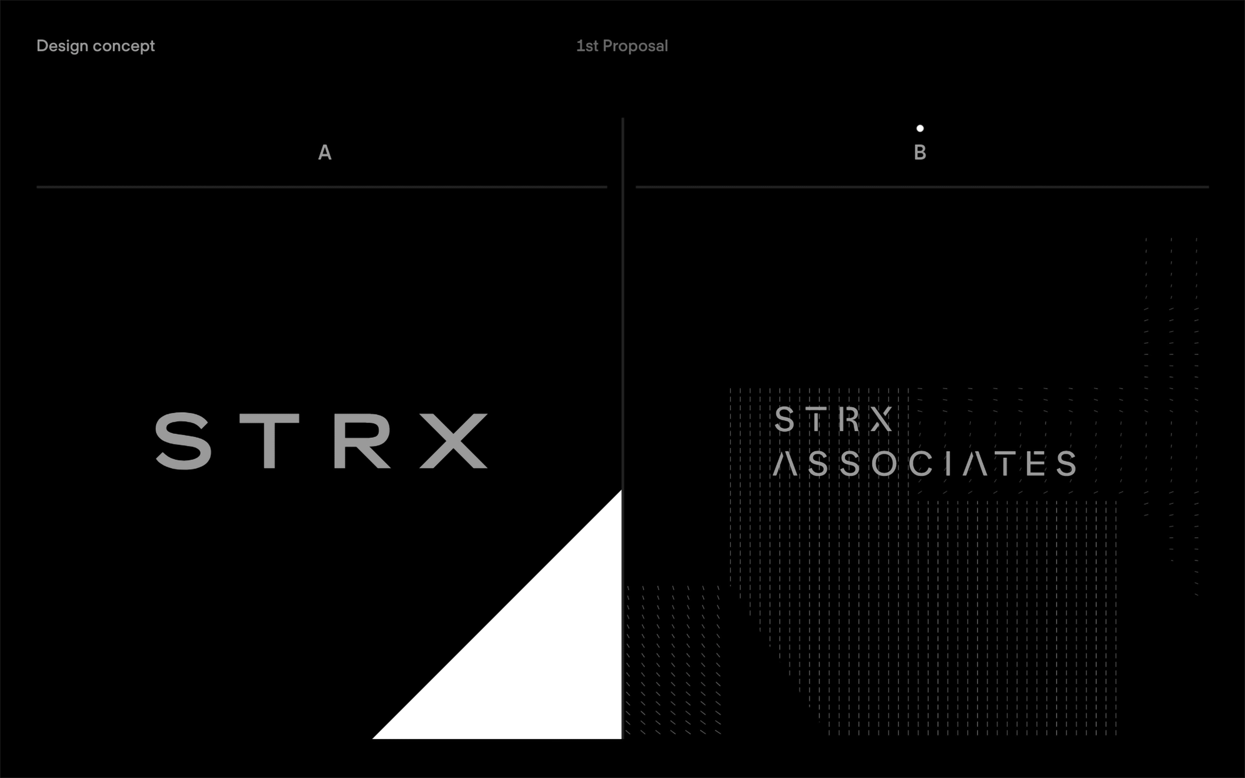
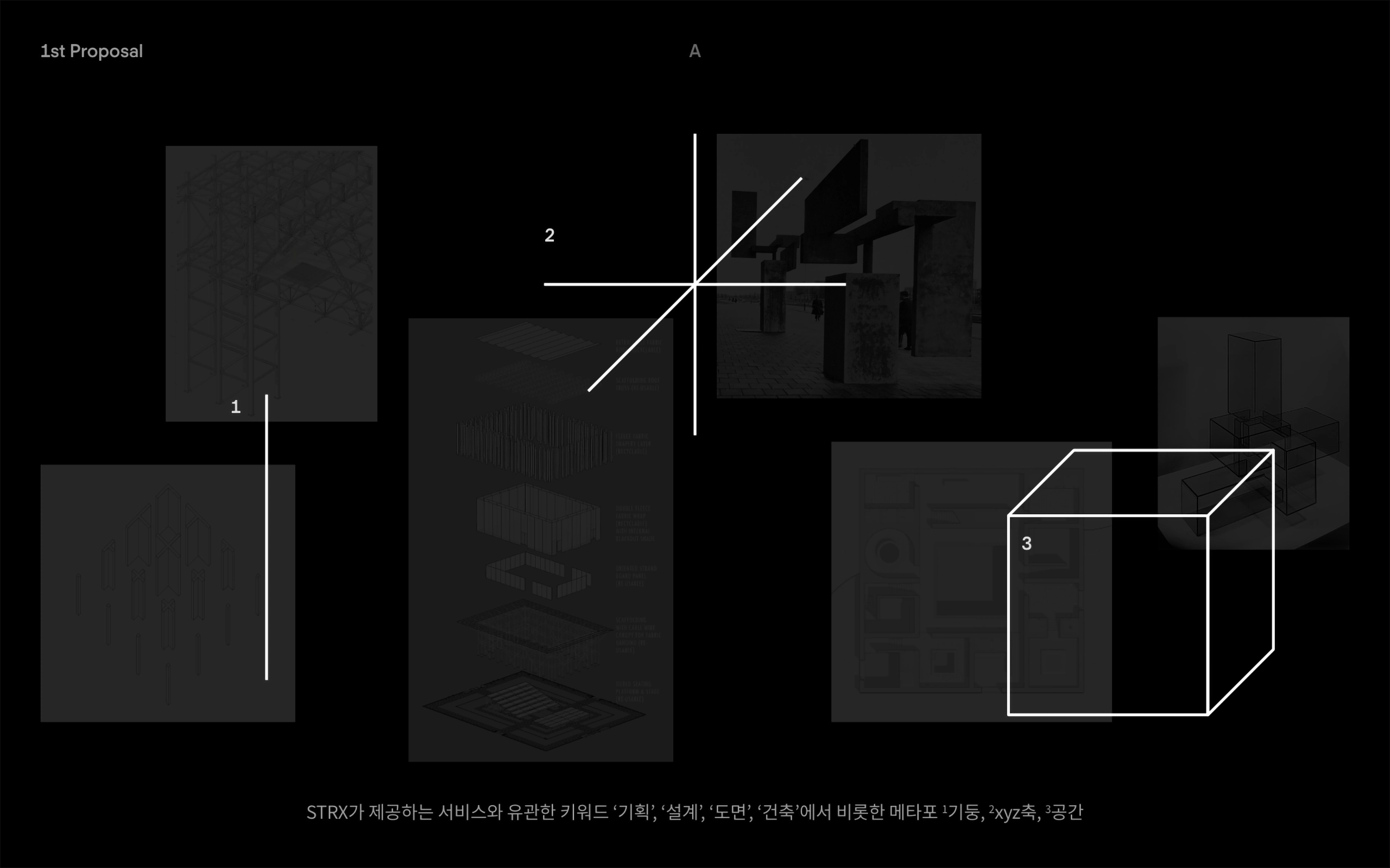
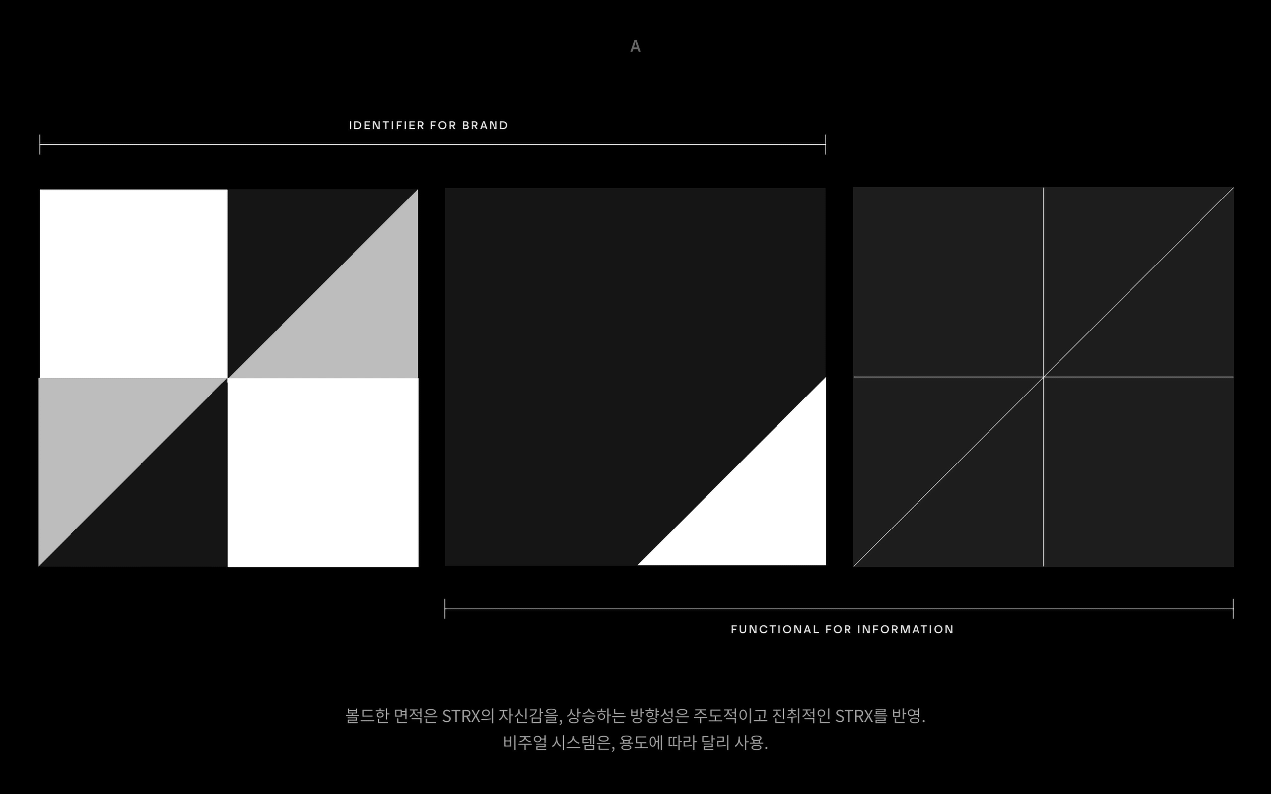
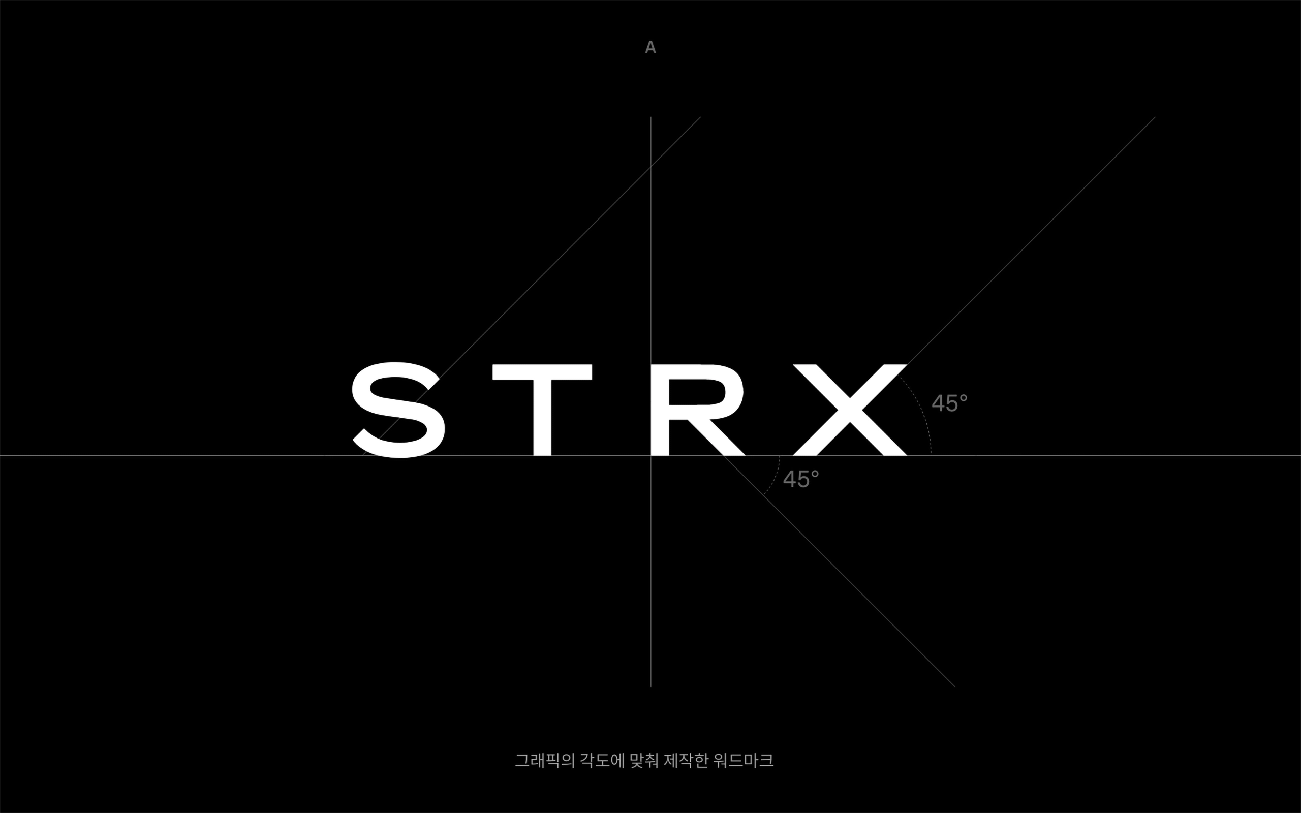
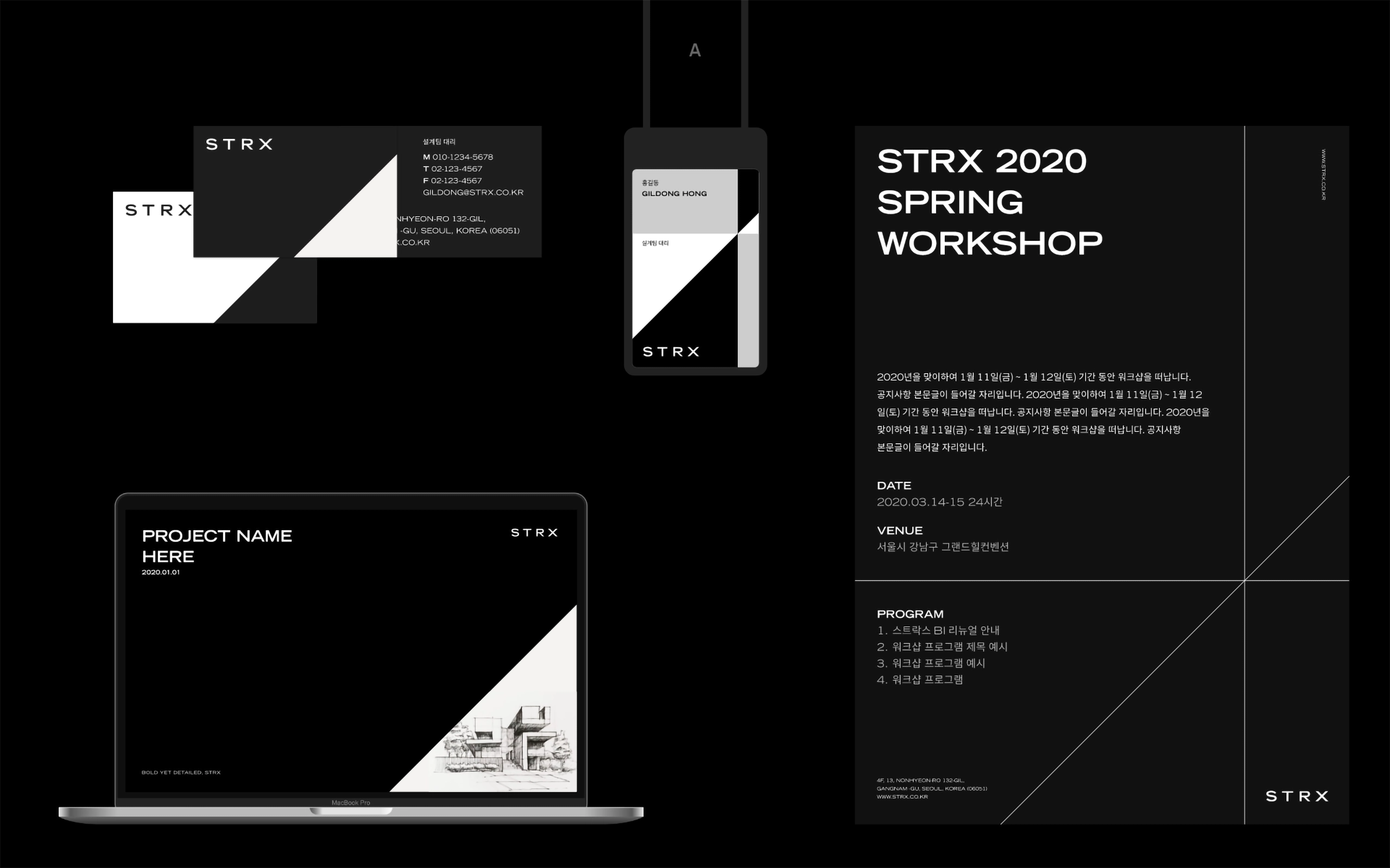
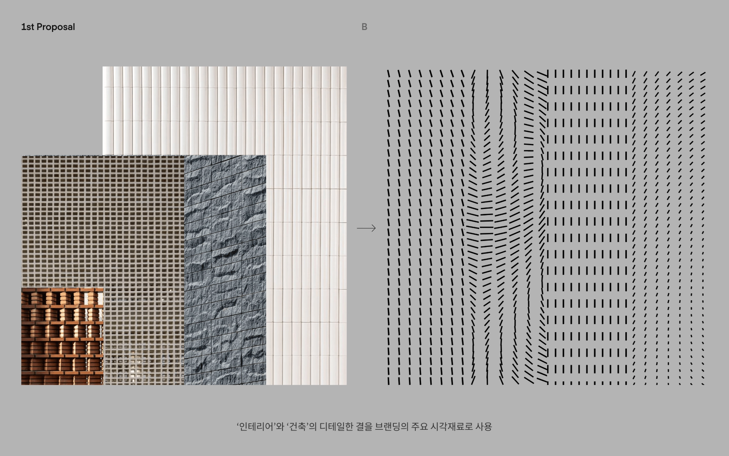
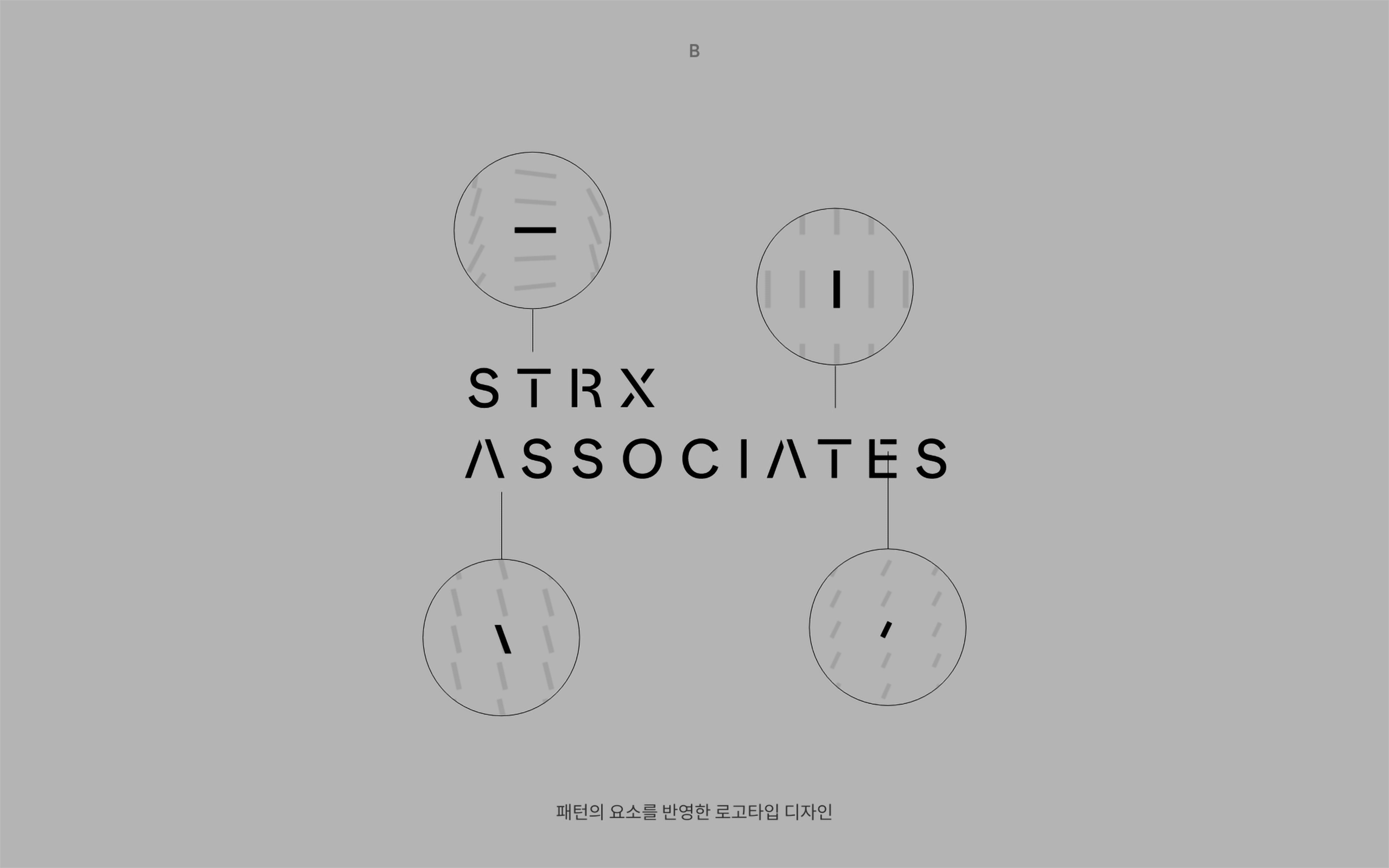
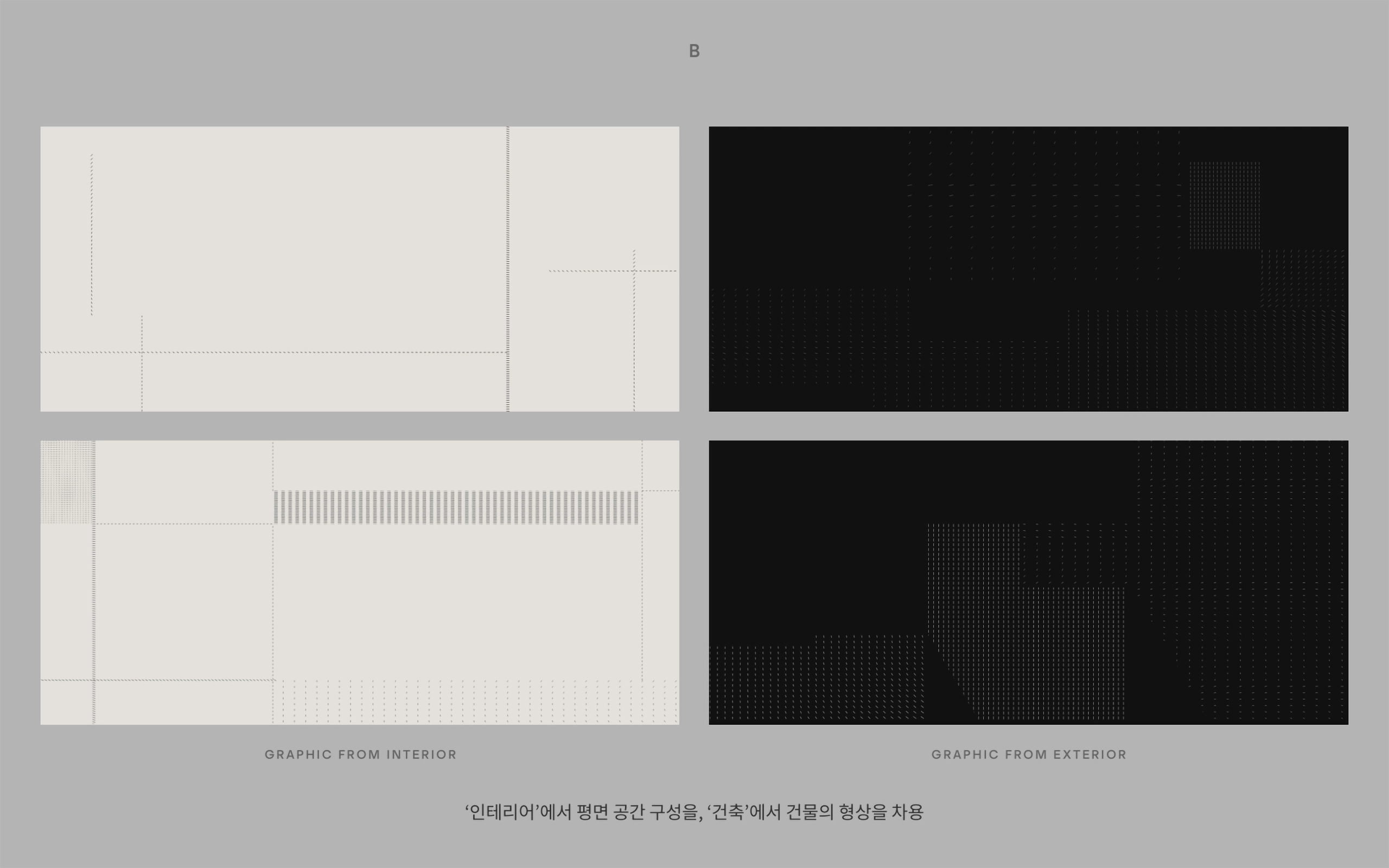
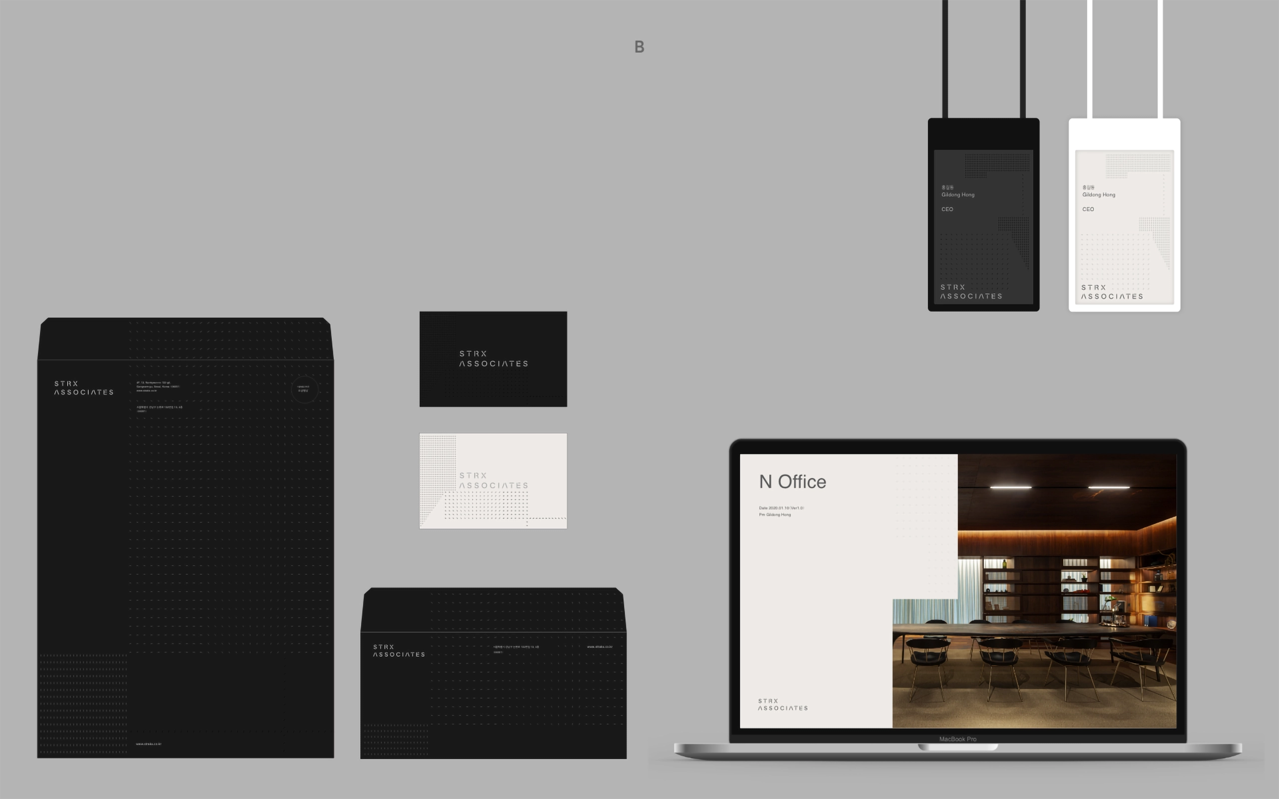
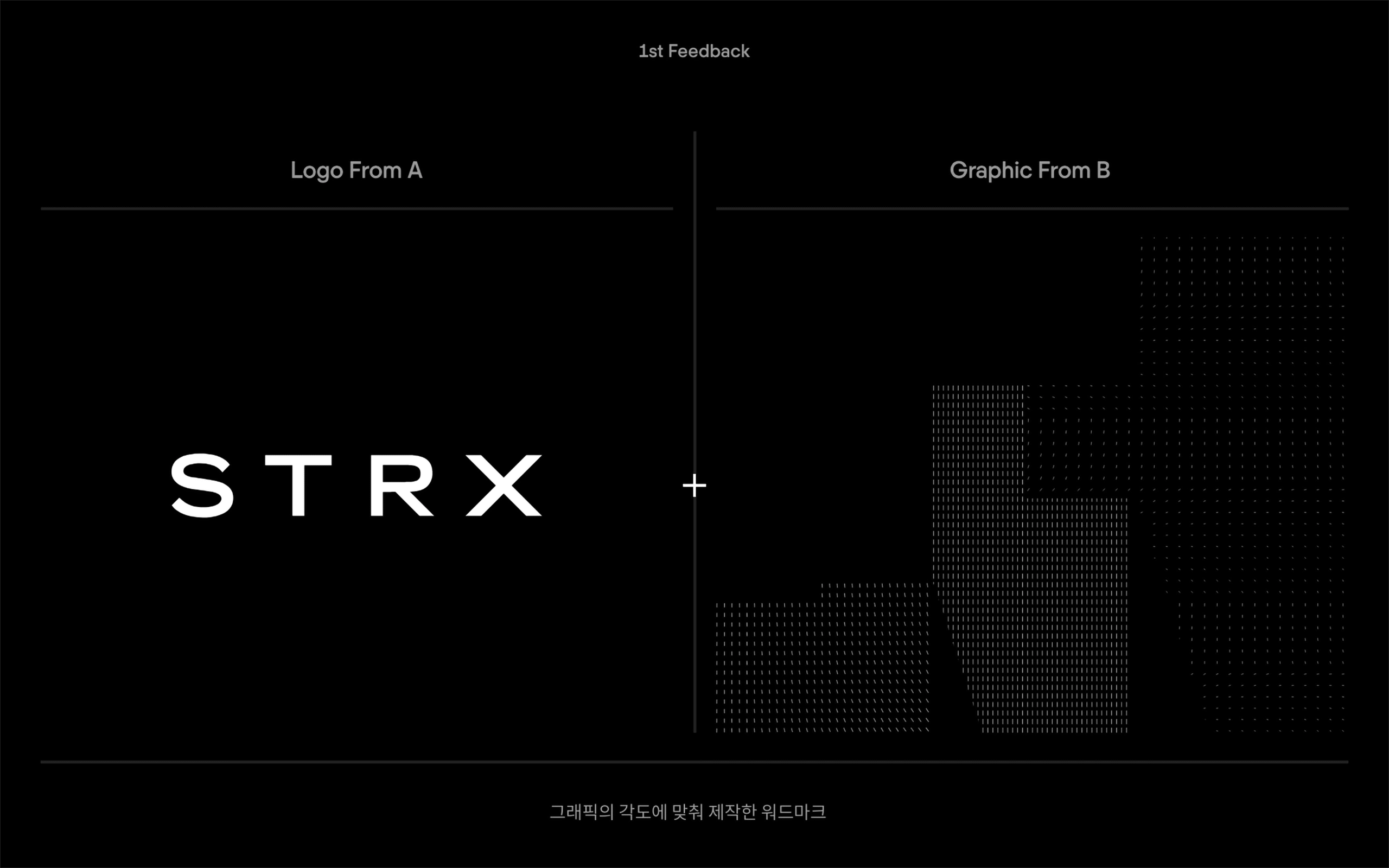
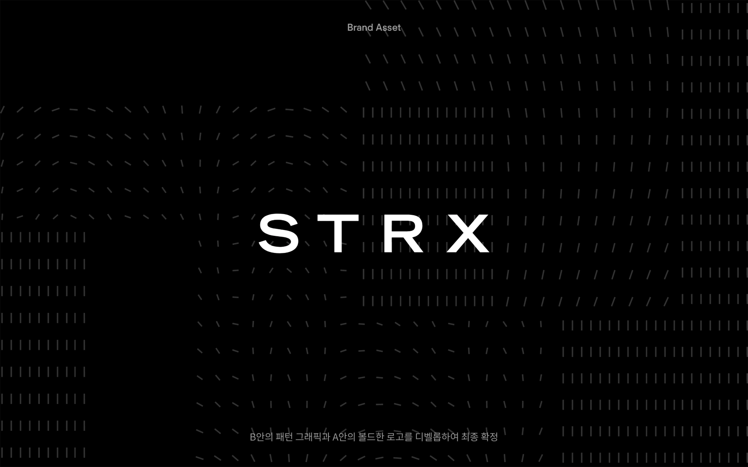
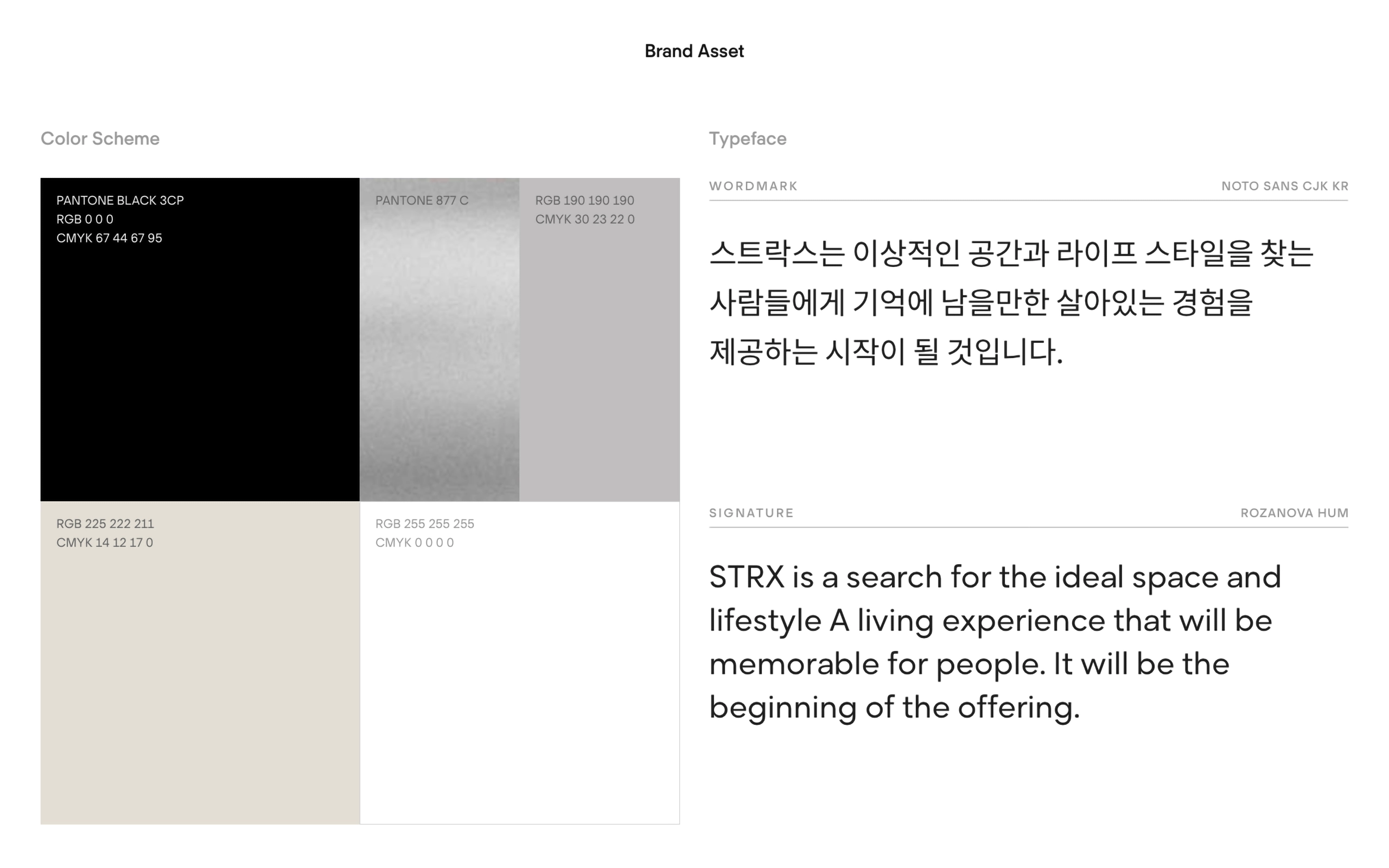
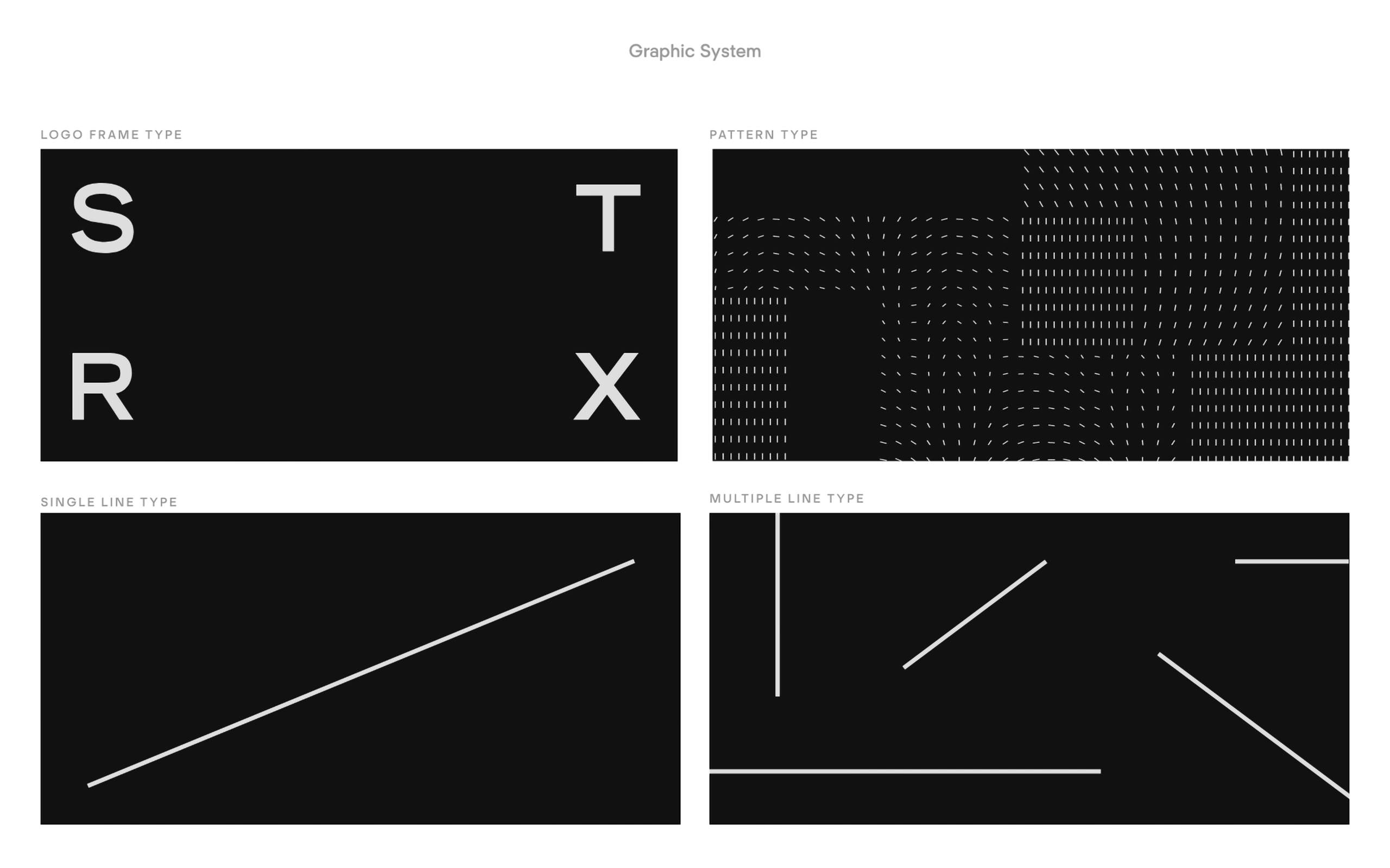
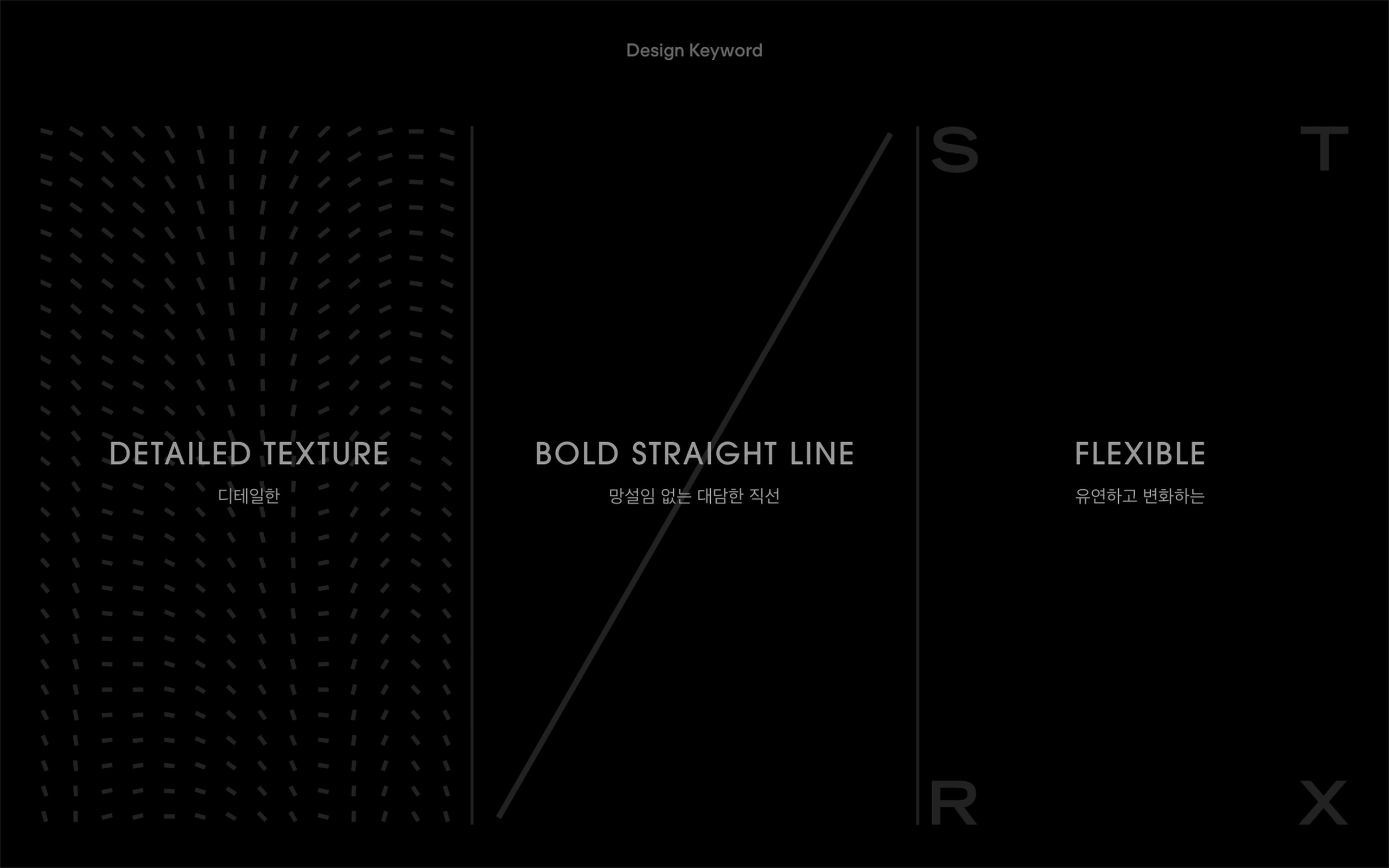
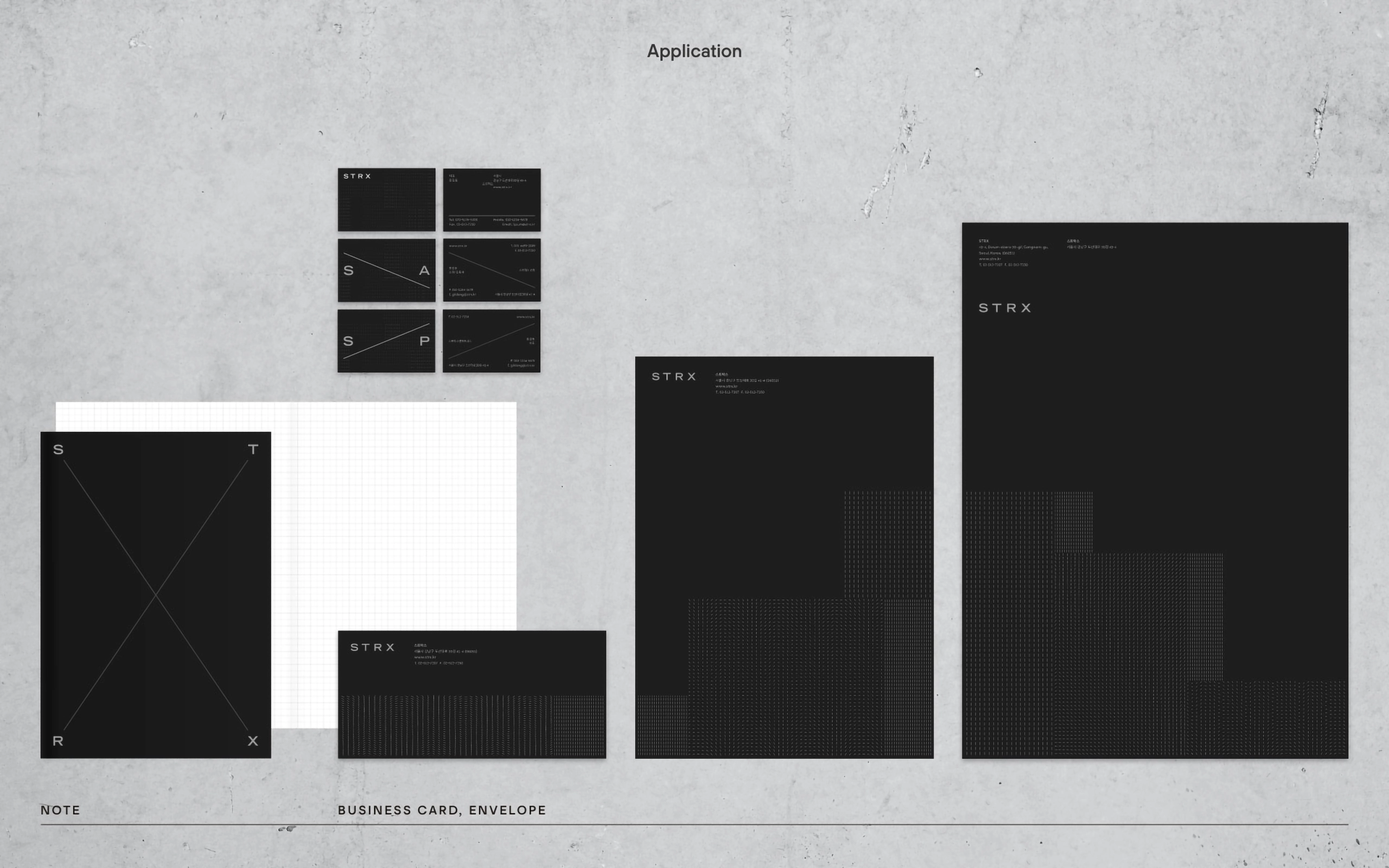
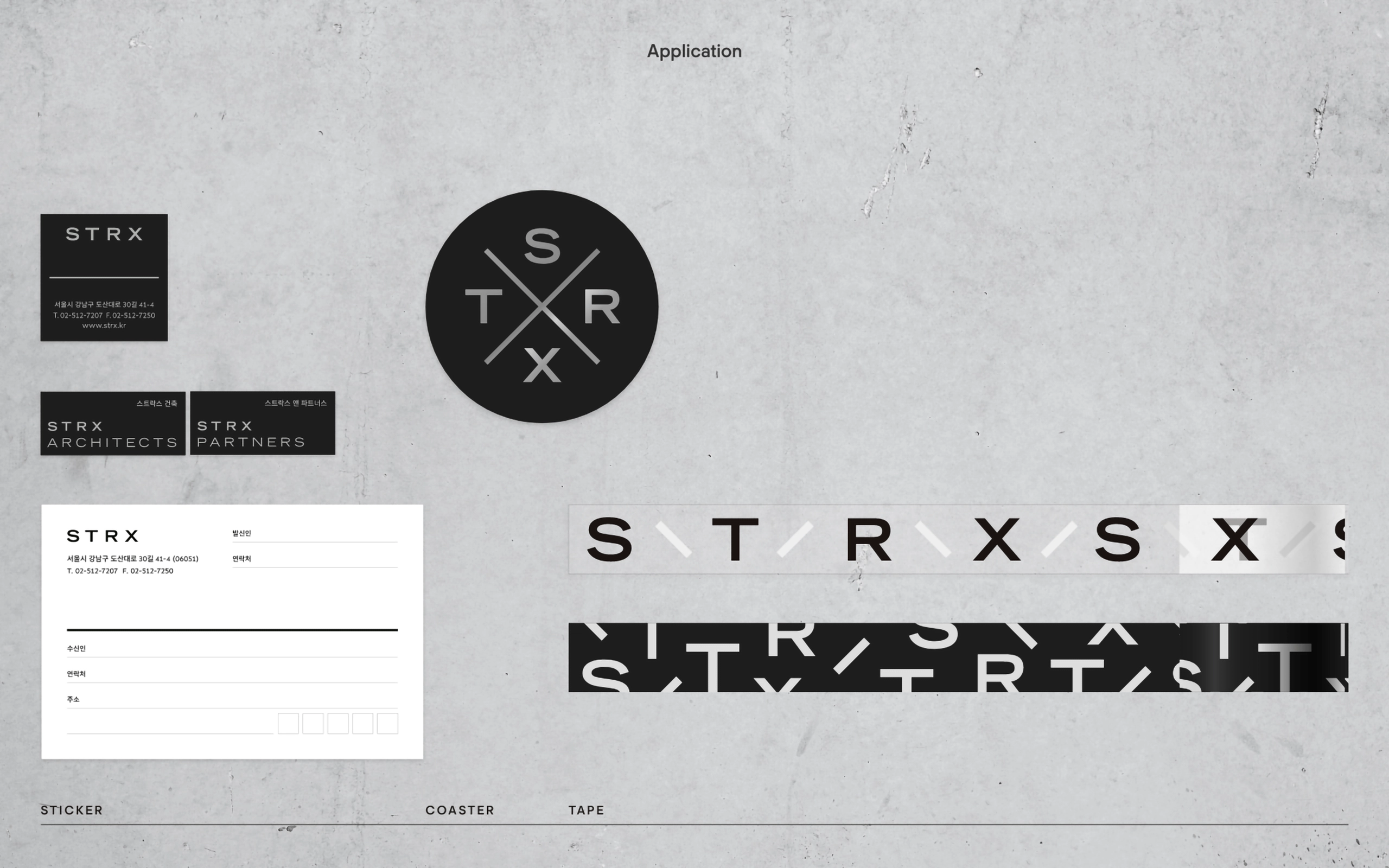
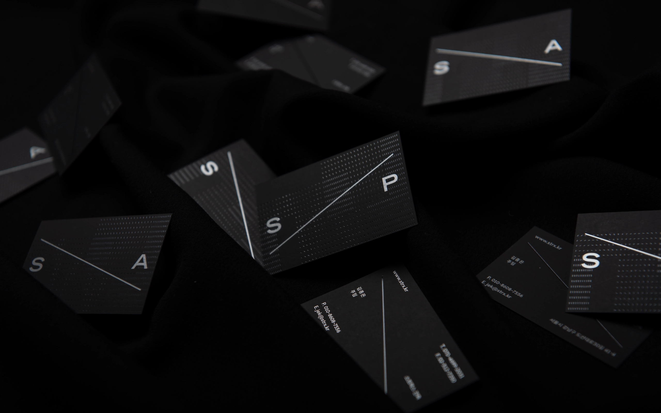
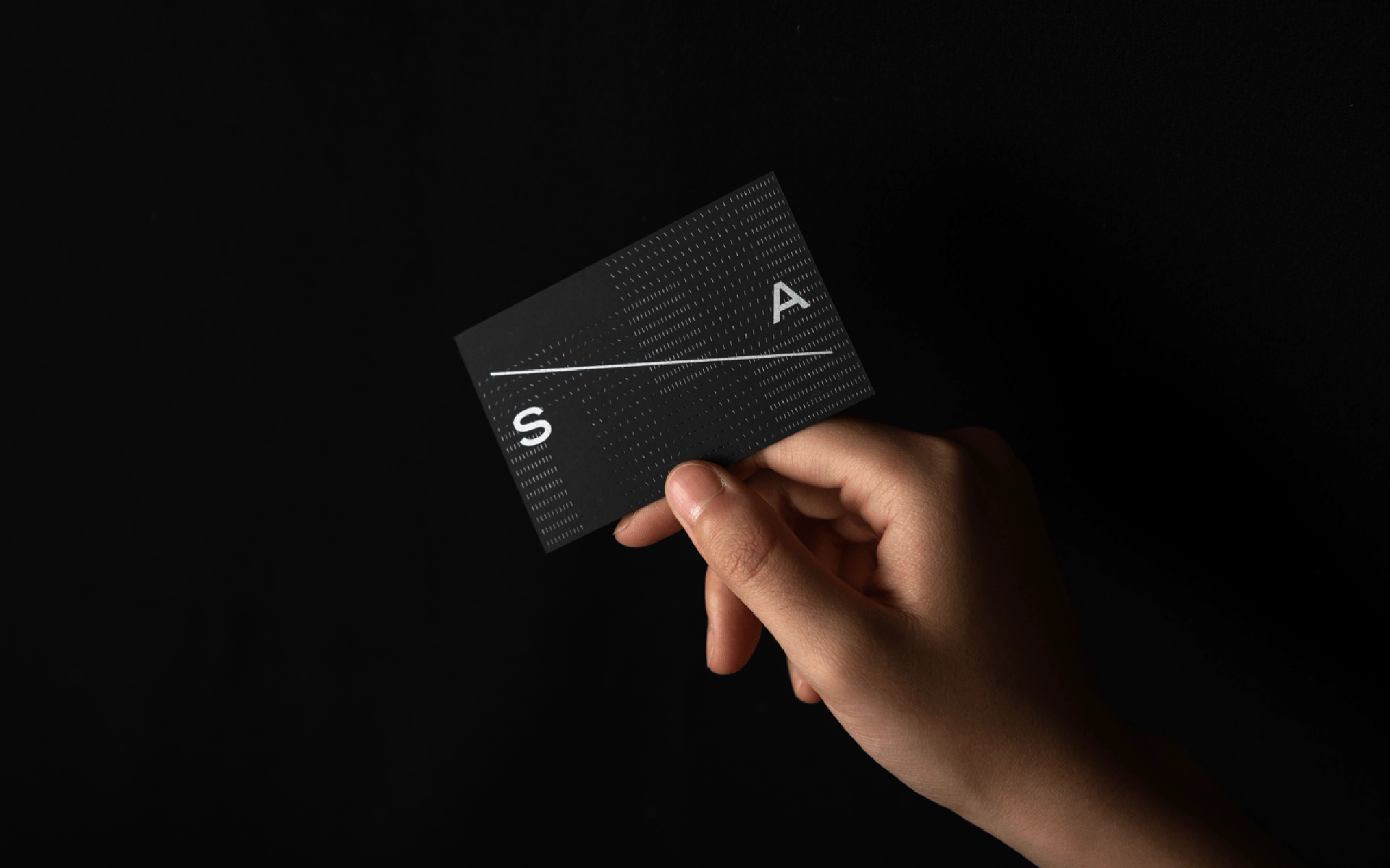
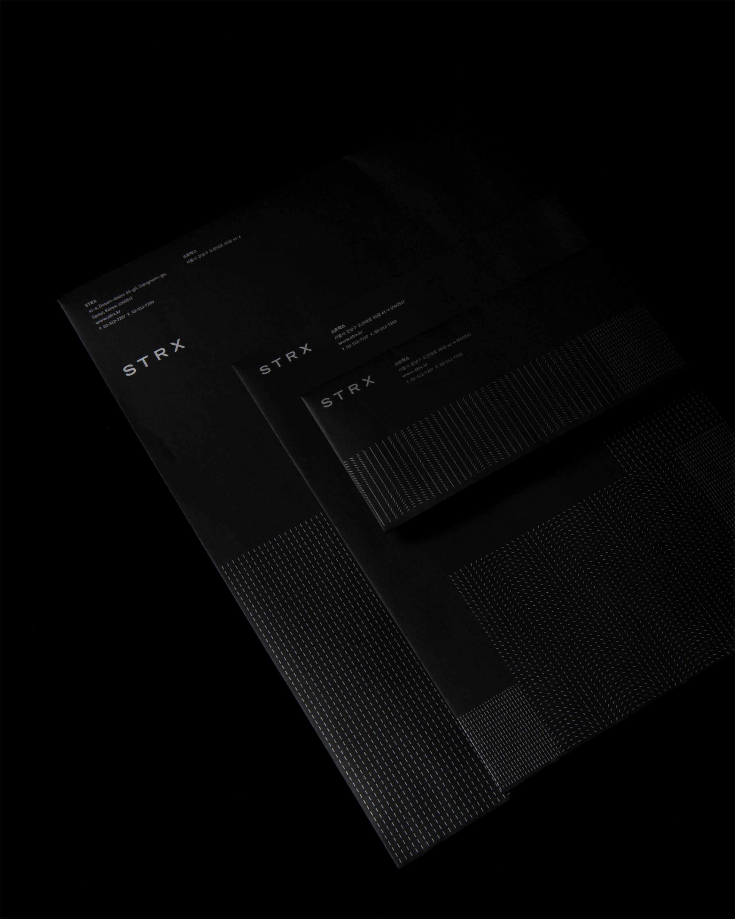
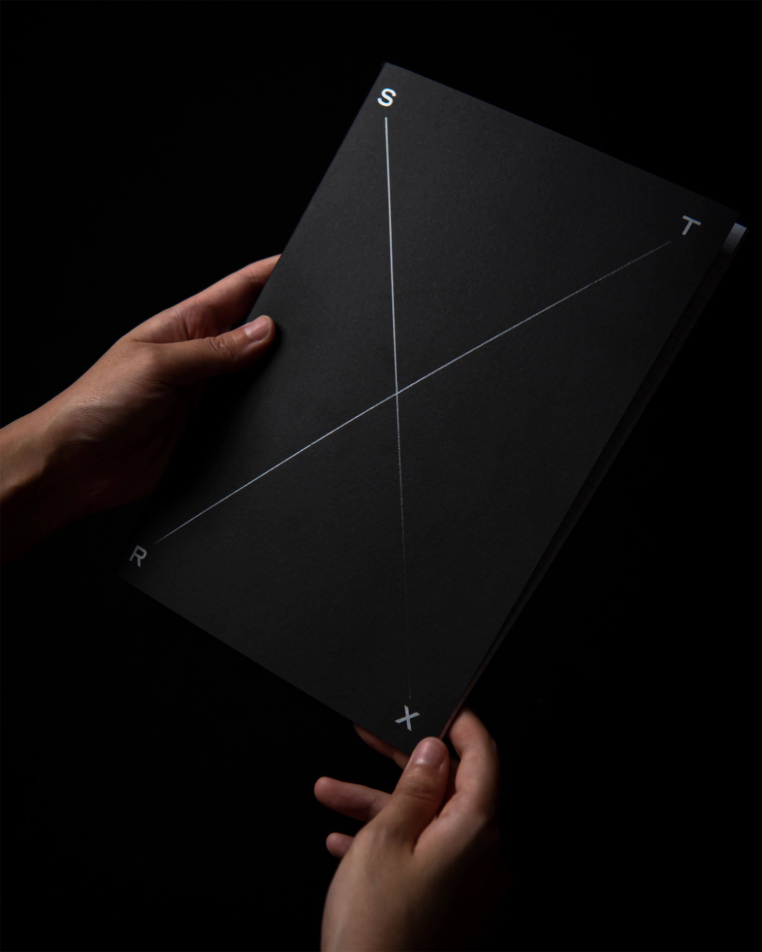
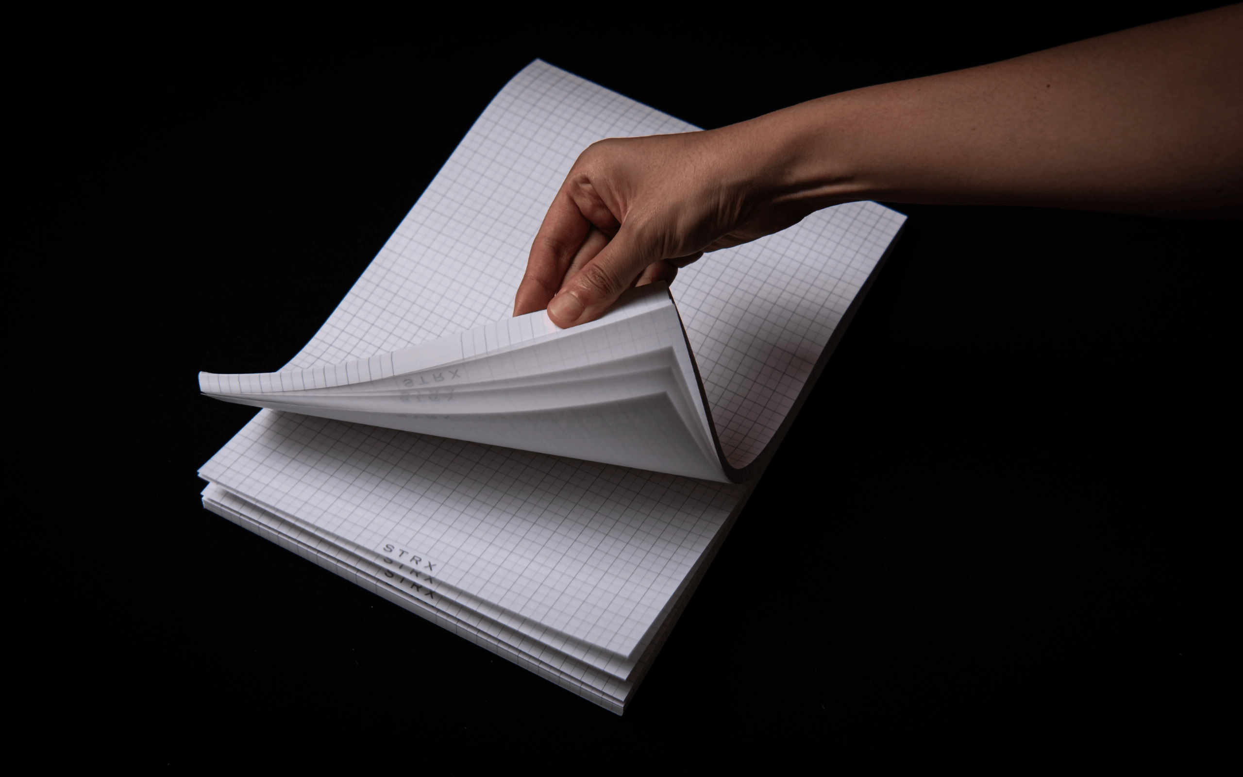
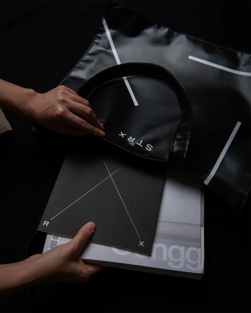
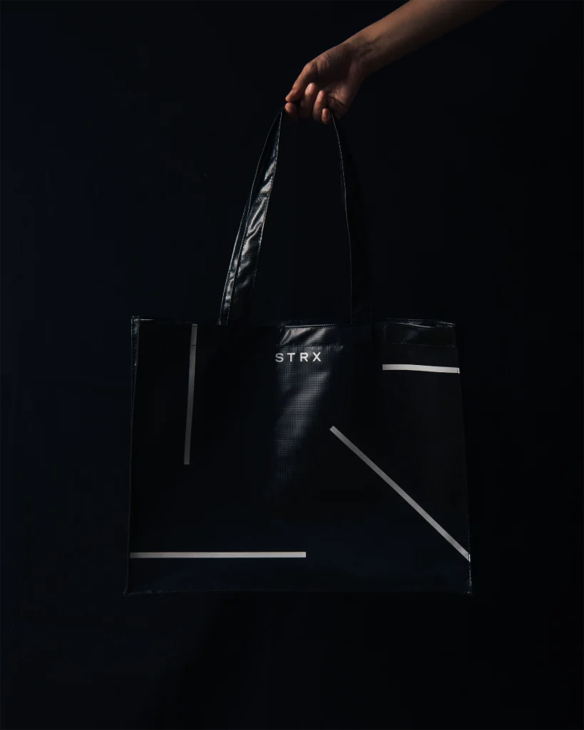
We worked on the identity renewal project of ‘Strax Associates’. We proposed and changed the name to STRX, which was more meaningless than the name ‘Strax’, as we wanted their attitude and results to be seen and judged first. We applied the diagonal line to represent the enterprising and bold action in anything, the dot expression to represent the detailed and meticulous work style, and the bold and heavy tone and manner of the office building to the color system.
‘스트락스 어소시에이츠’ 아이덴티티 리뉴얼 프로젝트를 진행했습니다. 이름보다 그들의 태도와 결과물이 우선 보이고 판단되길 원하면서 다소 의미가 부족했던 ‘스트락스’라는 이름보다 더욱 무의미하게 STRX로 네이밍 제안, 변경하였습니다. 무엇이든 진취적이고 과감한 행동력을 사선으로, 디테일하고 꼼꼼한 업무방식에서 도트 표현을, 사옥에서 느껴지는 볼드하고 무거운 톤앤매너를 컬러시스템에 적용하였습니다.