Client
GLAD 글래드
Workscope
Brand Identity
Manual Graphics
Director – Seongkyun Lee
Design – Seongeun Kim, Minseon Gwak
Photography – Hanyeon Lee
Motion – Yeonkyung Kim
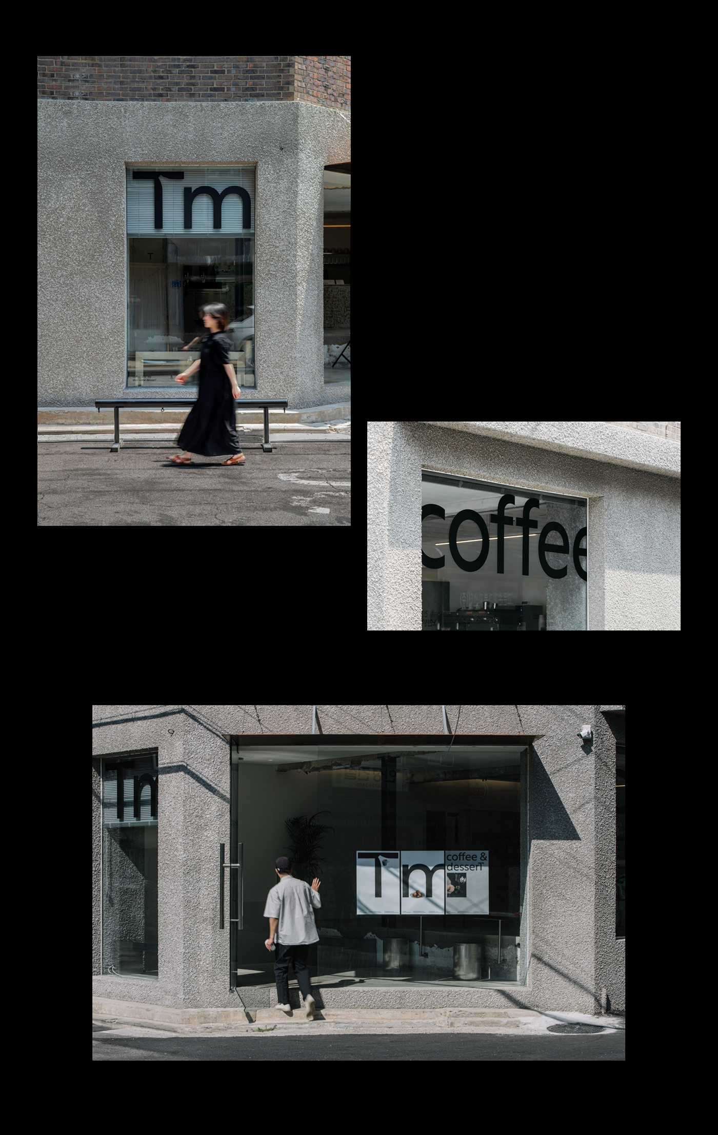
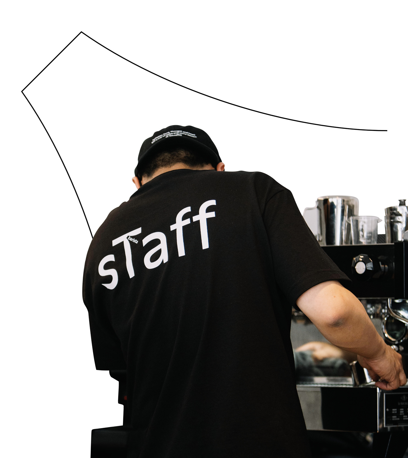
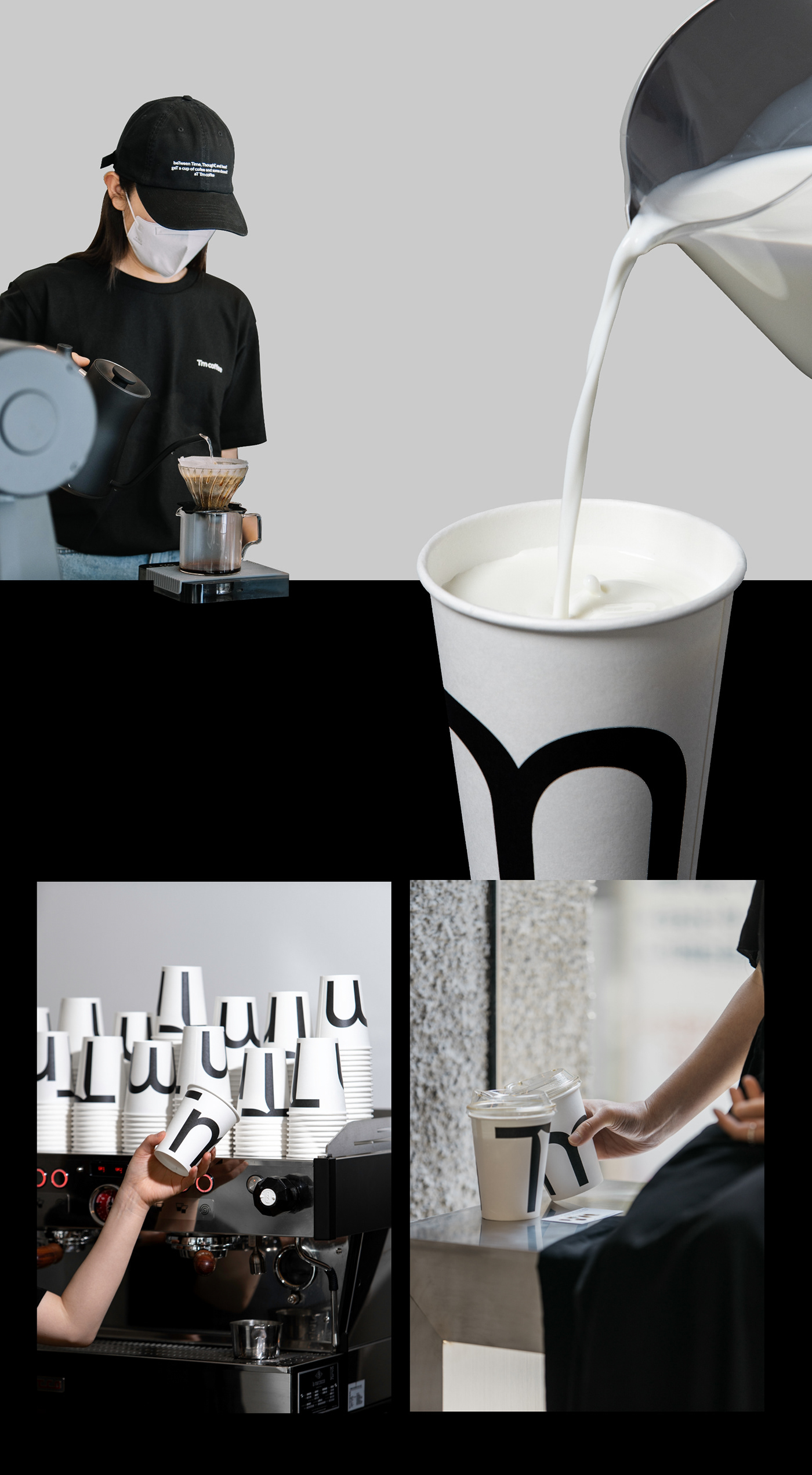
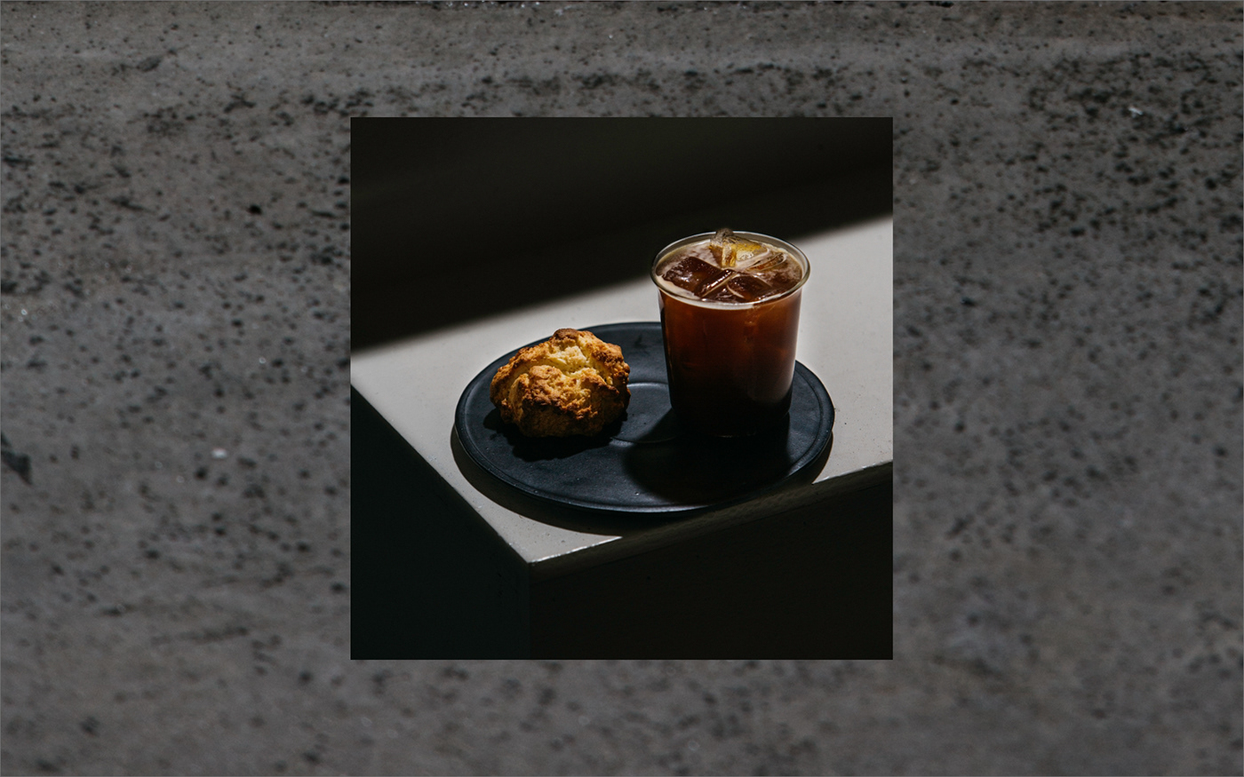
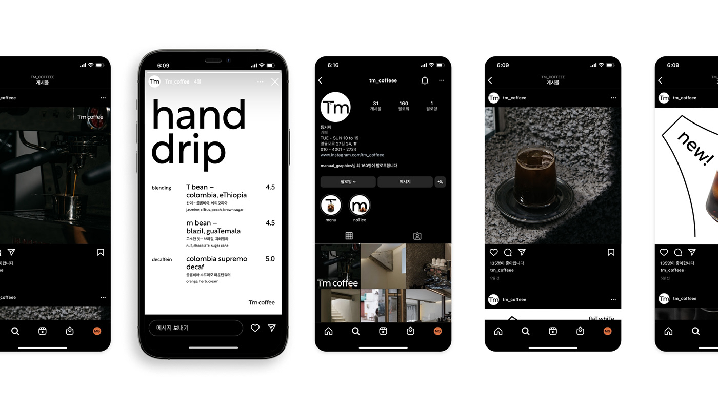
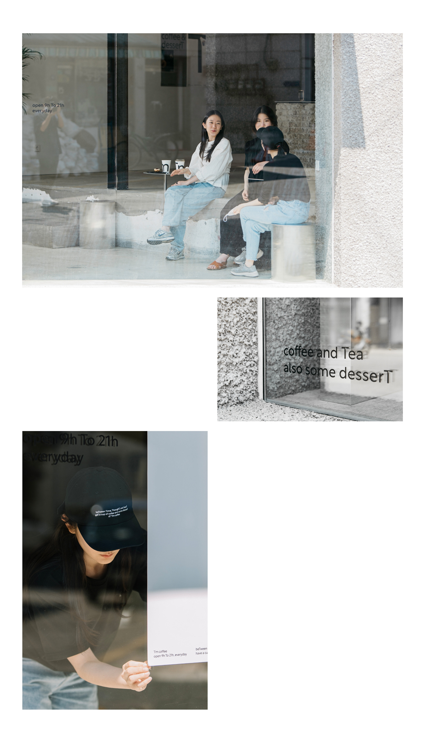
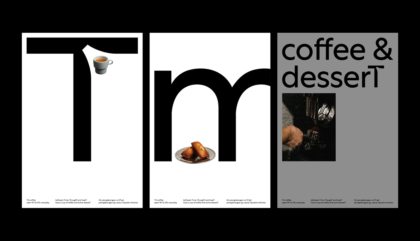
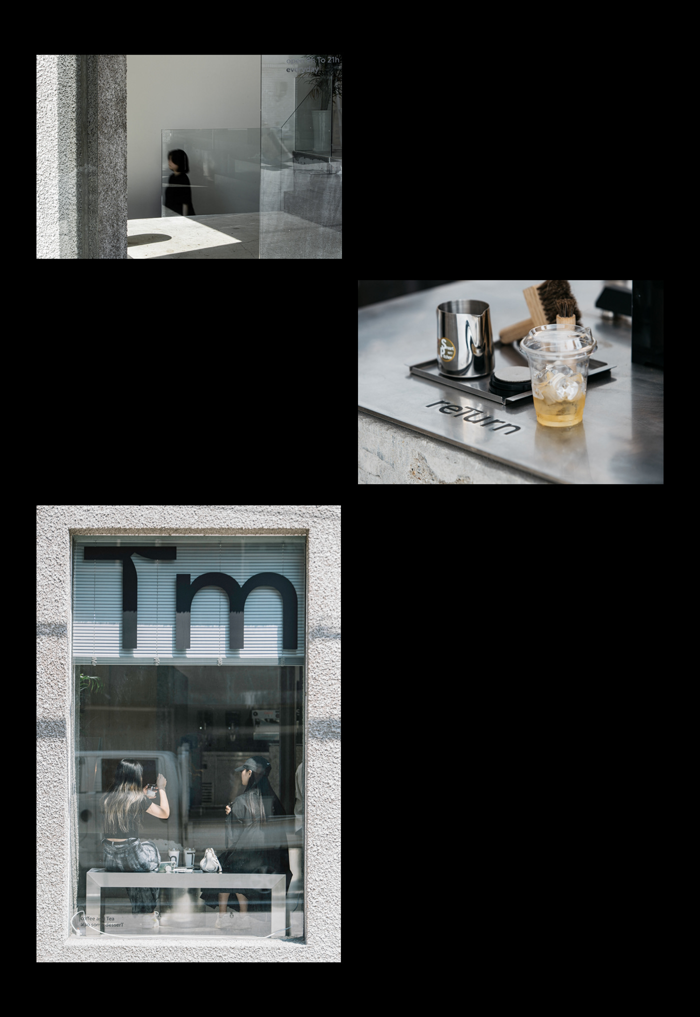
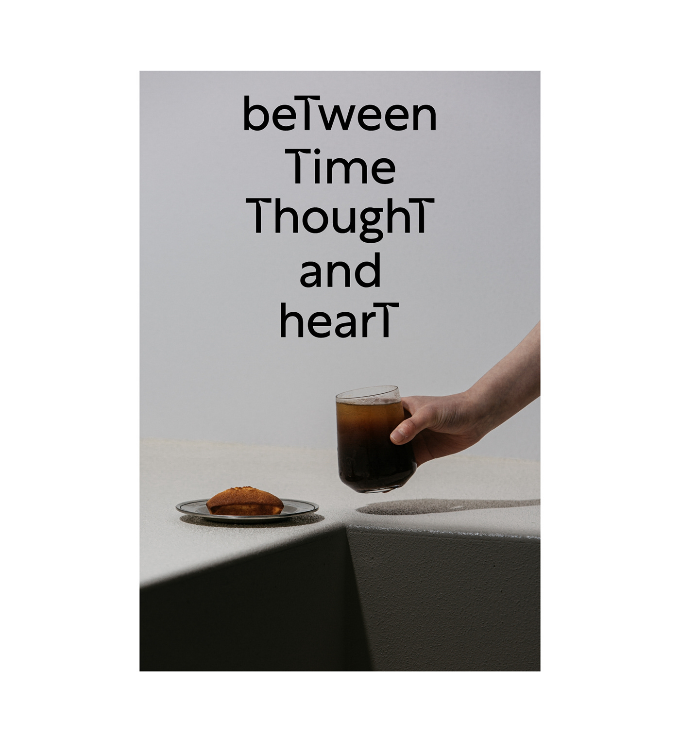
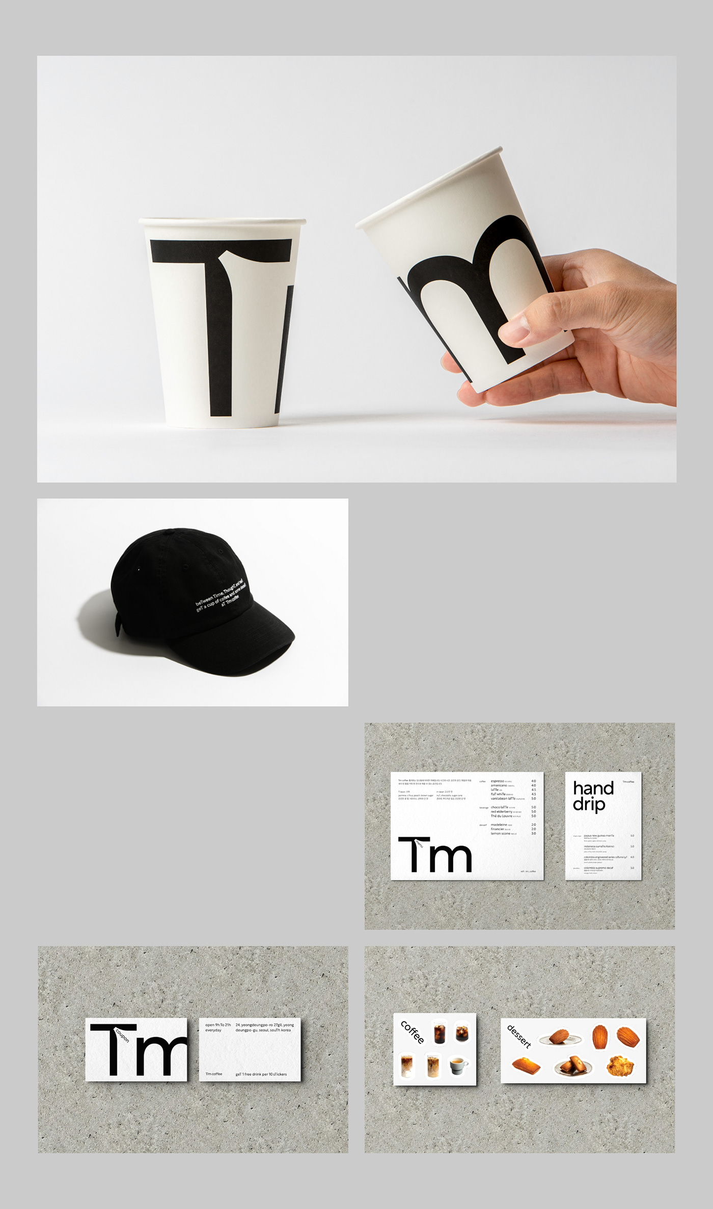
Tm Coffee is a cafe that offers coffee and relaxation in a minimalist space. The cafe’s name, “틈:Tm(Gap),” refers to the small spaces we create in our busy days.
Manual Graphics worked with client and space designer Glad to design the identity for Tm Coffee.
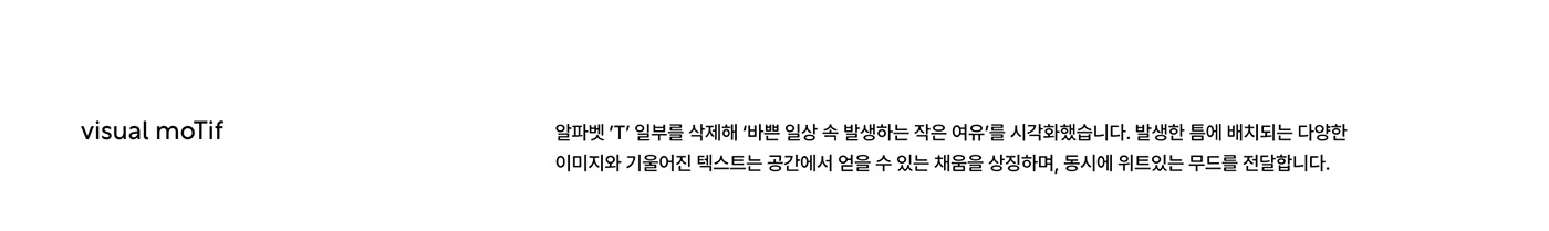
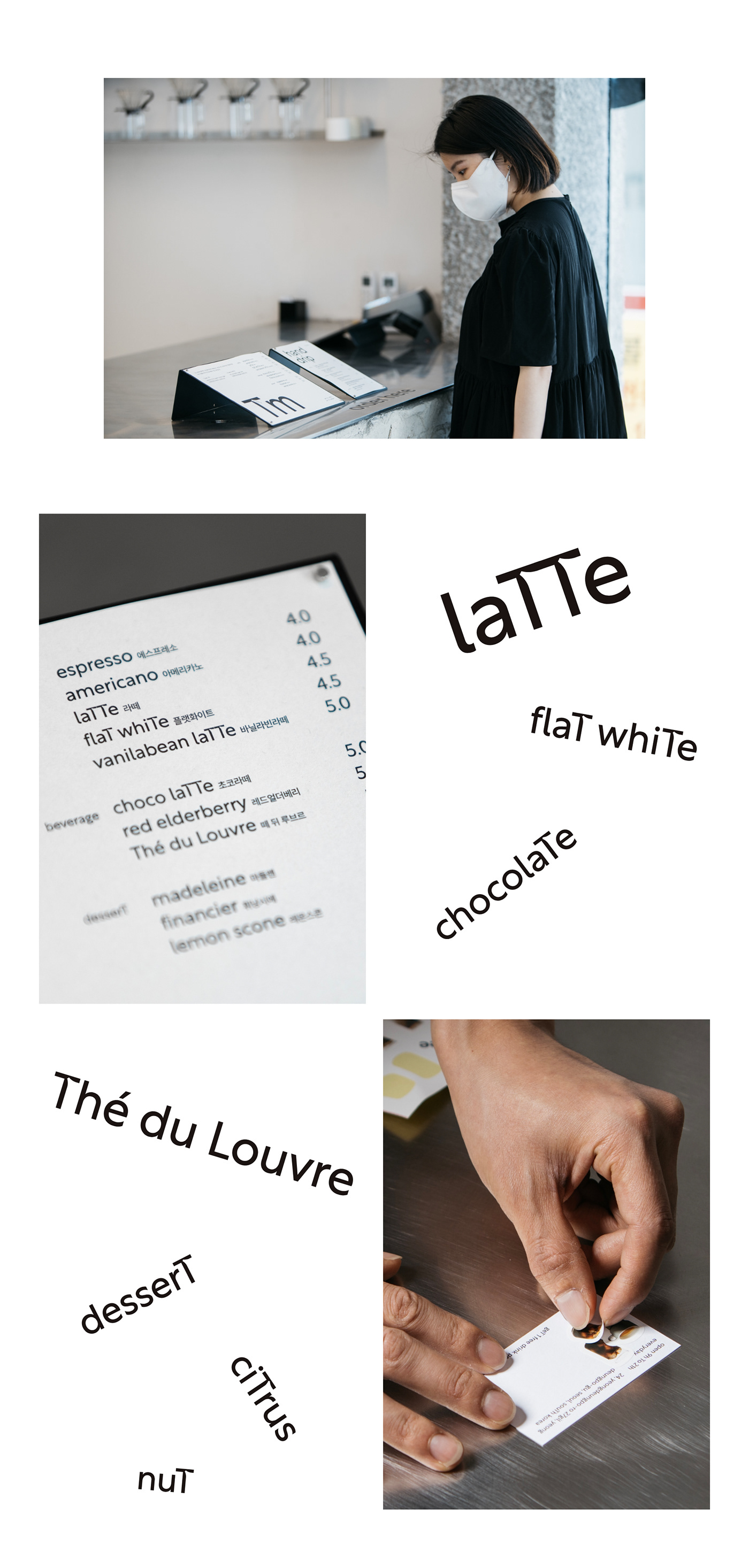
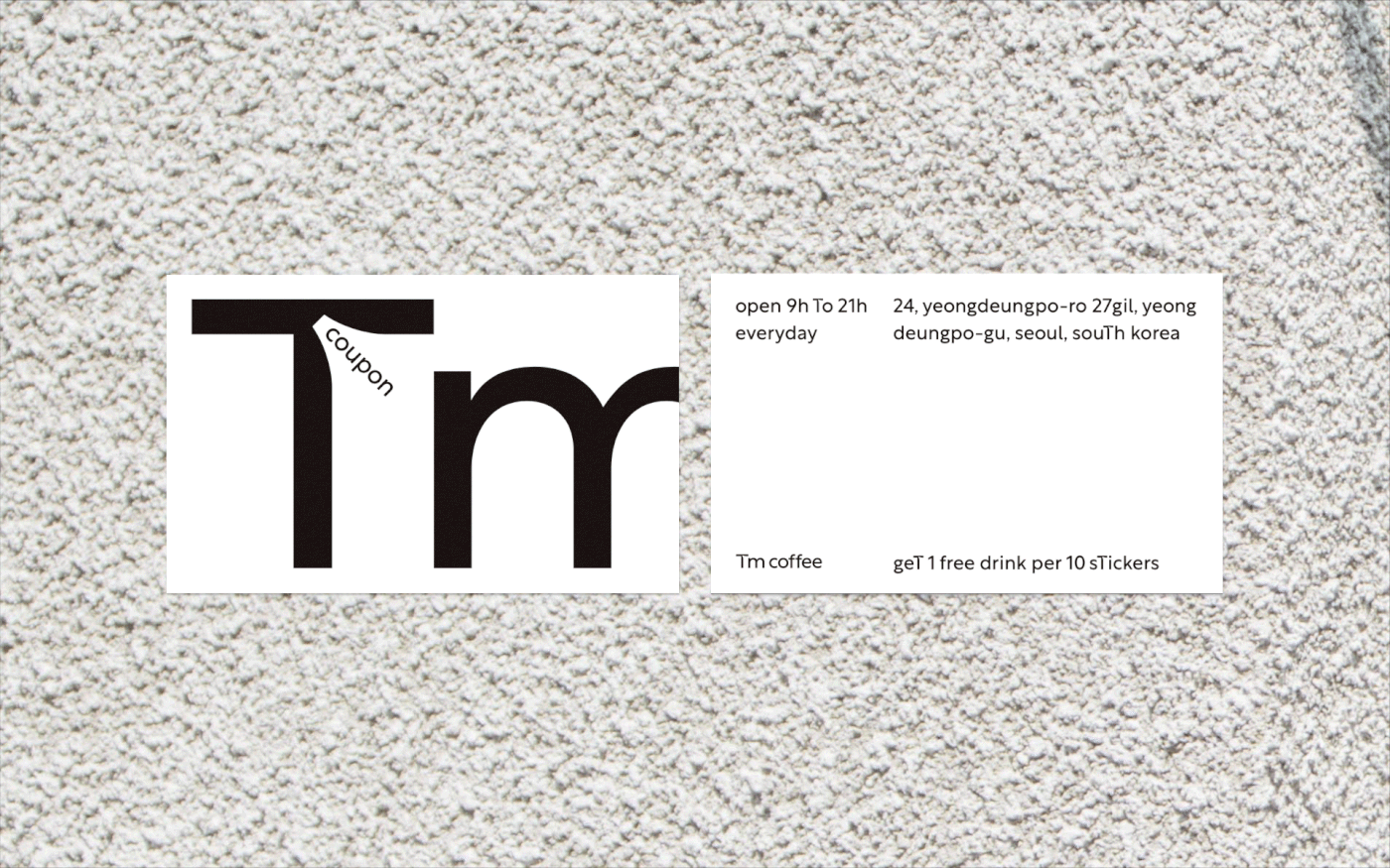
Utilizing the first letter of Tm Coffee, ‘T’, we created a graphic motif that intuitively represents ‘gap’. The gaping ‘T’ symbolizes ‘emptiness’, the keyword of the cafe, and the images and text placed between the ‘T’ symbolize the new ‘fill’ that comes from emptying. The rhythmic elements add to the organized layout, conveying a calm but playful mood.
틈 커피(Tm Coffee)는 미니멀한 공간에서 커피와 함께 휴식을 제공하는 카페입니다. 카페의 이름인 ‘Tm 틈’은 바쁘게 흘러가는 하루에 만드는 작은 공백을 의미합니다.
매뉴얼 그래픽스는 클라이언트이자 공간 디자인을 진행한 Glad와 협의하여 틈 커피 아이덴티티 디자인을 진행하였습니다.
틈 커피의 첫 자인 ’T’를 활용하여 ‘틈’을 직관적으로 표현하는 그래픽 모티프를 마련했습니다. 틈이 생긴 ’T’는 카페의 핵심 키워드인 ‘비움’을, ’T’ 사이에 배치되는 이미지와 텍스트는 비움을 통해 얻게 되는 새로운 ‘채움’을 상징합니다. 정돈된 레이아웃에 리듬 있는 요소를 더해 차분하지만 위트있는 무드를 전달합니다.