
Client
DXSS INC.
Workscope
Identity Experience Design, Key Visual Design, Application Design, Signage Design
Project Overview
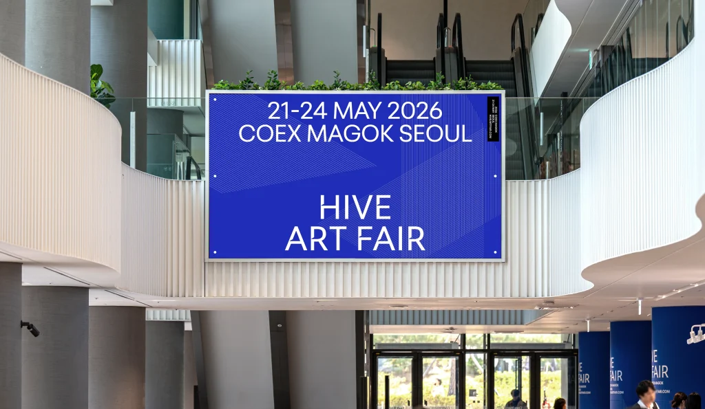
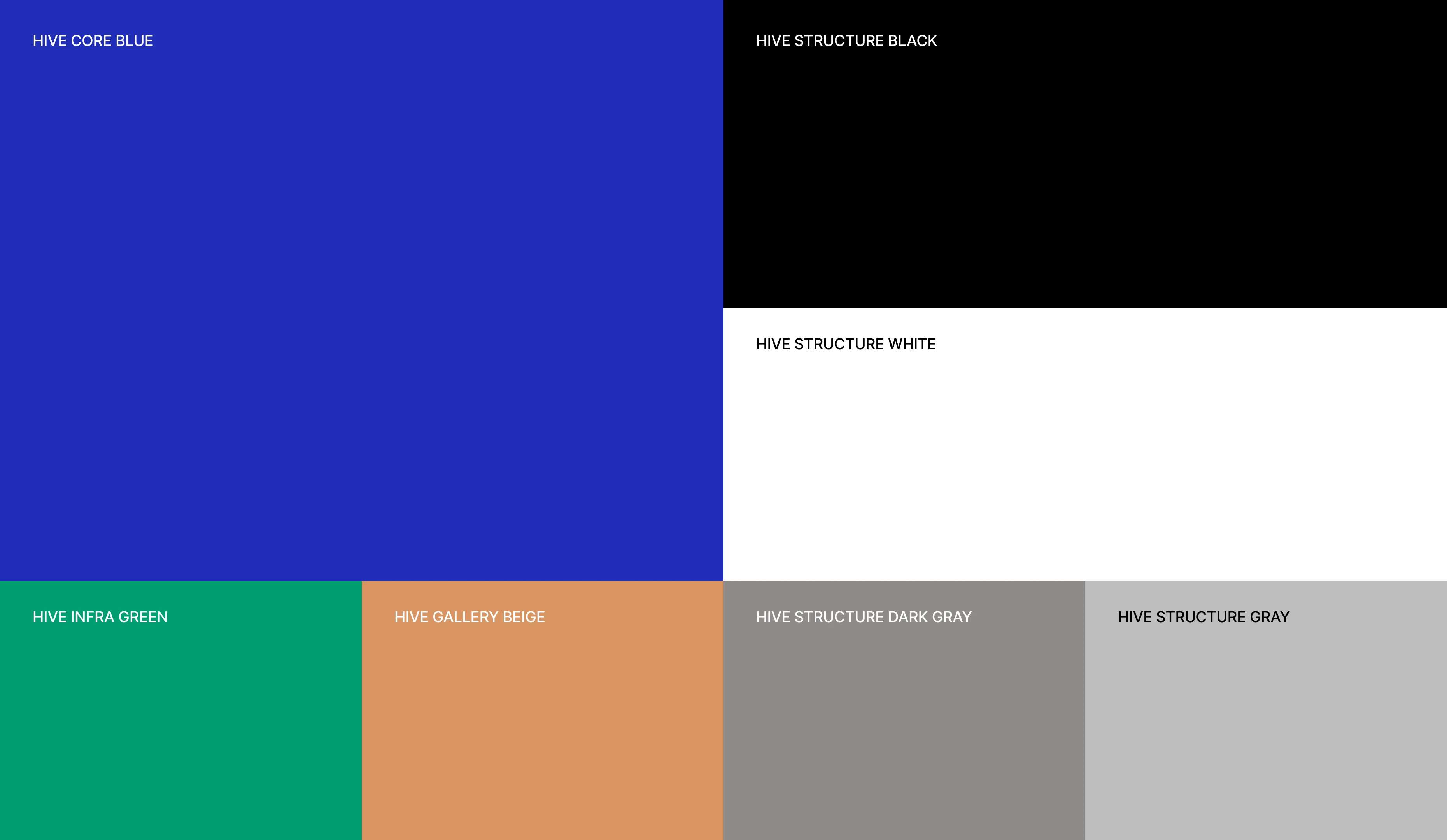
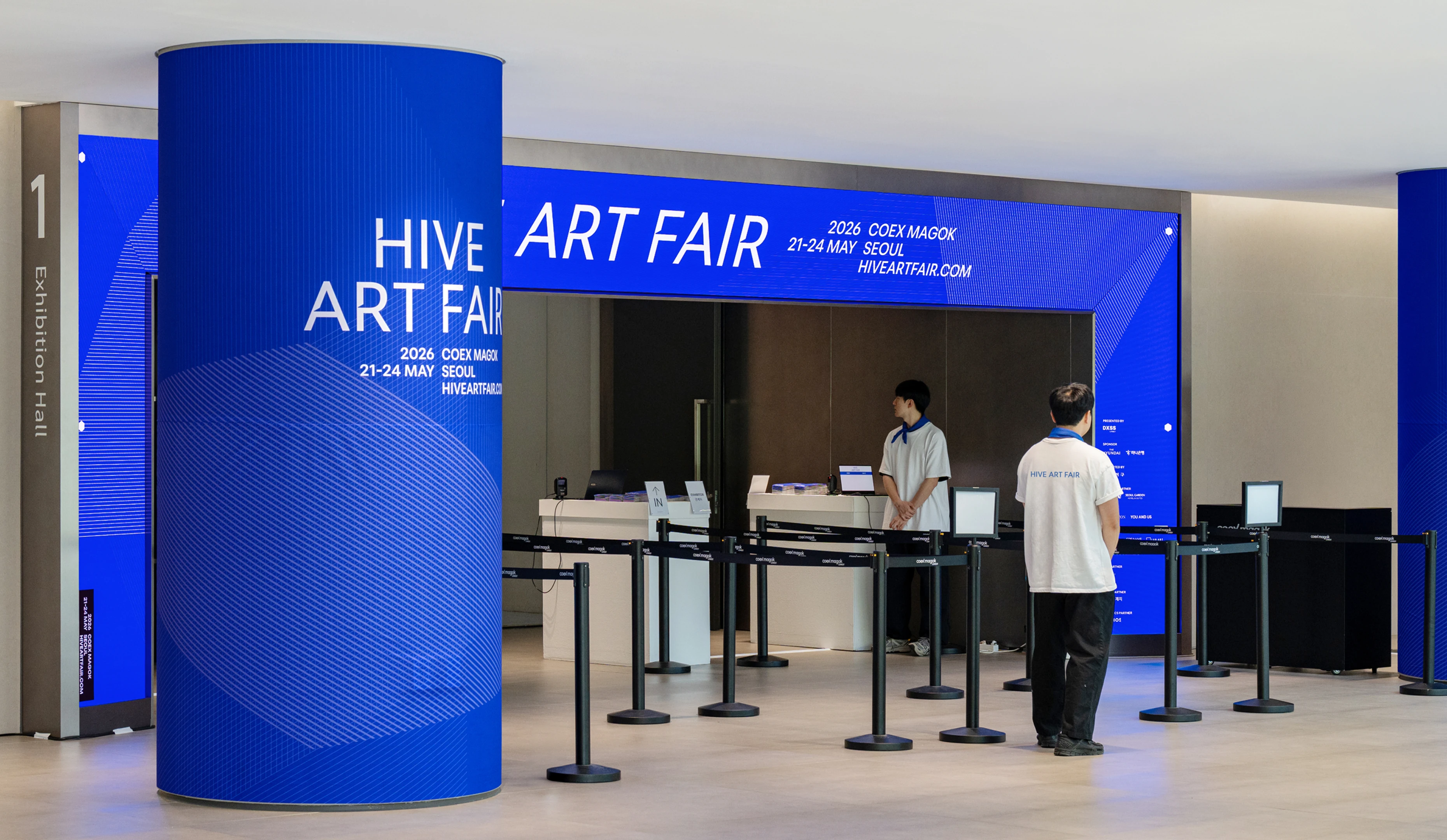
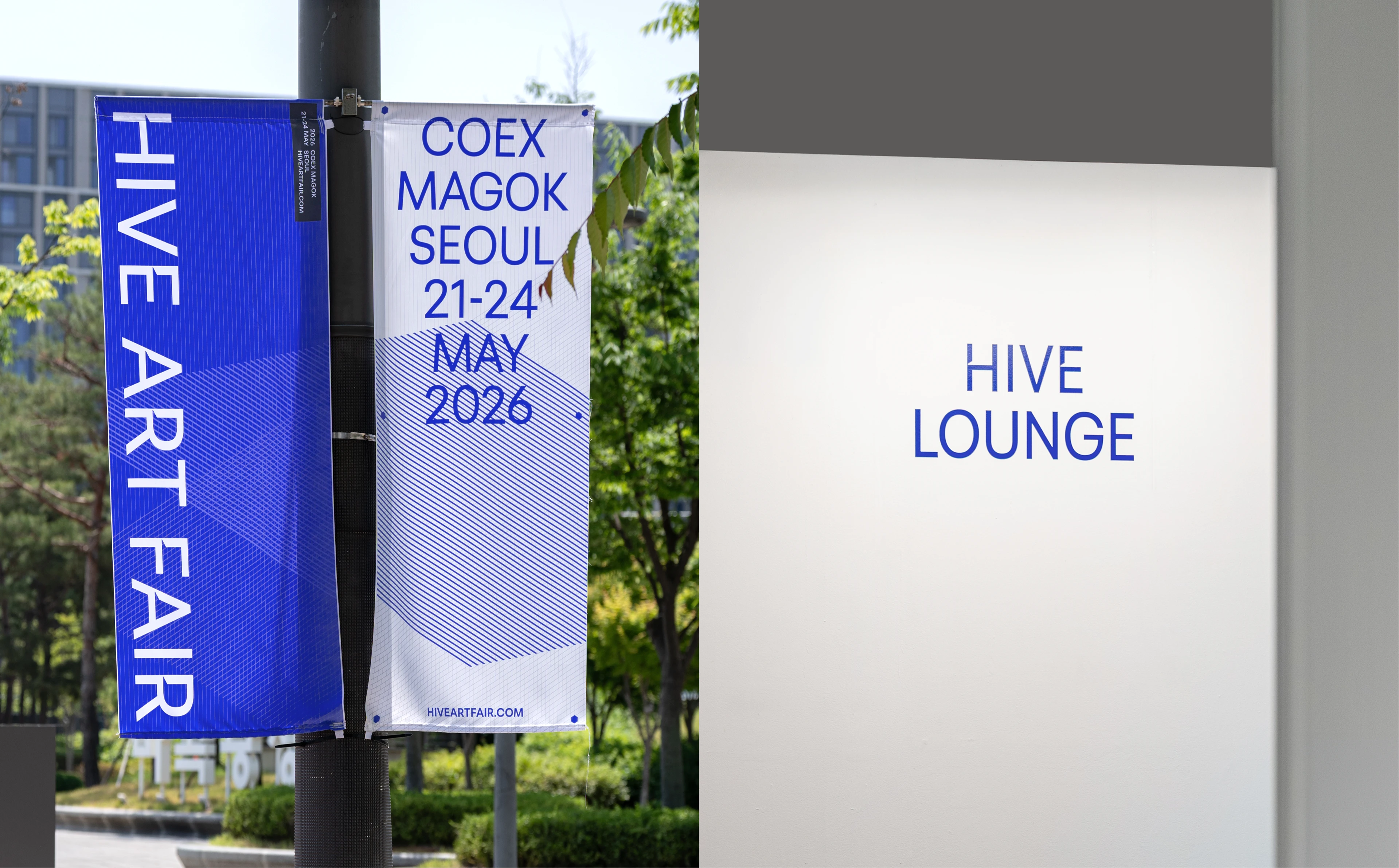
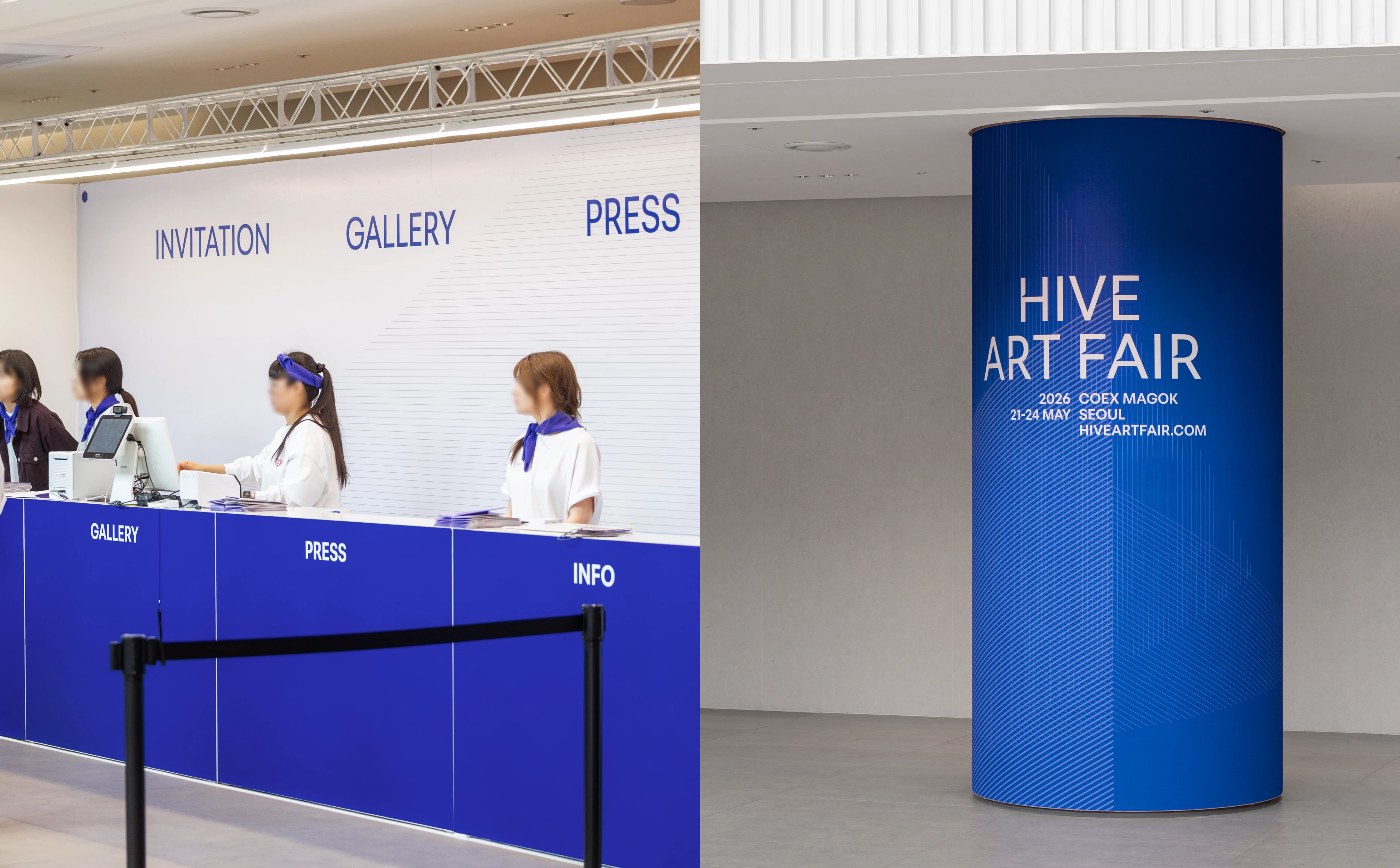
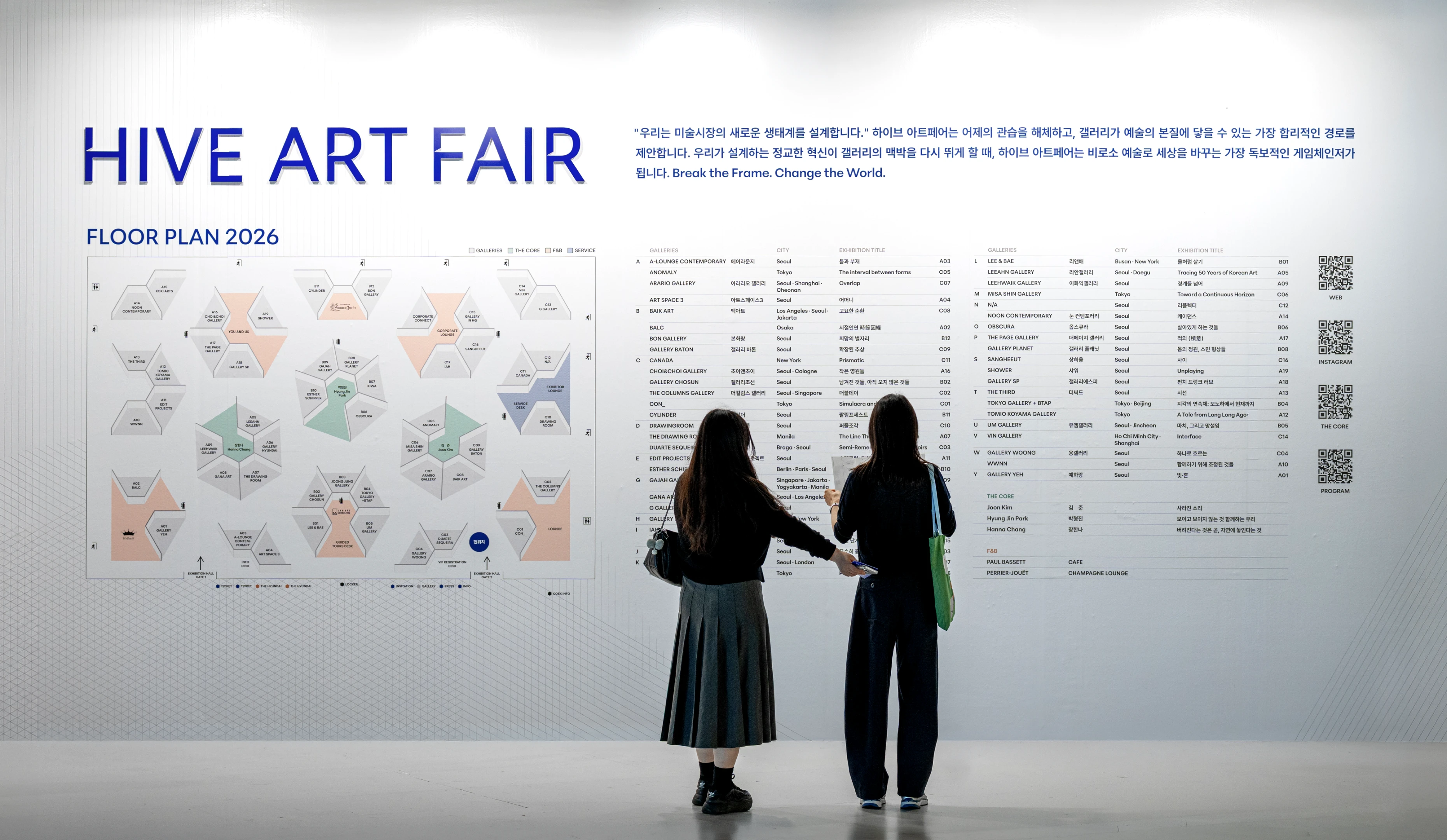
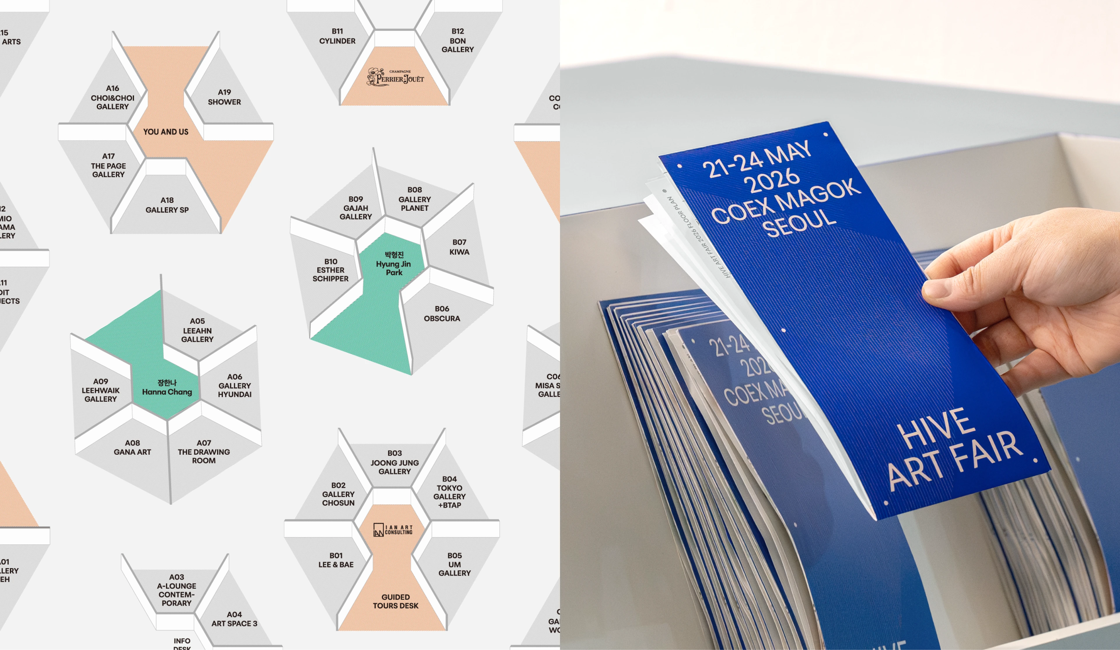
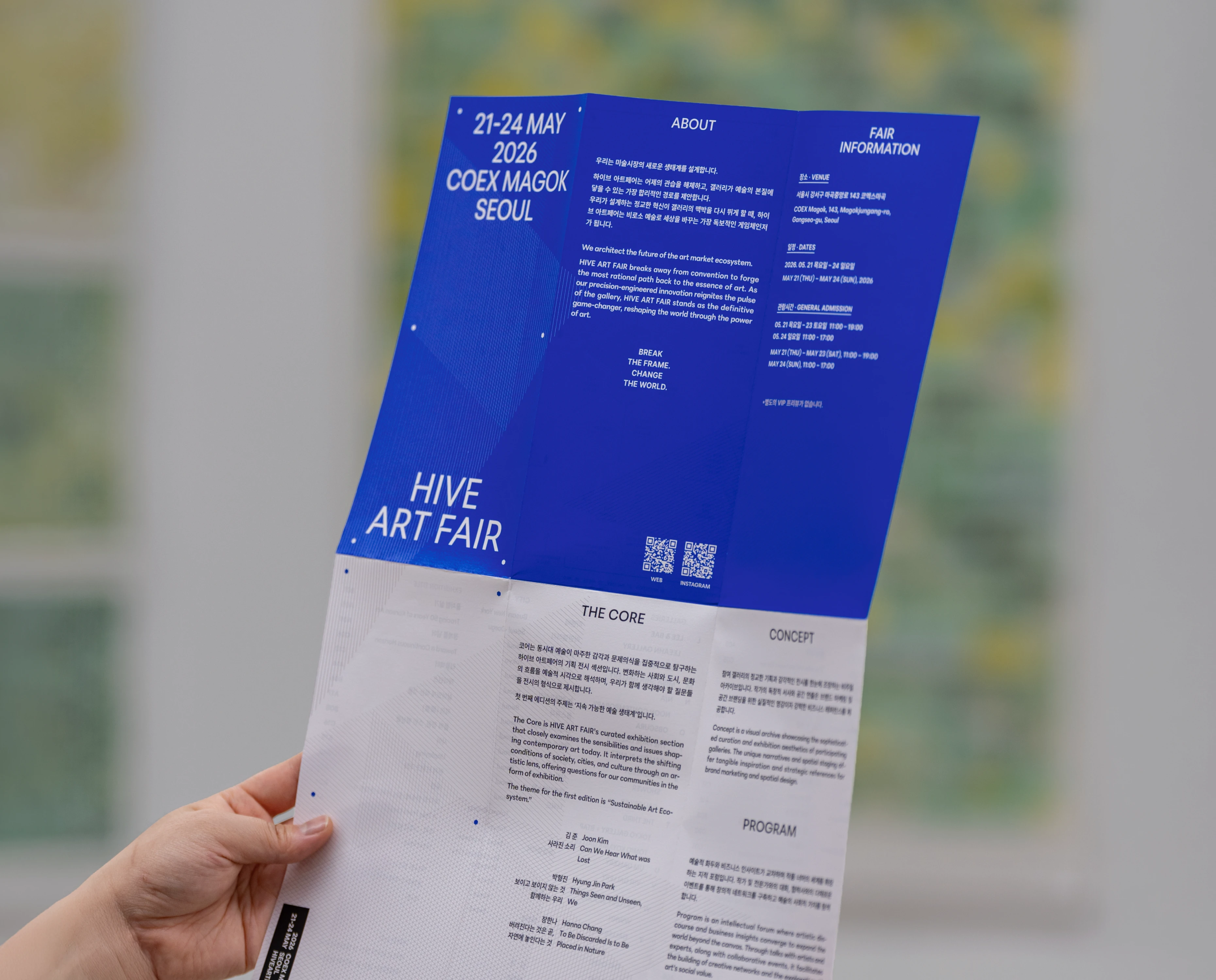
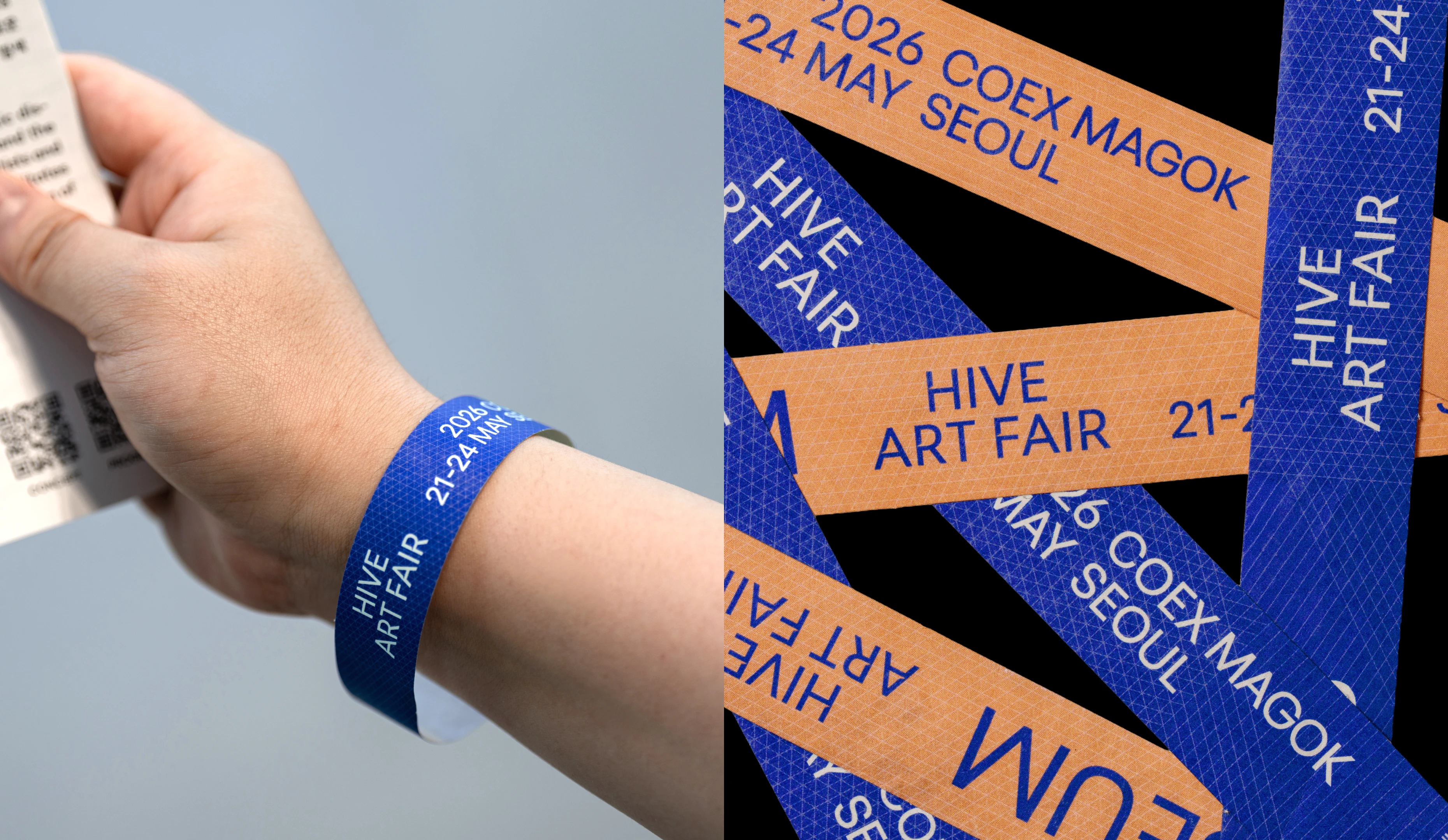
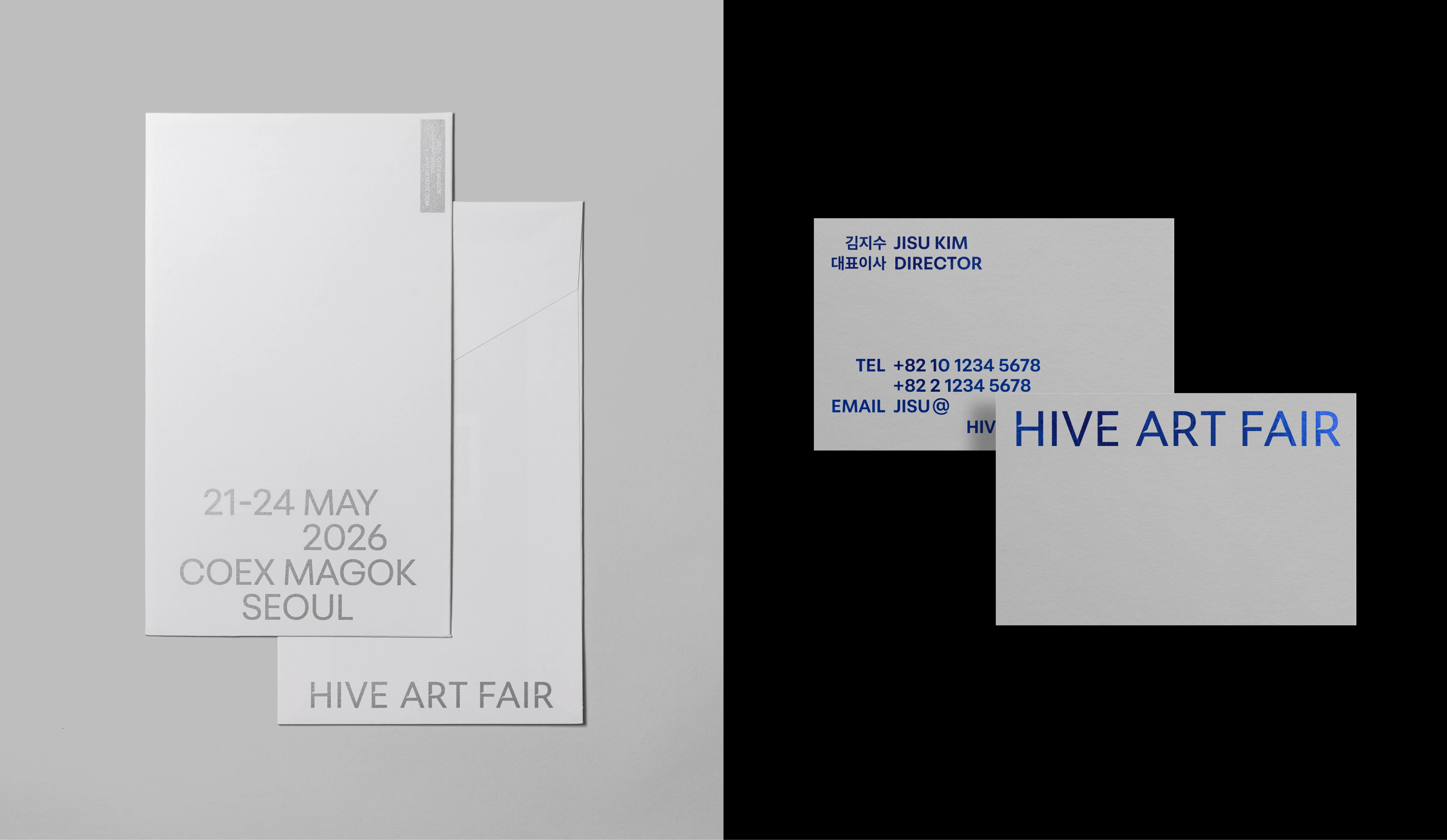
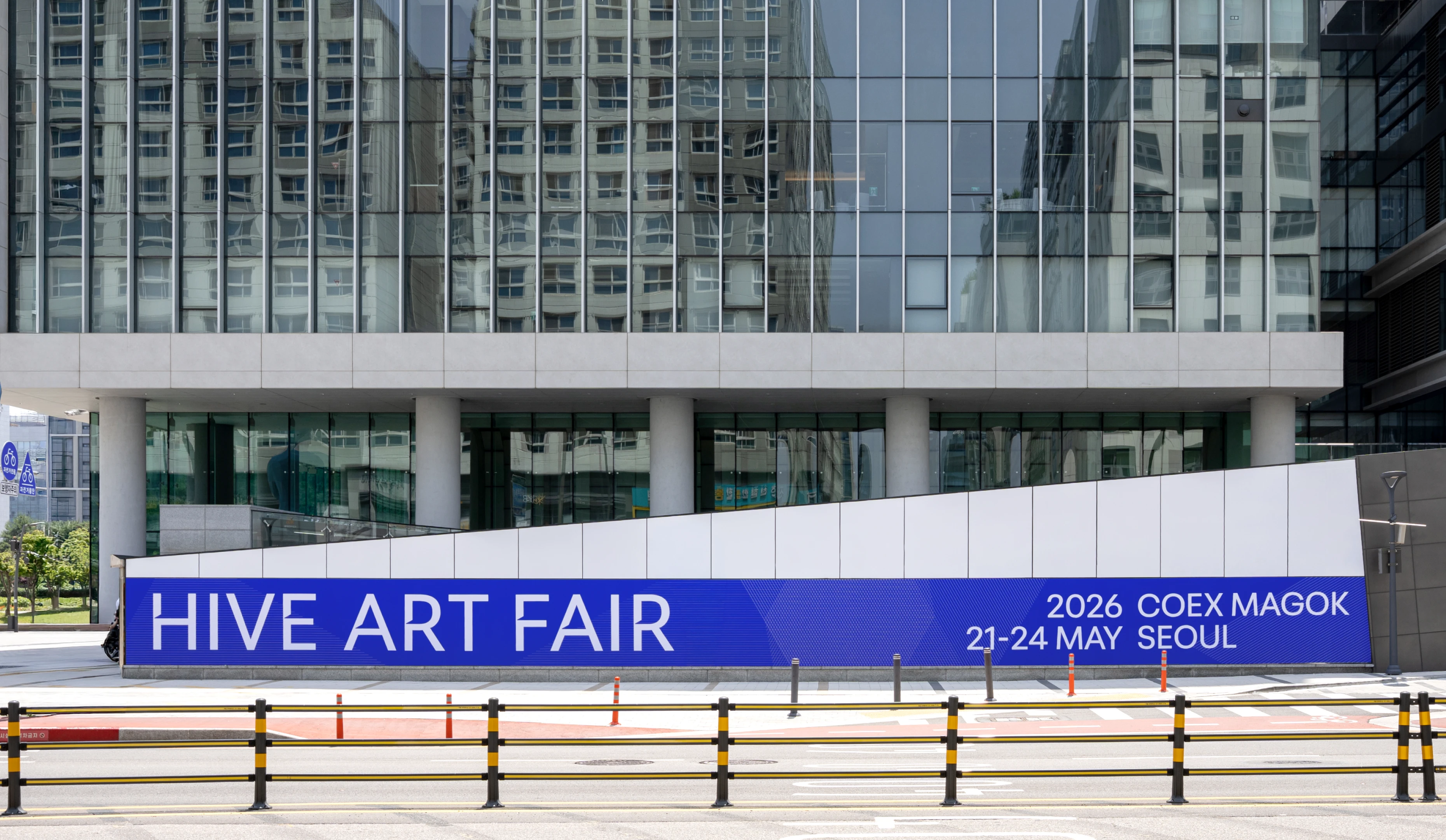
HIVE ART FAIR 2026 introduces a patented hexagonal “HIVE” modular booth, moving beyond the conventional grid-based layout of art fairs. Designed to enhance visitor immersion and create independent spaces for each gallery, the booth became the foundation for the brand’s core visual system. Manual Graphics established a long-term identity system for the fair’s first edition and developed the 2026 main key visual based on it. A grid derived from the hexagonal booth structure was used as the core graphic language, expressing modularity, connection, and expansion. Centered around vivid blue and highly legible typography, the system expands across signage, exhibition graphics, and printed materials to support intuitive spatial understanding and a focused viewing experience.
하이브 아트페어 2026은 기존의 바둑판식 사각형 부스 구조에서 벗어나, 육각형(HIVE) 형태의 특허받은 모듈 부스를 도입해 기존 아트페어 형식과의 차별화를 시도한 아트페어입니다. 이 부스는 관람 동선의 몰입감을 높이고 각 갤러리가 독립적인 전시 공간을 구성할 수 있도록 설계된 구조로, 관람객이 공간 안에서 보다 입체적으로 전시를 경험하도록 합니다. 본 프로젝트는 이 구조적 특징에 주목하여, 육각형 부스의 원리를 브랜드의 핵심 시각 체계로 확장했습니다. 매뉴얼 그래픽스는 첫 회 개최라는 점과 향후 확장 가능성을 고려해, 하이브 아트페어가 장기적으로 유지할 수 있는 아이덴티티 시스템을 구축하고 이를 기반으로 2026년의 메인 키비주얼을 전개했습니다. 육각형 부스 구조에서 파생된 그리드를 핵심 그래픽으로 설계하여 모듈과 연결, 확장이 일관된 시각 언어로 드러나도록 구성했습니다. 구조감을 선명하게 드러내는 한색 계열의 블루 컬러와 가시성 높은 타이포그래피 시스템을 중심으로, 대형 사인, 전시 그래픽, 인쇄물 등 다양한 접점으로 확장했습니다. 이를 통해 관람객이 공간의 구조와 동선을 자연스럽게 이해하고, 작품과 전시에 집중할 수 있는 브랜드 경험 환경을 형성했습니다.
IDENTITY LOGO
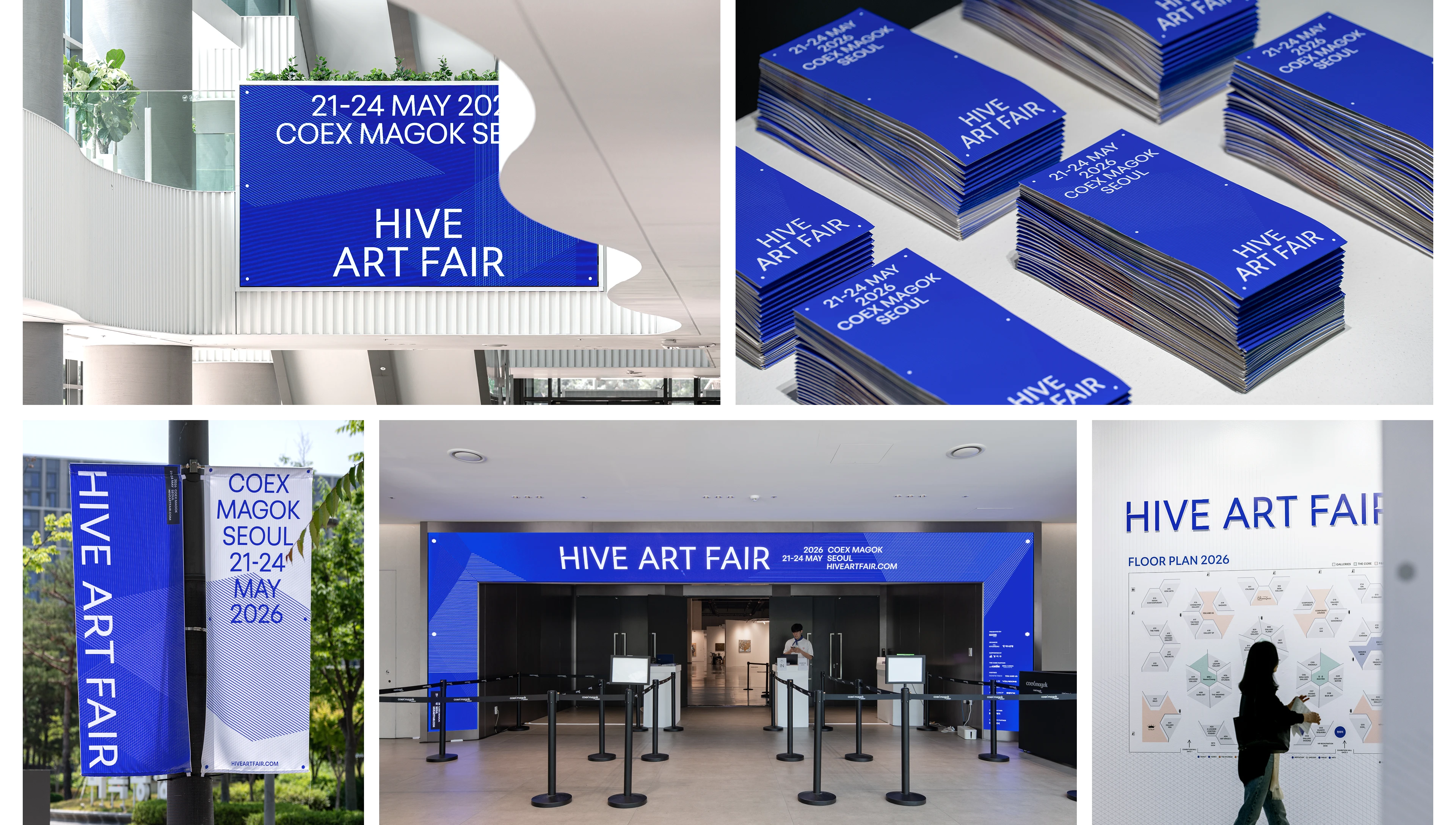
The HIVE ART FAIR logotype uses trapezoidal cuts within flat letterforms to create a sense of depth, as if the type is engraved into the surface. This spatial treatment connects to the three-dimensional viewing experience created by the hexagonal booth structure, visually expressing the brand’s structural identity and immersive exhibition experience.
하이브 아트페어의 로고타입은 평면적인 문자 안에 사다리꼴 절개를 적용해, 글자가 음각처럼 안쪽으로 파고드는 듯한 공간감을 만들어냅니다. 이는 육각형 부스 구조가 만드는 입체적인 관람 경험과 연결되며, 브랜드가 지향하는 구조적 공간성과 몰입형 전시 경험을 시각적으로 드러냅니다.
IDENTITY COLOR
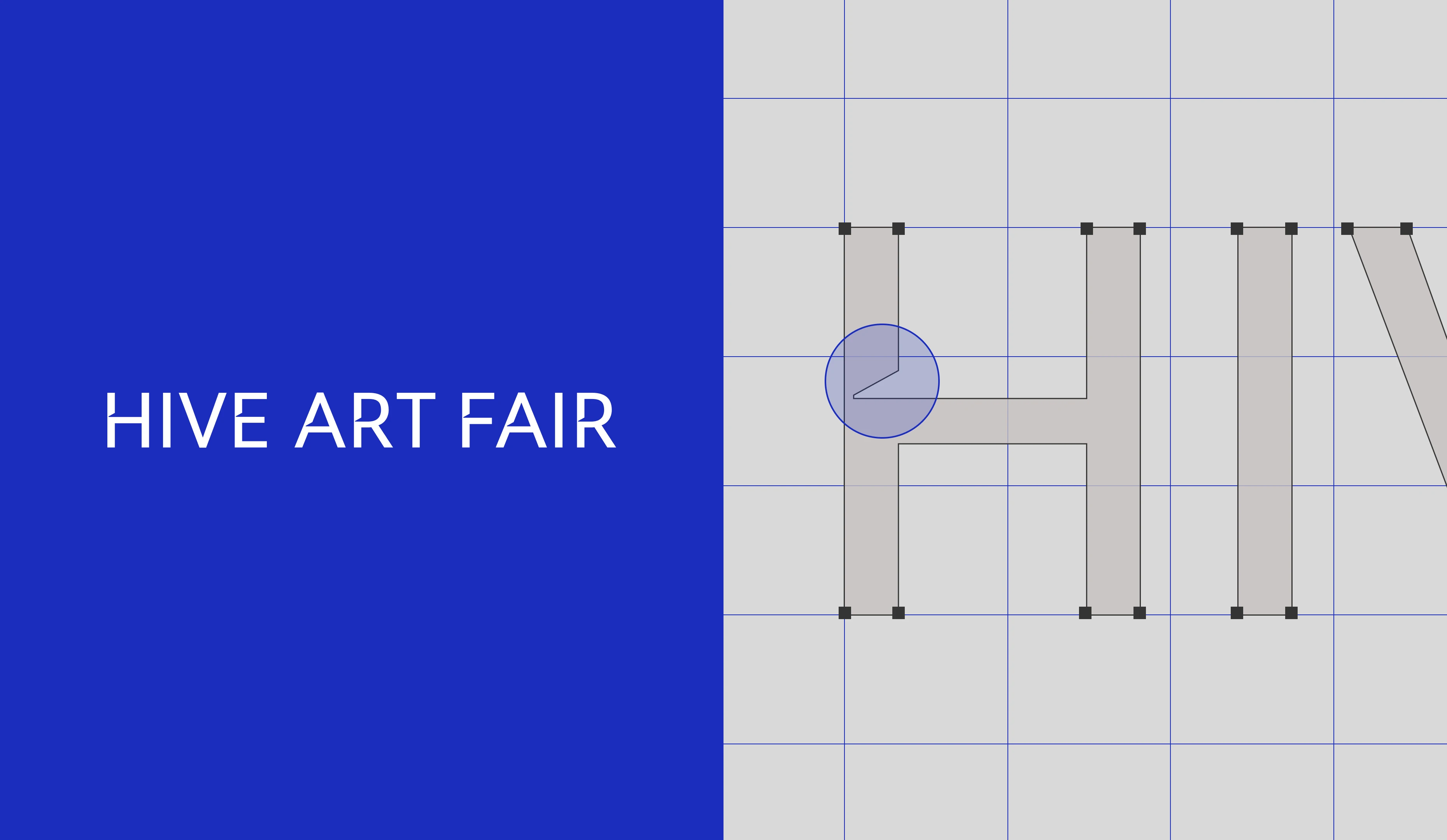
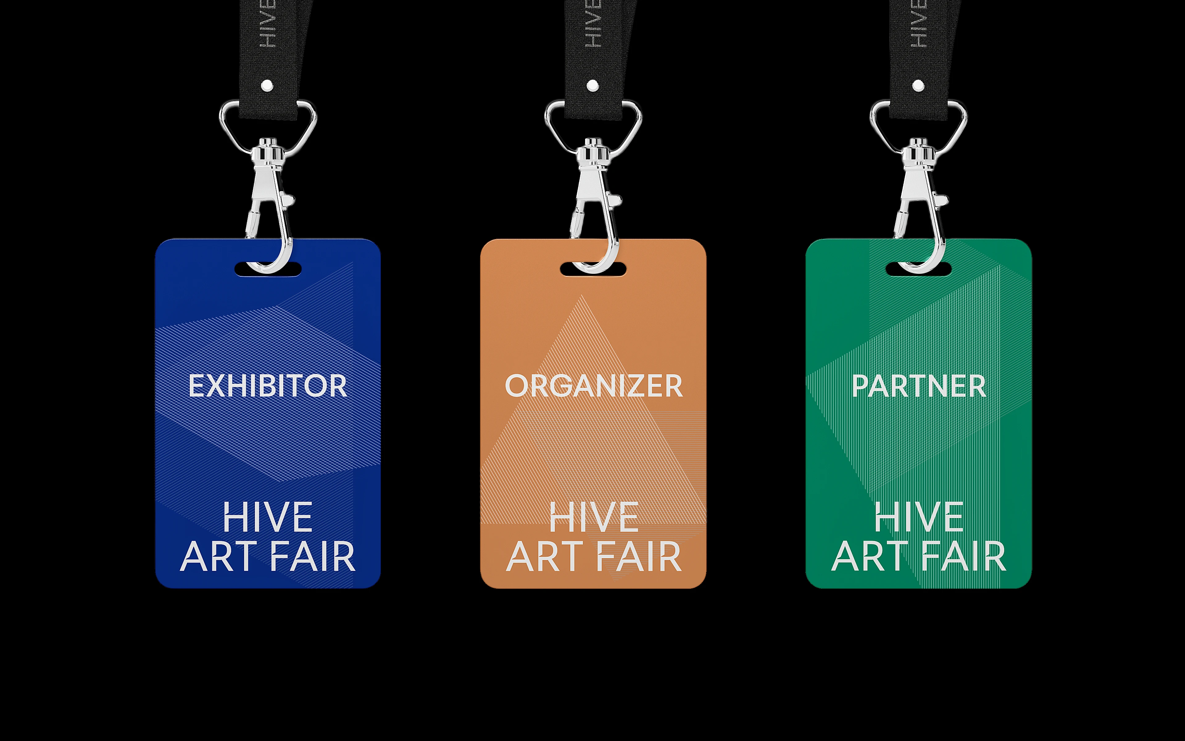
The color system of HIVE ART FAIR is centered around HIVE Core Blue to reinforce a structured and refined impression. The vivid blue, with its cool-toned quality, clearly brings out the structural character of the graphic modules derived from the hexagonal grid. Warm sub-colors are used to add overall visual balance.
하이브 아트페어의 컬러 시스템은 구조적이고 정제된 인상을 강화하기 위해 HIVE Core Blue를 중심으로 구성되었습니다. 한색 계열의 선명한 블루는 육각형 그리드에서 파생된 그래픽 모듈의 구조감을 또렷하게 드러내며, 온기 있는 서브 컬러를 활용하여 전체적인 시각 균형을 더합니다.
IDENTITY SYSTEM
HIVE ART FAIR uses the 120° horizontal binocular visual field as a design principle for its booth structure. Modular hexagonal booths are designed to help visitors experience artworks and space in a more dimensional way, while the visual system expands from the HIVE Core to express a new perspective and an expanded exhibition experience.
하이브 아트페어는 120° 수평 양안 시야각을 부스 구조의 설계 원리로 활용합니다. 관람객이 작품과 공간을 입체적으로 경험할 수 있도록 모듈형 육각형 부스를 구성하고, 하이브 코어를 중심으로 확장되는 비주얼 시스템을 통해 새로운 시선과 전시 경험의 확장을 표현합니다.
2026 KEY VISUAL : HEXA MODULAR
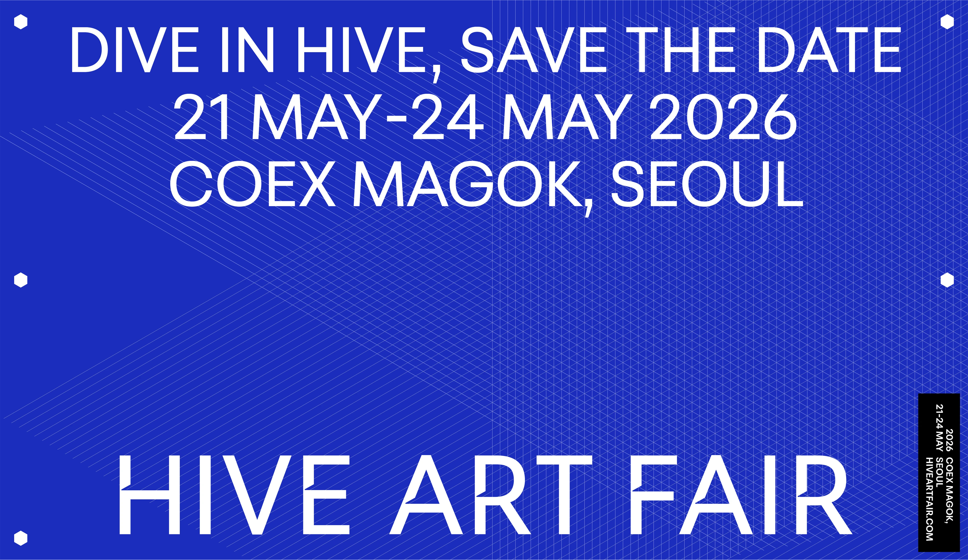
HEXA MODULAR is the main key visual for HIVE ART FAIR 2026, developed from a grid derived from the hexagonal booth structure. Reinterpreting the hexagon’s planes, axes, and directional flow into linear modules, it creates layered structures that expand from the HIVE CORE and express immersion, connection, and expansion.
HEXA MODULAR는 육각형 부스 구조에서 파생된 그리드를 바탕으로 설계한 하이브 아트페어 2026의 메인 키비주얼입니다. 육각형의 면과 축, 연결 방향을 선형 모듈로 재해석해 HIVE CORE를 중심으로 중첩되고 확장되는 구조를 만들었습니다. 단단한 구조 위에 형성된 레이어는 몰입과 연결, 확장의 경험을 시각화하며, HIVE ART FAIR가 제안하는 새로운 관람 경험을 드러냅니다.
HIVE ART FAIR
IDENTITY EXPERIENCE DESIGN
2026.
MANUAL GRAPHICS
Director – Seongkyun Lee
Design Lead – Minji Ko
Identity Design – Bomi Yang
Application Design – Bomi Yang, Hoyeon Won
Strategy Lead – Seohee Park
Project Management – Minji Ko, Seohee Park
Photography – Hanyeon Lee
©hiveartfair